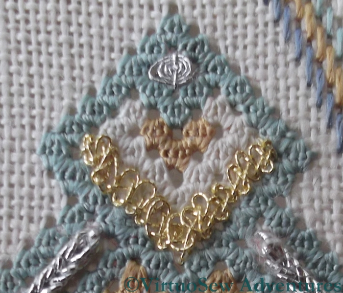
Petite Pincushion Detached Buttonhole
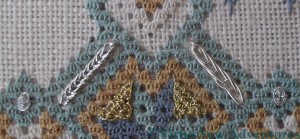
The diagram in the instructions listed the goldwork stitches from the centre outwards, so that is the order in which I decided to work them.
The detached buttonhole stitch at the centre was worked in a very fine silver thread. It was terrifyingly lively and had a will of its own, which made it hard to be sure of what I was doing. Yes, I had the magnifier, but looking at the closeup, the stitches are not especially consistent in size or shape.
I also caught down the detached fabric in the middle of the long side – not a step listed in the instructions, but one which seemed sensible at the time.
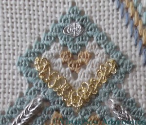
Petite Pincushion Figure Eight Interlacing
The Figure Eight Interlacing stitch filled in the strapwork in the middle of each side of the panel. I really enjoyed working this stitch, and this element of the Petite Pincushion seemed to be finished in no time at all! And believe me, I’m very glad I worked the detached buttonhole stitch first. I shudder to think how that whippy silver thread would have caught around edges of these panels, which stand proud of the surface to a considerable degree!

Liebster Blog Award
I’ve had a blog award passed on to me – thank you, Karen of Stitching Life.
When given this award:
1. Thank the giver and link back to their blog.
2. Reveal your 5 top picks and leave a comment on their blog.
3. Copy and paste the award onto your blog.
4. Have faith that your followers will spread the love too.
My picks:
- Susan of Plays With Needles, for providing thoughtful and thought provoking posts, and truly exquisite embroidery.
- Kathy of The Unbroken Thread, whose careful step-by-step descriptions of technique, and clear joy in creation make her blog a delight to read.
- Megan of Elmsley Rose, who is currently undergoing traumas of blog reorganisation, but whose embroidery posts always make me stop and think, and whose comments here are uniformly supportive and encouraging and frequently insightful as well.
- Alex of Under A Topaz Sky, whose embroidery I find wonderful to behold, although it isn’t a bit like mine.
- Hannah of Embrouderie, whose skills grow with every post as her blog develops.
Thank you, ladies, for hours of delight!
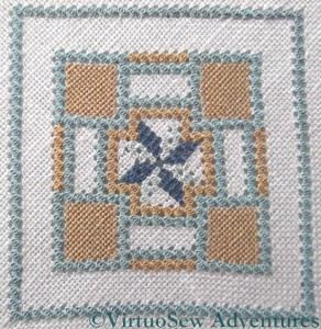
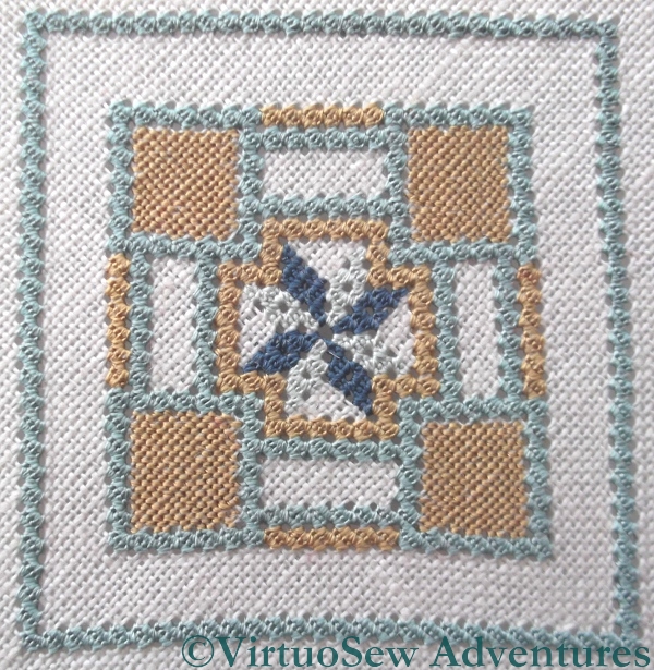
Petite Pincushion Silkwork Finished
Born teacher that she is, Tricia provided two additional projects with the Tudor and Stuart Goldwork Masterclass. After all, practice makes perfect, and practice is much more palatable when it produces something pretty at the end.
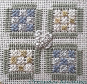
The silkwork of the Petite Pincushion is primarily worked in queen stitches. As you may have gathered, I’m not especially keen on counted work, regarding it as a salutary discipline rather than a pleasant pastime. I’ve been rather pleased that I’ve persisted with it in these cases, which is testament to the enjoyment I’ve been getting from learning the new stitches, and my desire to play with them even more.
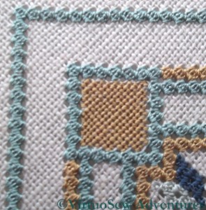
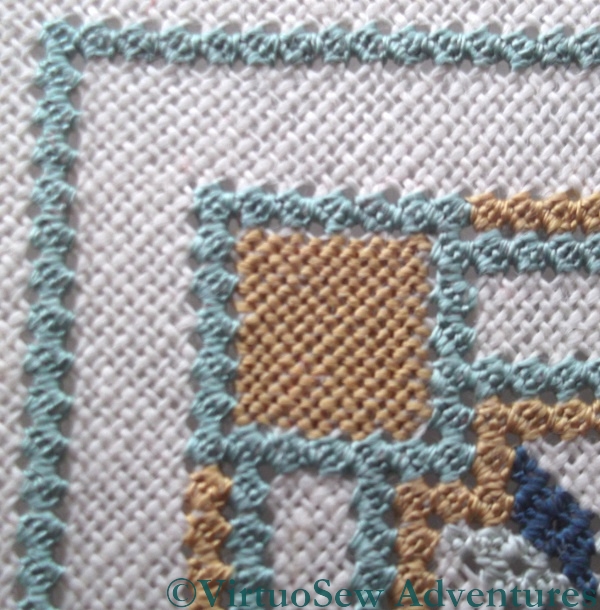
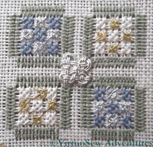
Petite Pincushion Quadrant CloseUp
Not that it has been entirely straightforward. The tent stitch corner panels were quite a strain – it’s astonishing how, even with a magnifier, I’ve managed to miss the odd stitch or set it crooked and have to unpick it and try again.
I never thought I would say this, but the queen stitches were easier! They interlock nicely, creating a textured, almost brocade-like surface which will make a good background for all the goldwork stitches that fill in the strapwork.
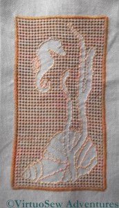
Not quite thought through...
I’m really not at all sure what to do with this. It’s an abandoned experiment that I recently rediscovered, and which is nagging me more than somewhat! I really should finish it, or do something with it. It was originally intended to be a traycloth, and I’ve also run out of the thread I was using to hem the piece. So, since I can’t remember what that was I have some unpicking to look forward to, whatever I decide to do with it.
I wanted to play with the idea of stitching the background, rather than the design. I also wanted to take advantage of the fact that Caron Collection colourways are dyed onto different threads (in this case, a fairly fine single-strand thread, and the heavy three-stranded type).
As it stands, I’m not happy with it. Maybe I chose to make the pulled work too large (it goes over four stitches in each direction), maybe it is too dark. Maybe I just haven’t done enough stitching yet?
I still think that doing most of the stitching in the background – a little like Assisi work – would be an interesting variation. Back to the drawing-board!
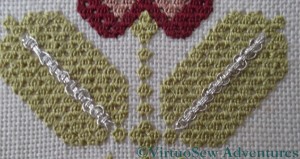
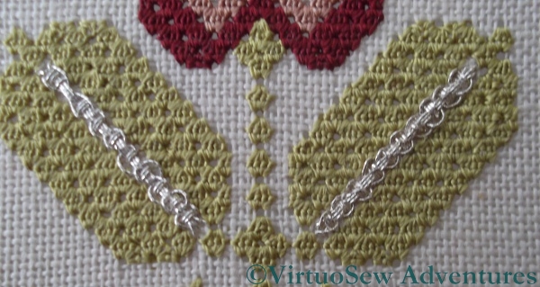
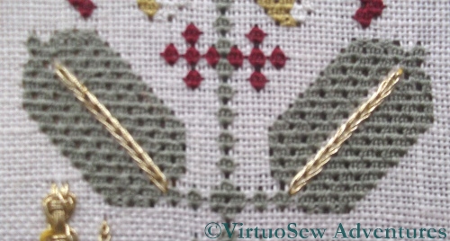
Guilloche In Different Threads
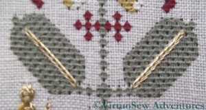
The central veins of the leaves here are in Guilloche Stitch, and in one case I have have used the “imitation silver” thread and in the other case, one of the other, very fine silver threads. This shows – if we needed it pointed out, at this stage – that all metal threads are not created equal. We tend to think of silver and gold as being unchanging colours, but in fact you’ve only to look at jewellery to realise that there are many colours of gold (or in this case, silver). The threads are slightly different weights, as well, but one is clearly a brighter colour than the other.
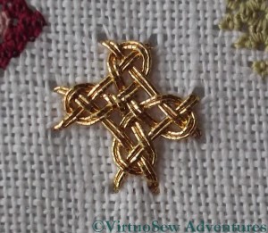
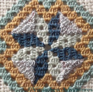
Cross Interlacing Stitch
I loved the diagonal cross shaped interlacing stitch. I can’t for the life of me think what I would do with it (something with a Celtic theme, perhaps?), but I loved working it, and like all these interlacing stitches, it looks harder than it is. That’s the right way around. Satin Stitch looks easy, but neat, smooth satin stitch is really only possible to the experienced embroiderer!
Once the foundation is correct, it is obvious where the interlacing threads need to go over and where under, and then hey presto! one fabulous, dazzling, interlaced spot.
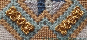
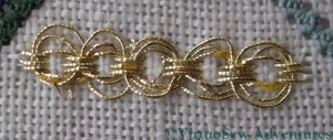
Plaited Braid And Circle Interlacing Stitch
You may recall that the plaited braid stitch was one of the reasons I wanted to do the course. My post about tackling it mentioned that I felt I was beginning to get to grips with it, and would be able to pick it up in future if or when I wanted to. So this was my first test of that confidence.
And yes, nailed it! I did have to unpick my first attempt, and I decided that the backstitch was rather hindering my efforts, but I really think that I can count this as a stitch I can take on whenever I want to!
The circle interlacing stitch is another of those wonderful, easier-than-it-looks stitches, and would make a great oversized “sequin” if one wanted to play with scales of stitches and design elements.

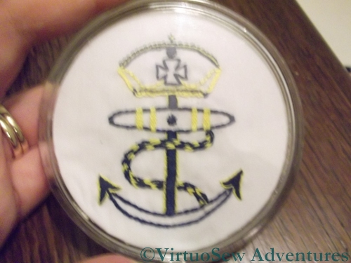
The Coaster I worked for my Grandfather
About fifteen years ago I was going through one of those periods of penury that we are all subject to, so Christmas presents and birthday presents became rather a challenge – usually solved by making something, with varying degrees of success.
This coaster was made for my grandfather, based on a version of the merchant navy’s Crown And Anchor symbol. It’s worked in ordinary stranded cotton (all I had at the time) and you’ll be surprised what stitches I managed to cram into it!
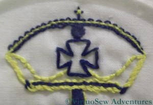
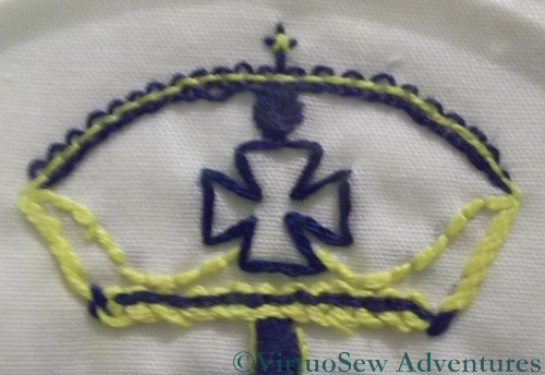
The Crown in close up
I don’t imagine that Grandad noticed (he only had one eye – the other was glass – and the working eye was short-sighted), but the top curve of the crown is worked in Pekinese Stitch, worked very small and tight, while the headband is worked with the colours the other way around and slightly larger and looser. The tiny cross on the top is a composite of an ordinary cross stitch worked over a slightly larger upright cross stitch.
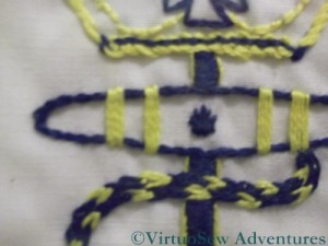
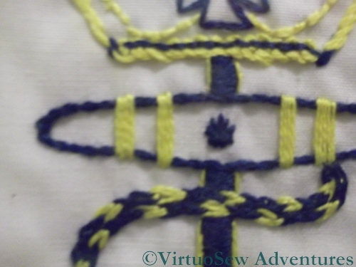
The Rope And Shank
The more conventional stitches of course included back stitch, stem stitch, and satin stitch. The cable that is wrapped around the anchor is worked in two rows of Magic Chain Stitch, purely because (if I remember correctly!) I thought it would be fun and had been twitching to try it ever since I had seen it diagrammed. It worked pretty well in the end, as it happens.
It’s not one of my most successful pieces, but it was fun to do, and it came back to me after my grandfather died and now lives beside the spare room bed, ready for glasses of water or cups of morning tea.
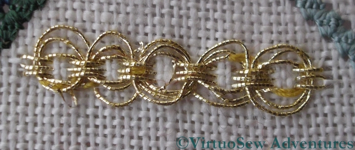
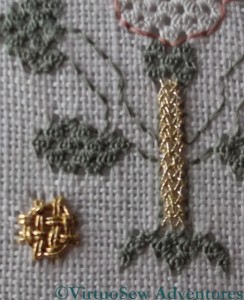
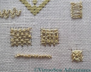
Two Versions Of Heavy Chain Stitch
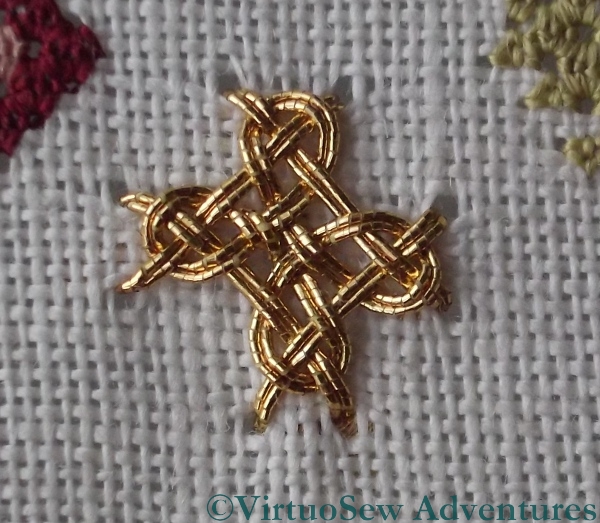
There are two more versions of heavy chain stitch here, again using different threads. This time the threads are so different that I snipped out the larger one, on the right, and reinstated it using the finer thread. This photo also shows the detached buttonhole filling with return, worked in the finest of the gold threads. This was rather a challenge as well. I believe it will appear again in the Petite Pincushion, so I will soon get to practise it once more.
Braid Stitch Finishing the Spot
In ordinary pearl cotton, braid stitch is one of my favourites, but in metal thread it is much more of a challenge, especially at a diagonal, and on a fabric which is coarse enough to be much better used in a counted fashion! As you can see in this photo, it creates a lovely rich looped effect – rather like a braid you might use in furniture or to trim a coat, but it doesn’t really bear close inspection, because some of the loops more closely resemble knots!
The tiny four legged spiders web stitch seemed to come together much more easily than the first set I did, so I am clearly getting a better grip on it!
Guilloche Variation
This Guilloche Variation is actually the stitch that most of my stitch dictionaries refer to as “guilloche stitch”, although they generally only have one run of interlacing rather than three. For some reason the thread broke up quite a bit, and I had my customary trouble with the interlacing loops. I wonder whether the relative simplicity of the stitch makes me rush more when I’m doing it?
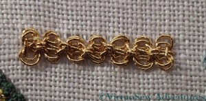
Figure Eight Interlacing Stitch
Figure Eight Interlacing stitch is great fun. I had a little trouble getting the first set of loops to lie flat as they are supposed to, but after that, the stitch just fell into place. This would be another good one for using to represent intricate gold jewellery or ornamentation on my Dreams of Amarna panels.
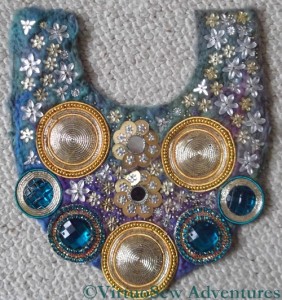
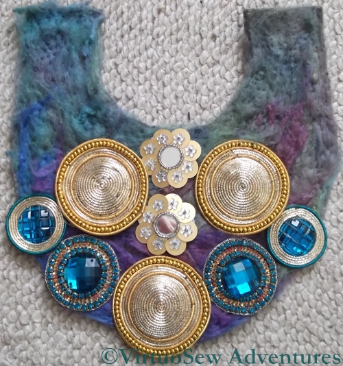
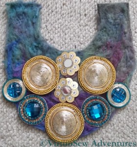
Embellished Necklace - intermediate stage
When I’d finished putting the large elements on to the backing felt, I laid it on the floor and scattered the small elements over it.
Although the basic shape is symmetrical and the basic layout of the design is too, I’ve not attempted to create absolute precision in the execution of the design. The backing has some “give” in it anyway, and besides I felt that if the piece were precisely symmetrical it would produce a rather stiff and lifeless effect, not at all the exuberant effect I was seeking.
So one side has more of the pale yellow flower gems, and indeed is more densely packed all together, while the other side is lighter and shows more of the background fabric. Remember that the point of the layer of throwster’s waste was to tie in the necklace to a dress, so I had to leave some of it showing!
At about this stage I realised that the next day was the day before Christmas Eve, so I attached some double-faced satin ribbons and decided to wear it as it was a couple of times before deciding whether it needed any more embellishment. It was a great success – it works well with the dress I intended it for, and really beautifully with a teal cashmere sweater I bought in the autumn.
I’ll let you know if I add any more beads!
Interlacing And Flat Webs
Even the macro setting on my camera has trouble with some of the fine detail here. The fine gold and silver threads used for the four-legged spider’s web stitches is barely heavier than the silk thread, and was quite a challenge to stitch with. At true size they create the smallest of subtle glimmers, rather than any dramatic effect.
The square interlacing stitch, on the other hand, makes its presence felt in no uncertain terms! It was fun to do, although using the heavy silver thread I did wonder whether the interlacing was going to create rather a congested appearance. I don’t think it does, but if there is one thing I have learnt from this course, it is “Test, Test, Test”. It is all very well being confident of how to work the stitch, but with the huge range of metal threads available and the variants of scale and flexibility, it’s much harder to be confident of the final effect if you don’t test it on the right fabric at the right scale!
Heavy Chain Stitch
The two rows of heavy chain stitch here are worked with different threads. The difference is subtle, and harder to see on the photo than in real life, because even the fact that the row of stitches are at different angles contributes to the effect. I’ve found heavy chain stitch a remarkably difficult stitch to work using metallic threads, and I’m not sure quite why, because I don’t find it at all difficult using cotton or silk!. I am assuming that it is a matter of tension, but since my various efforts haven’t cracked it yet, all I can say is “Needs More Work!”
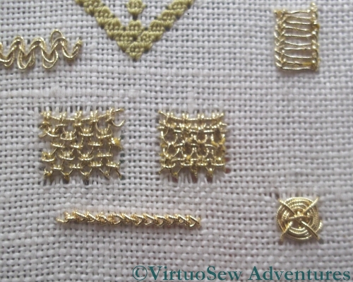
An Array Of Spots
Here you see a whole range of spots, worked with varying degrees of success.
I’ve had plenty more practice with Ladder Stitch since I worked this set, but I still find that one side of the stitch ends up appearing “turned over” compared with the other, which lies flat. Another stitch that needs more work…
I like the dense fabric produced by the two variants on Up-And-Down Buttonhole Filling, although strangely they don’t look as different from one another in the photo as they do in real life.
Eight-legged spider’s web stitch is more stable than the four-legged version – there are more stitches to keep it under control – and it produces a good, flat boss. It would probably be a good choice in places where the square interlacing stitch would draw too much attention to itself!
Laying Out The Large Elements
Once I had decided which of the score or so of arrangements I was going to create, I laid out the large elements on the needlefelted felt and tweaked the design a little more.
The gaps will be filled in with little flower gems and seed beads, so I ended up spacing out the large elements a little more. Then I had to work out how to sew them on. You see, unlike the original design in the magazine which had used oversized sew-on gems with no settings, I had ended up buying a selection of bead-and-purl assemblages from Aarti J’s and Bombay Fabrics. They weren’t quite as straightforward to sew on, and they certainly couldn’t be temporarily attached with safety pins, lest I break or crack some of the check purl.
Sewing on the large gems was several evenings’ work, as it turned out, using a fine but sturdy needle and being careful where I placed it. Still, each assemblage is backed with stiffened muslin, so in some cases it was relatively easy to stitch through the muslin and avoid the beads. In other cases the thread snagged on the front of one gem while I was working on another!