
Tag: commissions
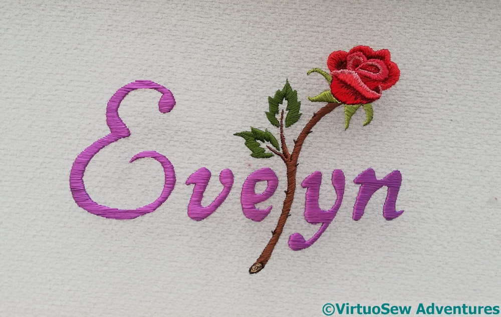
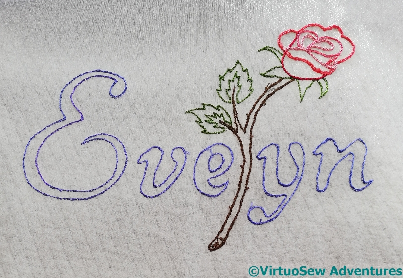
Evelyn Rose – Finished
I’ve only just realised you’ve not seen the finishing of Evelyn Rose – I wrote the post then didn’t schedule it!
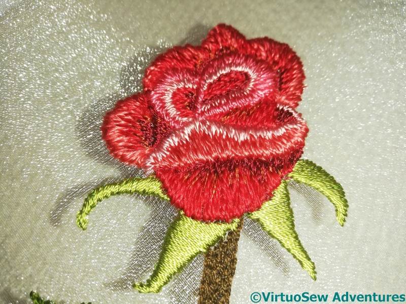
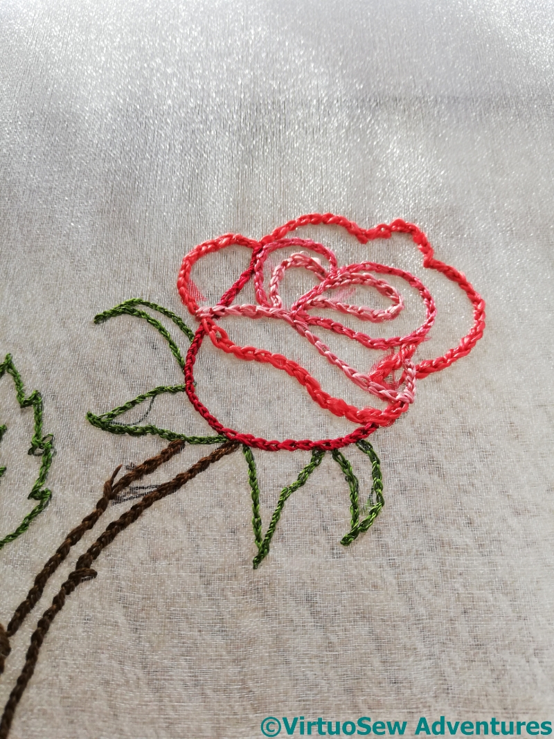
The glint of the gauze shows up particularly well in this photograph of the rose, and you can see, too, the various different silk threads I’ve used to get the effect and shade I wanted. Tricky, because I didn’t want a naturalistic, Redouté-style rose, but – because, as I said, they don’t work with stems – I didn’t want a canal-art style rose, either. I think I got it right, and I’m rather pleased!
This slightly “stencilled” type of leaf helps to keep the balance between “naturalistic” and “stylised”. It also provides an opportunity for some rather striking shadows when the light is right, and I was delighted, throughout the stitching, to have moments like this, when it became clear that the idea was going to work just as I had hoped!
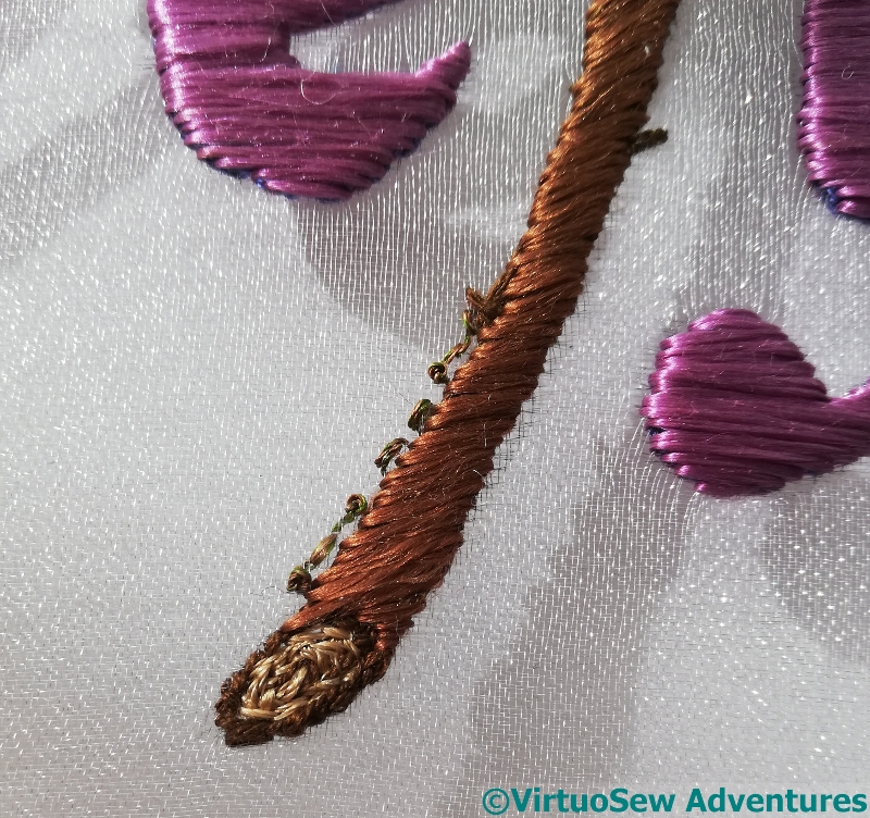
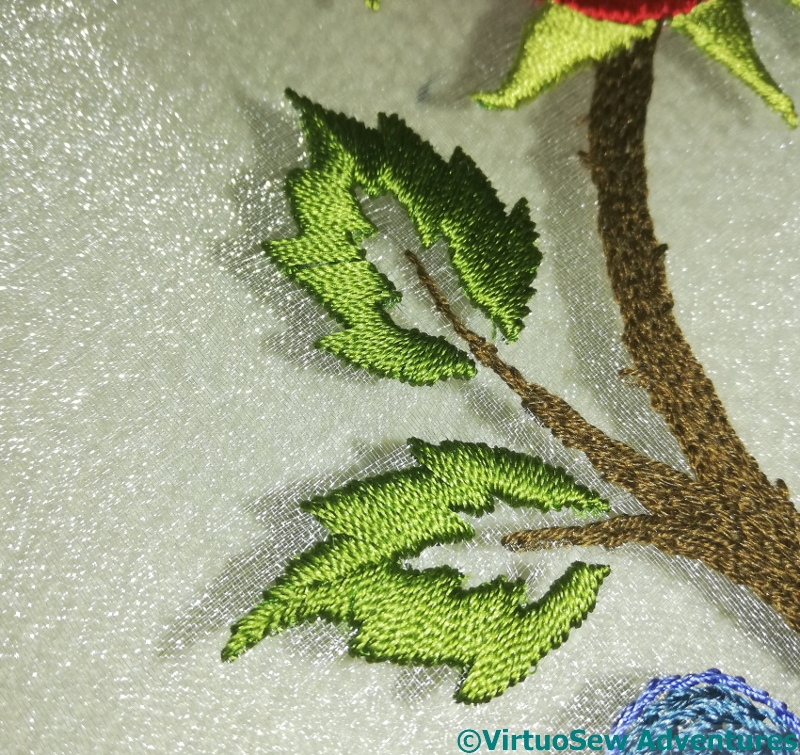
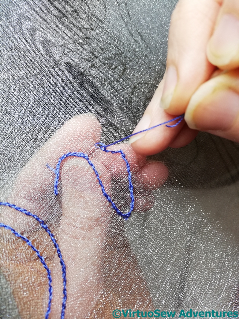
I knew that Evelyn’s father, in particular, would be very disappointed if he discovered later about my usual Morse Code signature, and I hadn’t done it for Evelyn, but making it small enough, and neat enough, and showing the stitches at the back as little as possible, was a little tricky. I twisted together several colours to get a fine, caterpillary thread, and worked my stitches as close to the stem as I could get them. In real life, it’s very hard to see my signature, but I promise you, it’s there!
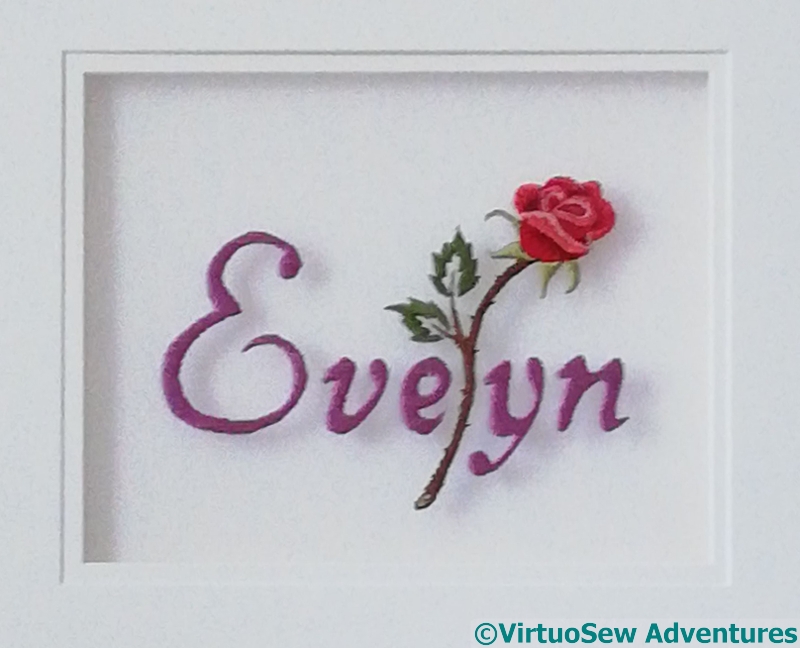
The next challenge was to mount it. All this was happening only just pre-lockdown, so I went to see my wonderful framer, who goes by the (entirely deserved) name of Framing Genius. Between us, we came up with a way to create a sort of “sealed unit” of the embroidery and the mounts, so that I could post it overseas to our friends, who would then have something displayable until they can find a framer when such things are possible again.
Now, the next post in SlowTV Stitchery is now live – Episode Eighteen – on the desirability of imperfection and the likeness of mathematicians to cats!
Progress on Evelyn Rose
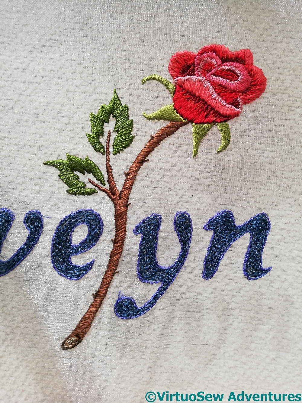
I decided to understitch all the elements, and then concentrate on the rose, stem and leaves.
However, in this photo, you can see not only the finished rose on its stem, but also the understitched lettering, and the beginning of the effect I want, with the sunlight casting a shadow through the gauze to the surface beneath.
Then I had to decide how to stitch the top layer of the lettering.
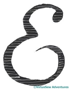
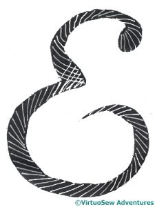
I took a photocopy of my painted design in black and white, printed it out twice, fished out a white gel pen, and began to experiment with stitch direction. I decided that the constantly changing angles of the slanting version would end up terribly “busy”.
So, horizontal it is, then. And I’m using Japanese Flat Silk, which at least makes the satin stitch easier to make work!
And while you think about how that is going to go – Episode Nine of SlowTVStitchery is now up, in which the first edge is reached, and it is agreed that the sight of colours against gold is worth getting up for!! Happy watching, happy stitching, and stay safe.
Getting Started on “Evelyn Rose”
I found a gauze with a slight glint to it, stretched it on my frame and drew the design on to it. And at this point, the primary challenge I was going to face made itself felt – finding the angle from which to see the lines on the fabric, so that I could do the stitching. Add in the glint on the fabric, and sometimes I could see the lines, sometimes I could see the fabric, and sometimes I wasn’t sure I could see either… I knew it would be this difficult, by the way, but I thought the end result would be worth it!
The stitching is going to be very simple, mainly satin stitch (yes, I know!) because the main characteristic I want here is the magical effect of the embroidery floating above the backing surface.
Obviously, the first thing to do was to outline every element. I’m using a mixture of silk thread, some vintage, and some from Thistle Threads courses.
So here you are – all outlined, and the thorns already in place on the stem. You can see the fabric I have over my worktable through the gauze in this picture, and you can see that glint in the sunshine as well.
The next episode of SlowTV Stitchery – Episode Seven – is now up. It explains why “Slow TV Stitchery” and offers memories of an astronaut. I hope you enjoy it.
A Commission for an Embroidered Panel – “Evelyn Rose”
Earlier this year a dear friend and his wife produced a baby girl, who they’ve named Evelyn Rose. We were, of course, thrilled for them, and sent many congratulations, and even managed to speak to them (they’re in a different time zone). During that conversation, they said, “We love what you do, and we’d love you to do something for Evelyn!”.
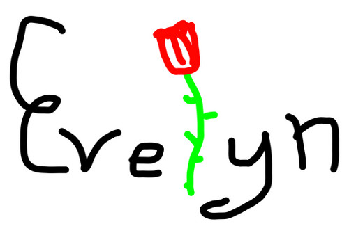
Well, I didn’t have another commission looming, and the Faience Necklace wasn’t framed up ready to go yet, so that fell very pat. I asked what they had in mind, and this is the sketch that came back.

That gave us a lot to think and talk about. I played with a variety of typefaces, and finally settled on a cursive style. Then I thought about roses. My first thought was stylised canal art roses, but they never have stems, so I thought some more. Unusually for me, at this point I got out my paints, found some photos of roses, and started experimenting with simplifying them and really understanding the forms of them and the way the petals fold.
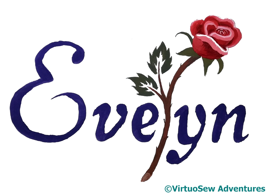
I ended up with this basic design – the name in an elegant cursive font, and the “l” replaced by a single stemmed half-open rose. Then I thought of the embroidery on gauze I experimented with a few years ago. It seemed to me that this was a perfect opportunity to play with this technique, and it has the advantage of producing something sufficiently grown up that in 20 years time, Evelyn probably won’t be embarrassed to have it on show…
Episode Six of “Slow TV Stitchery” is now up. Please take a look, and ask me any questions that occur to you…
..And the Sailor home from the Sea.
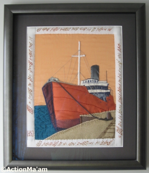
Framed
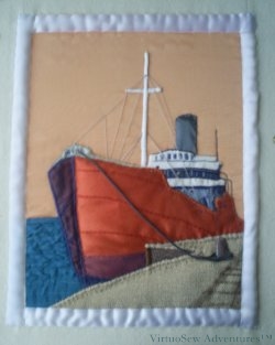
Once the Camberwell was finished, I handed the piece, still stretched on the bars I used to work it, over to my client (Action Ma’am) and her picture framer. I’m very pleased with what they came up with, so I’ve asked her to write up a little bit about framing the piece and where the Camberwell is living now.
At quite an early stage, I had decided that Camberwell was going to hang in the bathroom. An odd choice, maybe, but her colours went beautifully with the accent colours I had already chosen and the theme of nauticalia.
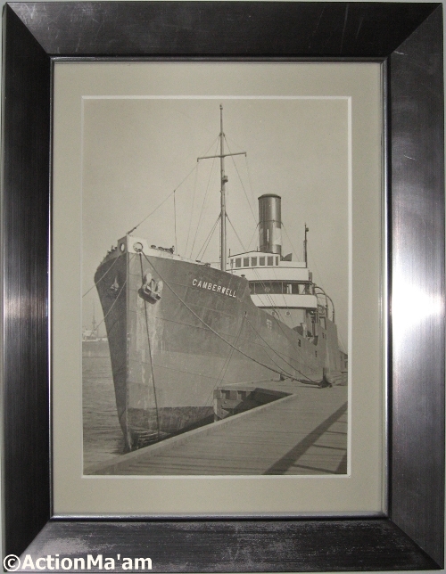
Original Photo
My local picture framer enthusiastically accepted the challenge of creating a suitable box-frame. We chose a rounded moulding, to echo the curve of the funnel, and charcoal for both mount and moulding to match the colour of the ribbon used for the funnel. Since it was to hang by an east-facing window, we selected a grade of conservation glass which excludes 98% of UV light. I took the opportunity to have the inspirational photo properly mounted in the frame I had bought for it from a high-street newsagent a year or so previously.
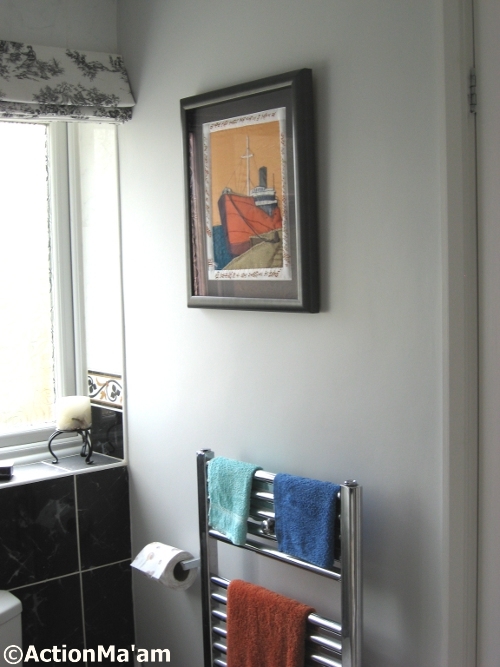
Camberwell Where She Belongs
The pictures now hang either side of the bathroom door. Rachel and I had a little ceremony with sparkling white wine to hang the finished panel. I can bore for England on how wonderful it is, and admire it in comfort whilst lounging in the bath.
The title of this post is taken from RL Stevenson’s “Requiem” – text here. Or alternatively from AE Housman’s “Home Is The Sailor” (here). We both thought it was the right title, but neither of us could remember where we’d heard it, and when I Googled for it, I found myself with a positive embarrassment of riches!
The Camberwell Panel – Fourteen
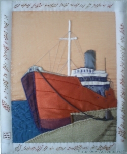
Final view
So at last, Finished!
By the time I had finished stitching it all I could nearly read Morse Code, even when it was running diagonally. The dedication runs from the bottom left anticlockwise around the picture – so the top border is upside down!
When I’d finished the whole dedication, and got to the left hand border I felt the end looked a little vague, so then I worked the little cartouche at the end of the left-hand border which contains my initials in Morse code. Somehow that provided me with the “full stop” the piece needed. The dedication itself already included the date, so I only had to sign it.
My cousin has had it beautifully mounted and framed in a box frame, and I gloat over it every time I visit her. Fortunately she loves it too, and she is going to write a guest post about framing and hanging the Camberwell in her house.
I also provided a booklet for her which documented all of the process of planning, designing, and working the piece, so there is a complete “provenance” attached to the piece as well.
The Camberwell Panel – Thirteen
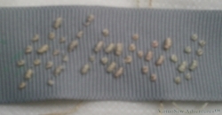
"S.S. Camberwell" in Morse code
I spent a lot of time in practising stitched Morse Code, in order to arrive at the best way of producing an ornamental but legible effect.
Eventually I settled on this as the best option. The Morse letters are laid out diagonally, using Colonial Knots and Bullion Knots (respectively the dots and the dashes). I discovered that I could mark up the ribbon with the Morse code one word at a time and then stitch over it, making the work slightly less unnerving than if I had had to work it without markings.
Satin Edges
My husband wrote a little programme that took the text, converted it to Morse code and then rendered it as a graphic that I could then print out at the appropriate size. That made it possible to mark up the ribbon before I stitched it. I pricked holes – dots and dashes – in the printout, laid it on the ribbon, and marked the ribbon with a quilter’s pencil. A variation of the prick-and-pounce method, I suppose you could say!
However, before applying the stitched Morse code to the piece itself, I created a padded border using fine wadding and satin ribbon. I wanted to ensure that the edges of the panel did not show through the border, and as it turned out the petersham ribbon was rather fine and showed everything underneath it.
The end is in sight! And even at this point, I have to confess that I was very pleased with the way this was turning out. I hadn’t expected that it would turn out so well with quite so little upset!
The Camberwell Panel – Twelve
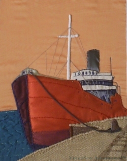
Moored At Last
There were a few final details to be added to the panel while we discussed the wording of the border, and tracked down suitable materials for working it. These are things like the radio mast and framework beside the superstructure which were worked in a mid-toned, matte grey cotton. The radio mast is in broad chain stitch, which produces a smooth and heavy line, while the framework is in whipped stem stitch which produces a more rounded effect.
Then even more importantly, there was the mooring line. In reality there would be one fore and aft and possibly another amidships, but there is such a thing as too much accuracy!
I tried several ideas, such as crochetted single chain, or even a heavy, single thread, but I finally made the mooring line with mid grey pearl cotton, using a lucet. This is an ancient technique which produces a strong, square braid. It was looped twice around the bollard (which is layered with gauze and padded), and then the free end was whipped to the standing end to simulate the looped cable that would be the first thrown to the quay on mooring. It is only attached at the ends (that is, where it is lead through the scuttle at the bows, and by the bollard about which it is wrapped). That means that it hangs in a fairly natural curve, although it is also both heavy and stiff enough that it has held that curve through the process of framing and transport of the finished article.
Can you tell that my grandfather, too, was a Master Mariner?
Rethinking The Elephant Doorstop
Needs More Thought
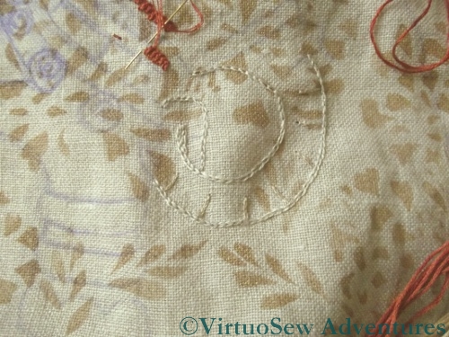
I originally decided to use plain stranded cotton for the Elephant Doorstop, in colours chosen to match the curtains in the living room as closely as possible.
However, once I started stitching I rapidly came to the conclusion that that just wasn’t going to work. We don’t want the Elephant to cover all my careful stencilling, but at the same time, he needs to show up. And he looks pretty hidden, here, as you can see. What’s more, I wasn’t enjoying it, and picking stitches was proving troublesome. I knew I wanted to stitch him – revisiting the original inspiration has been in the back of my mind for a while – but somehow, not like this.
There are two things I need to think about – the colours, and the weight of the thread. The creamy colours we chose are too light to show up well against the rather busy stencilled background, and although two threads of stranded cotton would be fine on this fabric, if it were a plain fabric, it is rather fine. Furthermore, one of the stitches I want to use is braid stitch, which is always a bit tricky in stranded cotton.
I’d already unpicked this section twice before I came to this conclusion, and I was beginning to feel rather anxious in case inspiration flagged completely. Then out of the blue, I was deafened by some triumphant trumpetings.
“I know what to do, I do!”, said he.
“What, then?” said I.
“Use some of those variegated silk perlés you’re always looking at. You can do any stitch that takes your fancy, the colours shading in and out will give you the lightness of effect you want, and – Ta-DA!”.
So now I’ve been told….!
The Elephant Doorstop

An Elephant Of No Distinction But Infinite Charm
Do you remember the Elephant of No Distinction But Infinite Charm, who inspired the canvaswork footstool I made for my mother? She’s now commissioned me to work a doorstop with the same inspiration. Naturally she didn’t want me to work it in the same technique. For one thing, the furniture in the living room has been reupholstered since I did it, and the jungle-inspired green background (although the footstool still looks quite happy) would no longer be as suitable as it was.

First Stage - stencil prepared and paint chosen
So we’ve picked a fairly loosely-woven linen, in a sort of pinkish beige (actually, “natural” unbleached linen run through the washing machine on Hot!), and rather than leaving the background completely plain, decided to stencil it with an all-over pattern taken from the lamps. The design is inspired by crystanthemums, as is the design on the curtains (a Designers Guild design which is older than me, and is proof that good design doesn’t date – it hasn’t looked dated or old-fashioned in more than forty years!).
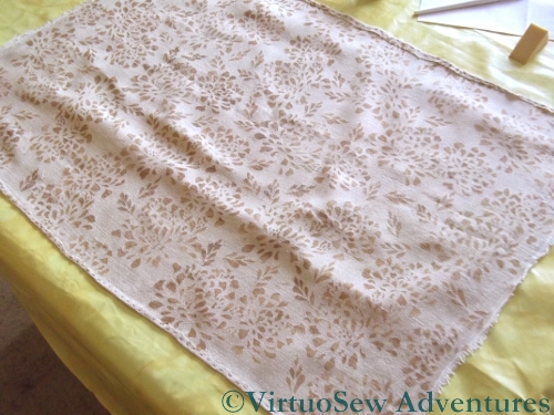
Stencilled fabric
After consulting my clients (!) I’ve decided to use a gold fabric paint for the background pattern. When I tested the stencil on paper the paint ran under it a little, so I chose to use a sponge instead. That seems to help in ensuring that the fabric paint isn’t laid on so thickly as to be unembroiderable, as well.
I didn’t create a proper, regimented repeating pattern, because I felt that it would make the stencil design too obvious. Instead I have twisted and turned the stencil and added extra leaves to fill in any really obvious gaps.