
Tag: Needlewoman Magazine
A Delight from the Past
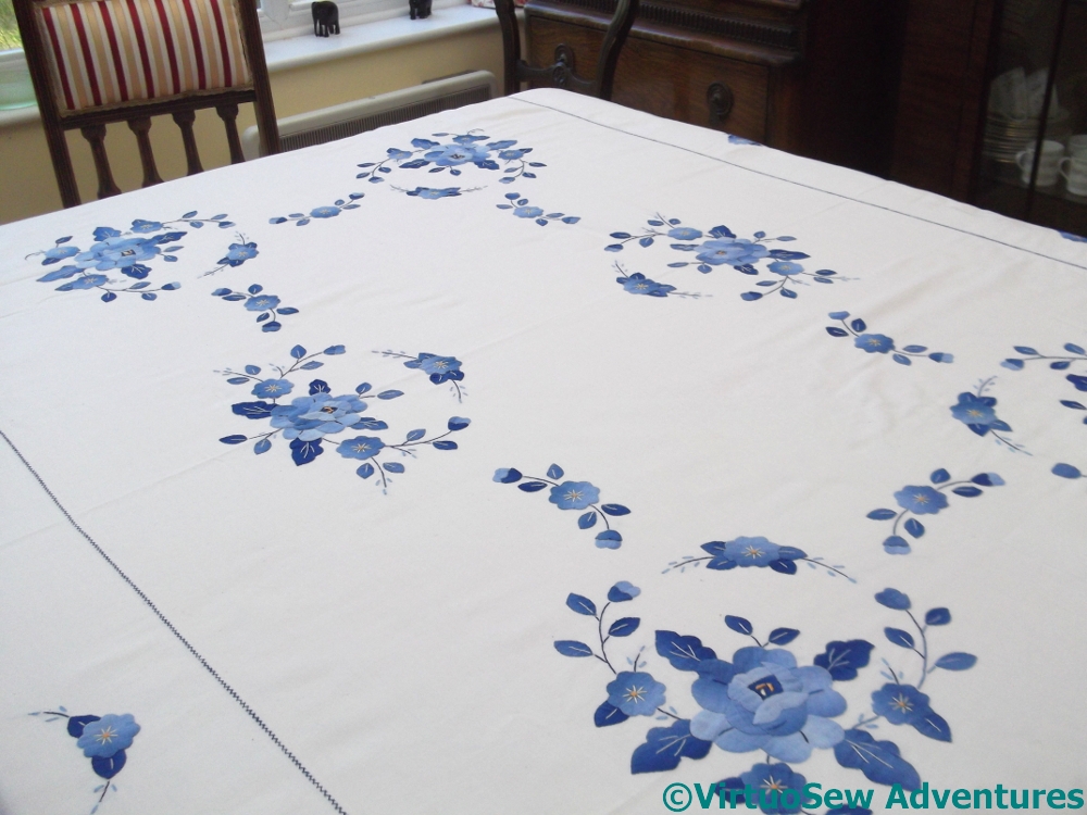
Applique Tablecloth
This is one of the most cheerful and striking tablecloths I have ever seen. It belongs to my cousin, who found it in an antiques centre, and brought it home to cherish.
It is crisp, and bright, and beautifully made, definitely by hand, and with some very ingenious Making Do. The lines of stitching marking out the edge of the central section are in a fine herringbone stitch, and in the case of the short ends they cover a join. Obviously the fabric wasn’t wide enough to achieve the length needed, so additional fabric was added at either end, and the joins camouflaged with stitching. This is just exactly the sort of trick suggested in some of my collection of “The Needlewoman” from the Thirties.

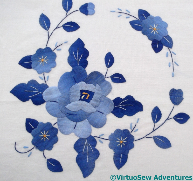
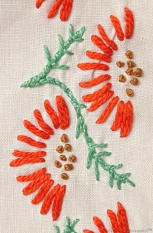
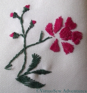
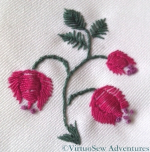
Applique Rose
And this close up shows even more. I wondered at first whether this might be an example of bias binding used decoratively – another popular technique in the Thirties and Forties, and mentioned in several of my older books on needlecrafts.
Looking more closely, however, we don’t think so. The fabric used for the applique is rather finer than I would expect bias binding to be, and besides, there’s the unevenness of the colour.

Applique Tendril
That unevenness, although nicely graduated, is rather straight-edged, too. My cousin and I found ourselves wondering whether the pieces for the applique had been cut from the best bits of an old, sun-damaged piece of fabric, maybe a curtain-lining, or something similar.
Corner Motif
If it is, it is absolutely the most striking case of making a silk purse out of a sow’s ear that I have ever seen in my life.
The selection of the dark and light pieces of fabric, and the way that the large blocks of colour in the applied sections are lifted and highlighted by very delicate embroidery – and just enough of it – speaks of a very accomplished needlewoman indeed.
It is utterly enchanting.
Kai Lung of the Golden Hours
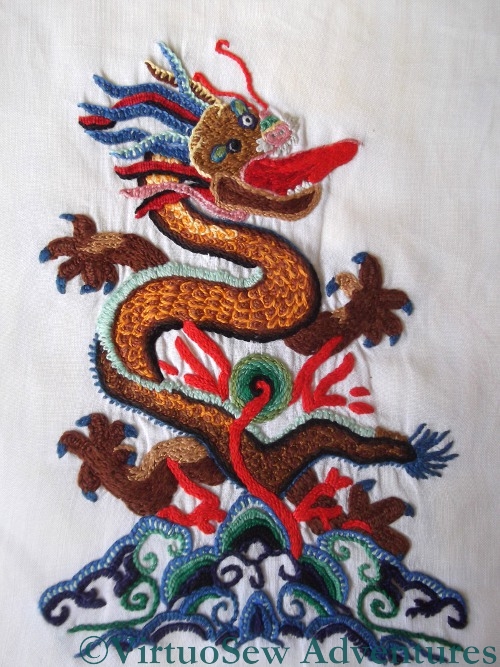
Kai Lung
This wonderfully contorted Imperial Dragon was another Needlewoman Magazine design (March 1934), and he got his name from the Golden Hours of Kai Lung, by Ernest Bramah, which I was reading at the time, because it had been mentioned in one of Dorothy L Sayer’s books (“Strong Poison”).
The pearl cotton I used was really too heavy for the base fabric – another old piece of linen – but it gave a fantastic lustre to his scales, which were worked using nested fly stitches (not my idea – I followed instructions on this piece!).
The tongue is closely-set stem stitch, the claws are fly stitch (so are the teeth – I think the designer liked fly stitch!) and the mane is made of interlocking blanket stitch. I worked very hard on this piece, to keep the stitches neat and even, and I used to take it with me to visit Grandmama when she was in hospital. There’d probably be a riot now if I sat at a hospital bedside, embroidery in hand, but Grandmama enjoyed watching me work and made a lot of useful and encouraging comments as well.
The magazine no longer had its transfer of the Dragon, which was intended as a Firescreen (other suggestions included the back of a bridge coat, a footstool, a cocktail tray, a cushion…), so I worked it at the size of the diagram in the magazine, on the back of a dress. Had I worked him full size, he’d have been too big for the dress.
I was thrilled when the wife of one of my father’s friends recognised it, told me that she had worked it herself when the magazine came out, and fished out the firescreen she had made using the design the next time we went to see them. She was the person who told me that you can tell he’s an Imperial Dragon, because he has five claws. She’d worked it in pastel shades to go with their drawing room of the time, and it was absolutely stunning. She and her husband are both dead now. I do hope that that screen found a happy home!
Holiday Traycloth – second installment
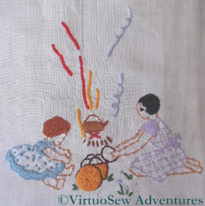
Making Tea
Now this is very “Swallows and Amazons“, isn’t it!
There’s a woven spiders web wheel for the top of the picnic basket, the little girl’s red hair is worked in coral stitch and her older sister’s is satin stitch. It’s barely visible in the photo, but the satin stitch is angled this way and that to create something that looks a little like a Marcel wave – a very grown up style on a relatively young girl!
As in the first installment, the cuffs and flounces are in blanket stitch. The spots are French knots, and the lilac dress is worked as a pattern of back stitches.
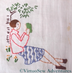
Reading
This motif, “Reading” shows particularly clearly how skilled the designer was in making the best possible use of simple shapes and simple line. Much of the design uses straight stitches – for the leaves, the bark, and the stems of the leaves.
The pattern on the skirt alternates back stitches with tiny satin stitch blocks, and the hair is stem stitch. The book and the shoes are satin stitch, the flowers are French Knots, and anything else is in back stitch.
It couldn’t be simpler to do, but doesn’t it look good!

Fishing
This is the point where – after nobly containing my experimental impulses for quite some time! – I indulged in a few wanderings from the path laid down. The shorts are actually woven! It must have been tricky to get right, but it’s worked really well – they look slightly tweedy, but in any case the sort of heavy fabric that any sensible mother would clothe her child in for scrambling around rocks and beaches.
The little gold fish is worked in Vandyke stitch, which is tricky to keep even but creates a strong line down the side of the fish to contrast with the net in the background.
Holiday Traycloth – first installment
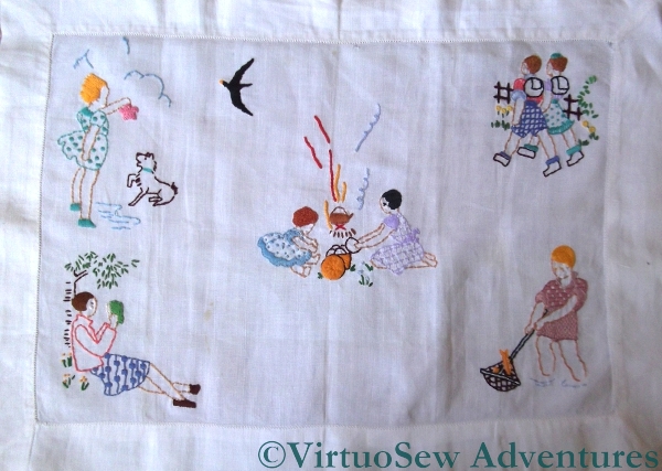
I worked this immediately after the First Voluntary Project, and my goodness, is there a difference between the two! I think I must have talked with Grandmama and looked at some of her embroidery, and it looks as though suddenly the whole idea “clicked”.
The motifs are from transfers from another of Grandmama’s Needlewoman Magazines (August 1934, if you are interested!), worked on an old piece of linen in stranded cottons. The design was suggested to be a cover for a photograph album, but since my family isn’t really photograph-conscious, I felt that such a thing would be superfluous, and finished it as a traycloth instead. We added the seagull to cover a hole in the linen, which was already quite old.
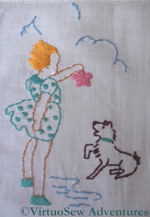
Rockpooling with Toto
The range of stitches is very limited on this piece – I must have been following the instructions in the magazine – and the whole thing is surprisingly neatly worked. I love the little girl’s spotty dress (satin stitch spots!) and windswept stem stitch hair, and the starfish is wonderfully knobbly, with closely packed French knots.
Most of the outlining across the whole piece is in back stitch, and although I didn’t count it precisely, I suspect the weave of the linen made that much easier to do than it might have been.
The designs themselves are very reminiscent of the children’s books of the period – it’s even exactly the right sort of dog, slightly scruffy, but always ready to play!
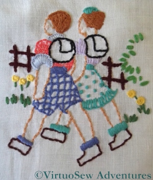
Walkers
These walkers have blanket stitch collars and cuffs, and stem stitch hair. His shorts are worked in Jacobean Couching and the spots on her skirt are French knots. The leaves on the bush in the background are detached chain, and the yellow flowers are blanket stitch wheels. Again, the hair is in stem stitch and the socks (like the little girl’s shoes) are in satin stitch.
You’ll notice that all of these stitches re-occur when I describe the other motifs, too. The designer has made absolutely first-class use of all the stitches.
Another early piece
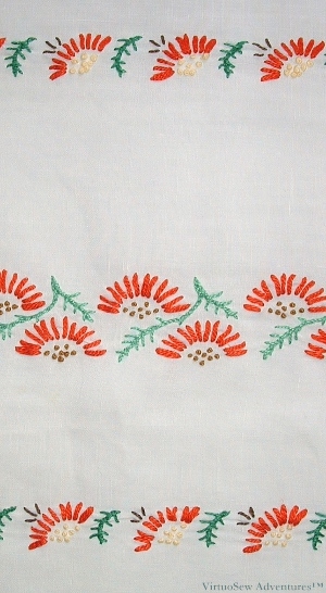
Table Runner from The Needlewoman Magazine
I worked on this very early in my embroidering career. The design comes from a free transfer in one of the Needlewoman Magazines my Grandmama gave me (September 1934, since you asked!), and I worked it to go with the curtains in my bedroom which were a wonderful Regency strip in red and gold. It’s a table runner – I used it on my dressing table – and it is very nearly two feet long.
The original article to accompany the transfer described several different colourways and a whole range of sketches of suggested uses. There was the idea of sprigging (organdie) curtains with the single motif, embroidering a sunshade, a bag (linen), a luncheon set, gloves, embellishment on the brim of a hat, even on a nightdress or slip (silk of course!). Sometimes I wish I had lived in the Thirties!
I used some fine linen – essentially altar linen, a fine even-weave, nothing fancy, and embroidered it using pearl cotton. As you can see from the close up, pearl cotton really was rather too heavy for the fabric, but then I liked it at the time, and if you don’t like what you’re doing, it tends to take longer to finish.
Motif Close Up
I should have had the courage of my convictions and worked the French Knots as seed stitches (I hated French Knots at the time – possibly because I wasn’t very good at them). There are only three stitches – straight stitch, stem stitch, and French Knots, so it was very easy and simple to work.
I simply had to keep going at it. That’s when I discovered that I’m not very happy doing repetitive embroidery!
And – in case you are interested – although the linen was old when I worked the embroidery, it has in fact outlasted the bedroom curtains… They don’t make fabric like that anymore!
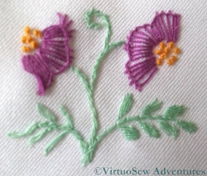
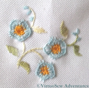
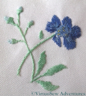
Close Ups on the Flowered Blouse – Part Two
Flower 6 - Close Up
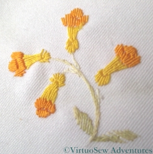
Here is the second installment of close-ups of the Flowered Blouse embroidery. I’ve noticed in picking out the Needlewoman magazine that the transfers came in that the colours I have used bear absolutely no resemblance to those suggested. For instance, flower 6, here on the left, is named as “Lobelia”, and a quick search suggests that real lobelias are bluey-purple!

Flower 7 - Close up
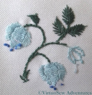
Flower 7, here on the right, is the same as Flower 2, but in different colours, and in fact stitched more openly. It is described as a Convolvulus in the the magazine.
Flower 8 - Close up
The Flower 8 is the same as Flower 3. This time I used the same stem colours, again to help maintain a certain unity. They are supposed to be Globe flowers.
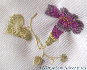
Flower 9 - Close up
Flower 9 is the same pattern as flower 5, and I think is supposed to be a Peony. I distinctly remember finding this one troublesome to stitch – partly, I think, because of the size of some of the stitches, and partly because I couldn’t make sense of the flower as depicted in the transfer. Nowadays, of course, I would go and find a peony, and stare at it until it made sense, but that method had not occurred to me at the time!
Flower 10 - Close up
Flower 10 is described as a Wood Anenome. Like Flower 4 (Forget-me-nots) it shows the edge of the blanket stitch curling in, rather than staying flat, but I am glad to see that at least the French knots loook better than I expected. I have always had trouble with French knots…
The magazine suggests a variety of uses for these transfers, including a “delightful party frock” for a little girl, a “dainty bed jacket”, and embellishment on a “puff handkerchief” which is an accessory I’ve never heard of before. For once the internet has not been my friend, although the drawing suggests some sort of combination of a powder-puff and a handkerchief that I strongly suspect would be nothing like as practical as the “two-tools-in-one” brigade would have us believe!
Close-ups on the Flowered Blouse – Part One
Flower 1 - Close up
You may recall, not so long ago, a post that I wrote about a blouse embroidered some years ago, during a particularly impoverished period in my life. Here are the promised close-ups of the floral motifs.
Or at least some of them. When the connection started slowing when I put all ten in one post (before I even started to add any text!), I decided to split them up. I’m hoping to put five per post and just write two posts…
Flower 2 - Close Up
I’m no botanist, and if I am honest, I suspect the original designer wasn’t either. The various pictures and descriptions in the magazine did not suggest a slavish adherence to the natural colours of the flowers – even supposing one could be sure of their likely species!
Flower 3 - Close Up
The polyester was not an easy fabric to embroider, and frankly the blouse wasn’t worth the effort I put into it, being a lot like a cheap school or office uniform blouse, but as I said in the original post, I didn’t really have a choice at the time. That said, I do still wear it, not without pleasure, so there is something to be said for all that effort, perhaps.
Flower 4 - Close Up
The stitches used were very simple ones, for the most part – satin stitch, fishbone stitch, stem stitch, blanket stitch, and the occasional French knot. The close ups show that the blanket stitch refused to settle properly and the spine of the stitch has rolled inwards from the edge, but that may simply be the result of years of wear and tear. The blouse goes in the washing machine when it needs a wash – inside a pillow case or lingerie bag, admittedly, but I don’t hand wash it.
Flower 5 - Close Up
When I was choosing the colours and the stitches was more concerned to balance the colours across the front of the blouse than to create accurate depictions of plants, but for all that, there are some motifs more reminiscent of the real thing than others!
A flowered blouse
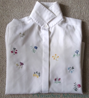
Blouse embroidered with flower sprigs
As Spring shows her head after the chill of Winter, I am beginning to fish out clothes other than bulky winter woollies. This is a simple polyester blouse I embroidered some years ago when I had time, an itch to embroider, but absolutely no money to buy fabric.
I used a Free Transfer from The Needlewoman of January 1934 (from the boxful that Grandmama gave me), showing sprigs of flowers which they suggested might be used for lavender bags, traycloths, handkerchiefs, or underwear (if only I had the time and skill to make lovely silk embroidered undies!). The silk threads came from my stash (even fifteen years ago my stash was extensive and varied!), and in fact I think the whole idea of the project was that I wanted to use those threads in particular.
I’m not really a “floral”-type person, or at least the florals I stitch tend to be quite heavily stylised, and I’m also not someone who likes perfect symmetry. So I snipped out some elements from the transfer and arranged them irregularly on the front of the blouse. Once they were transferred, I arranged the threads, so each colour appears on each side of the button placket, but not on the same flower sprig.
I will provide close ups in another post, when I have worked out how to format them!
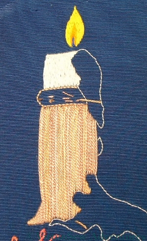
Candlestick Bookmark Finished

Finished Candlestick Bookmark
I’ve finished the candlestick bookmark.
I worked the stitches on the candle vertically, and the stitches on the drips of wax diagonally, to try to create a slightly different effect. The light reflecting off the different angled stitches creates almost different colours, and certainly different shades.
The dense weave of the grosgrain ribbon has made stitching this really rather a trial. As I’ve commented already, sometimes I feared I would break the needle, and that has meant that it has required a real effort of will to complete the embroidery. Now it is finished, however, I’m pleased.
The Candlestick looks like engraved brass (with the eye of faith, anyway!), with the vertical stripes suggesting the reflection of other things around the room.
The wax doesn’t really look dribbly enough, but it is as dribbly as I am willing to make a bookmark. If this were to be a wall panel (tell me why I would do that?) I would use bullion knots to make the dribbles look more textured and dribbly. That would also make a bookmark too thick to use.
I think the flame is a real success, though. It is astonishing how such a simple shape, with simple colours and stitches, should be so evocative of the real thing.
Stitching order for the Old Bookmark
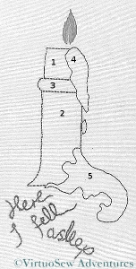
Bookmark Stitching Order
It’s important to stitch representational pieces in the right order to make sure that they “work” visually as representations of something real. Here I have numbered each of the elements from this point forward. The candle stub itself is the first, followed by the candlestick body, then the rim, then the wax dripping down the side. In this way it will be possible to make sure that the stitching goes over itself when it should.
Stitching the Candlestick - First Stage
So in this next picture I have finished stitching the cream candle stub, and then laid long straight stitches over the candlestick using Surface Satin Stitch. I don’t want to use real satin stitch as by the time I add the second layer of stitching, as I intend, this will be becoming too thick and heavy to use as a bookmark. I’m too fond of books to want to damage them by using thick bookmarks that break the spines.
I want to create the effect of a brass candlestick, so I have chosen a golden-brown variegated silk thread. I’m going to couch down these long threads to create something that will look like cast or engraved texture. I can’t create a barley-twist effect without redrawing the edge, which I don’t want to do. It will be intriguing to see whether I can create the effect I am aiming for.
If someone who embroiders ever tells you “I knew it would work” – beware. We only know that we think it will work!