
Tag: design elements
Starting to plan Aethelflaed’s Border

As I get nearer to stitching the border for the Aethelflaed Embroidery, it is starting to become imperative that I make some plans for it.
This is why I started to work on painting, originally – not to become a painter, but simply to make design mistakes more quickly and easily than in stitches!
As I began thinking about it, and since I am conceiving of four panels which will between them cover four now lesser-known characters in politics and religion during the medieval period, I came to the conclusion that I should keep some themes across the four.
I’m keeping the background of trellis couched laid silk, for a start, and it will be the same blue, although I may make a change to the order of dark and light in the trellis couching itself.
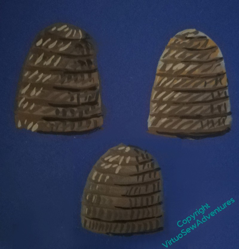
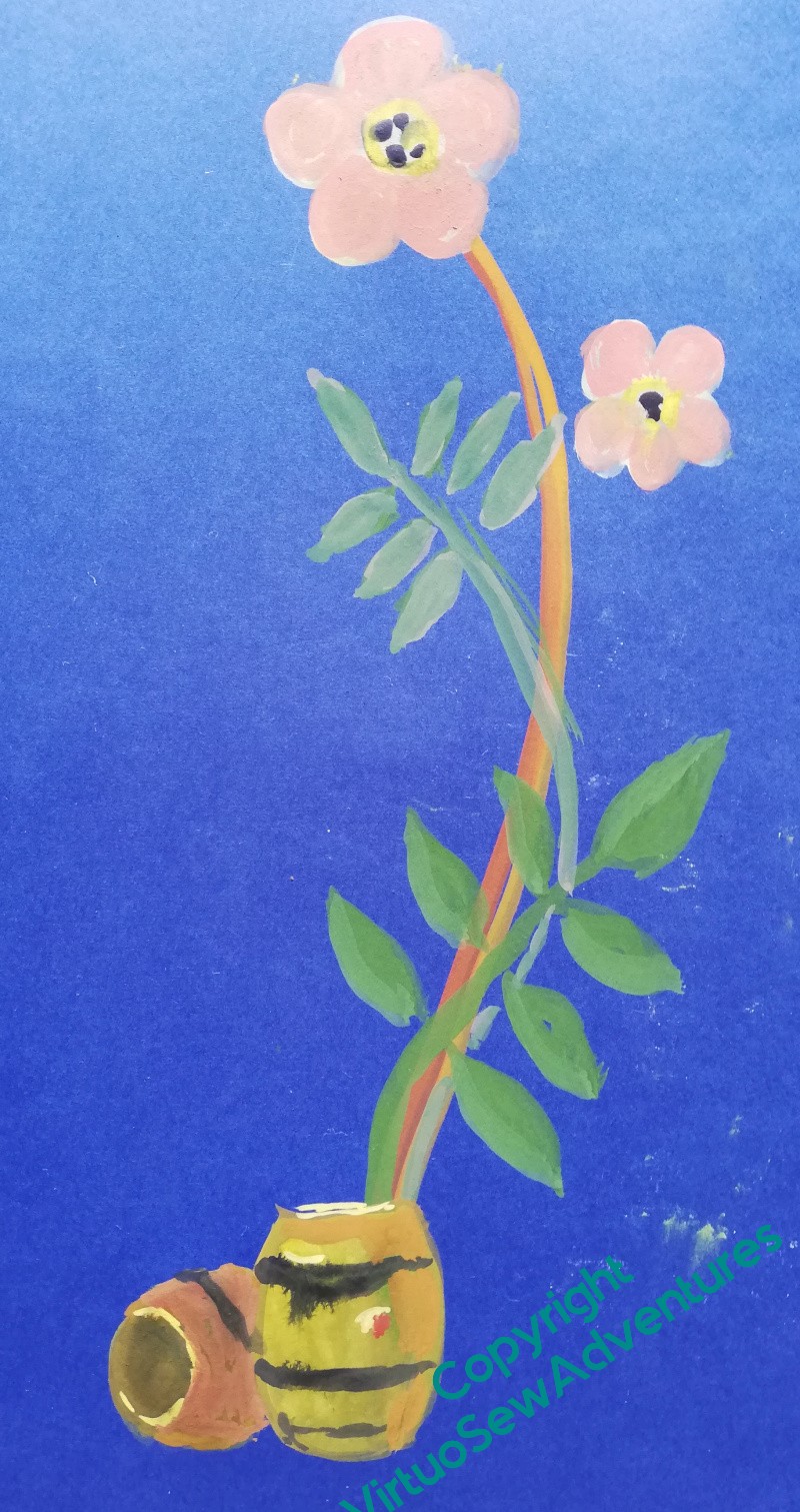
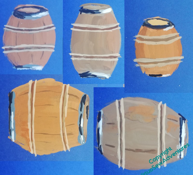
The dog roses I used for William Marshall will appear in Aethelflaed’s border as well. My researches haven’t turned up any specific flora associated with Aethelflaed, but there’s a tale that the Viking attack on Chester was routed with boiling beer and angry bees, so I’m experimenting with beer barrels and bee skeps.
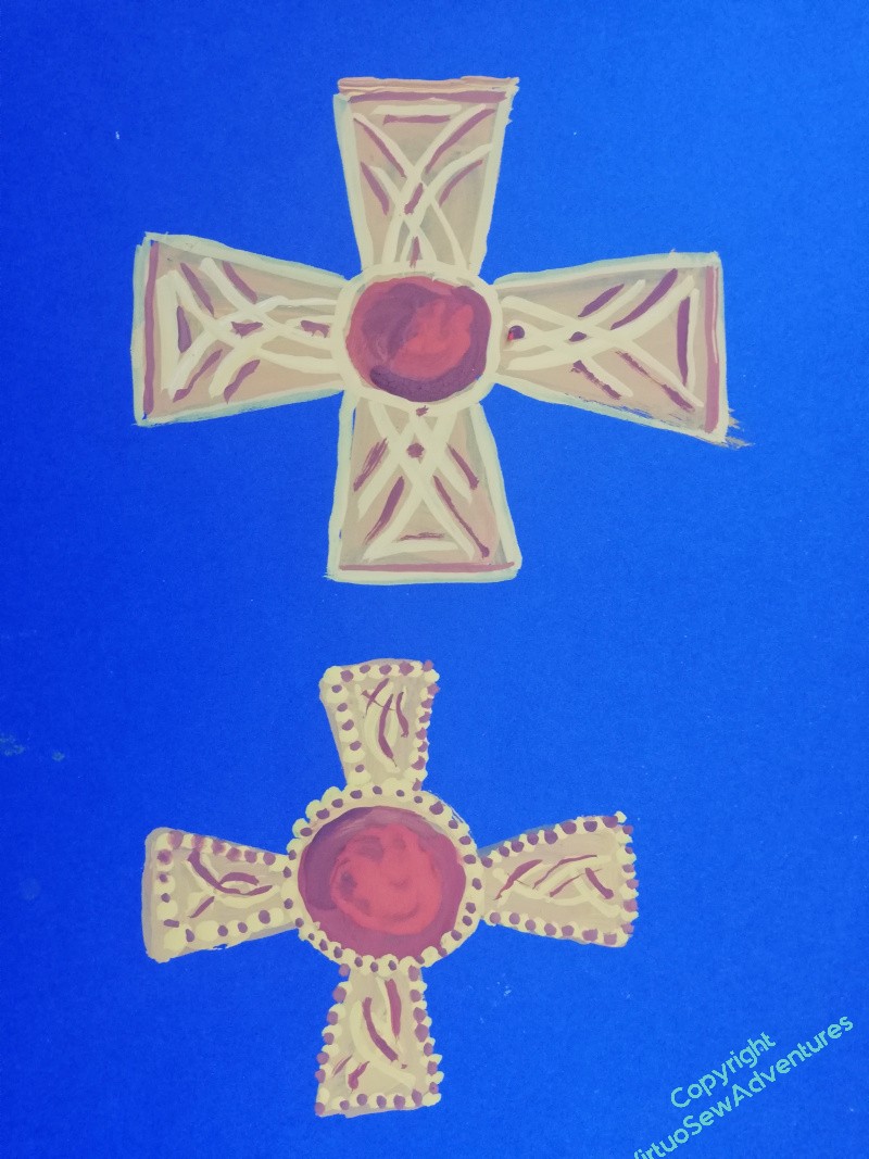
And there will be a different cross at the cardinal points of the embroidery. These first efforts are patterned after sketches I’ve made at some of the exhibitions I’ve visited, showing elements of the Staffordshire Hoard and other items. Garnet and gold is a combination very strongly associated with the Anglo Saxons, and I’m having a lot of fun playing with details.
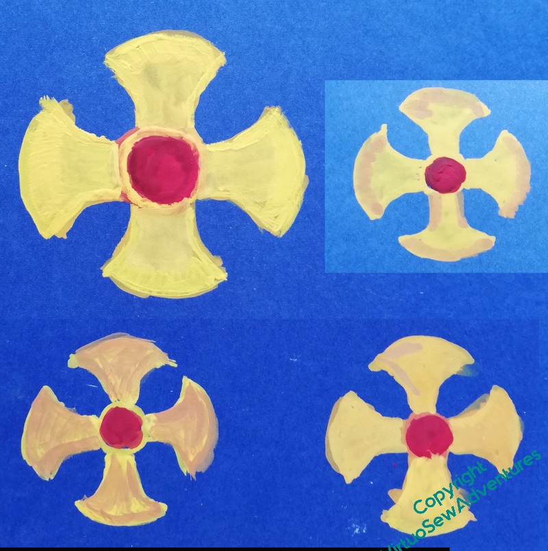
Some of the ideas are not really working, others I think definitely are.
I’m certainly not yet ready to assemble a finished design. But at least there may be some signs of something to work with, and after all, I’ve still got a few weeks of thinking time while I do the laid and trellis couched border!
Walls and Tussocks
One of the things I find happens very often to me – as regular readers will have noticed! – is that there’s a lot of rethinking that happens.
This is partly because rather than being trained to create a design in detail from the start, I have worked it out all very painfully for myself, with different levels of success for each project. And I’ve only been doing it for twenty years. I’m much better than I was, but I am sure that my visual imagination would be much more detailed had I started at the age of sixteen, say!
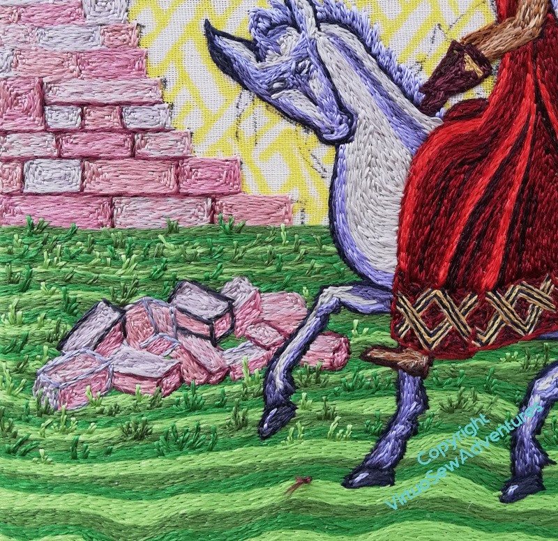
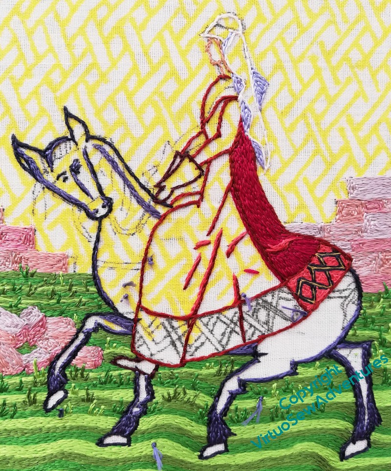
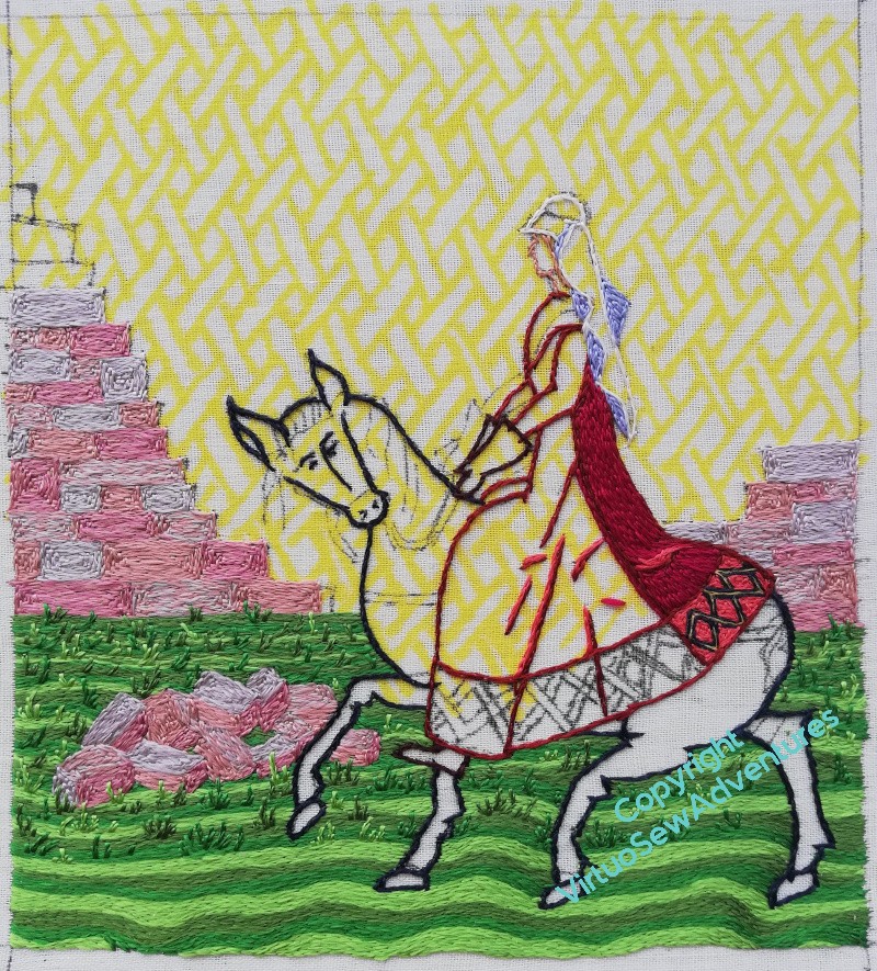
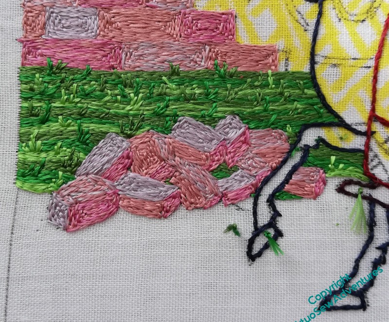
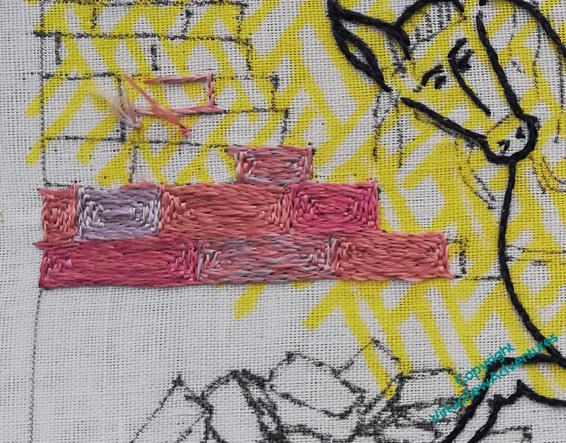
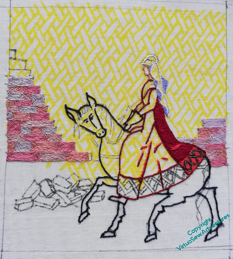
So, for example, when I first stitched outlines for the blocks, and hadn’t stitched the blocks, it looked very much too dark and out of balance, so I lost confidence, took out the outlines, and worked the blocks without them. Now that Aethelflaed is in place, darker and more emphatic than she might have been, the walls need a little more definition to stand up to her. But not too much, so this time I’m using essentially a mid tone of pinky plum. I think that’s going to work.
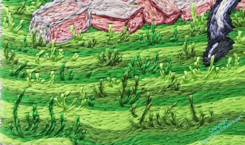
I’m also returning to the grass. You may recall that I had a thought as I was doing the early stages of the grass, thinking that it might be a good idea to increase the scale of the tussocks as I came forward. This is one of those elements which is a departure from classical opus anglicanum, as far as I know, but it is a way for me to explore some of the outer reaches of filament silk.
As I’ve said before, I’m not doing a reconstruction, I’m doing a thing which tries to tell a story using a blend of old and new design sensibilities, something that will be definitely a modern piece, but which has echoes.
How well this will work when all four of the Medieval Movers And Shakers are done and displayed together, I don’t know.
How well I will balance old style and new style, images, stories and echoes, I don’t know.
But it’s going to be fun finding out!
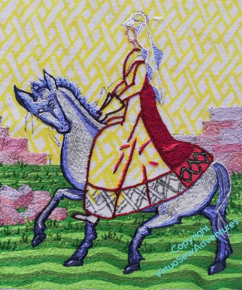
Aethelflaed’s Dress – going round again!
Just so we know where we stand…
Before I went through the reboot, I’d the back panel stitched and some dark lines in place – shadows and stitch lines. It’s not right at all. It looks unthought-through, and the drapery isn’t draping in a way that makes sense even in a medieval fashion.
So in the end I took it all out, ornate border and all, and started again.
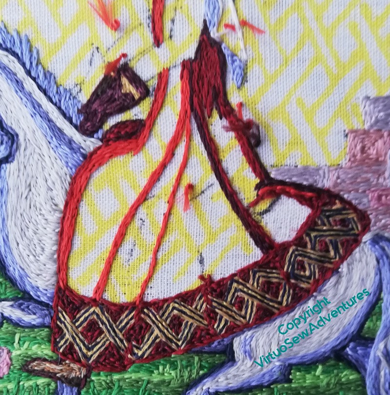
I’ve broadened the decorative border to have two navy lines and three gold, and given it a darker background.
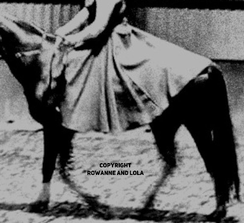
Then I turned one of my resource photos into greyscale, printed it out and stared at it. I’ve also stretched out the colours a bit to emphasize the lights and the darks.
So now, I want to translate what I’ve seen to the slightly different cut of Aethelflaed’s dress, and the slightly different style of Opus. That may be a bit tricky.
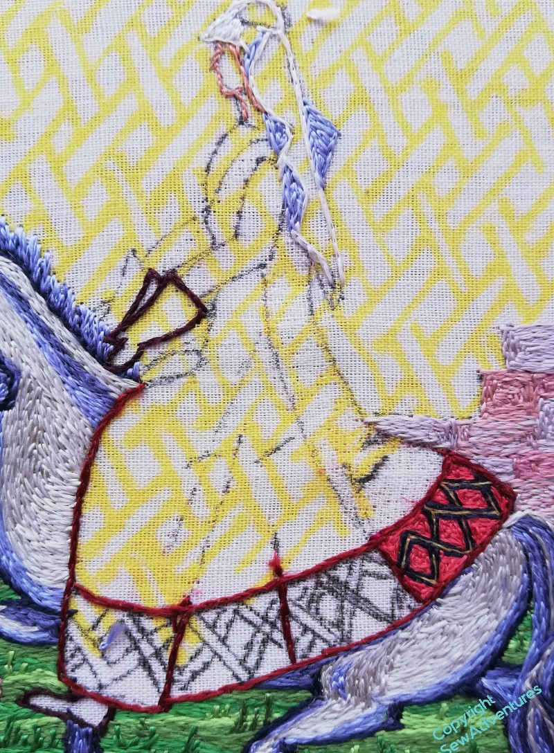
First thing to do was to remove all the unhelpful darks already in place. I think I just need to start all over again!
So here is the start of starting all over again. Light at the front, quite broad, and some new highlights. I may have to think a bit more about the border, but I believe that will be easier to do as the rest of the dress comes together.
I also need to get the sleeves in. There’ll be a contrast here, the sleeves of a contrasting shift or under-dress, and that will help the image to make sense from a difference.
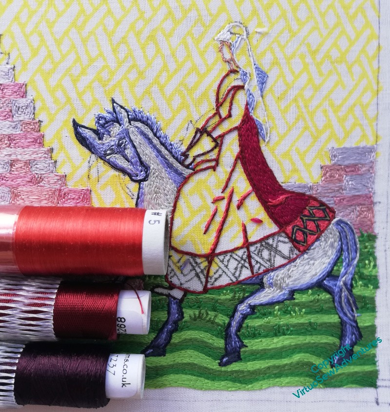
Beginning on Aethelflaed herself. Again.
Sigh. When last you saw Aethelflaed, I was about to start unpicking the back of her riding dress.
It’s done now. As regular readers of my blog know, I don’t unpick unless I really can’t avoid it and I’m sure I can do better. If I have no idea what to do differently, I leave well alone until I can come up with a Plan.
Well, I have a plan now. I’m changing up which silks I use, going for something redder and with less blue in it. Here’s hoping that the border still works, but that would be a serious trial to unpick (as though a panel of straight split stitch weren’t already a trial!).
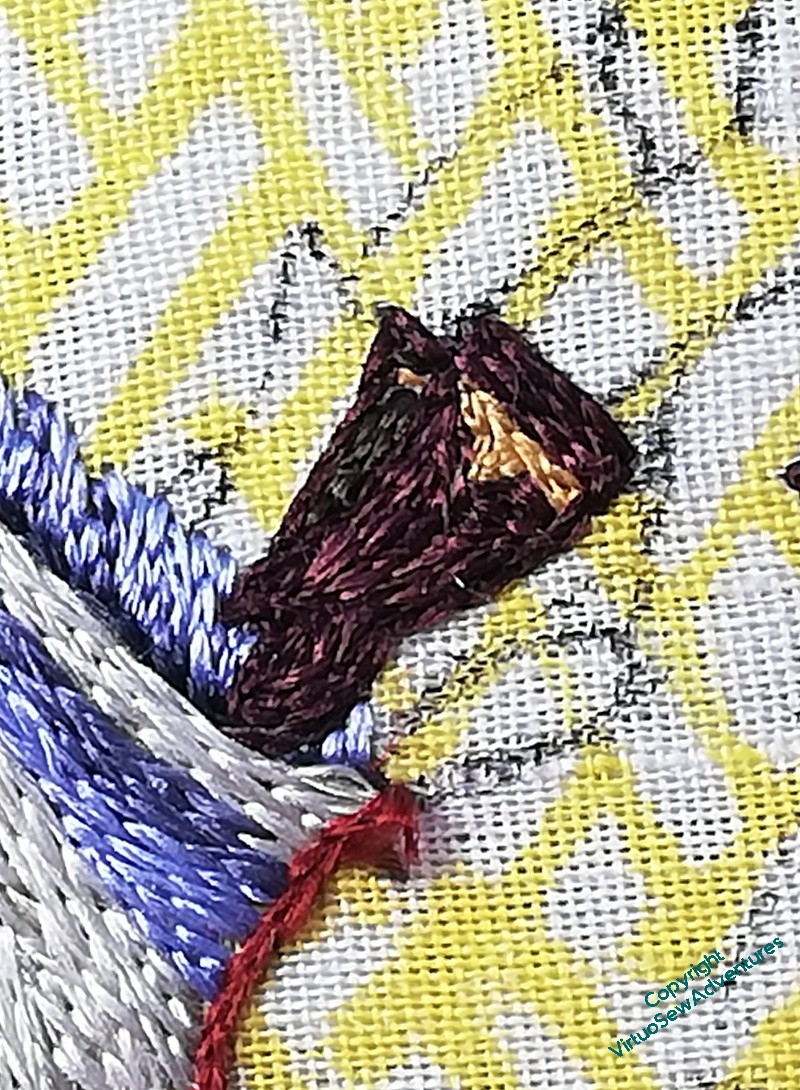
You can tell I’m not entirely sure of myself, however.. I have worked her gauntlets first!
You may recall I designed them as mittens, rather than gloves with fingers, because I could not imagine that fur lined mittens weren’t a thing for a noblewoman riding, and besides, it let me escape doing her hands. I will have to do hands for Rahere and Julian, but until then, I’m ducking it.
I gave the gauntlets a narrow border of yellow, thinking of a silk or metal braid that might have been used as a trim.
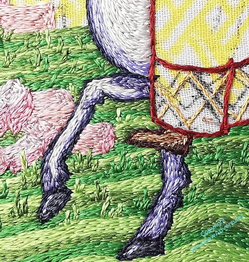
Then I decided to make sure she was shod. Practical brown ankleboots, with extra reinforcing down around the heel. I’m not sure whether stirrups were in use at this point, and in any case, I think it’s a detail I don’t need to add at this stage.
And now I really can’t put off that dress any longer!
Mane, Tail, and Headache!
I still need to find a name for this horse.
However, there’s time for that. Keep stitching.
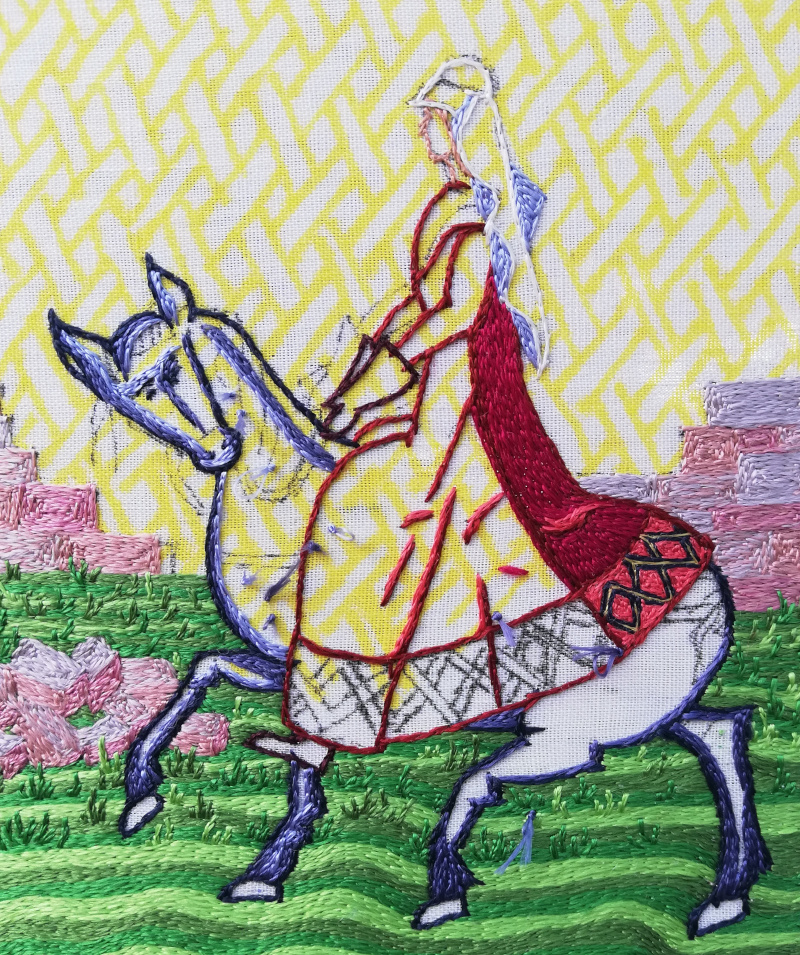
The mane and tail didn’t take too long, and the horse is looking bright and neat. I think the image as a whole is working so far (thank goodness, it’s an awfully time-consuming technique to end up dissatisfied with!), so I’m happy to keep going.
I might be able to get back to the tussocks soon, but in the meantime, close ups.
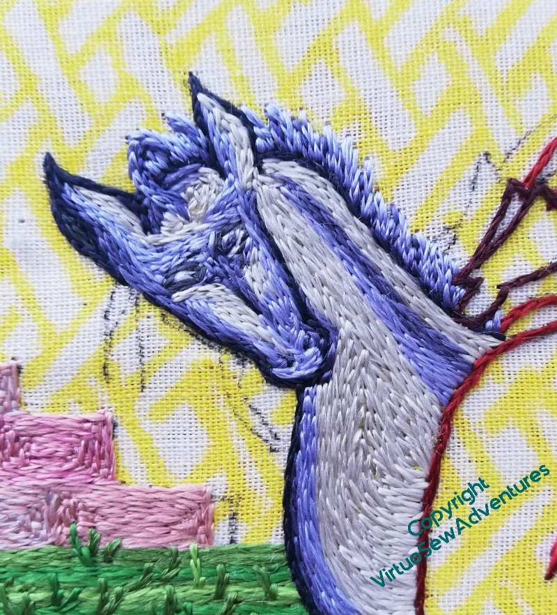
I chose to do a short standing mane for this horse, rather than the flowing locks for William’s horse, but gave it a little quiff of a forelock as well.
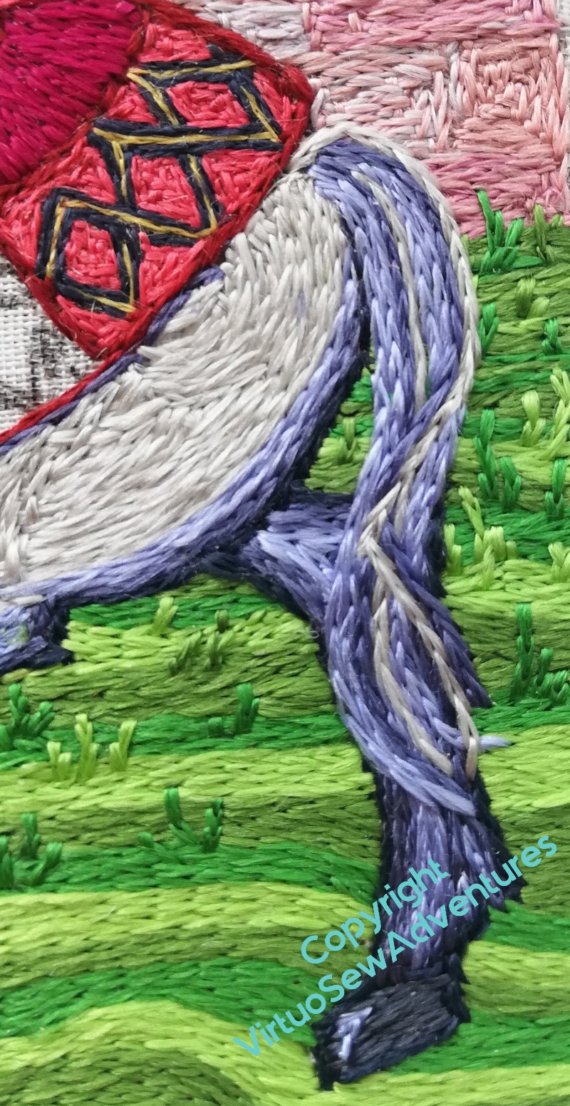
I was trying to create the effect of flying strands crossing over in the tail, but instead I’ve got a kink in it. I might have to do something different there, but until I’ve worked out what, I shall leave well alone!
I have another problem.
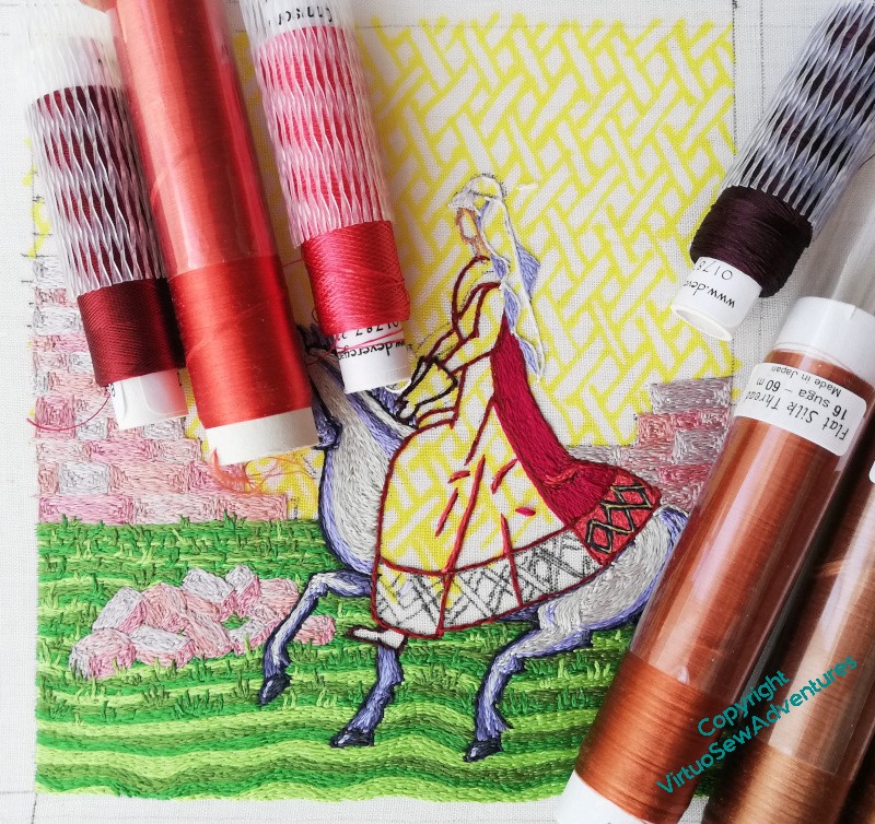
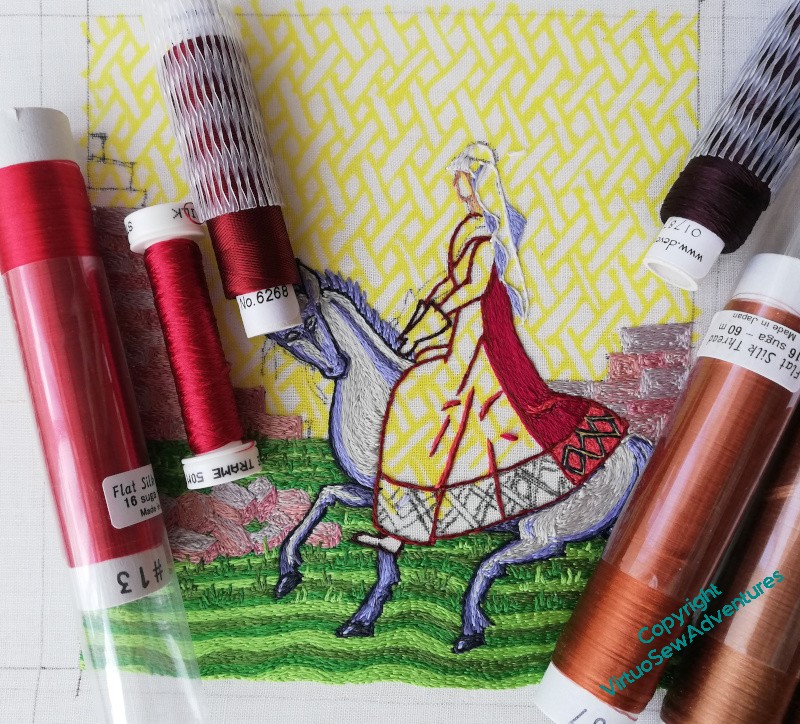
I’m not happy with the colours on her dress, there’s something a bit “off”, not the atmosphere I’m looking for. So yes, I’m going to have to undo the dress.
<fx: growls>
More on Aethelflaed’s Horse
Onward and forward, as my Grandad used to say!
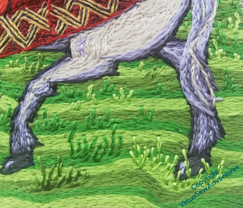
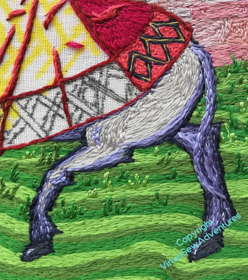
I want to make Aethelflaed’s horse contrast with William’s in more than just colour, so instead of doing dapples, I’m just going to have the horse smooth of coat and light of colour.
I got a little adrift earlier with the horse’s eyes, and I’m a bit unsure about whether I have enough of the lighter blue, but I think it’s going to work reasonably well. I can probably add more if I need to when the whole thing is finished and I am trying to balance the whole thing.
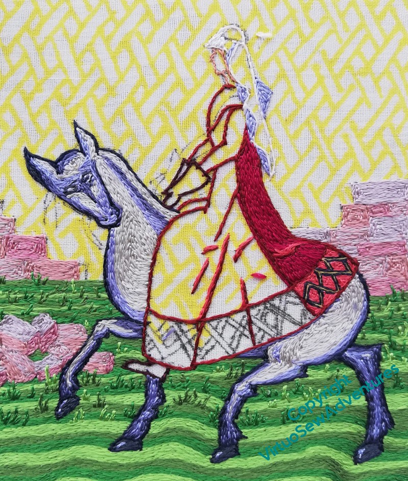
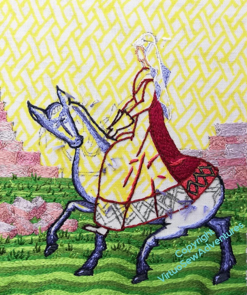
Here we are, then, with the horse filled in and the eyes more Opus-style. I get rather the feeling that this horse may be the “getting there under my own steam” steed, but it’s a bit of a ham, high-stepping, head up, adding to its rider’s mystique.
That, of course, is no bad thing. A ruler of the early medieval period needed to have some grip on self promotion, as well adjudicating when their people turned to them, choosing when to make peace and how to make war. Aethelflaed must have understood how to craft her presentation, for the benefit of Mercia as much as herself.
The Irish Chronicles mentions of Aethelflaed are full of superlatives, so my depiction needs to offer some impression of that glowing prestige, reaching across the Irish Sea.
Even if her brother Edward the Elder’s chroniclers don’t mention her at all. Jealous, much?
Anyway, body in place, on to mane and tail!
Aethelflaed’s Horse
Now the thing about Opus Anglicanum is that it’s lots of very small stitches, so you maybe don’t see so much of Aethelflaed, but apart from occasional periods of Life getting in the way, she is making progress.
I’ve started on her horse. It’s going to be a grey – what you see of it, what with her riding dress and all! – so with a wave of my artistic licence, shadows and details are going blue.
I have time to wonder what she’d call her horse – all the names I can come up with tend towards the Norman French (Blanchemain, Blanchefleur), and that’s a good couple of centuries too early. So I’m looking for something Brythonnic, or Welsh (although the Mercians weren’t on reliably good terms with the Welsh, so maybe not..). Welsh would suggest something with “gwyn” in (for “white). Moving to Old English, “hwita” is “white”, but “aedre” is “stream”, and then suddenly you have a name starting with the same syllable as the rider’s. And that is the sort of thing you find in retellings of myths as a way to bring the two close together in the mind.
Thoughts, anyone?
I’ve not forgotten Aethelflaed…
… although I will admit that sometimes I don’t manage to fight away all the things that get between me and my frame at a time of day when I have any chance of stitching her sensibly!
However – I’ve done the grass!
Well, I stopped doing tussocks when I thought I might want to do more extensive tussocks in the foreground, and decided to do the horse first, in case I wanted seedheads nodding over its legs. But apart from the tussocks, the grass is done.
However, that means I now have a decision to make…
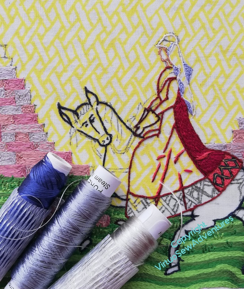
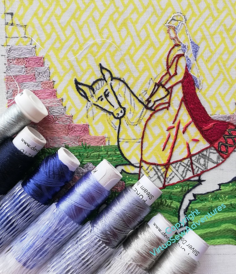
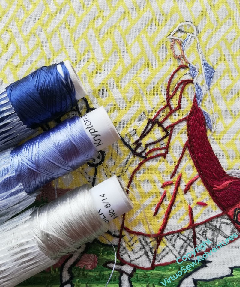
I’ve decided she’ll be mounted on a grey (contrasting with William The Marshall’s chestnut), and that it will be grey tending to blue. But which blue, and how much blue, and what colour should the lightest shade be? This is going to be important, as I think I’m not going to do dapples this time, just shading and a smooth coat.
Some thinking required…
Tackling Stones And Tussocks
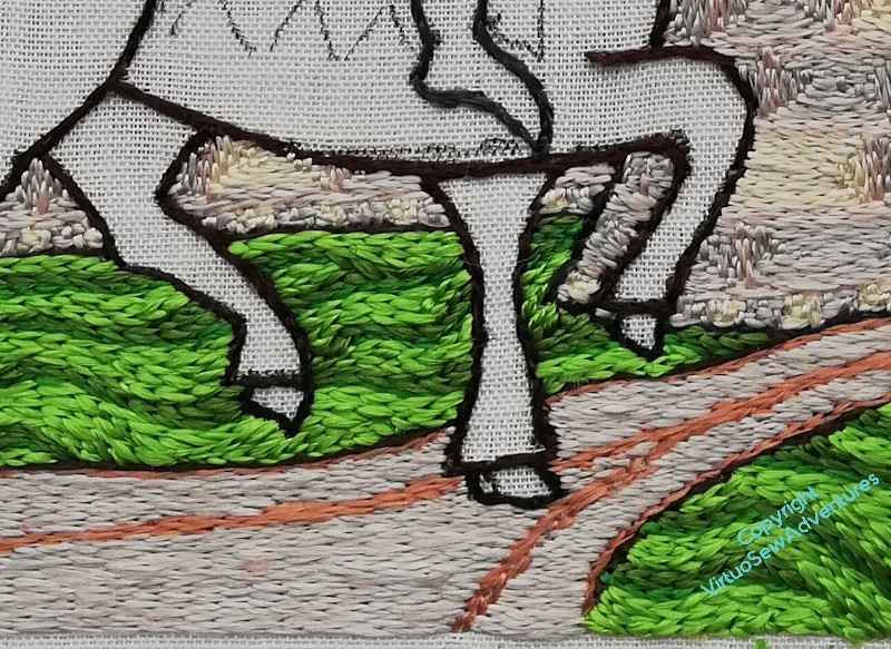
You may recall that when I was stitching William Marshall, I chose to use more strands of silk in the needle, and to stitch relatively calm curves and unevennesses in the ground. I wanted to suggest that William’s kinsman kept the land around the walls of his stronghold close clipped (by grazing, one presumes) so as to ensure that he could not be take too much by surprise, whether by welcome or unwelcome visitors.
Aethelflaed, of course, is visiting, in effect, a building site. She has no road, and her horse is picking its way around heaps of building stone and over grass that’s tussocky and and uneven. I gave some thought to the question of how to represent that, staying true to the aesthetic, using only silk and split stitch, but creating some of my own variations. After all, this is modern, inspired by the past, not a reconstruction of an existing piece. I have a little freedom of movement here!
So I’m using three different greens, and I’ve not increased the thickness of the silk in my needle. I’m not stitching the curves quite as regularly, and I’ve devised a way to stitch little tussocks at uneven intervals across the ground. They are just little groups of split stitch lines crossing the flows of colour, but I think they are working rather well so far.
It has only just occurred to me, however, that I may have a slight tweak to make in my process for doing them, as I come forward: they need to get bigger, cross more of the lines of colour. Do I now just put the colour in, so that small tussocks don’t compete visually with large tussocks, or do I just carry on regardless?

Now, a reminder that I shall be giving a talk for the Embroiderers Guild on June 3!
I believe I’ve turned this image into a link to the Eventbrite page, and for anyone not in the right timezone, or otherwise occupied on the day of the talk, the Guild makes recordings available for some time afterwards.
I shall remind you every week until it happens!
Questions About A Wall
So, having once decided to redo the walls, I had to actually do it!
I’m rediscovering the quiet process I found with William Marshall, sitting down at my frame of a morning, working until the sun comes around and casts shadows across the work, or until I find myself losing focus, whichever comes the sooner. You may recall that I was surprised to find myself so enamoured of a technique that involves only a single stitch!
This time, however, that single stitch is very much part of the conception of the project, and I have learned that I can delight in the subtleties of something that once would have bored or frustrated me. I am pleased to find I’m still enjoying it, and in spite of the unusual level of pre-designing I’ve done (and I’ve yet to really get started on Rahere and Lady Julian!), there are still details and ideas to work out.
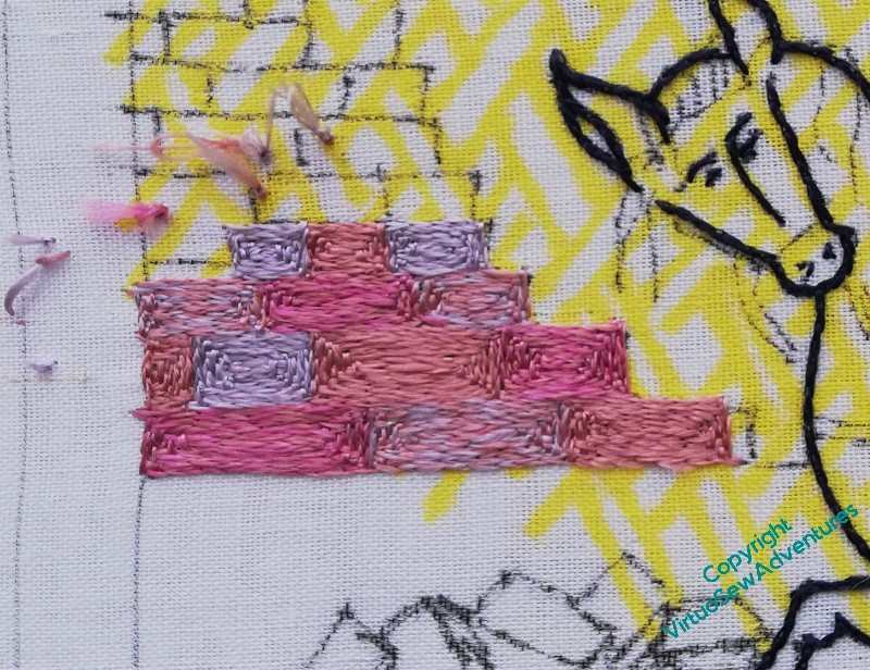
I’m keeping to the close tones I chose, using two of the three possible blends, and two solid colours. I think that is working well to represent the assorted colours in Cheshire sandstone, while being pale and pulled back, not dominating Aethelflaed but allowing her to dominate instead.
I have been quietly, methodically, choosing a silk, stitching my square spirals, stitch by stitch and block by block, thinking only to raise the remnants of the Roman Walls so that Aethelflaed can restore them.
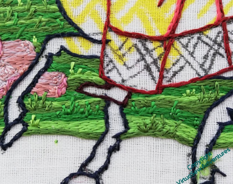
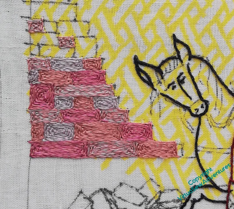
And then, last week, I was blamelessly stitching my blocks, when I looked at my design with a new eye, and suddenly I have a thought to think through.
Notionally, for me, Aethelflaed in this design is outside the walls, touring the building site, as it were. That’s one of the reasons that I made the wall more than head-high on the rider. However, last week it suddenly seemed to me that visually, that high wall was blocking Aethelflaed’s view, and I’m not sure I want that.
Fortunately, I have all the rest of the silk embroidery, including the borders (still not entirely designed!) before I need to be certain of my decision.