About Rachel
View all posts by Rachel
More on David’s Hares
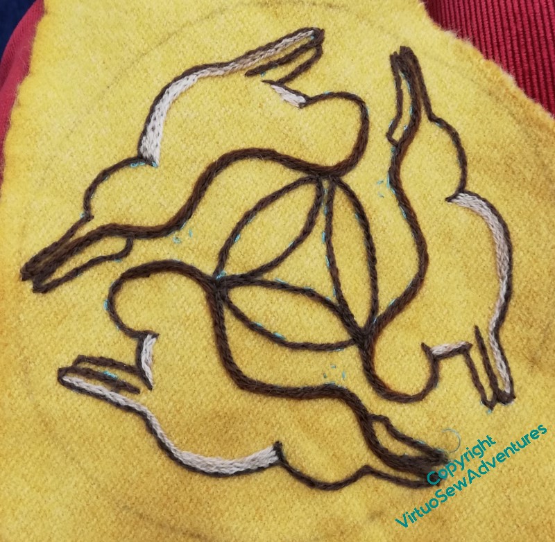
The yellow wool was really a lovely fabric to be stitching on, but being a bit mobile around the edges, I decided I wanted the circle of blanket stitch in quite soon, and didn’t keep it quite as neat as I might have hoped.
However, it looks lovely, the red contrasting nicely with the ground and will the brown hares (I keep wanting to call them bunnies, but hares have bigger ears, which must make it easier to share them!)
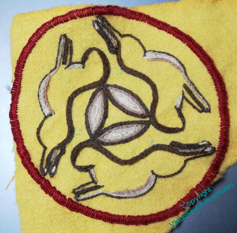
The innermost line on the ears is a pinky-cream mohair, and I’ve also used it for little pink pads on the hind paws. I’ve no idea whether this is accurate to life, but it gives the design a lift at the edges, and I think that has helped enormously.
You will note that I’ve kept all three Hares at the same rate of development all the way through. That’s made it easier to think of it as a single design, “David’s Hares”, rather than three versions of one hare. It also means that when I was working the progression of shades in the ears, I didn’t have to make notes, and while it’s true I’m a more note-taking-minded stitcher than I used to be, something like this is meant to be more freestyled!
I don’t know what I’m going to attach the Hares to, but I’ll think of something..
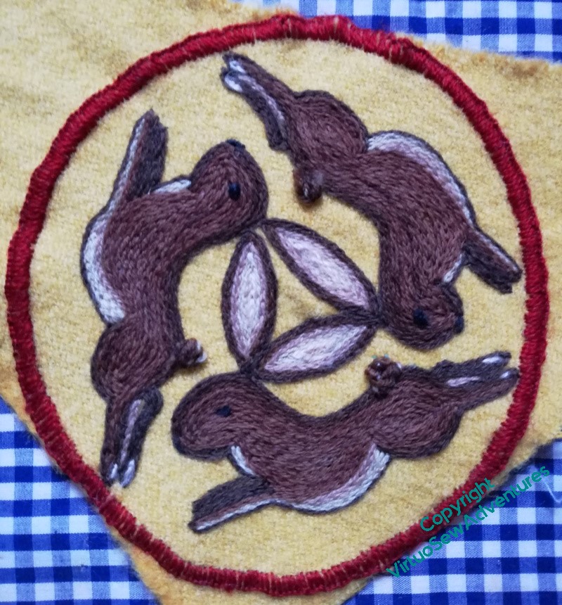
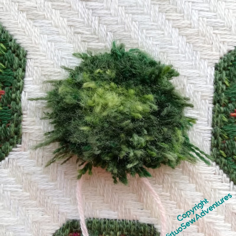
Here you see I’ve actually finished the stitching, including a pile stitch for the tails. I’ve not cut it, but left it soft and curled, which makes for a slightly stronger shape, and possibly more hardwearing too. But my goodness, pile stitches take more thread than you expect, even when you’re expecting it (if you follow me!)
Close ups will come in a later post, but in the meanwhile…
In Memoriam, David Singmaster, mathematician, metagrobologist, mischief, and friend. Thank you, David.
Chorus of Angels Tablecloth
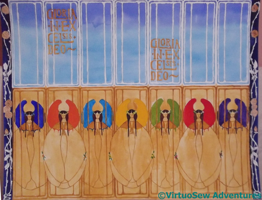
Some of you may recall this design, which Mam and I were thinking of developing into the background for the crib figures I inherited from one of my great aunts. I’ve not managed to think of a way to make it work in embroidery yet, so I keep on looking at it and thinking “No”, and moving on.
Sigh.
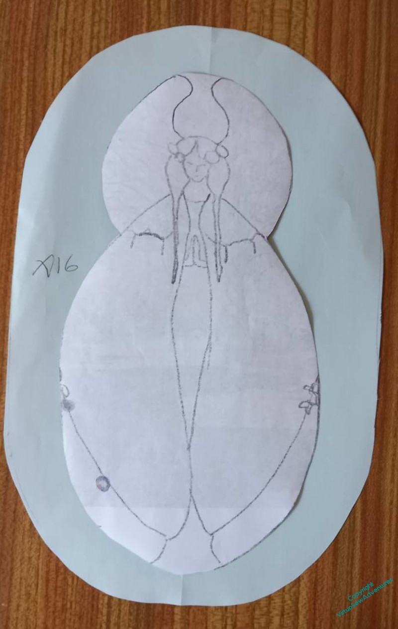
However, it has occurred to us that using the same angels as the basis for a design for the Christmas tablecloth might work quite nicely, and will give us another chance to play with the shapes and design.
So, sized for the purpose, planned out and tweaked. And we’ve decided, rather than embroidering directly on the tablecloth (if you’ve ever embroidered a tablecloth, you will have a fair guess why we aren’t!), we are going to prepare the applique separately and attach those to the tablecloth.
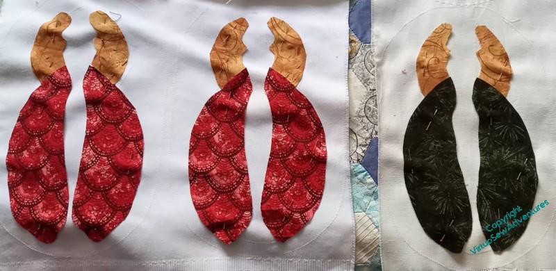
We’re using quilting cottons in red, yellow, and green, and we’ve got everything cut out and pinned approximately in place, and now we’re not sure what to do next!
So there are some experiments ahead. I’m thinking of restricting the colours to stranded cotton in the same red, green and yellow (as far as possible), and using a variety of interesting edging stitches. And we both have samplers of those in our embroidered Coat of Many Flowers and the Little Jacket!
Working on Aethelflaed
You may recall that the planning and designing of Aethelflaed is proving quite a long winded process, with a lot of repetition and rethinking going on.
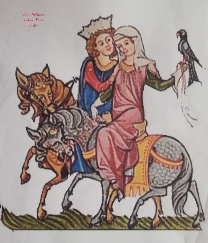
I’ve been looking for medieval women on horseback, because I want Aethelflaed under her own steam, as it were – not lead on a palfrey, but mounted on her own horse, with the reins in her hands.
The best I’ve found so far is this one, which I think was in the Holkham Picture Book Bible.
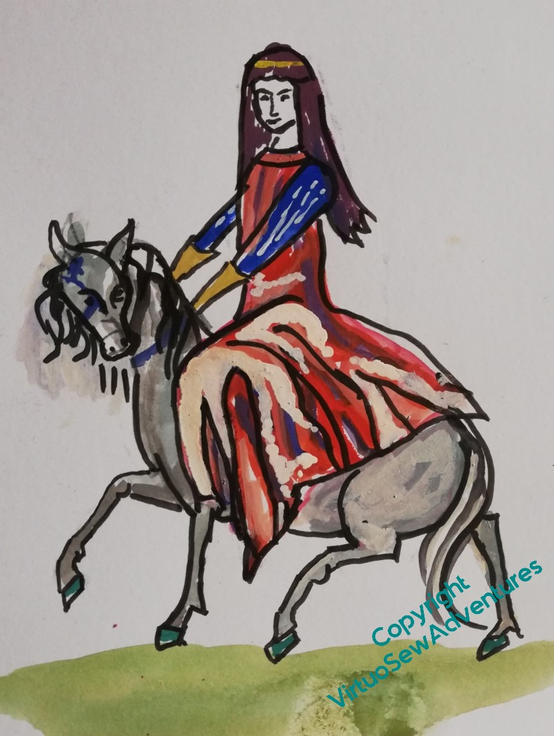
I started with the lady, and began some alterations. I want her horse to have some personality, so I’ve turned the head towards us, and lifted it a little.
I’ve extended the skirts somewhat, and given the rider a veil that flies a little, held in place by a golden fillet.
But the high contrast suggests a silk or brocade, and I want something that suggests a sensible woollen riding dress.
Then I found some Viking and Anglo-Saxon reenactors and talked to them. And goodness, that gave me food for thought. In particular, yes, riding dress was indeed a garment that an Anglo Saxon woman like Aethelflaed might have worn. But Anglo-Saxon dressmaking was not at all like ours.
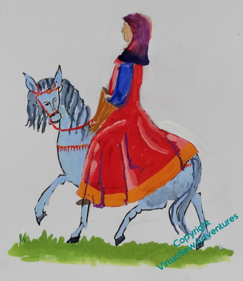
In particular, whereas we tend to have pattern pieces that start with the widest part, and remove fullness by means of darts, pleats, or gathers, Anglo-Saxon dressmaking started with the narrowest width and added fullness by means of gussets and gores. In fact, an Anglo Saxon riding dress would have a full circle’s worth of gores inserted into the side seams, resulting in something roughly like this.
But not quite. I’ve actually been to talk to my reenactor friends, and there are a few bits which don’t quite ring true. I have some photos to work from, so there is more to come…
Making a Mending Kit
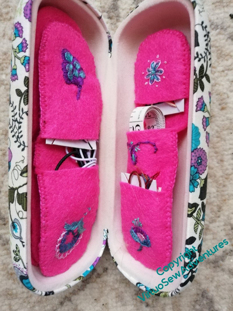
I have a rather nice spectacle case which is surplus to requirements for spectacles, but which I thought I could make useful for other purposes, so it’s now a mending kit!
I’m notorious in the family for reaching for needle and thread even when a machine stitch might be better (I was doing some mending when visiting with friends a few years ago, and when their father rang, they said “Guess what, Rachel’s been here half an hour, and she’s already got a needle in hand!”), but what I don’t have is a mending kit I can just stuff in a suitcase/glove compartment and be sure it’s to hand.
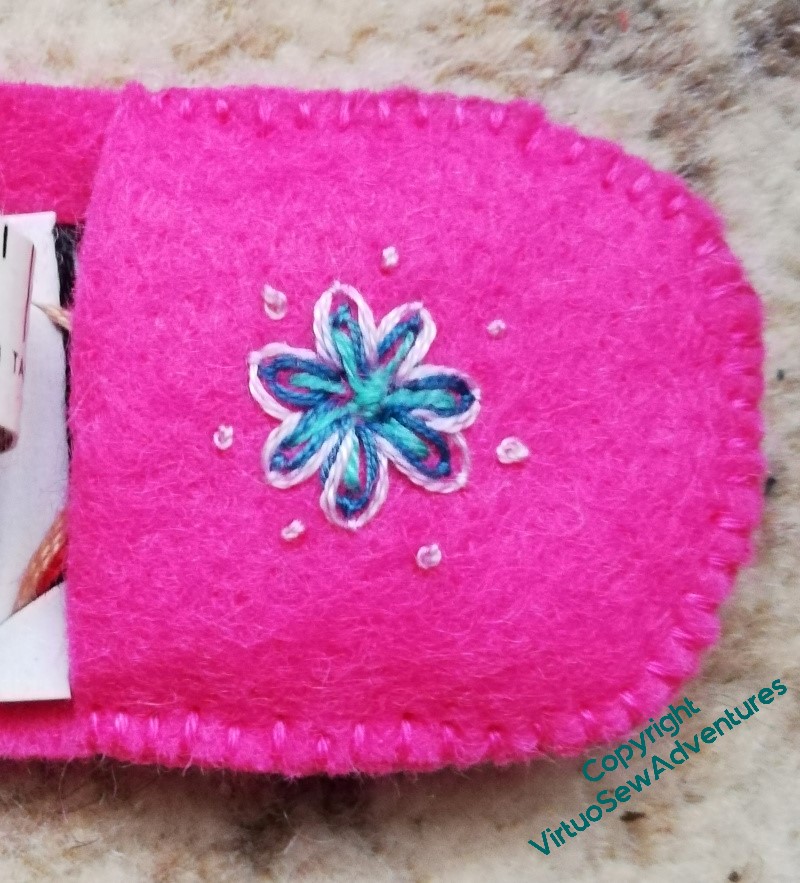
I put some thought into what I wanted to have to hand, and embellished various elements with embroidered motifs inspired by the motifs on the case.
There are pockets for small cards of thread. I’ve used half metre lengths of stranded cotton in a variety of colours so I should always have something close-ish to what I need.
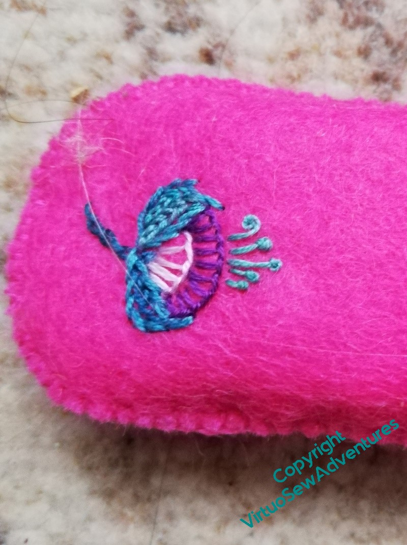
Other pockets hold some round elastic and a measuring tape. The measuring tape isn’t often necessary, but it’s hard to improvise when you need one.
I’ve found a small pair of folding scissors and attached them at the back of one of the sections, as well. I’ve seen an idea for a captive blade for a really minimal mending kit, and I’ve a small packet that idea might be perfect for, but I don’t have to be minimal here!
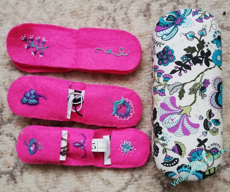
I’ve ended up with three sections.
The top one is essentially a needle book, but I’ve tacked four shirt buttons to one page, and I’m gathering safety pins for another. I’ve got two sewing needles and one rather larger eyed needle on the one page with needles in.
There are three cards with three colours of thread on each, in their own pockets, one pocket with elastic (black and white) and one with a tape measure. If I find a flatter tape measure I’ll swap that out. I’m sure I have one.. and on the back of the middle section I’ve got a strap for the scissors.
You just watch, I’ll not need it for a year at least!
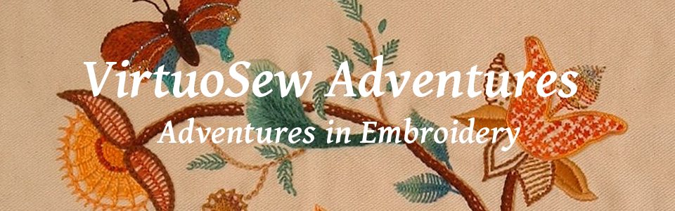
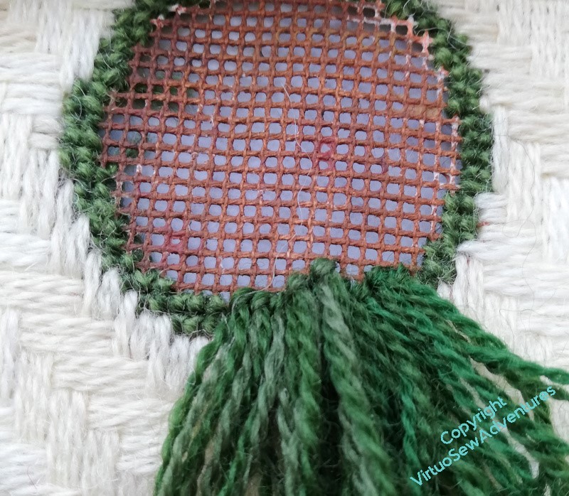
David’s Hares
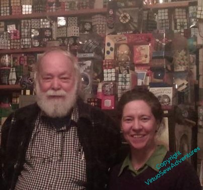
Last year, The Australian’s world of mathematics and recreational mathematics lost one of its titans: David Singmaster, mathematician, metagrobologist, and discoverer of the wreck of a Punic warship (as you do!). David had a fine mind, contributing hugely to pure mathematics over the years, but his intense curiosity about, well, everything, lead to him writing the first book about solving Rubik’s Cube, and being involved in a fabulous book detailing the spread of the Three Hares pattern along the Silk Route. He was also a really lovely man, who enjoyed sharing puzzles with all and sundry. He was always seen with a drawstring bag embellished with those Three Hares, from which an assortment of physical puzzles and embodiments of mathematical principles would be taken for the bafflement of anyone within range.
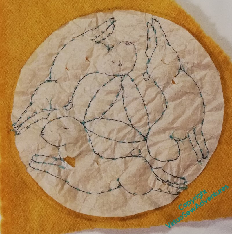
It follows that when the British Society for the History of Mathematics invited The Australian to speak at a one day conference in David’s memory, I decided to sit quietly at the back, stitching a new version of the Three Hares. It’s a lovely woollen fabric, and I’ve chosen some wool I rather like to stitch it with, and started by transferring the design using running stitch through tracing paper.
I got it to this stage in the hotel the night before, and then got rid of the tissue paper in short order.
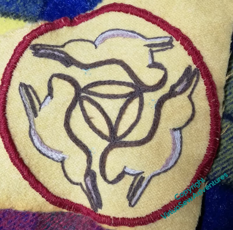
It was a wonderful day, many old friends, some lovely tributes to David, and some fascinating expositions of his work. And all through the day, I sat quietly stitching away at the Hares, for some of the time beside David’s widow, Deborah, who made the original bag that gave me the idea.
I’m quite pleased with how it’s going so far, especially as I was using my new Sketching Glasses (aka bifocals), so that I would be able to see the slides as well!
Parterre – no, these are the final stages!
So you may recall that, when last seen, I was working the Surrey Stitch boss for the centre of the Parterre. This is something else that uses a lot of thread, so I had a nervous time wondering whether I would run out of the wool I wanted to use before I finished it. And because the stitches were pushed down for quite a while as I was working it, I tied some thread around the finished stitches for a few days to help them stand up to be trimmed.
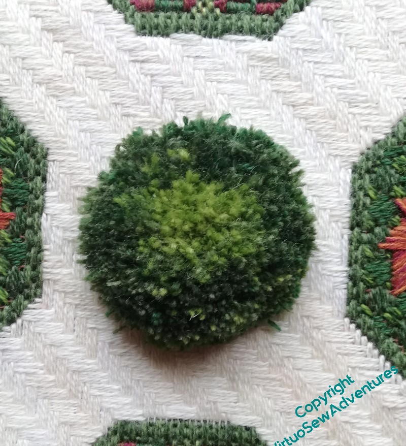
Then I realised that some of those stitches were still loops and might not be standing up to where they should.
So the semi-final trim took a bit longer than I perhaps hoped, and is maybe not quite as short and trim as it should be. That’s because I don’t have enough wool to do it again, and I am absolutely terrified of trimming it too short!
However, any further trim can wait – it’s something that can be done off the frame, and I wanted to see how the whole Parterre had turned out.
Pretty well, I think. It is squarer than it looks, I just need to block it a bit to take the frame-kinks out of the canvas!
An Experiment For Aethelflaed
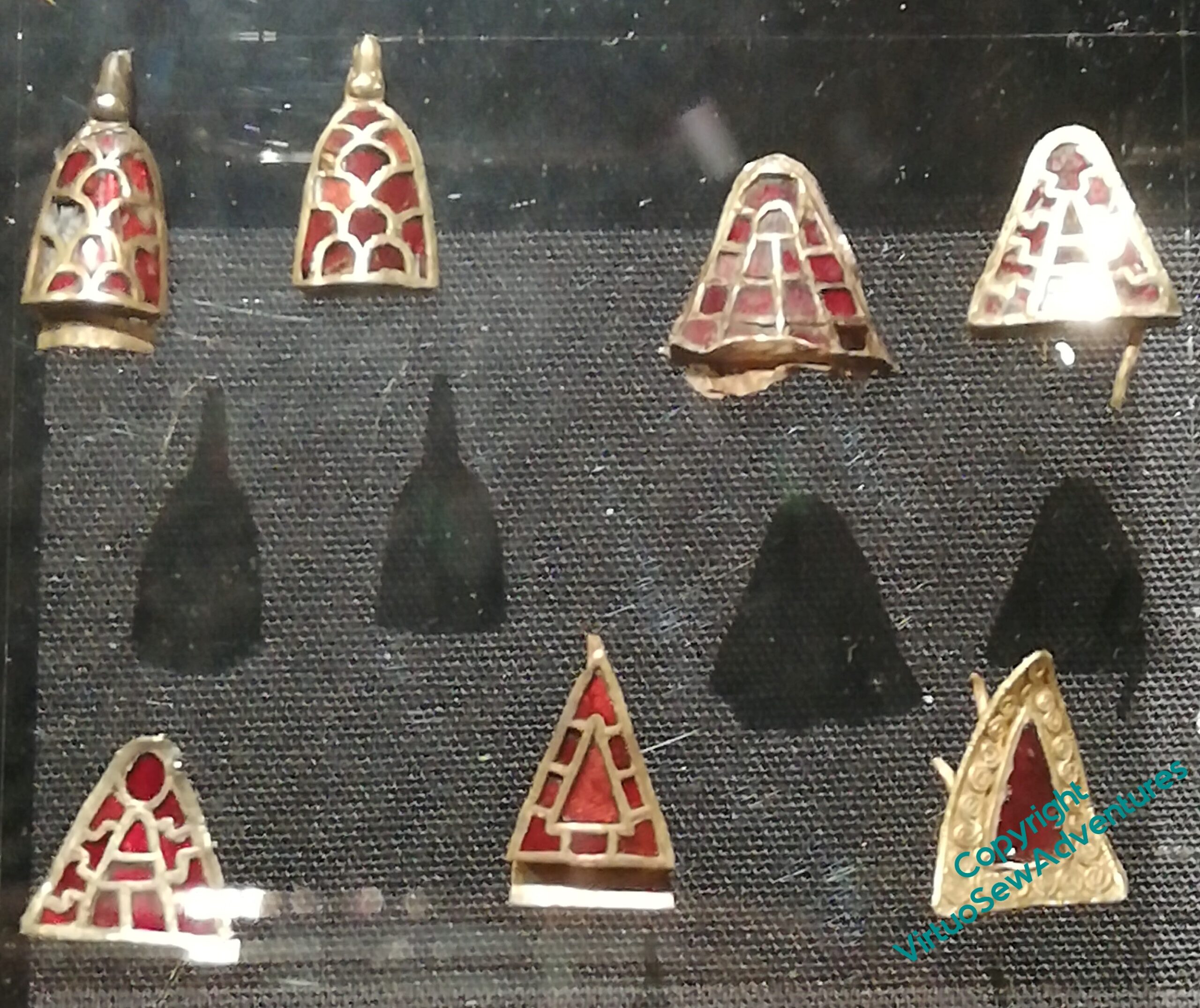
I’m beginning to realise that if I take into account at the beginning of a project the final destination of it or the way it’s going to be displayed, life might be a bit easier.
I think the Medieval Movers and Shakers may end up displayed on banners, but while the clerics Rahere and Dame Julian should probably be on a simple vertical drop, like a pulpit fall, I think William and Aethelflaed might want somethiing more ornate.

With that in mind, one idea I had for Aethelflaed was to ornament her banner with reproductions of Anglo Saxon jewels in trapunto quilting. Easier said than done, and I don’t imagine I’ll get it right first time, so I hope that this will give me some thoughts!
Trapunto involves creating channels and cells that can then be filled with coloured yarns or wool. This experiment is done using leftover gauze from the Amarna overlays, and the design was quite roughly hand-drawn to make a first approximation, but in due course I had all the lines done in split stitch.

Then it was time to fill in the channels and cells. Mindful of my recent experience with the Golden Accessories, when I found there was definitely a Right Order in which to fill in the strapwork, I did (believe it or not!) pause for thought before just barrelling in. I think I made the right choice – the channels are quite narrow, and it was definitely easier to fill them in first. I’ve used tapestry wool, and I’m not sure that’s necessarily the best choice, but it’s the right sort of colour, and with the narrow channels, it’s easier than fleece. Especially as I don’t have any to hand!
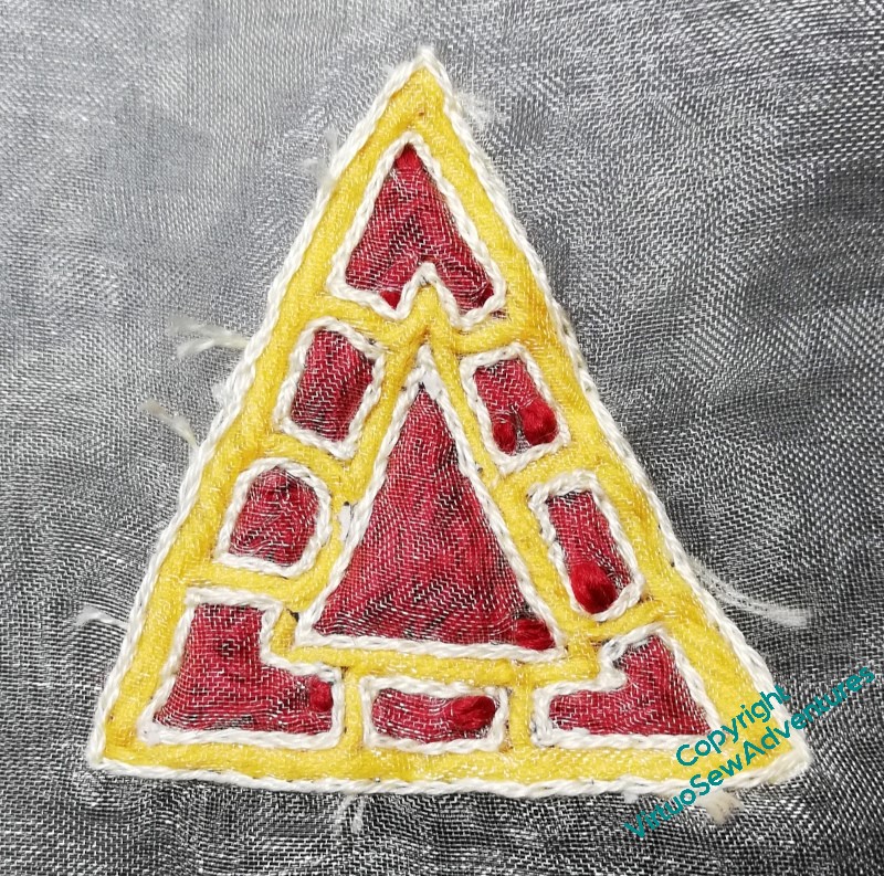
The final stage was to fill in the cells – this time with Paternayan. I think I would prefer to use fleece for cells, to avoid having shadow lines between the “stitches”, but as a first attempt, I think it’s worked well.
Two layers of gauze are a bit much, though, I think it would be easier to manage if the backing were in calico. So next time I have a moment for this sort of experimentation, I might start with that, and maybe a different shade of gauze.
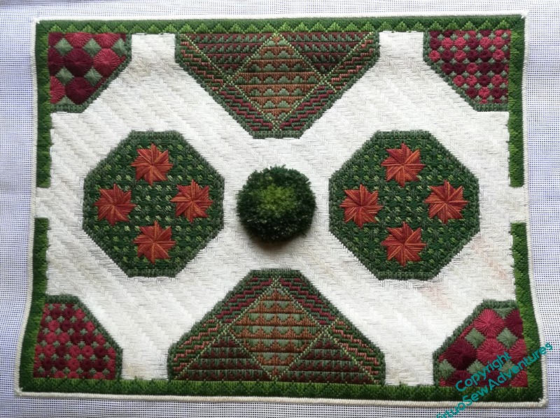
Parterre – final stages
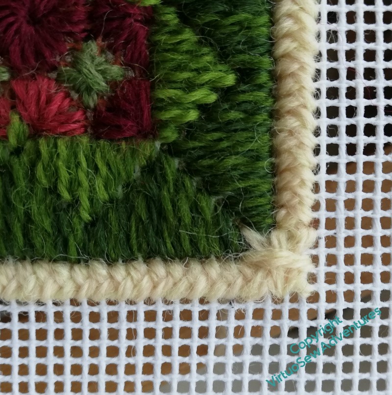
While I was stitching away at the limestone pavement, it occurred to me that I maybe needed to think of some way to “finish off” the edges. I’d left a corner space in the green border, being unwilling to go down to a straight stitch over a single thread, which rarely looks good.
I decided that the best way to to deal with the whole look would be to pull the inside and outside together, using the cream to run around the whole garden – limestone chippings to separate one garden room from another!
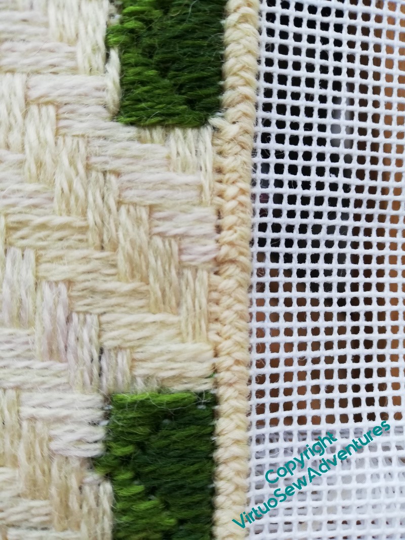
Using a double cross stitch boss in each corner seemed to work – just enough emphasis to put a full stop at the end of each run of the plait stitch.
The plait stitch also helped by tidying up the gap in the short sides. I left the gap because the “hedge” repeat didn’t fit into the short side neatly, and when I got to the edge with the limestone pavement, I wasn’t happy with the way it looked. I am now, though – I think the plait stitch worked well, stopping the pavement falling off into the view!
Once I’d got everything else done, I could start to work on the central boss. My book told me that Turkey Stitch, which I was intending to use, is Unsuitable For Mono Thread Canvas, which was a bit of a facer, but fortunately offered Surrey Stitch as an alternative.
So I got started on the Surrey Stitch – which turned out not to be as quick as I expected..
So, not quite the final stages!
Finishing the Golden Accessories
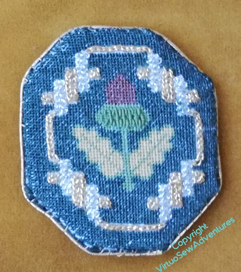
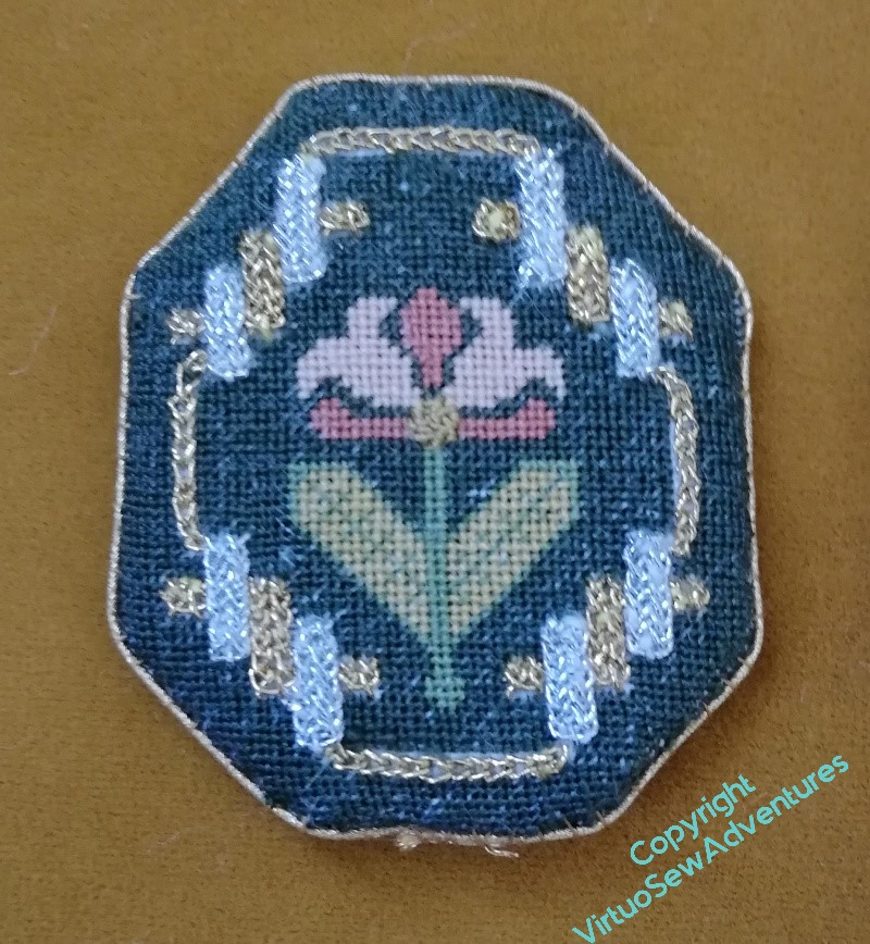
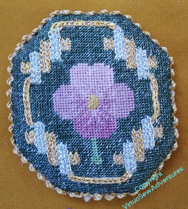
Since I made the mistake of losing the fabric and then picking a fabric of the wrong count, and what’s more, when I looked at the finished pieces they were none of them even the same proportion, I decided to abandon all thought of turning them into accessories for a workbox I don’t have, and just made little pads, backed with silk and edged with pretty braids from Thistle Threads. The two outer ones are Russian Braid, and the inner one – the last and largest – is in Silk Serpentine Gimp.
The pads are made using two heavy pieces of pelmet vilene, or something similar. I tacked the silk on as if it were English paper piecing, but the linen I sewed in place on the inside. Then caught back and front together with overstitching, and then went round again, attaching the braids. Someone on better terms with glue might have risked using it, but I am not that person!
They are now propped up inside the parlour dome with the other Online University pieces, and sit on a coffee table in the living room. I am slightly astonished that no one who’s visited us since I set it up has ever commented on the dazzling intricacies on display, but then, maybe they’re enjoying the conversation too much?
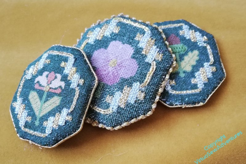
Parterre Progress
Interior design involves balancing places for the eye to rest with things for it to look at, but having that happen at different scales and different distances from the eye means that you can have just as much visual excitement as you want.
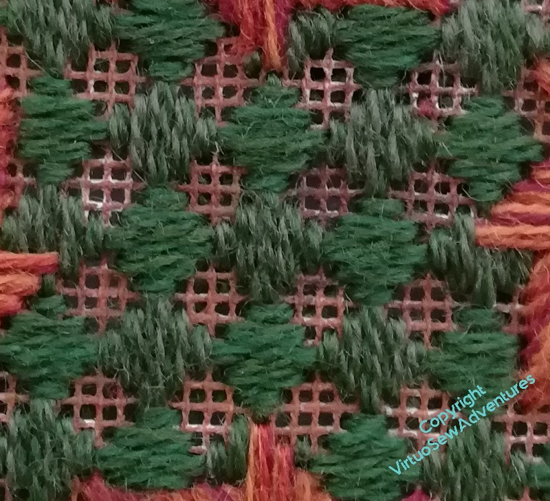
Once I put my “hero” stitches – the pinwheels – in the octagonal borders, I needed to find something to surround them. It needed to be much quieter, to allow the heroes to be truly heroic, but at the same time, I wanted something that would be visually interesting if you bothered to look.
This is the first two stages of Palace Stitch, which was one of the stitches I interviewed for the limestone pavement. Heathering the yarns means that even close up you have something to look at, and it helps me eke out my stash of Paternayan, too. It’s too beautiful not to use, but doing a large project is becoming something of an exercise in invention!
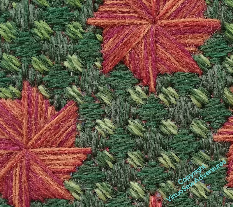
The final stage of Palace Stitch involves small squares of diagonal stitches. Again I have heathered yarns, this time using lighter, yellowy greens.
The placement of all my colouring variations isn’t quite exact, but I like it that way. Plants don’t grow identically, and a lot of the charm of knot gardens and parterres lies in the crisp shapes with the subtly varying colours of the plants filling them. I’ve been trying to paint hillsides and forests of late, and I never thought I’d say this, but the canvaswork is easier!
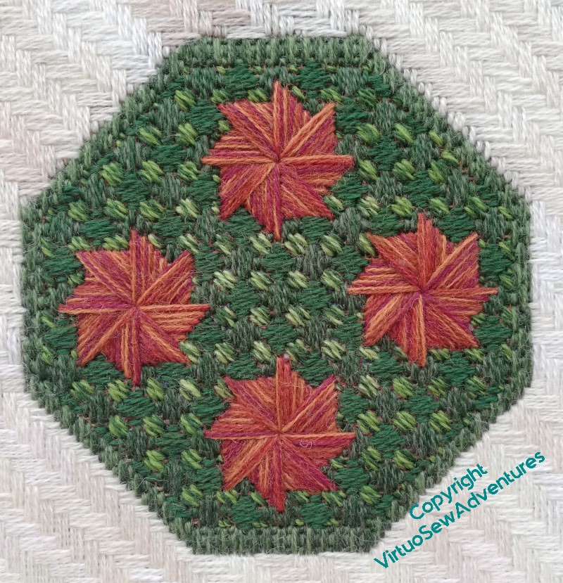
I think this is a success. The slightly lighter centre, the darker edges, and the varying colours of the pinwheels (four different shades of Appletons Crewel Wool held together) all create a varying effect which is properly geometrical and definitely canvaswork while still managing to be vaguely horticultural.
I do like it when a Plan comes together!