I described the first of the background panels I am planning for the Dreams of Amarna a few months ago. I will describe some of the other stitching I have done on it in another post, but I have been racking my brains since I began stitching, trying to work out how to embroider the title.
The challenge I am facing with the whole map is that I want it to be clear that it is embroidered, not screen-printed, but at the same time, I don’t want to show off every stitch I know or produce something that is so heavily stitched that it pulls the final pair of panels out of balance. So far, every time I have tried something it has been too prominent or too fiddly or Just Plain Wrong. While this is disheartening, one of the advantages of the butterfly mind is that I could stow the piece away and work on something else while waiting for inspiration.
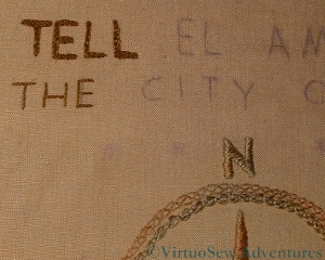
A Corner Of The Map Of Amarna
Then suddenly, a few days ago, the Gordian Knot was loosed. I’m using ordinary stranded cotton (two strands) in the darkest shade I am allowing myself. It’s not overdyed or textured, and I am using the same thread for both rows of text.
The large text uses the Chain Stitch with Buttonhole Edging that I learnt in Month Five of the Tudor and Stuart Goldwork Masterclass. I knew it would be useful as soon as I saw it! It is slightly fiddly to work at this scale, especially using stranded thread, but importantly, it doesn’t look fiddly when it is in place.
The smaller row of text below it is in split stitch. This provides a narrow, unbroken line, again clear enough to be readable, but equally not drawing attention to itself. If I decide later that this row is a little too unassuming I can always whip the split stitches!
This now means that I know what I am doing with this panel for a while yet, and can just get stitching on it. Unfortunately the transfer that I made has worn off the centre of the fabric so a large section of map will have to be retraced and reapplied, but that can wait until I have finished the titles.
I’m greatly relieved. I’ve now got plenty to work on while I think of the next idea…
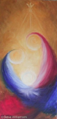
Christus Natus Est, by Steve Williamson
A couple of years ago, my mother painted an absolute cracker of a painting – a semi abstract Nativity, which she entitled Christus Natus Est (Christ in Born). At the time it occurred to me that it might make a good design for an embroidery, and now I have decided on the style I am going to use – or nué.
Obviously I am going to change it somewhat, since the techniques of embroidery and oil painting are so different. For one thing, the background of closely spaced gold threads will be striking, effective, and rather reminiscent of an icon. So rather than covering the gold with coloured silk, the background will be left clear. Also, I don’t think I can hope to create the same subtlety of colour in the figures, so I will use only two or three shades of each colour.
Classic or nué uses straight rows of gold, but in her book All That Glitters, Alison Cole suggests spiralling and curving lines, so I am going to try that.
The first stage is to work out precisely how I am going to simplify the design and transfer that to the backing fabric. As none of it will be seen, I can simply use calico, and colour it with fabric paints.
Then I have to plan the placement of the spiral and curving lines. The obvious thing to do is to centre the circle on the Christ-child, but I think that is too obvious and will make a rather stiff design. Instead I will use a larger circle, centred between the Child and His Mother.
The original painting was one metre by one and a half, and clearly I won’t be embroidering it that big – it is going to be more like three inches by eight!
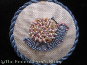
Stitch a Snail for Storage Needlework Nibble
Since I am following the Tudor and Stuart Goldwork Masterclass, I receive Tricia’s Newletter, and a recent one described a plan she has to raise money for storage and display of gloves in the Museum of Costume in Bath, which she’s calling “Stitch a Snail for Storage“. It looks fascinating, so I’ve ordered one of the kits, and downloaded the instructions and printed them out.
The fundraising is about two thirds of the way to the total needed by the Bath “Museum of Costume” to rehouse the collection of embroidered gloves and gauntlets in such a way as to make it possible for embroiderers and other people interested in embellishment techniques to examine them without touching them and rishing damage to them.
Tricia’s “Needlework Nibble” will be a great way to support this while being introduced to some of the interesting threads she has developed following her research. Why don’t you give it a try?
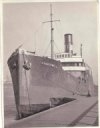
Photograph of the Camberwell
The Camberwell Panel was a commission from my cousin. I documented the design and progress of the work for her while I was doing it, and she has given me permission to share it with you as well.
The Camberwell was the ship her grandfather retired from in 1938, and when we found this photo in the family home, we thought it would make an ideal subject for an embroidered panel. Although the Camberwell was a merchant vessel (a collier, in fact), the looming prow in the picture reminded us of the liner posters of the 1930s, so that was to be the inspiration for the panel.
That idea in turn lead me to decide to use appliqué as the basic technique, embellished with embroidery. The flat blocks of colour used in the posters of the period would be most easily produced by appliqué, and it is a technique that I’ve never used seriously before. I thought it would be fun to try.
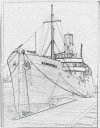
Camberwell "Sketch"
So I began by scanning the photo and then tweaking it digitally to get a sketch. With Master Mariners on both sides of my family tree, the last thing I wanted was to get the rigging wrong!
Once I knew what size the panel was to be (decided on the basis of where it was to hang) I could use a projector to project it at the appropriate size and create a basic pattern.
Then I spent some time playing with colour schemes. We settled on something vaguely reminiscent of the the Art Deco period …
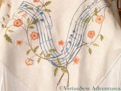
Since I had some requests for more details about the Piano Shawl, I rummaged around in my photographs to try to come up with pictures that might explain a little more of what I did and how I approached it.
I knew that I would be using some variegated threads and some plain ones, so the first decision I made was that I would use each in particular places. In that way there would be a scheme of sorts that would guide me.
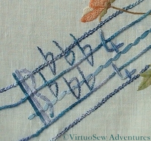
Five Flats on the Piano Shawl
First of all, the ribbon stave was definitely going to be variegated. It would help to create a ripple of life around the design, and incidentally, since it felt like miles of stitching, I would be able to feel the progress I had made in an afternoon in the colour changes. Then I felt that the colour alone did not provide sufficient structure, so I developed the scheme further – the chainette ribbon was couched down as the middle line on the stave, and also used for bar lines and clefs. The next two lines of the stave (one on each side of the central one) were worked using pearl cotton, in Portuguese Knotted Stem Stitch, which is a favourite of mine. I used it elsewhere for some of the stems, in a very fine silk thread which produced a very different effect. The two outer lines of the stave were stitched in ordinary chain stitch using a rayon bouclé which was serious trial to stitch with, but which looks really effective.
Melodic Corner on the Piano Shawl
The flowers themselves I worked in ordinary stranded cotton, using about six different shades of browny-pink, and creating an entirely un-naturalistic variety of light edges and dark edges, strong and weak colour variations. There was the risk of producing something too stately if I tried too hard, and since the Shawl was destined for a grand piano, the surroundings were going to be pretty stately already. A grand piano is a pretty dignified and imposing piece of furniture!
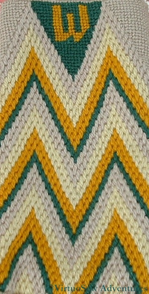
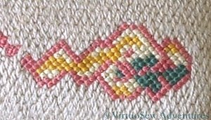
Spectacle Case in Bargello, worked for Grandmama
When I finished the Dragon Footstool I had some wool and some canvas left, and so I made a companion piece – a spectacle case so that Grandmama would be able to find her sunglasses in her handbag. That’s why it’s in the lighter colours.
It is a simple bargello pattern – in fact the simplest, most basic Florentine Flame pattern there is, and the charted initial is very simple too.
When I consider the range of stitches in the Dragon Footstool, I can’t help but wonder why I didn’t go for a more complex pattern, but I had painted the Dragon and this was charted – in fact, in the same book (The Readers Digest Guide to Needlework). Maybe that had something to do with it. I’ve always found charted pieces somewhat problematic. I have a tendency to lose interest in counting, which is a very bad idea in a charted piece – in fact it is one of the reasons I have other projects going on while I’m working on the charted motifs for the Tudor and Stuart Goldwork Masterclass!
Grandmama was happy with it, anyway.
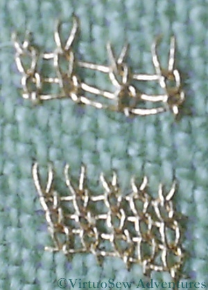
Ceylon Stitch
I’ve not been making as much progress on the silk work for the Spot Sampler as I would have liked, recently. Still, I have managed to have a go at the Month Seven stitches, Diagonal Half Guilloche Stitch and Ceylon Stitch. As always, I have done them at two different scales.
I’ve worked Ceylon Stitch before, although certainly not using a metallic thread. It produces something that looks a little like knitting. I suspect it will be easier if I use a stiletto to control the thread. I know I have one somewhere, so I’ll look it out before I try this one again. I think I used it as a needlelace stitch before, and that, of course, used a simple round cotton thread.
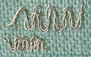
Diagonal Half Guilloche Stitch
I think the Diagonal Half Guilloche Stitch has possibilities for some of my other projects. It looks very like one of the braids sometimes used to edge upholstery, and might also make a good filigree necklace for the Amarna panels. It will be important to pick the right scale of thread and fabric, as you can see in the picture here, but at least when I have been working at the large scale it has been easy to see where the needle is supposed to be. This hasn’t been one of the most complex stitches, but I’m glad that I have chosen to work practice versions of all these stitches before I work them on the sampler or the pincushions!
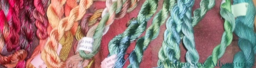
Stef Francis Threads For Amarna Project
Since I don’t have a convenient, well-stocked local embroidery shop, and have discovered over the years that colours often don’t display well on screen, leading me to spend lots of money on the wrong thread, I now concentrate almost all my embroidery shopping around one event: The Knitting And Stitching Show in Harrogate. I had a wonderful weekend there last week, and even managed to take tea at Betty’s Tearooms, and to visit the Royal Pump Room Museum which had few items from Amarna, as well as a rather fabulous painted and embroidered screen from the early 1900’s.
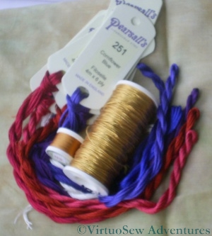
Pearsalls Silk and Gold Jap For Christus Natus Est

Pearsalls Silk and Silver Jap For Hittite Amulet
It’s particularly useful when I am planning to branch out into a form of embroidery I’ve not tried before. There are always stallholders with a deep knowledge of the particular technique I have in mind, and they are always willing to talk, and share tips and ideas.
This time I am planning two or nué pieces, so my first stop (after buying some merino/possum blend wristwarmers from Jamie Possum) was to visit The Golden Hinde. I described what I had in mind, and soon had a spool of gold and a spool of silver to use for those pieces. Then on to the Pearsall’s Embroidery stand to buy the silk to couch it down with. I’m not sure how much I will need, so I bought one skein of each colour. Since these are single colour threads, I can re-order if I need to.
Oliver Twist Threads for Amarna Projects
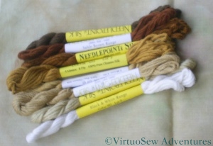
Silk Threads For The Second Dig House
I also bought some more turban cotton and faience-coloured threads from Stef Francis and from Oliver Twist, and some silk threads to make another attempt at the Dig House. I’ve been looking for threads that resemble some of the other colours I will need for the Dreams of Amarna panels – the carnelian and jasper and other semi precious stones the Egyptians used, but some of those aren’t so easy to find. I am going to need to do some more reading in my references to get a clear idea of some of the colours I will need.
I’ve found I’ve bought more silk threads than cotton, this time around. All this work using silk for the Floral Glove Needlecase Course and the Tudor and Stuart Goldwork Masterclass is changing my habits!
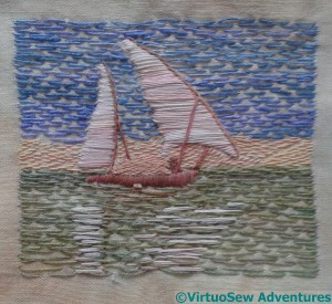
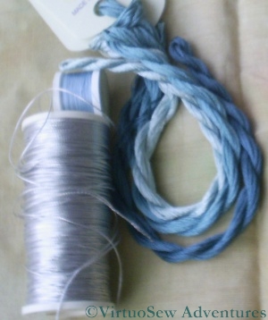
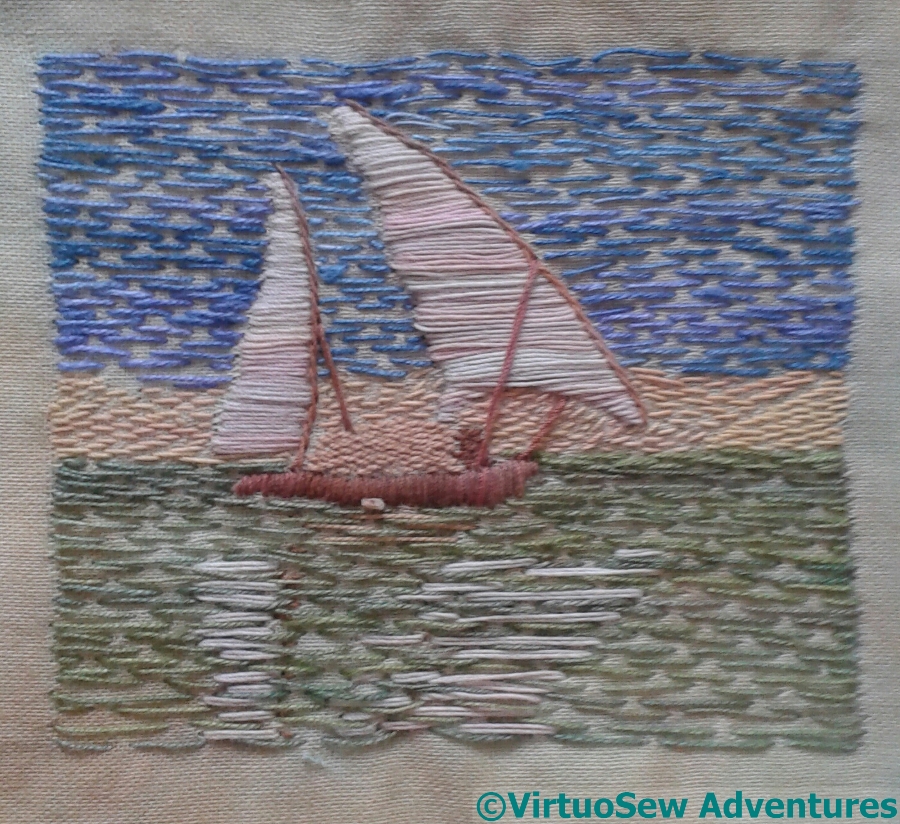
The Felucca
I have finished the first trial of the Felucca design. As I always say of these design fragments, I do not yet know whether they will make it to the final piece.
You can barely see the stitching on the coastline – I used a fine thread and spaced the stitches far apart. For the cargo, I crammed the stitches as close to one another as I could. The sails are worked in Satin Stitches rather than darning, and the spars in Stem Stitches. I’ve decided I am happy with the pinkish tinge on the sails, and the greenish Nile is just as I imagined it would be.
I think it has worked. The reflections of the sails bring the whole piece to life, and I added some small stitches to provide an impression of a reflection of the spars.
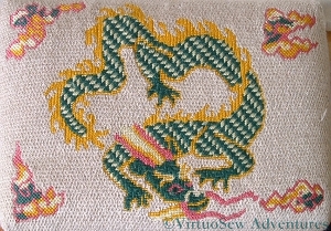
The Dragon Footstool I worked for Grandmama
I think that this was my first reasonably large canvaswork project, worked very early in my stitching career. The design was in the Readers Digest Encyclopedia of Needlework, which is a very good general introduction to a lot of styles of needlework, but needless to say, even at that early stage I made changes to both the design and the materials.
The Readers Digest suggested plain canvas – on the advice of my local needlepoint stop, I used interlock. The project pages said Tapestry wool – again, on advice, I used Persian Wool (lovely colours, and a really gorgeous sheen). They said Tent stitch – ah well, you can guess what’s coming, can’t you! Oh, and the colours were all changed, too. I did paint the design onto the canvas, using my mother’s oil paints, but after that, almost all resemblance to the project in the book ended.
Corner Motif for the Dragon Footstool
The ornaments in the corners were worked in Upright Cross Stitch, which creates a surprisingly heavy texture for such a relatively simple stitch. Looking at the design now (after my grandparents died, the footstool came back to me) I rather feel that the original designer didn’t quite think things through. The corner motifs are all at different spacings from the dragon, and somehow the whole thing looks a bit congested. I think they may have designed for the round footstool bases that were popular at the time, and then added the corner motifs to make it more interesting for those who wanted a rectangular one. Nowadays, of course, I would try to have the courage of my convictions, and remove something or change the spacing, or alter the motifs to create a more pleasing effect. But a printed book looks so authoritative, doesn’t it – not for experimentation. One lives and learns!
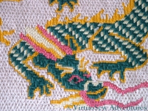
Dragon's Head Closeup
The scales on the dragon’s body were worked in Oriental Stitch, and the spines on his back in Kelim Stitch, worked vertically instead of horizontally. Small details like eyebrows and outlining were worked in tent stitch (I do occasionally make the simple choice!). The trailing beard and horns were worked in rows of Knotted Stitch.
I don’t think I would use the same stitches again, or at least, not in all cases. I think the Oriental stitch is at the wrong scale for the dragon’s body – it was certainly a nightmare to get the compensation right! – and the beard and horns in fact need a heavier and more distinctive texture. The Kelim Stitch spines work well, I think, and the corner motifs in Upright cross stitch are successful too. I hadn’t, at this point, worked Slow-and-Steady, and although pictures of the worked stitches give you an idea of the worked appearance, it really isn’t the same as having done it yourself.
Still, it was fun, and interesting, and at the time, Grandmama said she was very impressed!