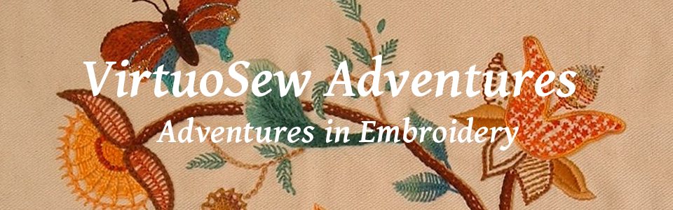
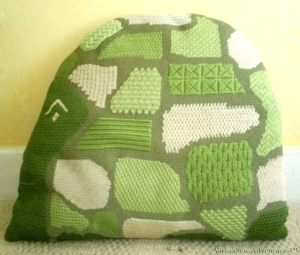
The Piano Shawl, Finished and Delivered
Although putting the fringing on brought the whole thing to life – which goes to show how important the finishing details are for big projects – I was very relieved when I delivered the Piano Shawl, and it settled into its destined home as though I’d sat there to stitch it. As I don’t have any rooms decorated in similar colours, I wasn’t confident when I finished the piece, until I saw it in place. Phew!
I created a booklet to go with the Piano Shawl, which included a short description from Elaine, describing why she wanted it, and the following, describing how I tackled the commission.
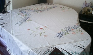
The Piano Shawl - Second View
From the Embroiderer’s Frame
This was an intriguing project, growing out of several conversations, visits to the Client’s house, and an assortment of research in libraries and online for suitable images and inspirations. The ultimate inspiration was a scene in a painting in which the black polished surface of a grand piano was broken by a patterned shawl.
I was asked for a piece that would suit the room and the grand piano, and would in some way incorporate references to Music. I prefer, with this sort of piece, to find some way of allowing the client to contribute, not just with a brief, but with some element of the design, so I devised three possible ideas,
- a piano keyboard stretched into a ring, which would allow for a variety of stitches and techniques
- a series of instruments rendered in a broad, slightly “graphic” style
- a more “romantic” design of flowers
In adapting the inspiration to circumstances and ideas, we decided, rather than using a scattered all-over pattern, to develop an undulating stave design, entwined with flowering stems. The flower patterns were developed from the shapes used by my grandmother in one of her embroidered tablecloths. As she set me off on my embroidering way, I always try to include some idea or reference in big projects! We chose to pick up the floral pattern of the carpet, dusty pinks and apricots for the flowering stems, and take the blue background as the basis of colours for the stave. Then I asked Elaine to write out for me the musical elements that she wanted to have put on the staves.
In the event, this piece involved far less variety of stitch technique than the other design ideas I had thought of, but at the same time it gave scope for a much wider range of variegated threads. The blues used in the stave are brighter than those in the carpet, because darker colours would have dragged the design down, making it seem less light hearted. There is always a balance to be struck in embroidery between the naturalism that is available through needlepainting techniques and producing something that is clearly an embroidery. I almost always choose to do the latter, because the textures of fabric and thread as they are used in embroidery are what interest and inspire me.
My initials and the date are included in Morse code, on diagonally opposing corners.
Now Elaine not only has her Piano Shawl, but something for the archives as well.

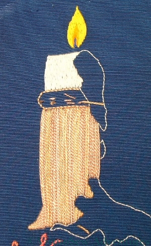
Finished Candlestick Bookmark
I’ve finished the candlestick bookmark.
I worked the stitches on the candle vertically, and the stitches on the drips of wax diagonally, to try to create a slightly different effect. The light reflecting off the different angled stitches creates almost different colours, and certainly different shades.
The dense weave of the grosgrain ribbon has made stitching this really rather a trial. As I’ve commented already, sometimes I feared I would break the needle, and that has meant that it has required a real effort of will to complete the embroidery. Now it is finished, however, I’m pleased.
The Candlestick looks like engraved brass (with the eye of faith, anyway!), with the vertical stripes suggesting the reflection of other things around the room.
The wax doesn’t really look dribbly enough, but it is as dribbly as I am willing to make a bookmark. If this were to be a wall panel (tell me why I would do that?) I would use bullion knots to make the dribbles look more textured and dribbly. That would also make a bookmark too thick to use.
I think the flame is a real success, though. It is astonishing how such a simple shape, with simple colours and stitches, should be so evocative of the real thing.
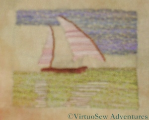
The Felucca - the Second Stage
I’m afraid that this photo isn’t as good as I hoped it would be, but it does show the progress I am making on the Felucca.
I realised that not only did I need to have the sails completed before I put all of the sky in, but I needed to put the Nile in before I put in the reflections.
So I’ve done the Nile – nearly. If you look carefully you will see that there is a small section of Nile behind the Felucca which hasn’t been finished yet. I’ve used the same irregular darning stitch as I used for the sky, and run in the reflections using long straight stitches in the spaces between the rows of green. I need to put a few more stitches in yet, but I’ve run up against rather a headache which I need to resolve.
I need to do the land behind the Felucca. I was intending to use a paler version of the reddish-brown thread I’m using for the hull and the spars. However, when I put it in, it really didn’t work. No, I mean it. Not At All. I’ve since tried a couple of other threads with no marked success, so I need to spend some time finding a suitable thread.
If you look at the photo on the original post, the tones of the sky, the Nile and the elements of the felucca are not quite correctly reproduced in my embroidered piece. Part of this is because the base fabric isn’t white so everything is turning out a little darker than I expected. I think it will work in spite of the changed tones, but I am anticipating working the design again in a different form or scale, maybe using different threads, so if in the end I don’t like it I will still feel I have learnt something useful!

The Felucca On Turban Cotton
I’ve begun to work on the Felucca design I have already described. As I am not at all sure about the colours or the stitching that I will want on the final panels (remember this is to be a design element for the edging panels I described a little while ago), or even the scale, I am thinking of working this design several times on different fabrics, with different threads and at different scales, to see which one I like best. I’m sure I will find something to do with any leftover pieces of embroidery!
This version is about two and a half inches by one and a half inches, and it is worked on turban cotton, just like the fabric I used for my earlier experiment with the Dig House. I’m using similar stiff overdyed linen threads as well, but this time I have learnt from the trouble I had with the Dig House. The fabric has been hooped up over a piece of calico, and although it is slightly irritating to have two layers to stitch through, it has a lot more body and is much easier to stitch.
I’ve put the design onto the fabric using a transfer pencil and began with the sky, using a sort of irregular darning stitch. Then I realised that if I were to work the sails first it might be easier to fill in the sky afterwards. I’m not entirely sure about the thread I am using for the sails – it may be a little too pink – but I think it will be hard to be sure before I have finished. I have a dark blue-green thread that will do the Nile perfectly (I hope), and I will be able to run lines of stitching in the hull and sail colours into the water section to make reflections.
This might become my evening stitching until I have finished it. Although it is small, the colours are distinct from one another, and the stitches don’t have to be as precise as they would if it were a counted piece.
EDIT: spelling improved!
Second Stage of working the Candlestick
I wanted to create the appearance of engraved brass on my candlestick, so I began by laying long stitches vertically over the whole area. It didn’t occur to me for a moment to do the surface satin stitches horizontally. When you look at a shiny or patterned metal candlestick the reflected colours tend to blur out vertically, colours of the thread create vertical, slightly blurred stripes in the first layer.
Then I worked a basic laid work pattern over the top, with the diagonal threads couched down with an upright cross at the crossing points.
The background looks a little strange because the light was poor and I had to use a flash. It has washed out the detail of the stitching, and created a strange watermarked effect on the grosgrain ribbon. The weave is so tight that with every stitch I feared I would break the needle, especially at the edges with other layers of stitching to stitch through.
Now I move on to the dripping wax. No, I’ve not forgotten the wick. I just need the candle and the flame in place to weave the thread into the back!

Sailing Felucca from Egypt Exploration Society photograph
The photograph here is a close up from one of those that the Egypt Exploration Society made available to me, and shows a Nile felucca in passage with a cargo.
Mary Chubb describes in her book the expedition’s arrival at the site on a felucca, one of the traditional sail-driven freighters of the Nile and Eastern Mediteranean. As she also mentions in the book (when they go on a tour of the Pyramids on first arriving in Egypt) that she is somewhat claustrophobic, it seemed to me that an open sailing vessel and the broad sky over the Nile were probably very important to her. As the felucca also took their finds back to Cairo for inspection by the Museum Director, it was very important to the Expedition as well.
So clearly the felucca should figure at least once in my Dreams of Amarna panels! Equally, however, I need to develop the styles of embroidery I will use for the panels and their assorted images. So I am never sure, when working on these small elements, whether they will end up as part of the final piece or not.
I’ve not even started stitching the Felucca yet, but I have decided that it will be another experiment. I am going to try to stitch the whole thing using straight horizontal stitches. This should emphasize the breadth of the space, which would have been so important to Mary. I am not going to attempt to fill the space, either, so the picture will look slightly sketchy, rather like a photocopy of a memory, perhaps.
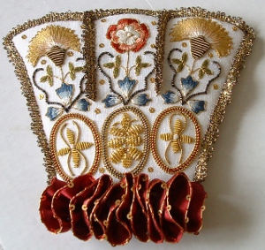
The Cuff of the Floral Glove Needlecase
I’ve had an exasperating time with the Floral Glove Needlecase since you saw it last, what with unpicking and reinstating the gold lace (fx: growl!), and wrestling with the silk ribbon ruffle, which had to be gathered up and attached across the bottom in a sort of squiggle.
However, when I finally got all that sorted out, I screwed my courage to the sticking-point, gathered my wits, picked up my glue-pot, took a deep breath and finished assembling the separate ornamental cuff of the Floral Glove Needlecase.
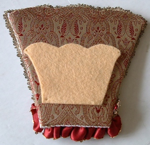
The Back of the Cuff
So here is the cuff lining. I know that the felt isn’t centred. I was sure that it was on the brocaded silk, but by the time I had tweaked and stretched and glued, that was the best I could do. As someone who is clumsy and awkward with glue I would have prefered a slightly wider margin of fabric around the card shape, which would have made it easier for me to handle.
The front and the back (stretched over batting, heavy interfacing, and light card) are attached to one another by overcast stitching. I used a strand of one of the silk threads from the embroidery – that seemed the best way of being consistent with the materials used.
Now, as I’ve said before, I’m not good with glue and scissors, so I was worn out when I finished, and I know it isn’t perfect, but it does look pretty good, especially from a reasonable distance!
At this point Tricia’s instructions say – I kid ye not! – “Sit back and admire!“.
So I did.
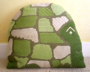
Slow And Steady needlepoint cushion
I worked this cushion from a design in one of the craft books Grandmama gave me (“The Book of Creative Crafts”, it was called, and it included woodwork, screenprinting and candlemaking as well as embroidery, needlepoint and rugmaking), but in my usual somewhat ambitious fashion, I did not restrict myself to a single side.
Slow And Steady Facing The Other Way
In some ways this made it easier, because the patches of stitching that represented the plates down the centreline of Slow-and-Steady’s shell had to be worked in the same stitch and colour on both sides. That at least meant that those decisions were only made once. I also decided that the shapes of the plates would be the same on both sides (approximately – they were drawn freehand!) and that the colour would be the same as well.
After that, I rummaged through every book on canvaswork I had, to find a sufficient variety of stitches to keep the work interesting. In effect it is a sampler, almost a practice piece, but camouflaged by making it irregular in shape and style. My favourite stitches pop up again – Leaf Stitch, Upright Cross Stitch, Linen Stitch, Byzantine Stitch. In fact this is probably where I met most of them for the first time.
I have a notebook in which I drew out the pattern and then listed all the stitches used, so that if I forgot how to work the stitch I would be able to look it up. I used Persian wool, rather than tapestry wool, and 14 gauge cotton single thread canvas. One thing I did not note down, and should have done, was how many strands of the wool I used for each stitch. I know they are not all the same, but I didn’t keep notes. That means that when I use these stitches in future, instead of checking on my previous experience, I will have to work samples all over again.
I did note down what the materials cost – £13.50. It was a very long time ago!
Calling him “Slow and Steady” was my idea. I always loved the Just-So Stories.
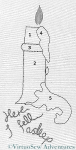
Bookmark Stitching Order
It’s important to stitch representational pieces in the right order to make sure that they “work” visually as representations of something real. Here I have numbered each of the elements from this point forward. The candle stub itself is the first, followed by the candlestick body, then the rim, then the wax dripping down the side. In this way it will be possible to make sure that the stitching goes over itself when it should.
Stitching the Candlestick - First Stage
So in this next picture I have finished stitching the cream candle stub, and then laid long straight stitches over the candlestick using Surface Satin Stitch. I don’t want to use real satin stitch as by the time I add the second layer of stitching, as I intend, this will be becoming too thick and heavy to use as a bookmark. I’m too fond of books to want to damage them by using thick bookmarks that break the spines.
I want to create the effect of a brass candlestick, so I have chosen a golden-brown variegated silk thread. I’m going to couch down these long threads to create something that will look like cast or engraved texture. I can’t create a barley-twist effect without redrawing the edge, which I don’t want to do. It will be intriguing to see whether I can create the effect I am aiming for.
If someone who embroiders ever tells you “I knew it would work” – beware. We only know that we think it will work!
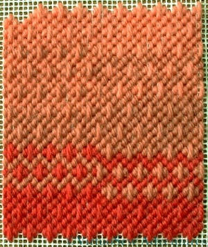
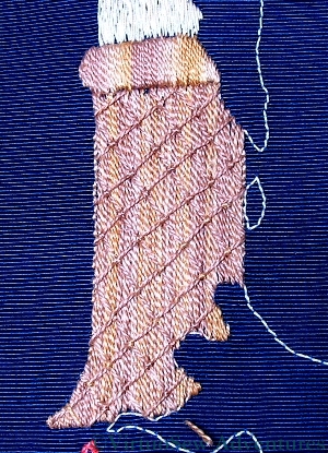
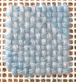
Stitching showing colour changes
Several of the comments on my Lady By The Lake post asked me to show some close ups of how I achieved the colour changes on the skirt. I’ve not had enough light to get her down from the wall, so in the meantime I found a fragment of canvas and some tapestry wool and worked a couple of patches of stitching to show what I mean.
The stitch is a bordered Hungarian Stitch. I couldn’t find a diagram online, but I think it is fairly clear to see how the stitch fits together!
I was rather limited by the threads I had available, but I’ve tweaked the image in The Gimp, and I hope you can see that I’ve only used three colours of wool, but I’ve achieved seven variants of shade. In practice I think I would choose one or other of dark diamond and light border or light diamond and dark border, and stick with that choice, since changing between them is rather messy. That said, sometimes it’s worth the extra headache to get the precise effect you want. This stitch gave the Lady a slightly textured skirt with suitable shading without spending the earth on different thread colours.
A Patch Of Linen Stitch
As this patch shows, you can blend colours with Linen Stitch as well, and I have done in the past, when the available colours weren’t quite right for the effect I wanted to achieve. I didn’t do so on the Lady, because I wanted to create the effect of a glossy silk satin blouse. So rather than creating softer colours by blending them, I wanted strong shadows and bright colours. The Lady’s canvas was a double thread canvas, so I could choose to work at two different scales. I wanted to reserve the finest scale for her skin, so everything else used the basic canvas count, and the skin and features were worked as petit point.
Hmm, I really do need to get her down and try photographing her again, don’t I. There’s loads more to say about the Lady by the Lake!