
Tag: commissions
The Camberwell Panel – Eleven
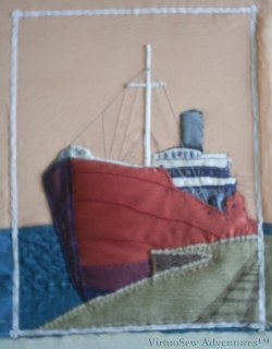
Rigging The Camberwell
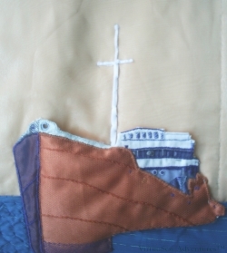
At last I could get started on the rigging. I was hoping to get it right as far as it went, although I don’t imagine it is as complex as the real thing. The thread is a medium weight matte cotton thread in a mid toned grey. Essentially each piece of rigging is a single long straight stitch. The connections across the spars are made using a simple figure of eight knot, which interlaces across the spar. This creates the suggestion of a connection, without trying to give great detail.
I used some brown net to represent the shadows on the quayside (railings, I imagine, although the photo doesn’t give that much detail), and stitched another set of catching stitches just inside the quayside edge.
The cotton tape is simply there to give me an approximate idea of where the border is going to go, and thus the true extent of the design.
While I was doing this, I was also thinking – and discussing with my Client – the form that the border would take. We finally settled on a “Dedication” in Morse Code embroidered on to petersham ribbon.
That’s a lot of dots (French Knots) and dashes (Bullion Knots)!
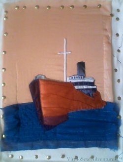
The Camberwell Panel – Ten
Quayside First Stage
Quayside Second Stage
I ended up using both fabrics.
I decided to use a layer of the darker fabric to create the shadow of the face of the quayside edge, covered with a layer each of brown and navy net.
The two layers of net intensified the darkness of the shadow, but at the same time, suggested the roughness of the surface. The net was cut as fragments – not the same size – and the heavy material is cut to the same basic shape as the top layer, there were no lines of fabric edges showing through.
The slip for the upper layer was outlined in buttonhole stitch and then attached over the top. At this stage I felt that some additional stitching would be be needed to create an impression of the quayside in similar detail to the ship itself but now the only fabric to be applied was the border.
Which at this point I still hadn’t yet decided on….!
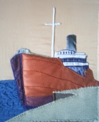
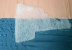
The Camberwell Panel – Nine
Transferred to stretchers
When I began to attach the slip, I needed to make sure that the background would be smooth and straight, so as the floor frame was failing to achieve that, I transferred the work to an old set of stretcher bars and used plenty of drawing pins to attach the fabric. I wasn’t concerned about holes in the fabric because the pins were well outside the area of the design that would be on show.
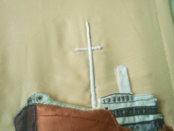
This photo shows the slip of the hull and superstructure, the funnel, and the masts finally attached. Each area was firmly sewn on using a suitable colour of stranded cotton (several different colours in the the case of the hull!), and the holes for the anchor chains were held down to let the background show through.
There are some small elements which yet need to be done on the ship – notably the rigging, but the next important element is the quayside. I had originally picked out two upholstery fabrics to choose between, one of them dark and heavily patterned, and the other lighter and smoother, but as it turned out both of them came in useful….
The Camberwell Panel – Eight
Stepping the Mast
While I was attaching the hull, I was also looking at my references on Stumpwork, or Raised Work. The headache that had been looming all the way through to this point was, How Shall I Do The Mast?
I tried to cover straws with thread or find narrow pieces of plastic or wood, and all of the attempts looked clunky and un-seaman-like. I thought about trying to use stitching – either satin stitch or lines of stem stitching, but in the end decided that these elements needed to be smooth and relatively featureless, whereas the stitching in the piece is entirely to create detail. When I thought a bit harder, it seemed to me that the mast and spar weren’t mere “details” and that there would be a rather jarring effect if I created them using a “detail” technique, rather as though they’d been magnified, or something like that.
In the end I decided to continue using only fabric in the piece. This meant a slightly more difficult process, as the mast and spar are narrow and need to be rounded, but it also maintains the integrity of the design as a purely fabric appliqué.
Mast Close Up
So: the mast and spar were padded with slivers of felt and covered with narrow cotton tape. This made the ends slightly tricky (the tape kept trying to fray), but provided a clean edge on either side of the spars.
I also attached the padding for the funnel to the background. Both of these needed to be attached before the entire slip for the hull and superstructure were entirely caught down, but at the same time I couldn’t be sure of the placements (wretched shrinkage!) until I had the slip in place.
Frolicking Teddies – Part Two
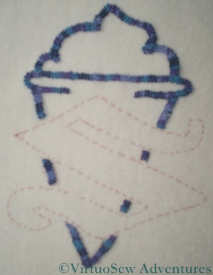
Cone In Braid Stitch
The logo on the Frolicking Teddies Cot Blanket was an interesting element to work. It consists of a letter “S” superimposed over an ice cream cone. Clearly as a graphical element, it needed to be consistent in feel – achieved by using the same thread in each part of the logo – but I also felt that stitches that would work for the “S” might not work for the ice cream cone.
In the end, I used the ordinary Braid Stitch for the ice cream cone, producing a strong, textured line. This is actually an easier stitch than it looks, and in fact when I have a broad line to cover, braid stitch is one of my favourites.

Logo for the Family Business
The “S” was a slightly harder question. I wanted it to be solid and “blocky”, and yet not to have excessively long stitches that might catch. I also wanted the thread to show to its best advantage. In the end I stitched most of it in vertical satin stitch, but outlined it in stem stitch and then created an ornamental line down the widest part, taking my cue from the pierced effect sometimes used for capital letters in illuminated manuscripts. I think this may well be the element I am most pleased with!
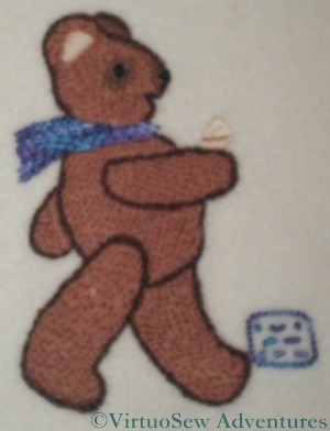
Morse Code Teddy
As this was a commission, of course I signed my work. One of the Marching Teddies is kicking a small cartouche in which my initials are worked – in Morse Code, as has become my habit, using French Knots and Bullion Knots.
I decided to line the Cot Blanket. With silk, of course. Although I rather doubted that it would be used except on special occasions, I thought it would be better to protect the back of the work from little kicking feet and little sharp nails! Attaching the lining was a time consuming operation, since I had to make sure it was very firmly attached, without pulling or dragging at any point.
I also provided a tiny leaflet explaining the idea of the design and saying a little about how it was done. This was my very first real commission, and I am glad to report that the client was delighted.
The Camberwell Panel – Seven
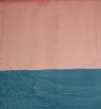
New Background
Remember I said that the Camberwell had other ideas for the background?
At this point the deafening racket of complaints from her became too much for me to ignore and I unpicked all of the background and reinstated it, differently. For instance, you might notice that the twinkly fabric for the water is puckered and gathered to create ripples on the surface.
I then pinned on the different choices of quayside fabric I had prepared, and the slip for the hull, and contemplated them for a while. Beside helping to clear up my choice, I realised that the picture was going to work better if I brought the edges in closer to the ship rather than having an expanse of sky above the mast.
Padding the hull
So, those choices and decisions made, I moved on. I wanted to make sure that the prow “loomed” somewhat, so I put a layer of padding in the shape of the hull over the background. That should also help to ensure that the horizon line does not show through the slip, as well as differentiating the looming bow from the bridge and superstructure. So I also added a further small extra patch of padding to emphasize the flare of the bow – you can probably just see it.
Frolicking Teddies – Part One
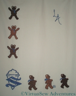
Frolicking Teddies
The “Frolicking Teddies” were created in response to a commission to produce an heirloom Cot Blanket for a much-anticipated first grandchild. In the initial stages of planning, the child’s sex had not been determined, so we planned a gender-neutral design of Teddies. I was also asked to include the logo of the family ice cream business, so in the end settled on a story of exuberant, star-jumping teddies down one side, with the logo in the lower left corner, and a procession of teddies with ice-cream cones in their hands (sorry, paws!) walking from left to right.
Once the child’s gender and name became known, I chose the colour for the logo and embellishments, and then added his initials in the top right hand corner. The initials gave me some concern, in fact. I usually use Portuguese Knotted Stem Stitch when I want a heavy line, but when I’d completed the Teddies and the logo, I felt that that would create too heavy an effect in the top right hand corner. I settled on Heavy Chain stitch, which produces a smooth, strong line, but doesn’t have quite the overbearing personality of the Portuguese Knotted Stem Stitch.
Since the commission was explicitly for an heirloom, I used cashmere blanketing as the base fabric. Fortunately, since it’s not easy to get in the UK, we were visiting my husband’s family in Australia at the time I was sourcing the materials. It’s really a lovely fabric to work with, and I still have some left, awaiting further inspiration. Or another commission!
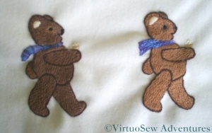
Two Teddies in Procession
The teddies are worked in long and short stitch using Paterna Persian wool. The only challenge there was the tension of the stitches, since it was especially important not to pucker the fabric. At the same time, I didn’t want the stitches to be too loose and snag on anything…
The ice cream cones were worked in stranded cotton, and the logo, initials, and the Teddies’ scarves were all worked in a standard variegated pearl cotton. Each scarf is worked in several rows of a different line stitch – stem, chain, Portuguese knotted chain, and so on. This was a way for my passion for stitches to inform and adjust the design, while remaining closely within the brief.
The Camberwell Panel – Six
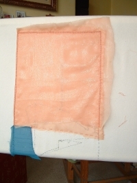
Gauze doubled over the sky
I finally decided that I wanted to use two layers of gauze for the sky. The apricot gauze has a slightly reflective surface, which would make the sky glow behind the ship.
I also worked blanket stitch around the outside edge of the panel. At this stage I intended to use a raised band stitch of some sort to frame the work, so the blanket stitch was to form the foundation of the final raised band.
Later I was to discover that the Camberwell herself had Other Ideas, and all of this was completely changed.
I think it is important to show some of the dead ends I investigated here, or at least to describe them. One thing that people who are at the early stages of their creative life always assume is that everyone else gets straight from “Germ of an Idea” to “Finished Design” without really passing through any points in between.
We don’t.
Any of us.
And we are not fair to them – and risk discouraging them – if we allow them to think that we do.
Oops. Rant over!
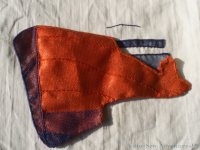
Camberwell - the Slip
This next photo shows further progress on the slip for the hull, in which I worked on the superstructure of the bridge and living quarters. I pierced the cotton drill where the anchor chains are lead through the hull and worked one of the portholes on the bridge in a raised satin stitch boss. Almost all the actual embroidery here used ordinary stranded cotton, although sometimes I blended colours in the needle.
The Camberwell Panel – Five
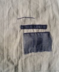
Gauze on the Superstructure
This shows the start of the work on the cotton twill which will form the basis for the hull and superstructure. I have used two layers of navy gauze where the shadows need to be darker and cut sections out of one of the layers where I want a lighter shade. The transferred outline – made using an iron-on transfer pencil – barely shows at all, and fades with age, so there is little risk of anything showing where it should not.
As the additional slip for the hull will cover the raw ends of the fabrics, I decided only to sew down firmly those elements that will be unprotected. I found that as I added embroidery and fabrics to my slips-in-preparation, they shrank – not something my books had ever mentioned, although it really should have occurred to me. That is why I ran the gauze down into the area which would be covered by the hull, although I only caught it down lightly. Although there will be padding under the hull, I was afraid that a strongly stitched line might show where it wasn’t wanted.
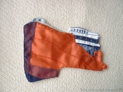
Camberwell Hull
It is hard to see what I’m aiming for in these photos of the work in progress, so in this picture I have overlaid the slip made for the hull on the cotton drill in approximately the correct place to show the general effect I hope to achieve.
It was at about this point that the project woke up and started talking to me.
Before you book my place in an asylum, let me explain: that’s how I describe the feeling of having a near-absolute certainty of what to do next or how to achieve the next stage. Some of my projects never really do wake up, but the Camberwell chattered incessantly for the next several months, even when I decided to undo and redo some elements. When I was in doubt, I found that if I could in some way lay out the choices, they became blindingly obvious as soon as they progressed from imagination to fabric.
That made the Camberwell enormous fun to work on!
The Camberwell Panel – Four
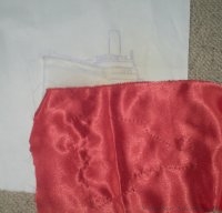
Cotton And Satin
This shows the cotton twill with the basic outline transferred to it for embroidering. I decided that the whole ship would be made on this cotton twill and then the twill applied to the background fabric over the sky and sea fabrics, with some padding to raise it. I checked with my client (my cousin, remember!) to be sure that she was happy with raised and padded appliqué, rather than wanted something very flat, and on receiving an intrigued and enthusiastic “Go for it” started planning what would be padded and by how much.
The photo also shows the satin that I chose for the hull, with the design, again, outlined in running stitches.
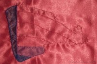
Progress on the hull
The next stage was to apply a layer of navy net and a layer of navy gauze to the satin where the hull was in shadow, and stitch over those edges in navy satin stitch. I built up several layers of net at the forefoot, with lines of stitching to add form.
Then I added a layer of tawny net to the light side of the hull to cloud the colour slightly and stitched along the main plating lines of the hull to help reveal the shape.
The next stage on this piece was to stitch over all the edges that will not be covered by other stitches and fabrics to ensure that no raw edges show. At various stages in the project I chose different stitches for this job, but in this particular case I used buttonhole stitch to make the edge crisp and clear.