
Category: General Embroidery
A Canvaswork Koala
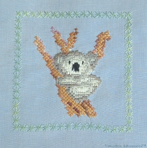
Canvaswork Koala
In fact this is worked on linen, but using canvaswork stitches. I was playing with some needlepoint charting software, in particular to find out how the stitches appeared on the chart and how easy it was to follow. I can’t remember where the Koala came from, whether he was originally in counted cross stitch or whether he was imported from a drawing. It is quite a simple design with relatively little modelling, and I’ve always been rather fond of it.
I used waste canvas to give me the stitch placement, and then simply worked the design according to the chart. The Koala himself is worked in straight stitches using stranded cotton, all six strands separated and made to lie side by side; the tree branch he is clinging to is worked in two shades of pearl cotton, using upright cross stitch (one of my favourites, as you know by now!), and the green frame of Algerian Eye stitches is worked in one of the Wildflowers threads from Caron Collection.
The embroidery has survived much better than the fabric it was stitched on. Originally I made a cushion cover, but the linen was already old before I started and now has holes in it. I’m going to do something with the Koala (suggestions please!) and then the rest will probably go into a rag rug…
Experiments in Woolwork
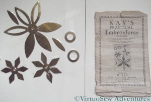
Kays Practical Embroiderer
EBay is a very dangerous place…
I bought several more copies of The Needlewoman magazine on eBay when I first discovered it (eBay, that is!), and some of those magazines mentioned “a new style of embroidery” using metal templates. It was called Kay’s Practical Embroiderer. Some time later, a set of the templates came up for sale. Furthermore, I won the auction, so I can now experiment!
Getting Started with Kay's Practical Embroiderer
The templates are mentioned in passing in the book Stitching For Victory (mentioned in my post about the teacloth that took three generations to complete), as a quick and easy method to create stylish embellishments using what was most readily available – darning wool.
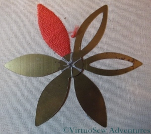
Of course, darning wool is almost impossible to find nowadays, but I have plenty of Paterna Persian yarn, so I am using that for this first experiment. It’s much fluffier and more springy than darning wool, so it won’t be exactly like the original, but I’m hoping it will give me some more ideas. It’s certainly making a huge change from the fine work I’ve been doing on the Spot Sampler!
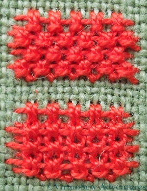
Snipping Away From the Template
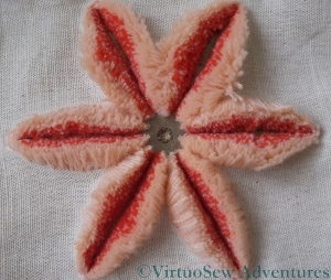
So here is the beginning of my experiment. The idea is that there are several layers of surface satin stitch worked over the metal template. I have to say that I would tend to quarrel with the idea of this being a quick technique. As I made progress and added each of the layers on to the petals, it became more and more difficult to to make the stitches. In fact, I made copious use of a needlgrabber (which did help, very much indeed), and frequently broke the thread. I wonder whether that might have been partly because darning wool would have been stronger and more tightly spun than the Persian yarn, and also, perhaps, because the darning wool would have been finer. The instructions say to use two strands of wool in each layer, and I’ve done so. I’m still wondering whether that was right, although I am rather afraid that if I were to use a single strand it might look a bit half-hearted.
Once the stitching is complete, you snip down the centreline of the shape (not easy, even with my very special sharp embroidery scissors), and end up with a raised, furry shape. Finish it off with a few lines of ordinary stitching, and you have a very textured, striking piece of work. The leaflet has a selection of suggested designs and ideas, and it will be interesting to see whether I can manage to devise ways to use the ideas in new ways.
Frolicking Teddies – Part One
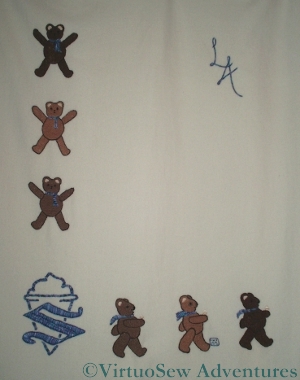
Frolicking Teddies
The “Frolicking Teddies” were created in response to a commission to produce an heirloom Cot Blanket for a much-anticipated first grandchild. In the initial stages of planning, the child’s sex had not been determined, so we planned a gender-neutral design of Teddies. I was also asked to include the logo of the family ice cream business, so in the end settled on a story of exuberant, star-jumping teddies down one side, with the logo in the lower left corner, and a procession of teddies with ice-cream cones in their hands (sorry, paws!) walking from left to right.
Once the child’s gender and name became known, I chose the colour for the logo and embellishments, and then added his initials in the top right hand corner. The initials gave me some concern, in fact. I usually use Portuguese Knotted Stem Stitch when I want a heavy line, but when I’d completed the Teddies and the logo, I felt that that would create too heavy an effect in the top right hand corner. I settled on Heavy Chain stitch, which produces a smooth, strong line, but doesn’t have quite the overbearing personality of the Portuguese Knotted Stem Stitch.
Since the commission was explicitly for an heirloom, I used cashmere blanketing as the base fabric. Fortunately, since it’s not easy to get in the UK, we were visiting my husband’s family in Australia at the time I was sourcing the materials. It’s really a lovely fabric to work with, and I still have some left, awaiting further inspiration. Or another commission!
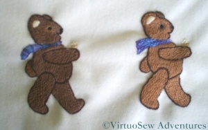
Two Teddies in Procession
The teddies are worked in long and short stitch using Paterna Persian wool. The only challenge there was the tension of the stitches, since it was especially important not to pucker the fabric. At the same time, I didn’t want the stitches to be too loose and snag on anything…
The ice cream cones were worked in stranded cotton, and the logo, initials, and the Teddies’ scarves were all worked in a standard variegated pearl cotton. Each scarf is worked in several rows of a different line stitch – stem, chain, Portuguese knotted chain, and so on. This was a way for my passion for stitches to inform and adjust the design, while remaining closely within the brief.
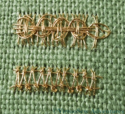
Tudor and Stuart Goldwork Masterclass – Month Twelve Goldwork Stitches
The two stitches this month are stitches I think I have seen used as needle-lace stitches, but whereas I’m most used to seeing variants of Blanket Stitch used in needle-lace, these are worked using Up-and-Down Blanket Stitch.
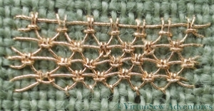
Up And Down Blanket Stitch - Alternating
As it happens, the Up-and-Down variant is one of my favourite stitches, so I sat down rather gleefully to have a go. This is the first of the variations, Alternating Up-and-Down Blanket Stitch, which produce a rather open, netlike appearance on my practice cloth, not much resembling the example in the instructions.
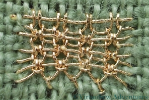
Up And Down Blanket Stitch With Return
The second stitch was Up And Down Blanket Stitch With Return. In this case the seconfd row of stitches goes into the tie of the Up And Down Blanket Stitch, creating a ribbed effect something like the welts on a sweater. It also rather conceals that same distinctive tie stitch, rather camouflaging the stitch that forms its basis. I’m very impressed that Tricia managed to “reverse-engineer” these stitches, as some of them are rather less than clear to work out!
Both Stitches In Pearl Cotton
Naturally, my practise cloth version in the gold thread suffers from the problems of scale I’ve already discussed, but as well as that I find when I look at the photographs that in a couple of cases I have done a pair of buttonhole stitches instead of an Up-and-Down Blanket Stitch. I defy anyone to work that out at the normal scale of these stitches, but I’m actually quite surprised that I didn’t notice at the time, since the short loop at the base of up-and-down buttonhole stitch does tend to twist when worked as a needle-lace stitch instead of a fabric stitch!
These versions worked in pearl cotton show much more clearly the heavily textured fabric that these stitches form when worked at the correct scale.
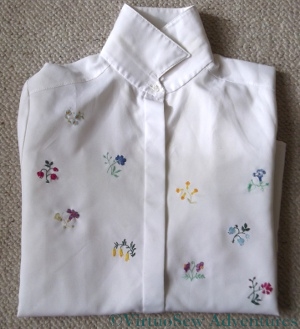
Close Ups on the Flowered Blouse – Part Two
Flower 6 - Close Up
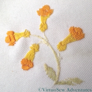
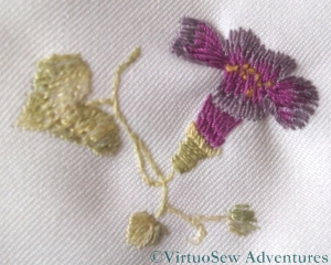
Here is the second installment of close-ups of the Flowered Blouse embroidery. I’ve noticed in picking out the Needlewoman magazine that the transfers came in that the colours I have used bear absolutely no resemblance to those suggested. For instance, flower 6, here on the left, is named as “Lobelia”, and a quick search suggests that real lobelias are bluey-purple!

Flower 7 - Close up
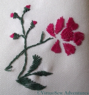
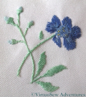
Flower 7, here on the right, is the same as Flower 2, but in different colours, and in fact stitched more openly. It is described as a Convolvulus in the the magazine.
Flower 8 - Close up
The Flower 8 is the same as Flower 3. This time I used the same stem colours, again to help maintain a certain unity. They are supposed to be Globe flowers.
Flower 9 - Close up
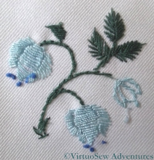
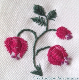
Flower 9 is the same pattern as flower 5, and I think is supposed to be a Peony. I distinctly remember finding this one troublesome to stitch – partly, I think, because of the size of some of the stitches, and partly because I couldn’t make sense of the flower as depicted in the transfer. Nowadays, of course, I would go and find a peony, and stare at it until it made sense, but that method had not occurred to me at the time!
Flower 10 - Close up
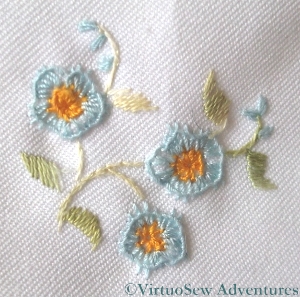
Flower 10 is described as a Wood Anenome. Like Flower 4 (Forget-me-nots) it shows the edge of the blanket stitch curling in, rather than staying flat, but I am glad to see that at least the French knots loook better than I expected. I have always had trouble with French knots…
The magazine suggests a variety of uses for these transfers, including a “delightful party frock” for a little girl, a “dainty bed jacket”, and embellishment on a “puff handkerchief” which is an accessory I’ve never heard of before. For once the internet has not been my friend, although the drawing suggests some sort of combination of a powder-puff and a handkerchief that I strongly suspect would be nothing like as practical as the “two-tools-in-one” brigade would have us believe!
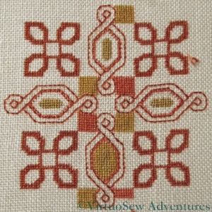
Tudor Pincushion Progress
Tudor Pincushion Silkwork Finished!
Finally, I have finished the silkwork on the Tudor Pincushion, which is part of the Tudor and Stuart Goldwork Masterclass course I am following.
I think I need to find something that is less fine stitching than this, to give me a rest from all these tiny stitches!
Still, you can see that the final pattern is simple enough in concept, and there is just enough subtle variation in the colours to make the design interesting. The final effect is almost one of a woven fabric, as though the goldwork were embellishing a genuine tapestry. Remember that a real tapestry is woven (the Gobelins ateliers in France are the best known, historically, although a lot of tapestries I’ve seen have been from the Netherlands). A real tapestry is not worked in tent stitch on canvas, whatever the kit manufacturer says, and the Bayeux Tapestry is in fact an embroidery!
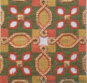
First Stage of Goldwork
I’ve also begun to work on the goldwork stitches. The small gold spots are worked in Eight Legged Spider’s Web Stitch which I first encountered in Month Four, and which is a great trial at the size it needs to be on the pincushion. I’ve not quite persuaded myself that I need to restitch them, as they didn’t markedly improve over the four I’ve done, but I am certainly considering the possibility.
The channels between the back stitches are filled with Reverse Chain Stitch, which I first encountered at the very beginning of the goldwork section of the course. This is an easy stitch to do, and very satisfying to see it build.
The course materials have included two Japanese hand made needles, which I was hoping to experiment with at this point, but I can’t even thread them! The eyes are much too fine for the thread, which is awkward, since I may be wasting quite a bit of gold thread unnecessarily because my ordinary needles strip the gold from its core.
There has to be a better way…
Close-ups on the Flowered Blouse – Part One
Flower 1 - Close up
You may recall, not so long ago, a post that I wrote about a blouse embroidered some years ago, during a particularly impoverished period in my life. Here are the promised close-ups of the floral motifs.
Or at least some of them. When the connection started slowing when I put all ten in one post (before I even started to add any text!), I decided to split them up. I’m hoping to put five per post and just write two posts…
Flower 2 - Close Up
I’m no botanist, and if I am honest, I suspect the original designer wasn’t either. The various pictures and descriptions in the magazine did not suggest a slavish adherence to the natural colours of the flowers – even supposing one could be sure of their likely species!
Flower 3 - Close Up
The polyester was not an easy fabric to embroider, and frankly the blouse wasn’t worth the effort I put into it, being a lot like a cheap school or office uniform blouse, but as I said in the original post, I didn’t really have a choice at the time. That said, I do still wear it, not without pleasure, so there is something to be said for all that effort, perhaps.
Flower 4 - Close Up
The stitches used were very simple ones, for the most part – satin stitch, fishbone stitch, stem stitch, blanket stitch, and the occasional French knot. The close ups show that the blanket stitch refused to settle properly and the spine of the stitch has rolled inwards from the edge, but that may simply be the result of years of wear and tear. The blouse goes in the washing machine when it needs a wash – inside a pillow case or lingerie bag, admittedly, but I don’t hand wash it.
Flower 5 - Close Up
When I was choosing the colours and the stitches was more concerned to balance the colours across the front of the blouse than to create accurate depictions of plants, but for all that, there are some motifs more reminiscent of the real thing than others!
A flowered blouse
Blouse embroidered with flower sprigs
As Spring shows her head after the chill of Winter, I am beginning to fish out clothes other than bulky winter woollies. This is a simple polyester blouse I embroidered some years ago when I had time, an itch to embroider, but absolutely no money to buy fabric.
I used a Free Transfer from The Needlewoman of January 1934 (from the boxful that Grandmama gave me), showing sprigs of flowers which they suggested might be used for lavender bags, traycloths, handkerchiefs, or underwear (if only I had the time and skill to make lovely silk embroidered undies!). The silk threads came from my stash (even fifteen years ago my stash was extensive and varied!), and in fact I think the whole idea of the project was that I wanted to use those threads in particular.
I’m not really a “floral”-type person, or at least the florals I stitch tend to be quite heavily stylised, and I’m also not someone who likes perfect symmetry. So I snipped out some elements from the transfer and arranged them irregularly on the front of the blouse. Once they were transferred, I arranged the threads, so each colour appears on each side of the button placket, but not on the same flower sprig.
I will provide close ups in another post, when I have worked out how to format them!
Tudor and Stuart Master Class – Month Eleven
Month 11 Goldwork Stitches
So while I continue with the silkwork for the Spot Sampler and the Tudor Pincushion, here are the two new stitches for Month 11 of the course.
The two stitches are Guilloche on Ladder Stitch, and Hemstitch on Ladder Stitch. In both cases I have cheated and just worked a panel of straight stitch bars as the foundation. This is because I wanted to get a firm grip on the structure of the stitch, rather than spending my time on working the foundation.
As the stitches become more multi-phase and more complex, the green doodle cloth is becoming a less suitable foundation. While it makes things easier by making the stitches larger when using the counted diagrams for them, it also makes things more difficult by making the stitches larger! I find that I am having difficulty in getting tension and stitch length neat and correct – in fact, you can probably see that from the rather floppy loops on the Guilloche Stitch Of course when I come to work on the real fabric using the real gold and silver threads, this problem should be much reduced, but I think I will find myself using a stiletto or a laying tool to try to keep the thread under rather closer control, even so.
Tudor And Stuart Masterclass – Pincushion Progress
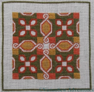
Tudor Pincushion Progress
So here is the progress on the Tudor Pincushion.
There are two close shades of red and two close shades of tan in the design, – this will increase the appearance of rich, subtle colour variation in the final piece, which will provide a gorgeous background for the gold and silver threads. It also means that I have to be super-organised with my thread. As soon as I cut a length, it is wound onto a card with the thread number written on it, because even my daylight lamp sometimes isn’t enough to help distinguish the colours.
I’ve miscounted and had to restitch the corner motifs in a couple of places, but that is probably because, first, it is a very fine count of fabric, and second, tent stitch is an oriented stitch.
Tent Stitch - demonstrating edges with the orientation and against it
That is, because it creates a diagonal stitch, diagonal elements of the design look different when stitched, depending upon whether they slant with the stitch or in the opposite direction. This doesn’t cause a problem once the piece is finished – especially given how small the stitches are! – but it does mean that it isn’t so easy to know at a glance whether details are right. When the details are wrong, it becomes clear that they are wrong just as soon as you stop stitching, and then it becomes a matter of how much or how little needs to be unpicked.
Of course, I suppose I could interpret (probably correctly!) that as a sign that I’ve been stitching for too long and my eyes are tired…