
Category: General Embroidery
Tudor and Stuart Masterclass – Month Seventeen
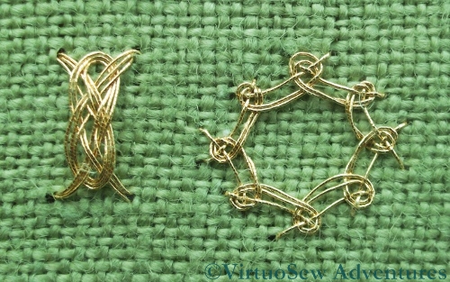
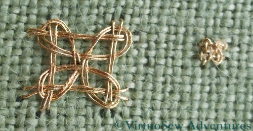
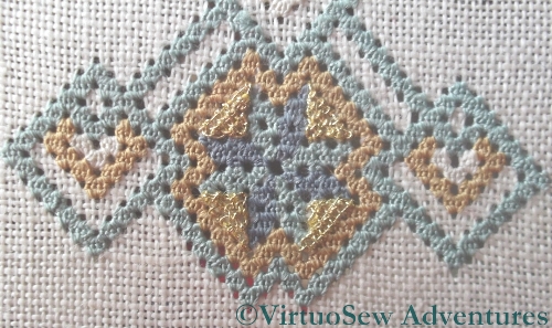
Eight Sided Interlacing And Josephina Knot
Month Seventeen’s stitches were Eight Sided Interlacing Stitch, and the Josephina Knot. I rather enjoyed them, too – they’re both very ornamental indeed!
The Eight Sided Stitch is less scary than you might expect on first sight, although I was slightly surprised to realise that the foundation layer interlaced in the direction contrary to the one I expected.
It will be more exciting at the smaller size on the real sampler, but I feel that I understand the structure, at least, and that is the important point, at this stage.
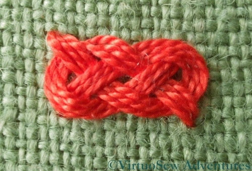
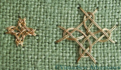
Josephina Knot in Pearl Cotton
However, if you look at the gold Josephina Knot in the top picture, you will see that I didn’t quite get the hang of that one…
This pearl cotton version shows what I was aiming for. It’s a really lovely ornamental spot stitch, with a slightly Celtic feel to it. However, if the interlacing goes wrong at any point during the working, it is very hard to recover – and not always easy to see before you’ve finished, either.
I made extensive use, for these stitches, of a belated birthday present from Elmsley Rose – a set of bone needlework awls/stilettos. I have a steel laying tool, but it’s so sharp that it’s not a good tool for coaxing threads into place. My birthday presents were just perfect – Thank You, Megan!
Tudor and Stuart Goldwork Masterclass – Bonus Instructions
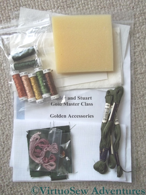
Golden Accessories Kit
There was a set of Bonus Instructions in the instructions for Month Fifteen, from a teaching project that Tricia had retired from use. She was asked whether she’d produce kits of the materials for those of us who don’t have easy (or even difficult!) access to a really good needlework shop. Yet again, apparently, demand outstripped her expectations (a good problem to have!), and here is my kit.
It includes finishing materials for the various accessories, as well as the fabric and the silk thread, but not the metal thread, since all of us already have large spools of that from doing the main Spot Sampler.
My intention is to finish these to add to that planned “winter decoration corner” I’ve mentioned a couple of times. I’ve found some masks which I’m going to decorate in silver and gold, and I will use some metallic gauze or something similar for the background. Already the two Needlework Nibbles, the Floral Glove Needlecase and the Tudor Pincushion look like they will create some wonderful reflective textures for a dark corner…
Tudor and Stuart Masterclass – Beginning the Petite Pincushion
Starting The Petite Pincushion
There were two additional projects included in the Tudor and Stuart Goldwork Masterclass, to provide further opportunities to use some of the stitches we are learning. The Tudor Pincushion was one, and this “Petite Pincushion” is the second. The materials include a piece of silk brocade for the backing, some gold cord to provide an ornamental edge, and more spools of assorted metal threads for the goldwork stitches.
Whereas the silk stitchery for the Tudor Pincushion was in primarily in Tent Stitch, most of the silk work on the Petite Pincushion is in Queen Stitches. I’ve not done any since I finished the silkwork on the sampler, and I am finding that I am having to remind myself to pull them tight to create the openwork effect. I will have to remember to line the embroidered side of the pincushion or the stuffing will poke out through the gaps!
I stitched centre lines on the fabric, but as you can see, once I had the first stitch placed I snipped out the middle stitches and pulled them back out of the way.
I’ve already finished with two of the silk colours, which appear only in the central starburst. Now I just have to do rows of strapwork in the other two colours, as well as the four blocks of tent stitches that provide a basis for a rather intriguing-looking interwoven stitch which will probably be nearly the last element I add.
Tudor Pincushion Finished
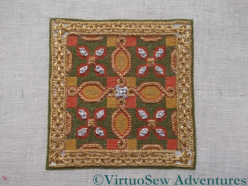
Tudor Pincushion Final Stitch In Place
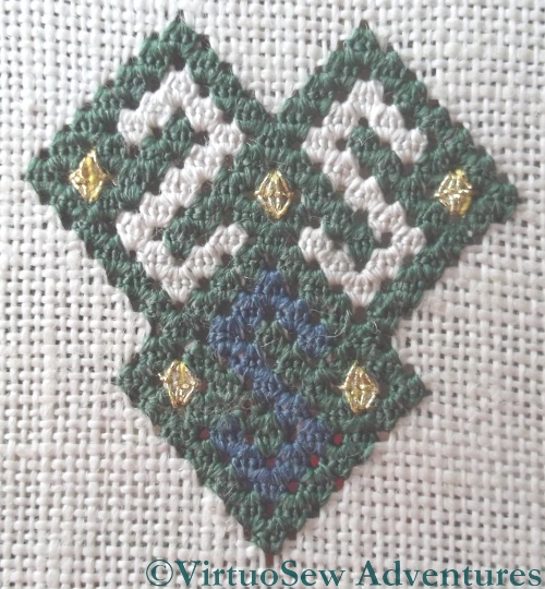
The final stitch in the Tudor Pincushion was the central boss in Four Sided Interlacing Stitch, which slotted nicely into place after I received the instructions for Month 16.
I decided – after staring at it intermittently while I’ve waited for the stitch to turn up – that I was happy enough with the border and did not need to unpick it. So the next phase was to attach the silk backing and stuff the pincushion.
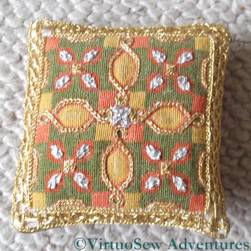
Finished Tudor Pincushion
I’ve tried not to over-stuff it, since I intend to use it as a decoration and not as a pincushion, but I still found myself pushing more stuffing in than I expected. Unlike the Tulip Slip Pincushion, where the velvet was so tough that I used a sewing machine, this one is finished entirely by hand, and stuffed enough to look plump and fat, but not so much that the fabric is strained.
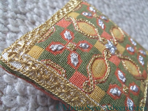
Close Up Of Pincushion
I’m finding with Tricia’s various pieces that photographing them from an angle sometimes produces a much clearer view of the stitching. There is certainly less likelihood of “glare” from the metal threads. Besides, after all that effort, I’m more than happy to show off a little…!
Cause for Alarm
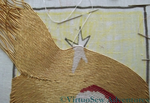
The Star That Rose In The East
I’m pleased with the progress I’m making on the panel now, but I’m becoming slightly anxious that I might run out of the gold thread before I finish the panel. I don’t know how thick the core is at the centre of the spool, and I’ve noticed that the kinks in the gold thread are getting tighter and more stubborn. If I do run out, that will put paid to the idea of photographing the finished piece for this year’s Christmas card.
You can see from this shot that the extra thickness of the silk thread forming the star is creating an extra curve in the lines of gold. If I were working a classical piece of or nué, with straight lines of gold, I would be trying to space the lines to reduce the effect, or I would have chosen a finer silk thread, with the same aim. In this case, however, I am quite happy to add an extra couple of curves to the gold lines, because it will add life and movement to the background.
If I have enough gold thread, I will rework the corner that is infilling that triangle on the left-hand side. I don’t think that the bends in the thread work as well as they might, and they are revealing the core more than I like. I need to finish the rest of the panel first, though.
More Progress on the Elephant of Infinite Charm
I don’t work on the Christus Natus Est panel in the evenings, so I have been making progress on the Elephant of No Distinction But Infinite Charm. Slowly, because he has been proving obstreperous!
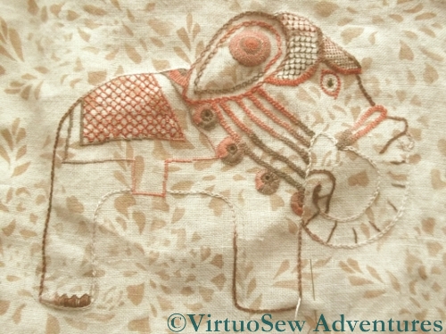
Progress on the Elephant of Infinite Charm
I’ve added a second row of cable chain stitch around his ear, and worked a single large roundel of spiral trellis stitch to embellish it. The spiral trellis is a very thread-hungry stitch – I think it used four or maybe five lengths, but it was well worth it. I was careful to bring the new end of the thread in using the end that the previous thread had just finished on, so that the blocks of colour in the variegated thread flowed smoothly rather than jumping about.
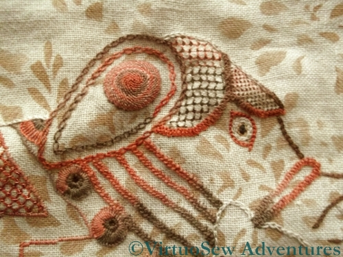
The Headcloth of the Elephant of Infinite Charm
You can see in the close up that I’ve used a pulled-work stitch for the Elephant’s Headcloth. I’m not sure which scale I prefer so I may just leave it as it stands. I wanted those sections to be covered, rather than open, but not completely solid. I think it’s pretty successful, but I intend to stare at him for a little while now, while I try to work out how I am going to work the anklets on his legs.
Tudor and Stuart Goldwork Masterclass – Spot Sampler Progress
Heavy Chain Stitch
I’m only adding a few stitches at a time to the Spot Sampler, partly because I want to take my time, and partly because I’m rather keen on the Christus Natus Est panel at the moment and seem to spend most of my daylight stitching time on that.
I was a little disappointed with this Heavy Chain Stitch when I worked it, because it seemed rather thin and attenuated. I tried using my laying tool to keep the loops open and reduce the abrasion of the yarn, but since the laying tool is a sharply-pointed piece of metal, it presented its own hazards. I might work the other leaf of this pair in the other thread to see whether it creates a different effect.
More On The Sampler
The two stitches shown here are the Up and Down Buttonhole Stitch variations. In the alternating variation, I realise now I look at the close up, I forgot to include the “return” or straight stitch across at each level. Yet another stitch to re-do in the margins!
The bar at the top is Diagonal Half Guilloche Stitch, and it looks much tidier at the proper size, rather than in close-up!
Tudor and Stuart Goldwork Masterclass – Month Sixteen
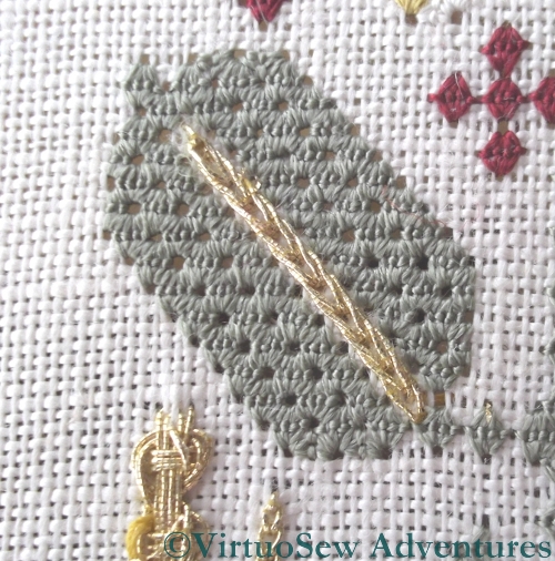
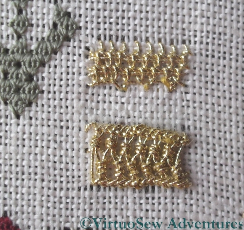
Four Sided Interlacing Stitch
The stitches for Month Sixteen are stitches that create prominent large “spots” of intricate pattern. They are simple enough in concept – there is a foundation of straight stitches, and an interlaced pattern worked around the foundation. Naturally, the actual working of the stitch proves to be less than entirely straightforward. I try to vary the scale of the stitches I work on my practice cloth, but in the case of Four Sided Interlacing Stitch when I was trying to work it as a counted stitch, the only variations I could create successfully were “Huge” and “Tiny”. At the smaller scale shown there is really little point in using an interlacing stitch like this, and one might more sensibly choose something a little simpler to work. At the large size, the effect of the metal thread is diluted by the background fabric.
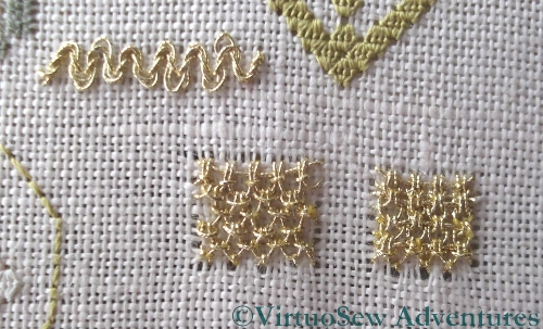
Diagonal Four Sided Interlacing Stitch
In the case of Diagonal Four Sided Interlacing Stitch my two different scales worked slightly better.
I know, by the way, that in the case of one of these stitches, I made a mistake in the foundation layer which lead to a further mistake in the interlacing. I can’t find it now, and I’m going to be intrigued to see how often I get these stitches right, when I start working them on the sampler itself!
Tudor and Stuart Goldwork Masterclass – more gold added
Detached Buttonhole with Return, and ZigZag on Ladder Stitch
I’ve been persevering with adding the goldwork stitches to the Spot Sampler. Tricia set up a Yahoo Group for the course so that we could help each other out, and I posted some of my headaches to that.
I received a good many helpful suggestions, and on top of that, Tricia posted a very long response on the Question and Answer blog, which included the reassuring detail that when she’s reverse-engineering the stitches, she uses the point at which the thread sheds to help her determine whether she is really doing the stitch that she’s trying to. Some shredding is to be expected, then…
Gold Queen Stitches Added
I think I’m doing better now, as I am finding there is rather less shredding (although there is still some). I suspect my tension is sometimes too tight, and Tricia has suggest that my Ladder Stitch in particular could do with being loosened up a little. Having the tension too tight will abrade the thread further as I make each stitch.
Gold Detached Buttonhole with Return
The detached buttonhole with return that forms the first embellishment on the large pattern at the bottom of the sampler was rather a surprise. It’s more raised than the photo of Tricia’s finished piece suggests, and I got into a tangle working it, although that is because the position of the stitches on the frame were not as comfortable to work from some angles as others. I find myself wondering how RSN needlewomen manage with those large slate frames!
Published!
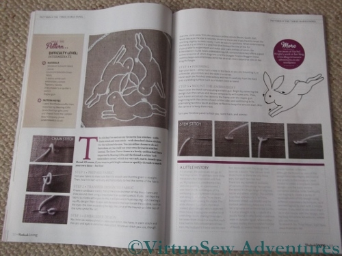
Article In Handmade Living
Some time ago I worked on a project I couldn’t tell you about, and this is it. There’s a new magazine in the UK – I think this one is issue 4 – which is called “Handmade Living”. It covers a huge variety of subjects, from knitting and embroidery to handmade soap and natural skincare. In order to bring all these subjects together, the editorial team have themes in mind for each issue, and when I suggested a few ideas to the editor, she thought that The Three Hares would fit nicely in the “Folk” theme. The Three Hares is a very old design, so she was absolutely right. It’s appeared all along the Silk Route…
I chose to use several of my favorite stitches, and worked the design as simply as possible. I’ve had a few ideas about using the design to experiment with some of the embroidery and needlework styles I’ve not played with yet – there are plenty of them, after all! – and it seemed sensible to start with a simple technique.
And by the way, if you’ve come to visit my blog after reading the magazine – Welcome! I hope you enjoy what you read…