
Tag: Assembly
Violets in place
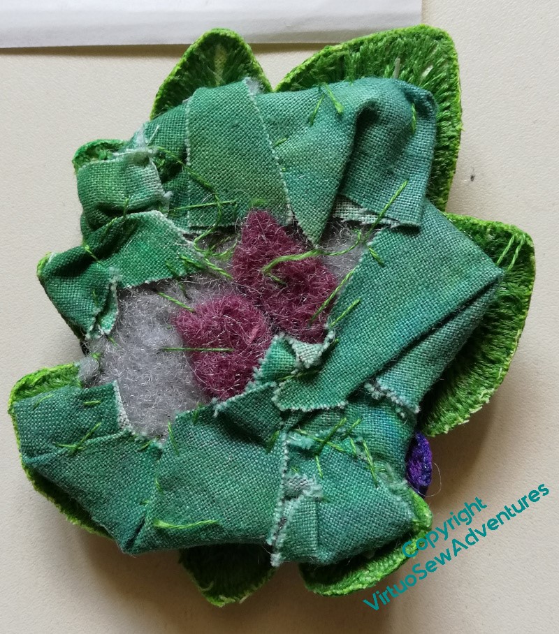
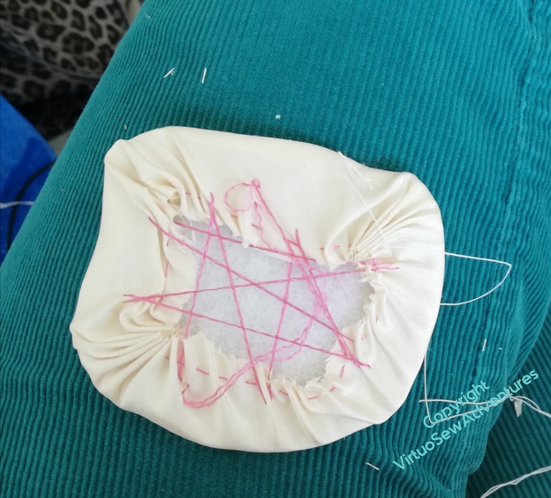
When I looked again at the back of the Clump, or Mat, of violets, it became clear to me why it hadn’t followed the contours of the little pot I’d made. The padding is much too broad, and much too inflexible. It was a sensible choice to do this when I was planning to include the Violets among the spots on the main panels, but when I began to look at assembling them, the Violets and the Daisy Beads drew closer together and started to look somewhat askance at the rest of what I planned.
I began to undo the padding, and found the whole mat disintegrating on me (not really a surprise), so I went back to the beginning. I made another piece of painted calico, redesigned the pattern of my Mat, pierced holes in the new calico and began to reassemble the whole thing, with only one small piece of felt to pad it, and some extra stitching to entangle the “legs” of my petals and leaves.
I had forgotten how many extra fingers and hands that process had required the first time around.
I got there in the end, I think we can say!
Reassured and making progress
After gazing long and hard at my layout, I decided that I wasn’t likely to improve it and that the thing to do was to just get started.
I’m determined to get to grips with Grandmama’s curved needles, and this is a perfect occasion to do so, because it’s so very hard to manipulate a straight needle to do what you want that even a curved needle feels like it is helping!
Grandmama’s set included three sizes, and I’m using the smallest, which is marked “lampshade”. I’ve always wrestled with a straight needle for lampshades, so who knows, this skill may prove transferable!
I’m using ladder stitch, or at least, something very like ladder stitch, and I’m beginning to feel that the curved needle genuinely does help me to make progress.
This is also the point at which I am made most aware that developing these panels into individual pieces that I work on separately has made it possible to achieve what I want. The panels aren’t huge (Placidus, when I get to him, will be much bigger), but if they were already attached to the Map or the Excavation, it would be nearly impossible to reach some of the angles I want to.
I’ve found it easiest to work on stitch lines facing away from me, and while this hasn’t been entirely straightforward in all cases, it would be altogether impossible if the turquoise panels were already attached to the sandy ones.
Especially the short ones, where I would find myself leaning over the entire height of the Map or Excavation!
I do have some concerns that the linen will sag under the weight of the Spots, so I’ve set these aside for a couple of weeks, upright, to see whether I need to gather in any Unfortunate Happenings.
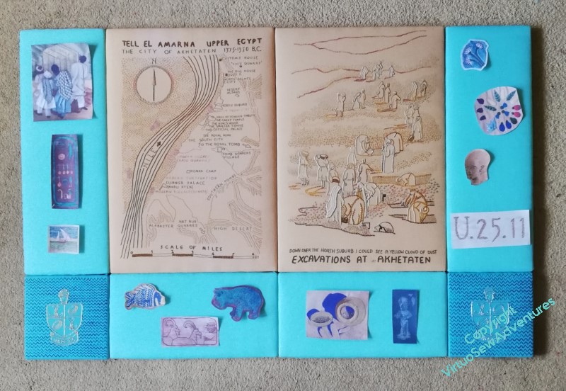
Spots laid out for attachment
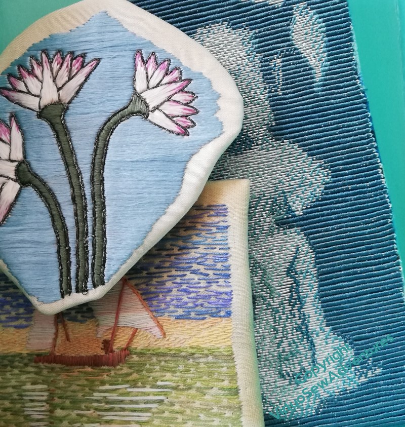
If you compare these two pictures, you will see what I meant by saying the embroideries had personality that the photocopies lack!
Some of it may be down to better lighting, but I think even the Map and the Excavation are looking brighter and happier.
So now they are back in their box, ready to come out one at a time to be attached to the border panels.
The details of that attachment may require some wrangling, and as for the details of attaching the panels to one another – I’m still very unsure about how that will happen. At the moment my best guess is mirror plates, but if anyone has a better idea I would love to hear it!
More spots prepared
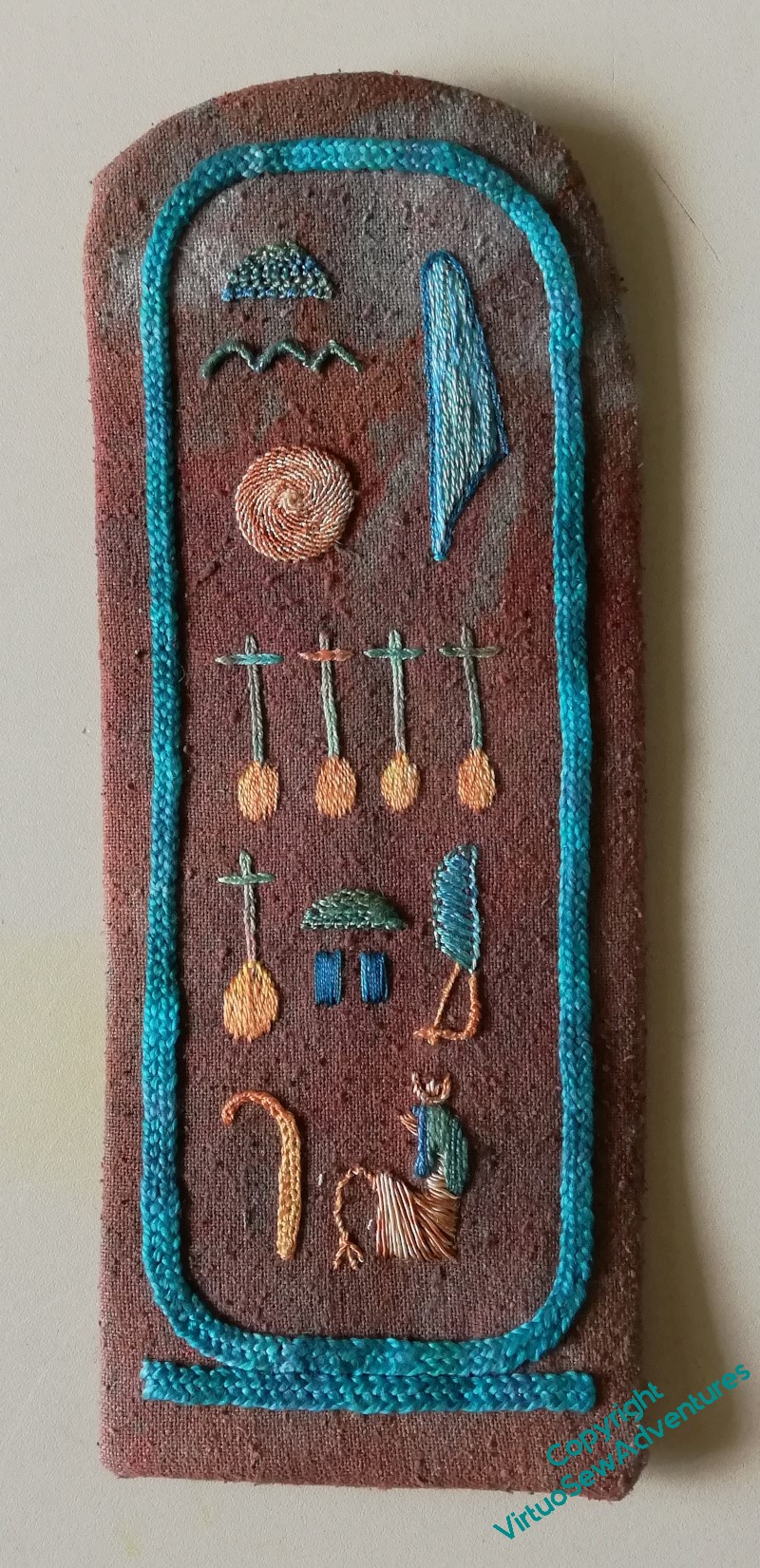
Originally the Cartouche was going to be rectangular, but as I started to cut the pelmet vilene I’m mounting the spots on, it began speaking to me very firmly.
Long term readers know that this sometimes happens to me, and I have learnt over the years that the sensible thing to do is listen. My projects almost always know better than I what they need to thrive.
In this case, I was informed that I should make the cartouche mounting echo the curves at the top while keeping the square edges at the bottom. It wasn’t easy to do – that silk noil fabric has a way of misbehaving that would make Robin Goodfellow whistle admiringly! – but now it is done, I’m inclined to agree.
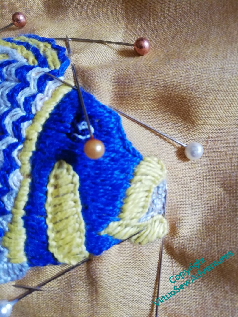
The next spot I tackled was if anything an even greater challenge – a fiddly shape (really fiddly!), in quite a light fabric, which didn’t always respond as I expected.
You can see here just how be-pinned and be-poked the poor Tilapia became! There was much clipping and snipping, muttering and tugging, before I produced something that looked at all pleasing. Maybe that’s just to remind me of the reason I did him – hearing a modern glass artist saying that he’d tried to recreate the ancient glass vessel and found it really difficult – to such an extent that even with much practice, he couldn’t expect every fish to go swimmingly (as it were…!).
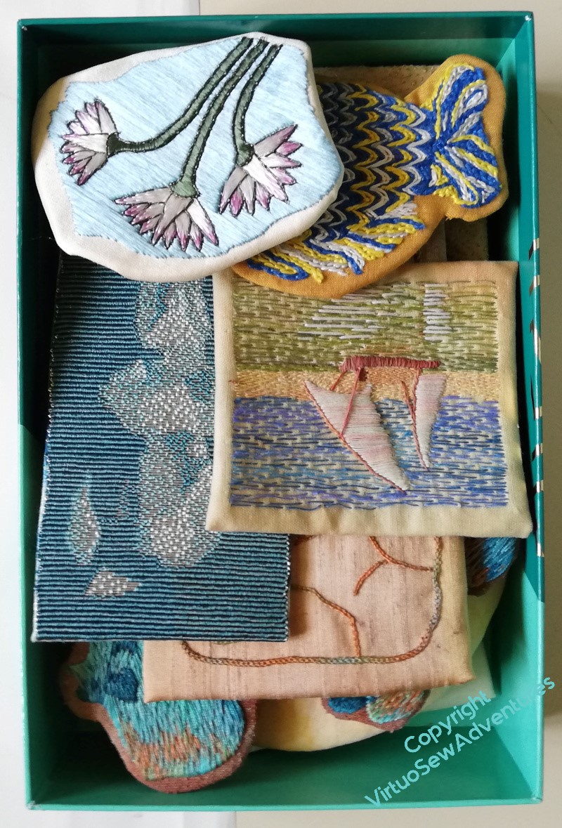
So, after much cutting and stitching, tugging and thinking, I’ve mounted all the Spots around shaped pieces of pelmet vilene, ready to be attached (somehow!) to the main colour block panels of the two main Amarna pieces.
Gratifyingly, they all have much more vivid personalities than the photocopies I’ve been using to plan their placement, so I think that will genuinely work. Thank goodness!
In the meantime, I’ve got them piled up in a box, all shouting at once that they consider themselves Absolutely Splendid, and will I please Get On With It…!
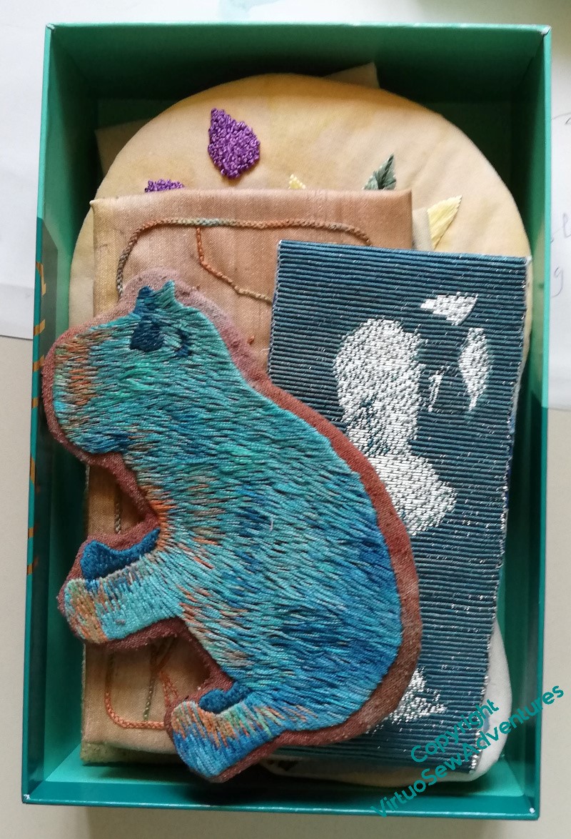
Preparing the “Spots”
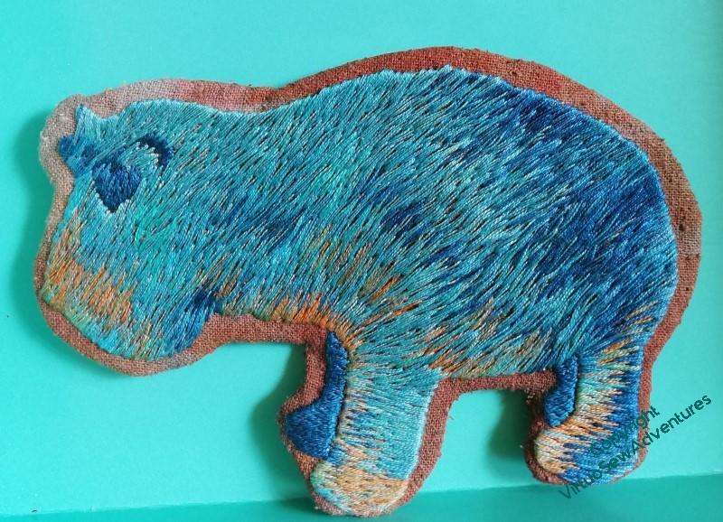
Once I had some sense that I knew which blocks went where, and what shape I wanted them to be, I could begin to mount them. Some of them will be distinctly tricky, such as the Lotus Tile Fragments, the Nile Tilapia, and (especially), the Faience Hippopotamus.
Since I also picked up a shoulder injury, all this was slowed down by the necessity to do little bits at a time, rather than a whole orgy of concentration.
I worked on the Lotus Tile Fragment while I was stewarding an exhibition that some of my paintings were in. It’s a good idea to have something to do that’s small and easy to put down for that sort of occasion. It’s not a great look to loom at people who’ve come to stroll around, but equally, sitting, hands folded, demure and silent, might also put them off. Looking up with a friendly grin and then returning to something that’s plainly small and interruptible is a useful position between those extremes. ( I sold a painting, too!)
I had a very useful, and suitably faience coloured little box to hand in which all the pieces, so far, have fit rather neatly, keeping them dust-free and untangled.
It’s remarkably satisfying to see them all stacking up, and I have had an idea about details of display in the eventual, hoped-for, exhibition: I could do “record cards” for each piece in the style of something recorded from an excavation, thus providing information, but maintaining the theme.
So now, the question is – what information should I include?
More Experiments with a Parlour Dome
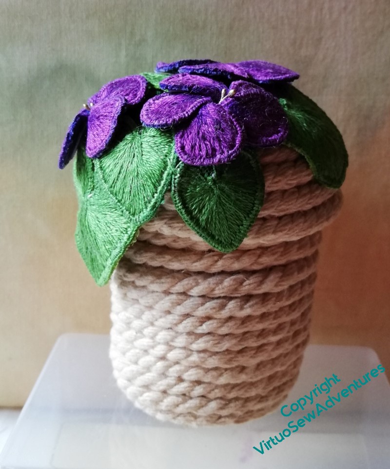
Once I had put together my coiled pot of cord, and, at the very least, I could feel I had something to play with, I had a look at how to assemble the parlour dome display.
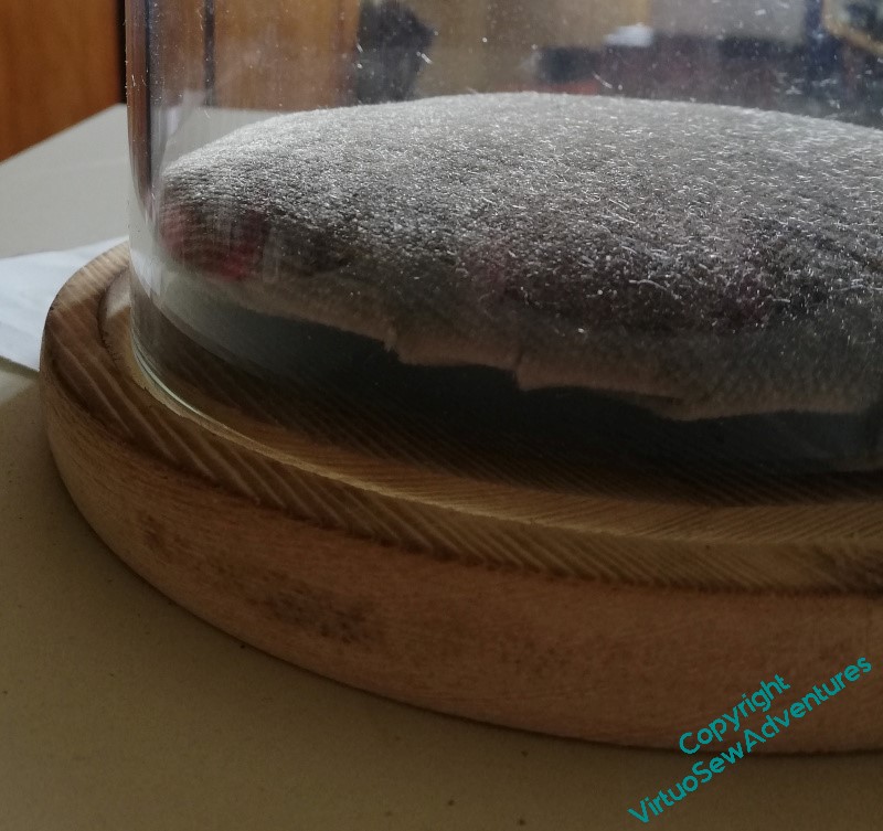
I intended to set the pot upon a little velvet cushion; that will give the sense of something “presented” rather than simply stashed away from the dust. Furthermore, I had some cotton velvet in a sort of inderminate brown, taken off a piano stool, which I thought would combine being unobtrusive with being sufficiently present. However, my first attempt to stretch the velvet over the padded card has left me with something that sticks a bit, and raises the card (and thus anything on it) rather further than I anticipated. More thought needed here, I feel.
While that thinking continued, I thought I might as well play with the whole display, to find any other difficulties so that I could think about those as well.
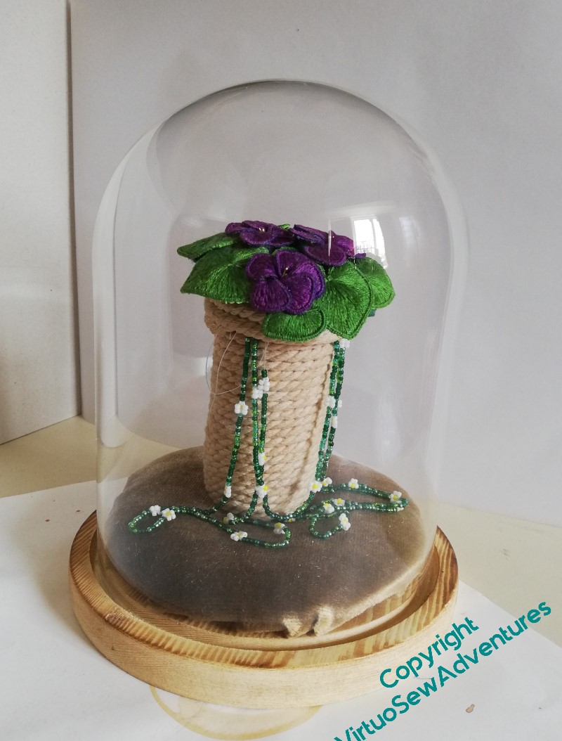
The tea-dyeing has worked, I think: the daisy beads stand out nicely, but it’s not the sort of high contrast that would overwhelm them.
And I think the beads flowing out of the pot and down onto the velvet work as well. The textures and scales seem to be properly in tune with one another.
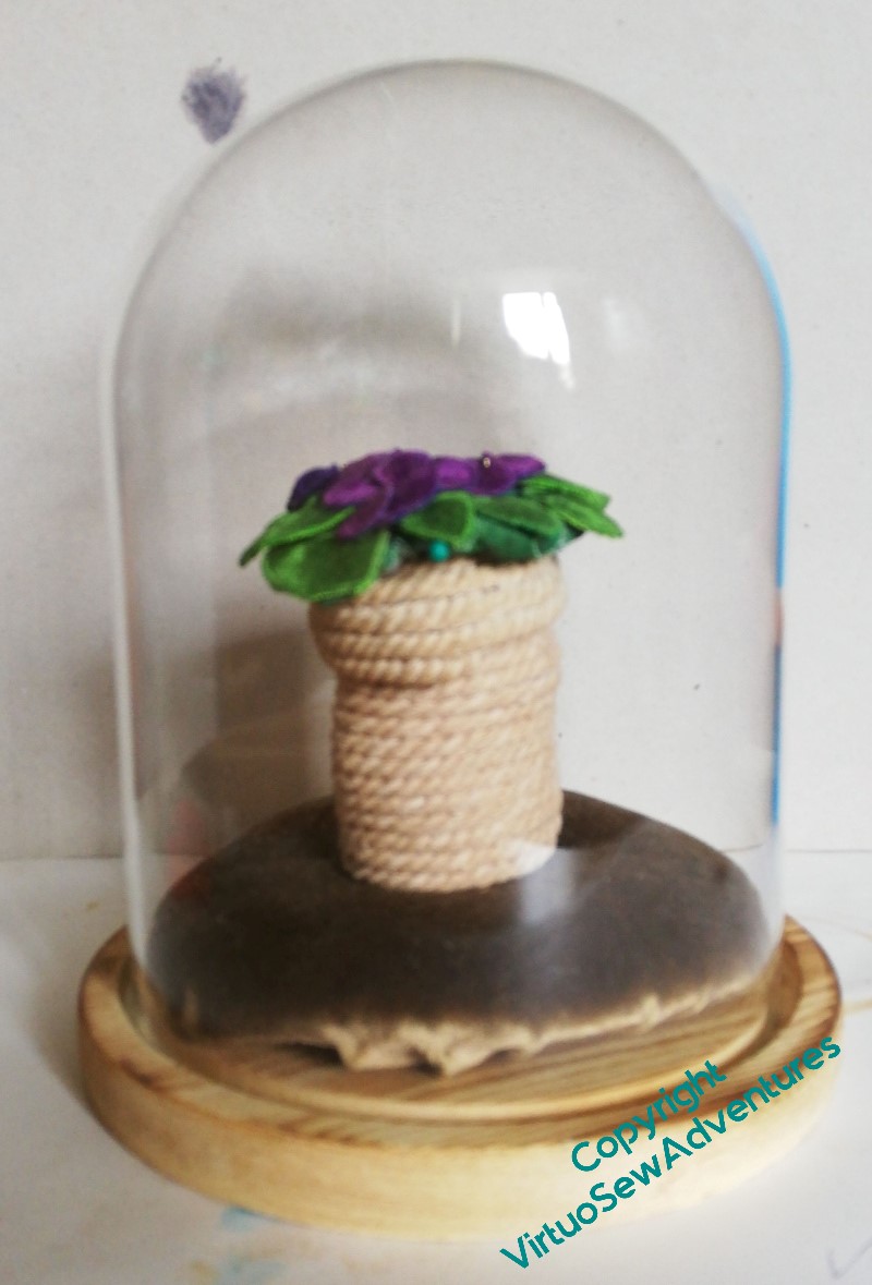
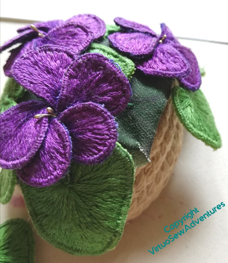
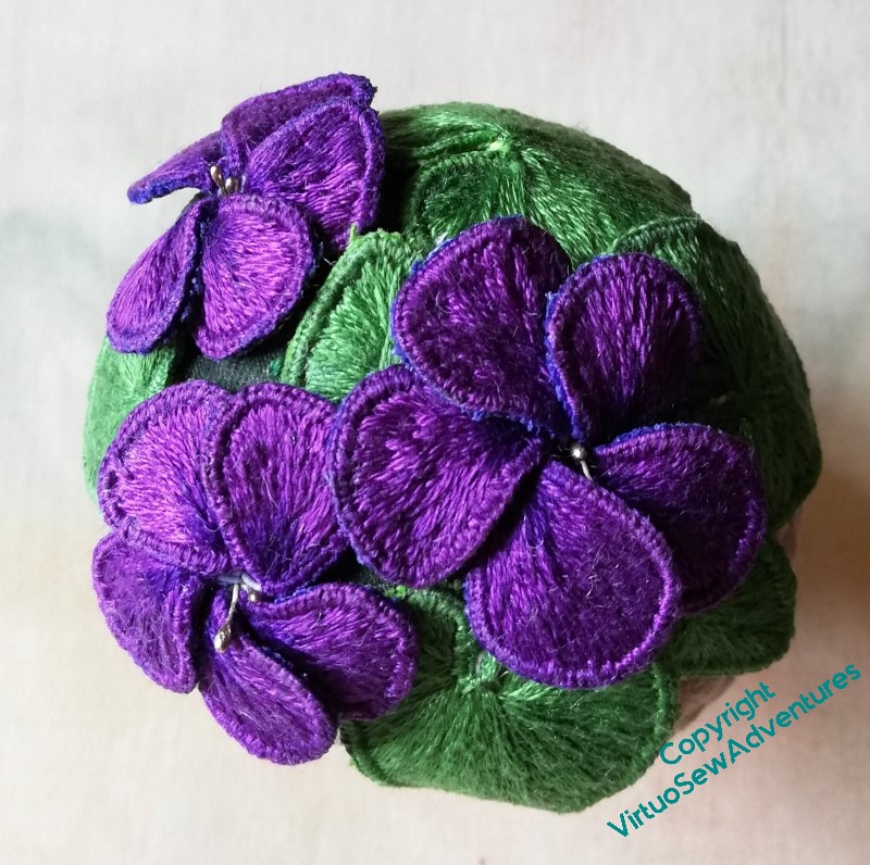
But I think the pot is too tall, and the violets stick out a bit too much. Violets are “mat forming”, apparently, so I would expect them to follow the contours of the lid a little more closely, shading the beads.. And somehow, with the pot so tall, I feel that the violets can’t breathe.
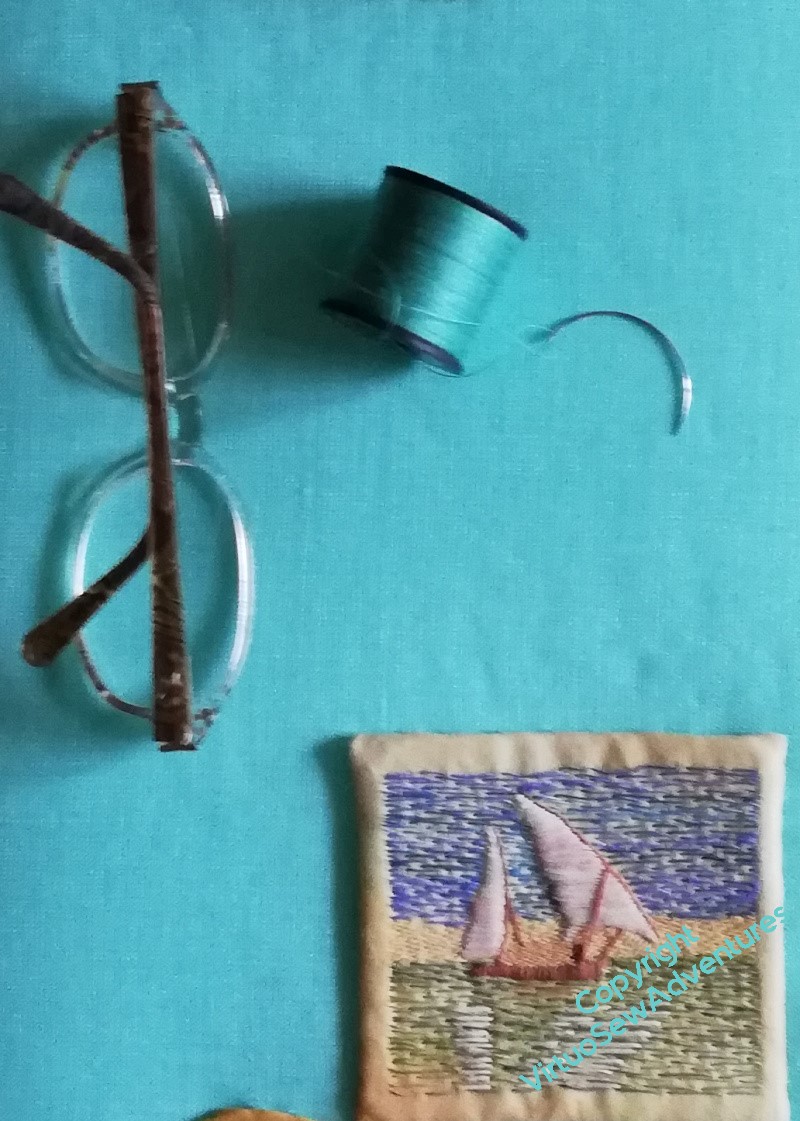
And indeed, although this photo is rather hurried (you can even see the pin holding the violets in place), I think it shows what I mean. The shorter pot gives the violets more air, and somethow that makes for a pleasanter display.
However, I do still need to find a solution for the Problem Of The Cushion!
Experiments with A Coiled Pot
You may recall that I had an idea to combine the Daisy Beads and the Stumpwork Violets into a little display under a parlour dome. The colours and scale don’t work with the main panels, and besides, both items are tied specifically to Mary in a way that nothing else is.
My first thought was a gold trinket pot, but so far I have entirely failed to find a pot of the right sort of dimensions. For some reason, everything I could find was too wide or too high, or not the right surface for gilding.
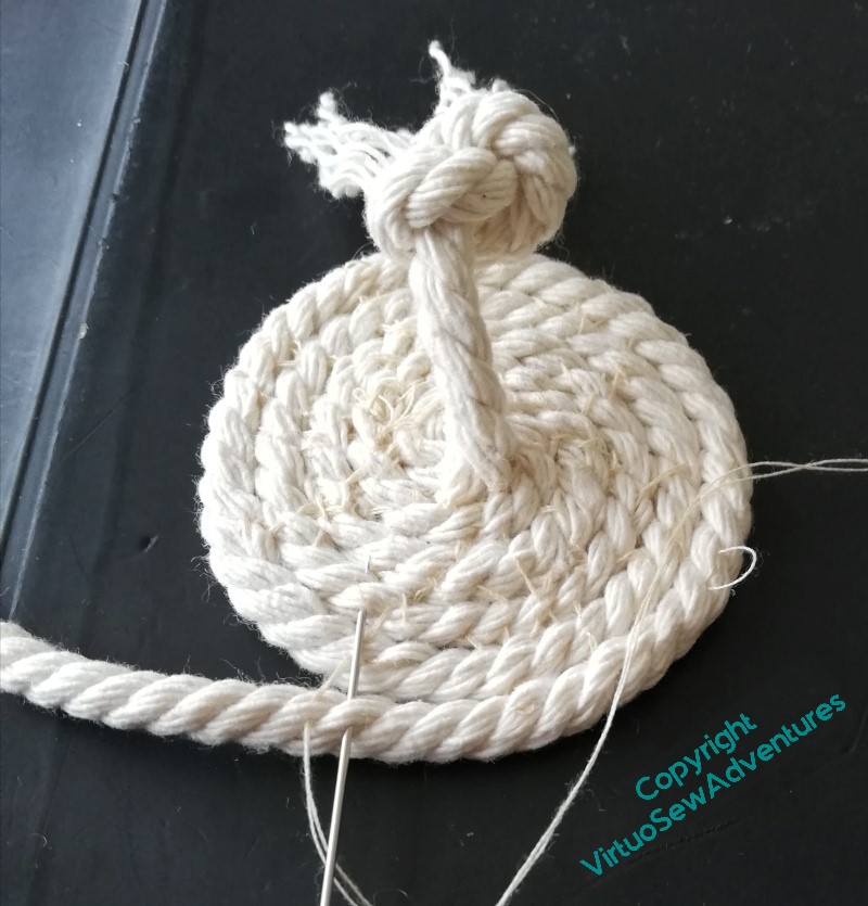
So after some frustration, I decided to tie the display back to the excavations by using a coiled pot made using braid or cord. It should be slightly reminiscent of the baskets used to carry away spoil from the excavations.
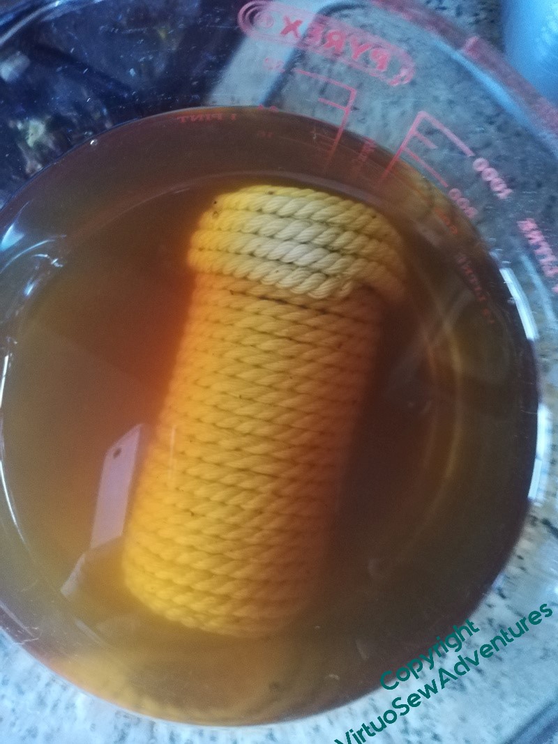
After some experimentation, I settled on piping cord, sewn together with ordinary sewing cotton as I wrapped the cord around a former (a spice jar, since you ask). Even that involved some unpicking and restitching.
When I’d done it, however, it was too white and stark, not a kindly background for the Daisy Beads. Hmmm…
So that is how I found myself tea dyeing a coiled pot made of piping cord!
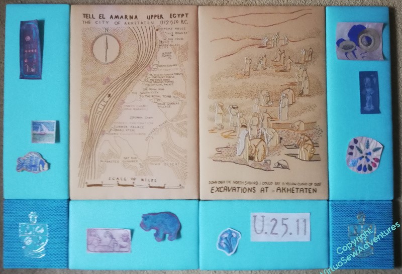
More layouts..
Telling stories without words can be a little tricky..
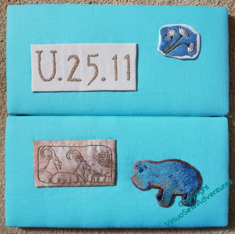
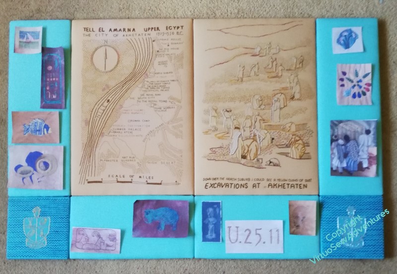
I’ve managed to get the Amulet and the Crock together here, and “Typed on Camelback” is on the horizontal panel, which works. But I put the Lotus Fragment at the top because it is the first thing mentioned in the book, only to find that it makes the whole thing fizzle out rather.
So for the next one, I’ve swapped the Faience Necklace with the Lotus Fragment. Better, I think. I like the way the Amulet echoes the Cartouche in shape, but not in placement. I also rather like the new, closer placement of the Fishie with the Felucca. Typed on Camelback and the Lotus Fragment look fairly happy together, too.
So, final tweak. The square tops of the Cartouche and the Crock of Gold balance each other nicely, and the grouping of Fishie and Felucca take only a little more space than the Faience Necklace. I think I will put the Hippo lower and the Antelope higher, mirroring the Lotus Fragment and Typed on Camelback. And incidentally, making more sense of them – antelope are dry land animals and hippos like water, after all!
So, have I finally made sense of this?
You know, I think I may have done!
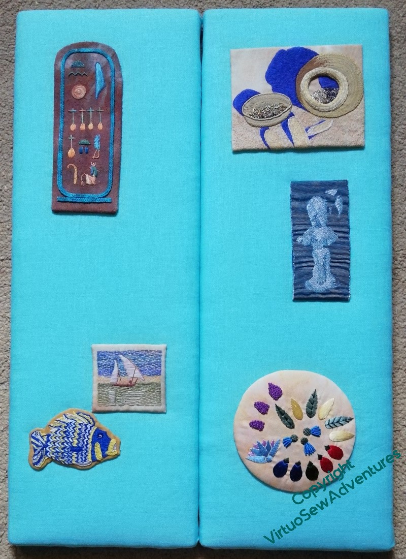
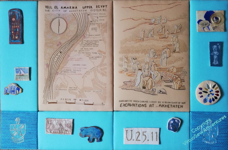
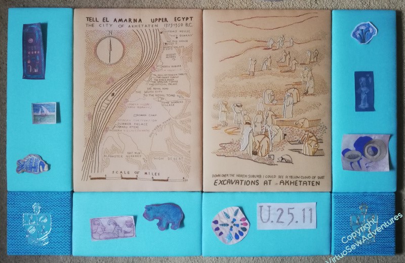
Laying out the “spots”
The first place to start with planning layouts was to simply trim my photocopies neat, square, and not too close, and see what result I could achieve.
I’m not at all pleased with this. It looks much too congested – or alternatively, not congested enough! If I had twice as many spots, maybe slightly smaller, and had them all jammed together, it might work, but this is betwixt and between, which is no place to be!
So I tried again, trimming some of the pieces closer or in a more shaped fashion, but still all of them being used. This is better. Actually, much better – but I think it still feels congested, and rather unbalanced. So, I need to think about what I can pick up from this, and take forward.
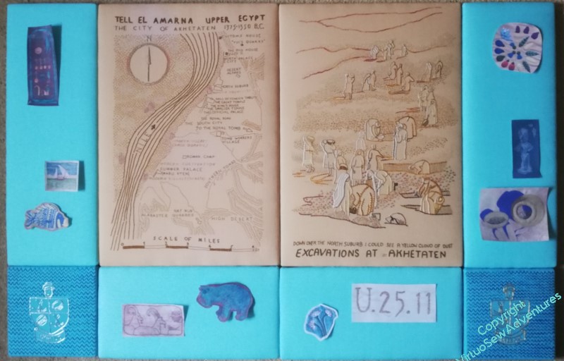
But before I do that, I do have a guideline in mind already: I want to use the “spots” which refer to finds or incidents that Mary referred to in the book with the View, and the ones which depict things already known about with the Map. So it’s arguable that I should either have “Loading The Felucca” with the View, or mount it separately. As it is bordering on too large in any case, I think I may choose to mount it separately.
The other one which is a bit tricky to wrangle is “Typed on Camelback”. It clearly has to be with the View, but it’s a little too wide to fit comfortably on the uprights, where I had it in the earlier two pictures.
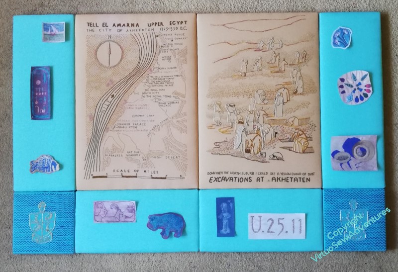
So how about this? I’ve taken off “Loading the Felucca”, and the “Head of Ankhsenspaaten”, and everything is now rather more spaced out. I think this works quite nicely, but at the same time, I thought the “Hittite Amulet” and the “Crock of Gold Hoard” had looked very happy side by side, so I wonder what further adjustment I can come up with?
Framing the Family
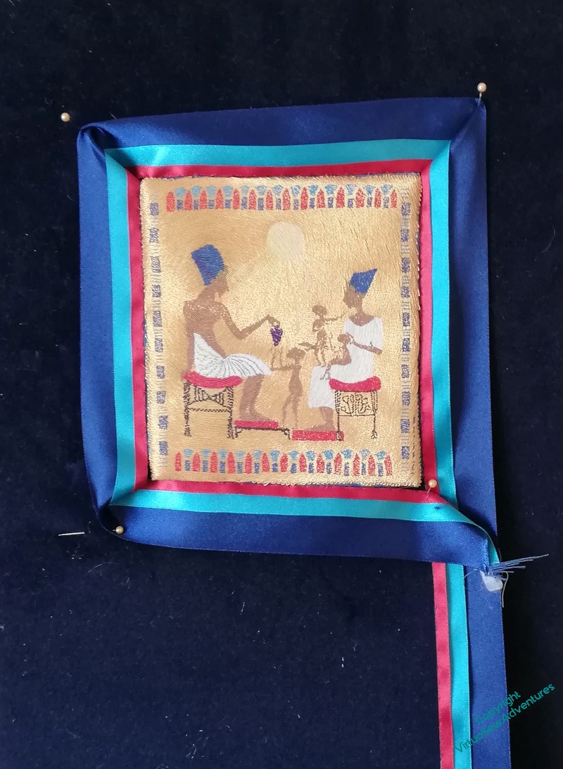
We left the Amarna Family lurking at the far side of the living room, surrounded by coloured ribbon. I was very certain it was better than the gold, but I wanted to be sure I was happy that there was nothing better somewhere at the back of my mind.
After rather longer than is evident in the gap between the posts on the subject (doing and writing often get thoroughly out of sync, for me), I decided that it was probably the best presentation I was going to invent, and needed to be done properly. The ribbons were already attached, so the next stage would be to make sure the corners were made neat and square, and the attachment was secure.
Secure, and not too noticeable.
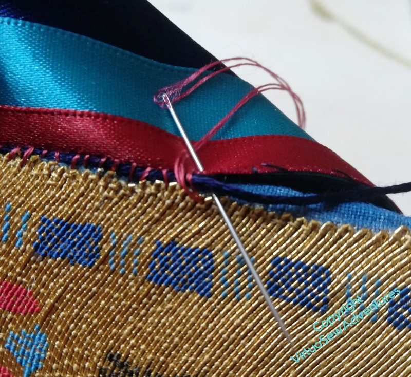
I was a little afraid that the join might leave the fabric showing, or otherwise draw attention to itself, so after a little thought, I decided to overstitch a navy thread (stele-coloured, as it were) with red silk. I’m hoping that because it’s not a single colour, the join will be slightly camouflaged. I did consider gold, but decided in the end that camouflage-by-lighting was not my aim!
The whole process took a couple of days, because holding the navy thread at the right angle and tension was something that required frequent breaks to avoid cramping fingers.
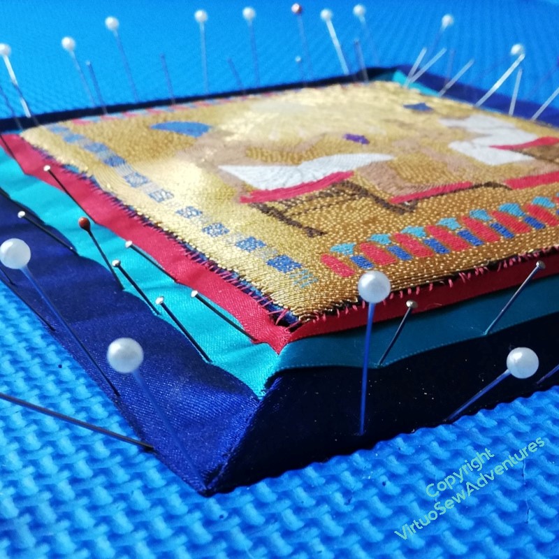
Each corner then required some manipulation to make it work, so once I felt I had the corners mostly settled, I pressed them (not the goldwork!) very, very cautiously.
And then pinned them down very thoroughly, and turned my back for a few days!