
Laying out the “spots”
The first place to start with planning layouts was to simply trim my photocopies neat, square, and not too close, and see what result I could achieve.
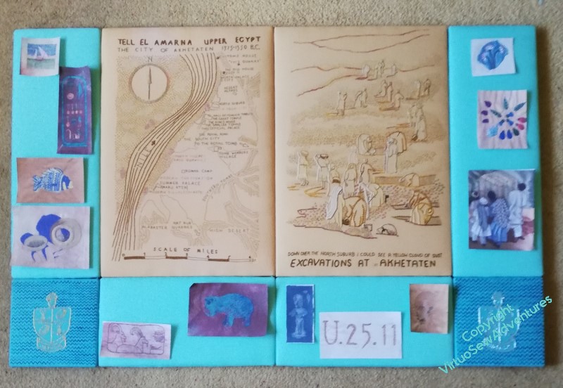
I’m not at all pleased with this. It looks much too congested – or alternatively, not congested enough! If I had twice as many spots, maybe slightly smaller, and had them all jammed together, it might work, but this is betwixt and between, which is no place to be!
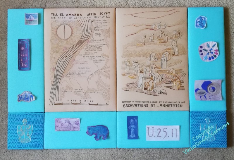
So I tried again, trimming some of the pieces closer or in a more shaped fashion, but still all of them being used. This is better. Actually, much better – but I think it still feels congested, and rather unbalanced. So, I need to think about what I can pick up from this, and take forward.
But before I do that, I do have a guideline in mind already: I want to use the “spots” which refer to finds or incidents that Mary referred to in the book with the View, and the ones which depict things already known about with the Map. So it’s arguable that I should either have “Loading The Felucca” with the View, or mount it separately. As it is bordering on too large in any case, I think I may choose to mount it separately.
The other one which is a bit tricky to wrangle is “Typed on Camelback”. It clearly has to be with the View, but it’s a little too wide to fit comfortably on the uprights, where I had it in the earlier two pictures.
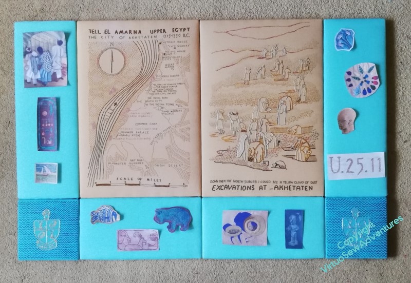
So how about this? I’ve taken off “Loading the Felucca”, and the “Head of Ankhsenspaaten”, and everything is now rather more spaced out. I think this works quite nicely, but at the same time, I thought the “Hittite Amulet” and the “Crock of Gold Hoard” had looked very happy side by side, so I wonder what further adjustment I can come up with?
Ooh, tricky decisions. Are you planning to add (printed/written) text labels to these little ones? Flying strings out to labels? Somehow, you do need to explain them all, so people can spend time enjoying them rather than hunting around to try and find out what they are about, where they fit into the story, why you chose them – the rhyme and reason of them. As well as what technique they are, and the other embroidery info to keep stitchers happy. They look a bit reduced and underwhelming as spots on a very strongly-coloured frame. Maybe just leave the least impressive on the frame and give the rest their own space?
I agree that less clutter is better. I also think that Sue Jones has a point about connecting the information in the frame with the map and the view.
When I make the Sunbonnet Sue stitch sampler, I always have problems tying the stitches’ names with where they are used on Sue. Some names are very long and the arrows connecting them with Sue have to curve. It sometimes looks like a mess!
I like the uncluttered look but think that bottom border should have an uneven number of items, which is difficult as you have 2 pages side by side, so how would you place that extra item?
The issue of labels is interesting. Perhaps you could have an information sheet explaining the significance of items that could be displayed separately as part of the exhibition?
Definitely too busy at the start and my feeling is that the spots are so exquisite in their own right that they are perhaps being short-changed by being used as decorations around the central image. Don’t currently have the brain capacity to suggest anything more useful though!