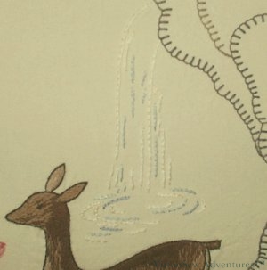
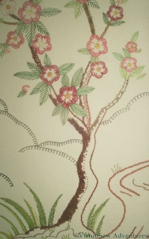
The Waterfall from the crag
I tried very hard to get a photo that does justice to the waterfall here, because it is another example of what I mentioned when I was discussing the gazelle, but I’ve not succeeded very well, I’m afraid.
The interesting point about the waterfall is that it looks like a trivial piece of design – just a few lines – and yet when I came to embroider it, I realised that it would be spoilt if I added “watery” effects with sparkling thread or metallics. I ended up stitching it very simply in stem stitch, using three colours of pearl cotton.
In real life (I wish I were better at photography!) this looks more like a waterfall than a few simple lines have any right to. I’ve looked at this panel over breakfast for ten years now, and I still can’t work out quite how the designer managed to do it!
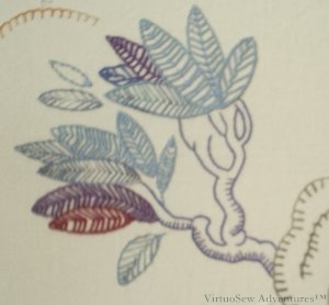
Tree On A Crag
This tree is a different matter. It doesn’t look much like a real tree, and it isn’t intended to. It is a purely decorative, “tree-ish” element of the design.
I’m coming to realise that the success of these panels rests partly on this balancing act, in which some of the elements look more realistic than others.
Something for us all to try, perhaps!
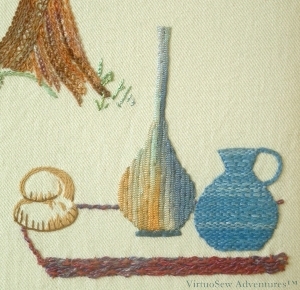
The Prince's Picnic, Panel Four
I enjoyed working on the prince’s picnic on panel four. The tall carafe is created using a variegated knitted ribbon (from Stef Francis), and has been used as if appliquéd. The inspiration here was those strange lustre-glazes that show widely differing colours in different lights, and I had great fun choosing particular sections of the yarn to create the effect. The blue jug is much more homespun (sorry – couldn’t resist!), using a Soft Cotton, this time inspired by coiled clay pots – a technique I remembered trying at school, although it was much easier in embroidery! Then there was the loaf of bread, using three shades of a plain matte, round cotton yarn, and the rug (or table – I’m not sure which) bordered with a complex border stitch in a strongly textured yarn.
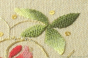
The Flowering Tree on Panel Three
The bark of the flowering tree on Panel Three was worked using various bouclé and other effect yarns, couched to the surface randomly. The basic design is so stylised that I was careful not to be naturalistic. I used a variety of yarns from a Texere Yarns Inspirations pack and caught them down with a single strand of stranded cotton, in loops and wavy lines. The flowers and leaves were working in plain stranded cottons. The flowering tree was already so dominant in the panel that it really didn’t need much in the way of emphasis from the yarns other than the bark. The tall grasses at the foot of the tree are in stranded cotton too, using feather stitch. I’m not sure that I would do this panel in the same way now, although I think that using satin stitch and long and short stitch, as in the original, might make it look a little serious, rather than decorative and fun.
And I wanted it to be fun.
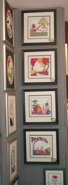
Counted Cross Stitch Inspired By Clarice Cliff
I’m very excited this week (again!).
I’ve done some counted cross stitch designs for Classic Embroidery, and on Tuesday I went to a trade show in the NEC, Birmingham, to see the designs up on the stand, and to talk about other possibilities for future designs and future collaboration.
It was so satisfying to see the designs, beautifully mounted and framed, and to hear that they are already selling!
I don’t think my designs have made it to the Classic Embroidery website yet – we only got all four ready to go a few weeks ago, and making kits is the higher priority at this time of year – but they are also going to send me a kit so that I can see how the designs are packaged. I’ve already seen some of their kits so I am confident that they will look good.
The designs are inspired by Clarice Cliff, although there is little about them which is even close to any of her designs. From top to bottom, they are called
- The Pagoda
- The Cat Who Walked By Himself
- Hollyhock House
- The Rabbit And Windmill
I’m glad to say that stitching the Persian Fantasy screen was just as much fun as I hoped it would be! I didn’t follow the instructions in the magazine, not least because it called for “Anchor Flox” , and no-one I could find even knew what that was! I’ve since discovered that it was a very shiny thread, something like a pearl cotton, but made of rayon. I was going to stick with a single type of thread, and conventional stitches, but my mother suggested that I should Be More Adventurous, so I was. I have been grateful to her ever since, as I had enormous fun playing with the threads and stitches.
The four panels show
- the hero out hunting,
- a gazelle in front of a waterfall, perhaps the object of his hunt,
- a flowering tree, and
- the hero again laying out a well-deserved picnic to share with his lady who so far has not appeared.
It is very stylised, very Thirties, but clearly inspired by early Oriental silk paintings. I have a couple of modern ones in a similar style, in fact – inherited from Grandmama, along with the lacquer box!
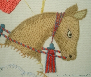
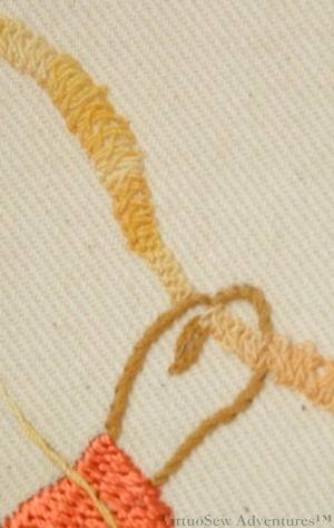
The Prince's horse, staring fiercely at his quarry
My knowledge of horses is limited to the direction in which they are going, but I remembered hearing from my horse-mad cousin that horses can get pretty shaggy, and that the lovely glossy look you see on a racehorse is due partly to the horse having had a good haircut. So when I came to do the prince’s steed on the first panel, although I didn’t want him glossy (I wanted the Prince to be glossy), I did want him to look cropped rather than shaggy. So I chose tapestry wool and brick stitch, slightly bent to follow the direction of the coat. I gave him a darkly staring, focused eye, like a warhorse on the Bayeux Tapestry, and matched his reins to the Prince’s clothes, using two colours of Anchor pearl cotton, matching the two colours of Anchor Marlitt rayon thread, twisted together to create cords. The fringe on the headpiece was created using twisted single lengths of pearl cotton, the raw ends plunged and the twisted cords hanging free. I’m still pleased with the horse, and I don’t think I would do him differently now.
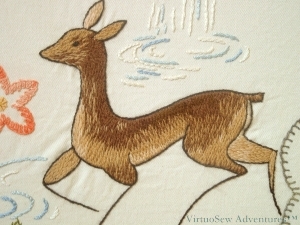
The running Gazelle on Panel Two
The running gazelle on the second panel makes a very good contrast with the Prince’s horse. She was worked using long and short stitch in Paterna crewel wool, with some mixing of colours in the needle, and I quite explicitly aimed for a slightly ragged look around the haunches, although in keeping with the very stylised feel of the whole design, I worked a neat, careful, dark outline of stem stitch. I particularly like the way the designer has made her very clearly a design, not an animal portrait, but at the same time, the single lines for the lower legs are so very reminiscent of the fragile-looking legs of gazelles and other deer.
Part Of The Bow, Panel One
The Prince’s bow is worked using Braid Stitch, using a mercerised variegated cotton. Archaeological and historical records show that the ancient bows could be very highly decorated while still retaining all their power as a weapon, and I was thinking of descriptions I had read (archaeology is another interest of mine) of bows using horns as the ends, and laminated wood (lamination was invented earlier than you might think) for the main section, all decorated with gold wire inlay. Naturally, all you can see on the embroidered bow is the inlay!
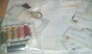
Floral Glove Course Kit
There was a gentle thud of a parcel through the letter box yesterday.
And Oh Frabjous Day, the Floral Glove Needlecase Course Kit has arrived!
What with hair-raising weather (in the UK and the US) and a much more popular course than the organisers anticipated (a great problem to have!) it has taken a little longer than anticipated for my kit to arrive. We’ve been kept very well informed, but of course once a parcel is in the system there is nothing anyone can do to speed it up…
It was worth the wait! There’s an intriguing variety of speciality metal threads, and some rather gorgeous looking silk. I’m planning to read all the instructions at least twice before even looking for a hoop – I’d like to do a good job on this, and I rarely use silks or metal threads at present.
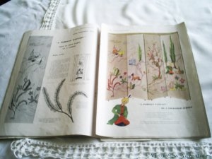
Photo of the Persian Fantasy Screen in The Needlewoman
There was one project in those magazines that I positively ached to do, but it was a four fold screen inspired by the Rubayat of Omar Khayyam and Grandmama did not have all of the four magazines that it was in. I resigned myself to looking wistfully at the picture, and got on with life – O-levels, A-levels, degree.
Then Grandmama died, and I inherited the black lacquer box. I tried to work out whether I could re-create the transfers I did not have from the photograph of the screen, but my skills with a pencil were not up to the task. And computers, in those days, did not have the fabulous range of image editing facilities now available at the click of a mouse.
Needlecraft magazine was launched. I subscribed promptly, and wrote to the Letters page, describing the panels, naming the issues, and asking, could anyone provide me, perhaps, with a photocopy of the missing stitch diagram? They could, and they did, but then of course I had to find some fabric.
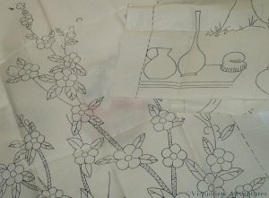
Full Size Transfers of the Persian Fantasy Screen
I was still looking, when a rather bulky parcel arrived in the post, which changed the direction of my search. My correspondent had the actual transfers, but she had wanted to check with her daughter to see whether she wanted to stitch the screen before sending them off. Suddenly, instead of looking for a fine fabric to produce the panel at the size of the stitch diagram, – much more excitingly – I was looking for a somewhat heavier, upholstery-type fabric..
I also had to gather my nerve. I’d seen the pictures and sketches in the magazine, but I hadn’t quite realised just how big those panels were – each one is about eighteen inches wide by five foot high!
I finally found some material, thanks entirely to a family friend who at that time owned a weaving mill in Lancashire. A loomstate cotton twill – so rather than having all the various bleaches and finishes applied, and the fabric shrunk to its’ finished state and difficult to embroider, it was perfect for playing with heavy ornamental threads, and the soft creamy colour would provide a pleasant and restful background.
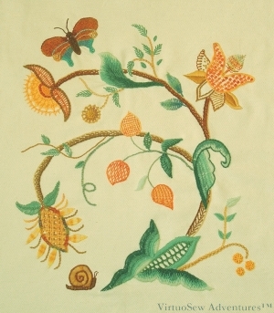
Jacobean Style Fire Screen, worked to go with the living room fireplace
I designed and embroidered this piece shortly after I was married. It was my first design for Our House, and I suspect it gave my husband fair warning (if he hadn’t already guessed) that furnishing it would not be a simple matter of a trip to a furniture shop!
I took some of the motifs from a tablecloth that Grandmama stitched using surface embroidery and needlelace. Then I combined them with some Jacobean leaf shapes and the occasional curlicue. The snail and the butterfly are added because Jacobean designs often included bugs and animals, and although our house is nearer to Arts & Crafts in style than Jacobean I wanted to work on a Jacobean crewel-style design.
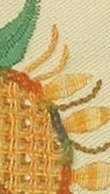
Fragment of the Jacobean Firescreen design, battlement couching and Pekinese Stitch
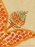
Second Fragment of the Jacobean Firescreen design, star stitch and fishbone stitch
I had enormous fun playing with ornamental stitches and threads. There are Persian wools, soft cottons, pearl cottons, stranded cottons, rayons. The butterfly even had some metallic thread in it, and I don’t often use metallics. Stitches included Battlement Couching, and Pekingese Stitch using overdyed chenille thread, and open Fishbone stitch in a crinkly overdyed rayon.
That rayon thread is much more difficult to embroider with than the chenille, but I am realising as I photograph and study some of my past embroideries that I seem to use a great deal of it. I should have a stern word with myself about that, because every single stitch with that thread is accompanied by muttered swearing – which can’t possibly be good for me!
I seem to be going through a phase of gold and teal at the moment, so when I wanted a picture of some of my embroidery to put in my header, this seemed the obvious one to pick. I’m not wholly happy with some elements of the design, but every time I see it I remember the fun I had making it. So it is a good representation of the sort of “virtuosewer” I would like to be.
Class Piece from the Elizabeth Embroidery Course
In October last year I went up to Durham for a weekend course in Elizabethan Embroidery with Tracy Franklin. She provided us with a kit of materials, including the design ready-traced onto a coarsely-woven canvas-like fabric fused to a muslin backing, and a good deal of tuition, advice, and demonstration, all fairly easy to see because there were only twelve of us on the course.
The leaves in the lower section of the design are worked in tent stitch, and here the challenge was to create the right shaded effect on the leaves. Tracy showed us some photographs of original Elizabethan embroidery so that we could see what they did then. Tent stitch is not really one of my favourite stitches, but making up the shaded pattern as I went along was much more fun.
Then we moved on to Corded Single Brussels Stitch. I’ve found a whole list of the needlelace stitches in this family here at Lacemakers Lace. This also seems to be a stitch much used in the Plimoth Jacket (story told in full on the Thistle threads blog), and it’s fairly straightforward, although made trickier in this case because we were using two plies of stranded cotton. That produced some more even blending of colours because we could mix colours in the needle, but it’s a bit more difficult to keep tidy because you have to make sure that both plies are picked up in each stitch.
Detail of the Class Piece
You can see in this shot that I played around with my Corded Brussels stitch. Two of the leaves are shaded and worked conventionally, from tip to stem. The other two are worked longways, from the centre outwards, producing a marked vein. You see what I mean about having fun with it?
The main stem was supposed to be worked in Plaited Braid Stitch. Now, I can do Braid Stitch – just ( I have to keep the book open all the time while I do it!) – but so far I’ve not nailed Plaited Braid Stitch. In the interests of finishing the piece, releasing the frame, and starting on the project that has been nagging me for the past ten years or so, I’ve done the stem in the ordinary Braid Stitch, and filed Plaited Braid Stitch under “Must Try Harder”.
I’m not the only one. Mary Corbet posted about the stitch last year, and a quick Google shows that there’s more than one stitch out there called plaited braid stitch – just to make things more difficult. And there is a description of the stitch on this page as well.
Still, now this is finished – if not entirely according to the original plan! – I can find a box top to mount it in, and move on…
My grandmother first taught me to embroider (there must be thousands for whom that is true! ). She was an extremely skilled embroideress, who learnt when she was living in Westmorland during the war with her own two children, her sister and her sister’s children. Her teacher, Miss Hunter, has even passed in to family legend – a little, dumpy lady in black crepe (old fashioned even then) with very sharp scissors hanging from a silver chain at her waist, and quite scarifyingly high standards. If her students’ work failed to meet those standards, snip, snip, snip, and out it all came. To this day, unless we pay close attention, we sometimes put tablecloths embroidered by Grandmama on the table the wrong way up, and we always pay as much attention to the back as the front.
The Magical Lacquer Box
Once Grandmama realised I was well and truly hooked, she allowed me to look inside a black lacquer box that had always fascinated me. Inside I found some rather tatty, but utterly enchanting, copies of The Needlewoman Magazine of the nineteen-thirties. Some of them even still had the free transfers still with them.
In short order, I’d turned a design for a photograph album cover into a teacloth (I still have it somewhere), made a runner for my dressing table using a repeating pattern (now in use in another room), and embroidered a dragon on the back of a linen dress. My history teacher complained that that dress took her mind right off her prayers in Assembly when I wore it for school one day!
Unfortunately, Grandmama died a couple of years later, but she’d taken great delight in what she had seen, and left me the magazines and her worktable. I still think of her when I am embroidering, and I still want to show her any piece of embroidery that I’m particularly pleased with.
I’ve been spellbound by Tricia’s blog following the progress of the Plimoth Jacket Project, and the idea of learning to use some of the threads that were recreated for the project was absolutely riveting, so when I found out about the Thistle Threads Online University courses, I was thrilled. So I’ve signed up, and I shall be writing up my progress as I follow the course. It goes for six months, so there should be plenty for me to say!
This afternoon I have been printing out the first month’s course materials, which consist of two fairly long documents, one of them the first month’s instructions for the Floral Glove Needlecase, the other a historical background for the design and the materials chosen. Both are copiously illustrated with very high-quality photographs, which she has licensed from various museums for the purpose.
In one of my other lives (don’t we all seem to be living at least three these days?) I’ve also been involved in negotiations with museums so I know how much effort Tricia has gone to, so that we can have some truly interesting and inspiring materials to study.
So, while I do that, there are two videos of the Plimoth Jacket at the end of this post on the blog. Enjoy!