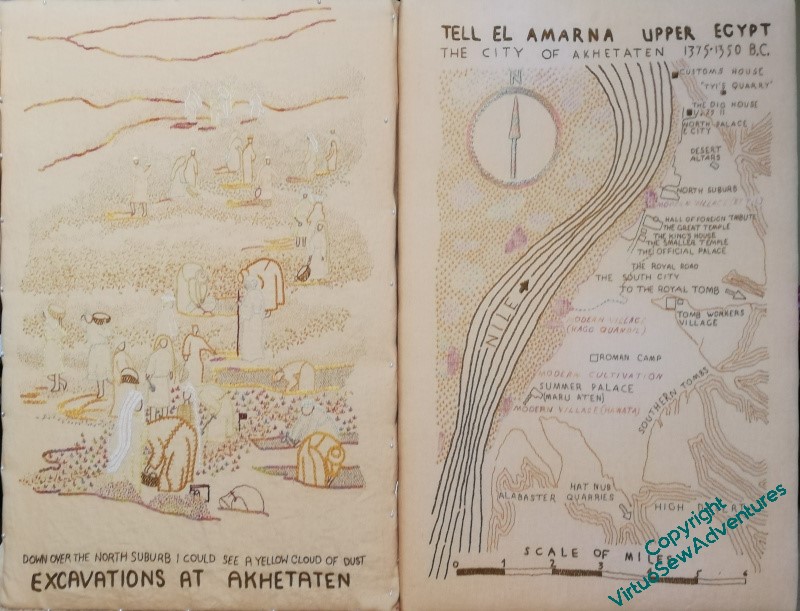
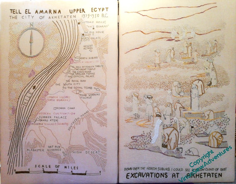
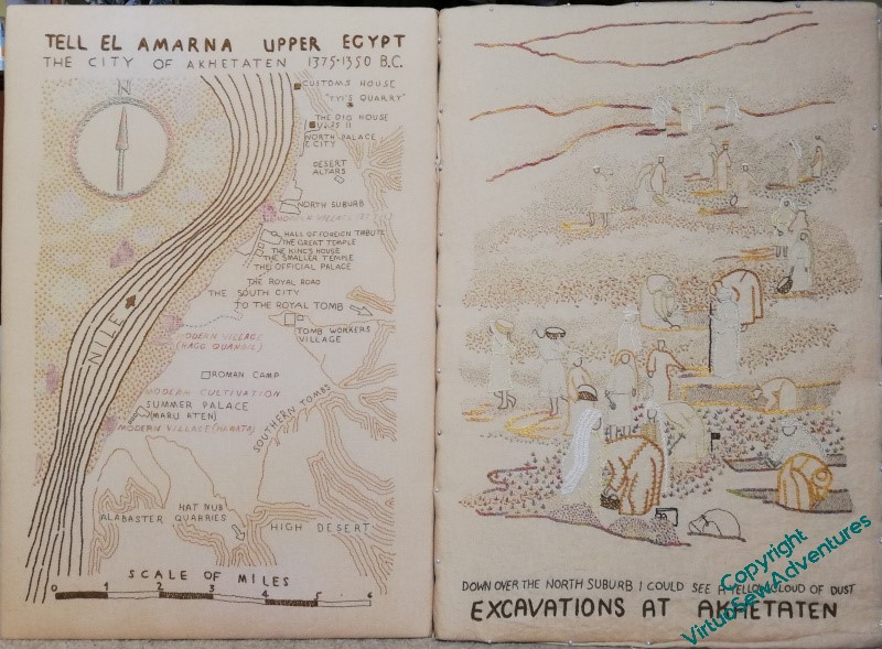
You may recall that I wondered whether I should reverse the order I had planned for these two main panels of the Dreams of Amarna.
When I finally add the border panels and the “spots”, my intention as far as possible to have the spots that were already known set with the Map, and the spots which are more closely linked with Mary’s experiences at the dig set alongside the View of the Excavation. I’m still not sure which way around to put them, but perhaps if I can arrange the border panels to be moveable, we can change that depending on what else is in the exhibition? There was a suggestion, pre-Covid, that particularly northern British museums associated with the EES might be interesting in combining my embroideries with their finds. Now that’s an enticing thought…
I don’t think I’ve quite finished adding details, and I still need to think out my reasoning and placement for these two, but although the extra shadows are barely visible, even in person, they have, I think, brought a better sense of focus. I do, however, have a few highlights and details to add!
One thing I really like is the clear, un-seed-stitched section at the bottom. When the fabric is washed and ironed, I think that area of plain cloth above the title and surtitle will help to make everything settle together.
I realised when I came to write about beginning to practice underside couching, that you’ve not seen William for a while, so here is a a quick update on progress.
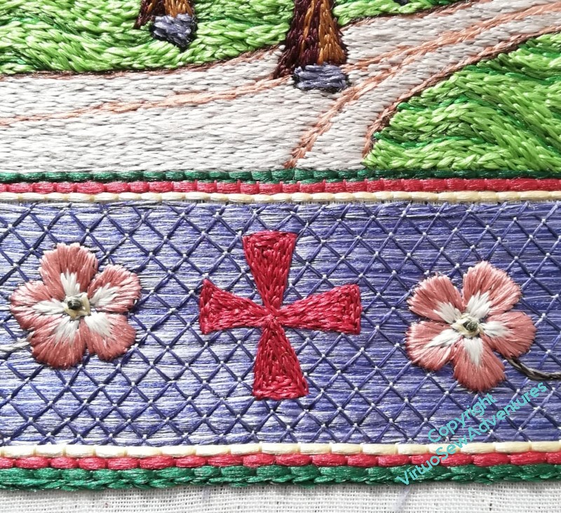
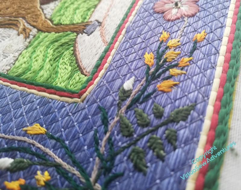
I got all the broom and dog roses done on the border, and then sat back to look at it. You may recall that I said last time that I thought that I would be filling the crosses, but I wanted to sit back and stare again, just to be sure.
That staring didn’t take long. The crosses, as outlines, don’t really have the authority they need, so it soon became clear I needed to fill them all in. I doubled the outline, as a single line, and then filled in each triangle separately in split stitch. I did consider using satin stitch, or some sort of couching stitch, but I felt that with the dog roses bracketing the crosses, a different texture was required, and I am content with the result, I think.
One of the delights of working with floss silk is to see how it responds to the light, so here are some more pictures to enjoy.
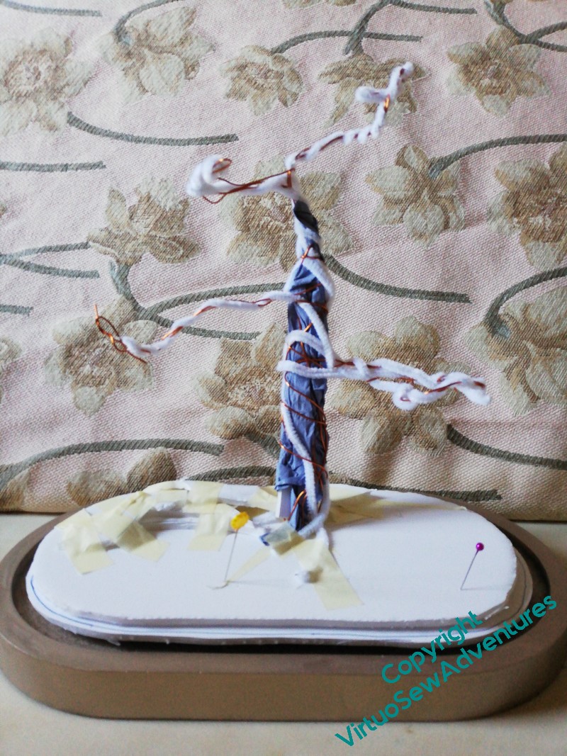
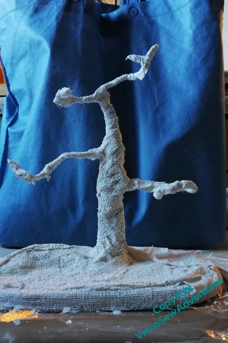
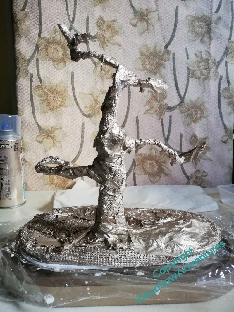
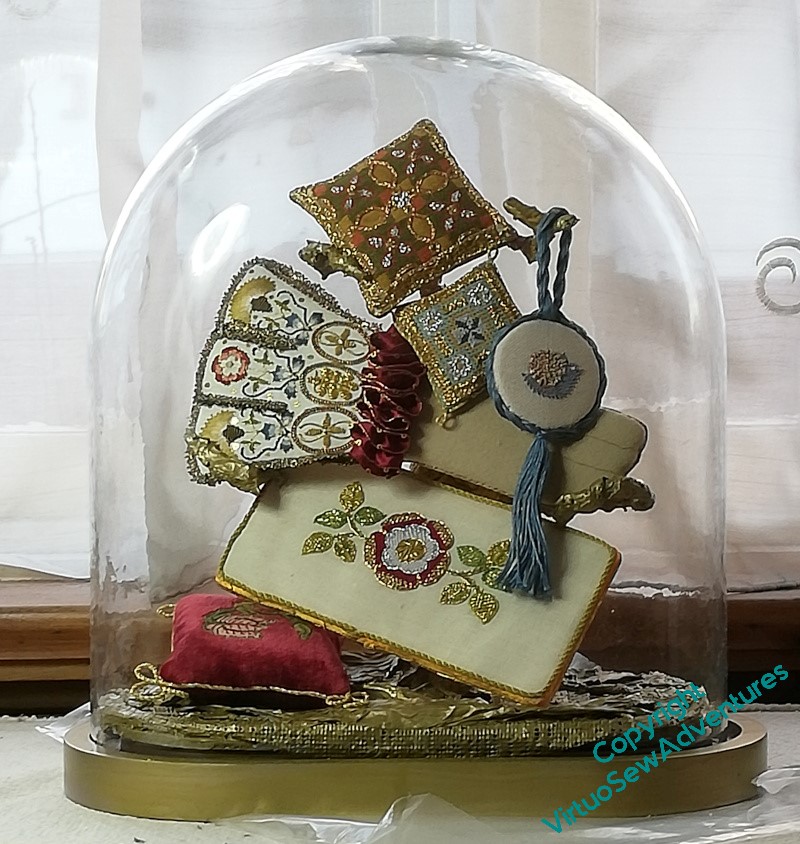
As I forecast, I had a rather entertainingly messy time with plaster bandage and acrylic paint to create my Trinket Tree.
As you can see, foamcore, wire, crumpled paper and lots of tape were involved, as well as some tissue paper to vary the texture a little. Although I needn’t have worried – now the Trinket Tree is loaded, you can barely see it!
At present it sits on the hall table – the table it is on for this photograph is where I stitch and usually covered with bits and pieces relating to the current task. Not a good place for a glass dome, although it fits so neatly over the trinket tree’s base, that it’s quite hard to knock adrift!
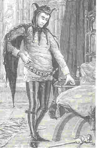
While I was working on William, my Mam passed to me her copy of Current Archaelogy, which included an article about the church founded by Rahere, jester to Henry I, then pilgrim and monk, founder of of St Bartholomew’s Hospital. Now, Rahere is a major character in one of the tales in Kipling’s “Rewards and Fairies”, which as a child I loved, and suddenly I found myself with an idea for some companions for William Marshall.
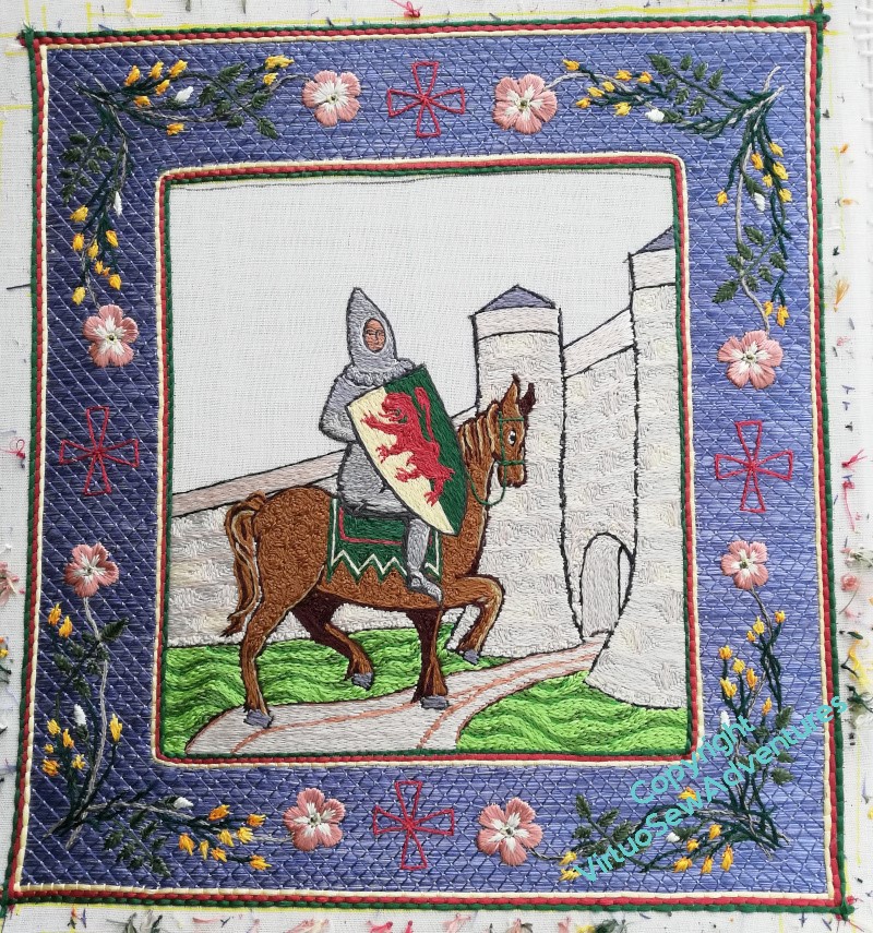
William Marshall, 1st Earl of Pembroke, jouster, statesman, guardian of kings, re-issuer of Magna Carta, subject of the first biography in English not concerning royalty or sainthood.
Image from Wikipedia
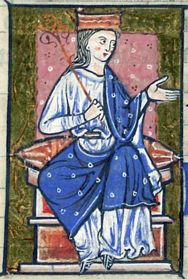
Athelflaed, daugther of Wessex, Lady of the Mercians, war leader and peaceweaver, guardian of Athelstan, she refortified Chester, and refounded the Minster which became, in due course, Chester Cathedral.
Image from Wikipedia
Rahere, jester, minstrel, courtier, pilgrim and monk, founder of St Bartholomew’s Hospital, which exists to this day.
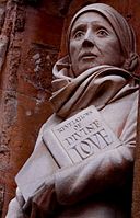
David Holgate’s statue of Julian of Norwich, outside Norwich Cathedral, completed in 2000
Dame Julian Of Norwich, anchoress, mystic, author of the the first book in English known to be written by a woman.
In all these cases, some vestige of their activities still echoes down the ages, and between them they cover both the political and religious life of medieval period. Their activities are scattered across the country, providing some excuse for some visits and much reading.
I wonder what images I could put in their borders?
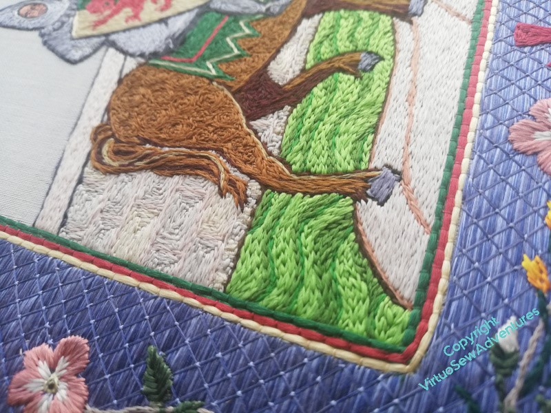
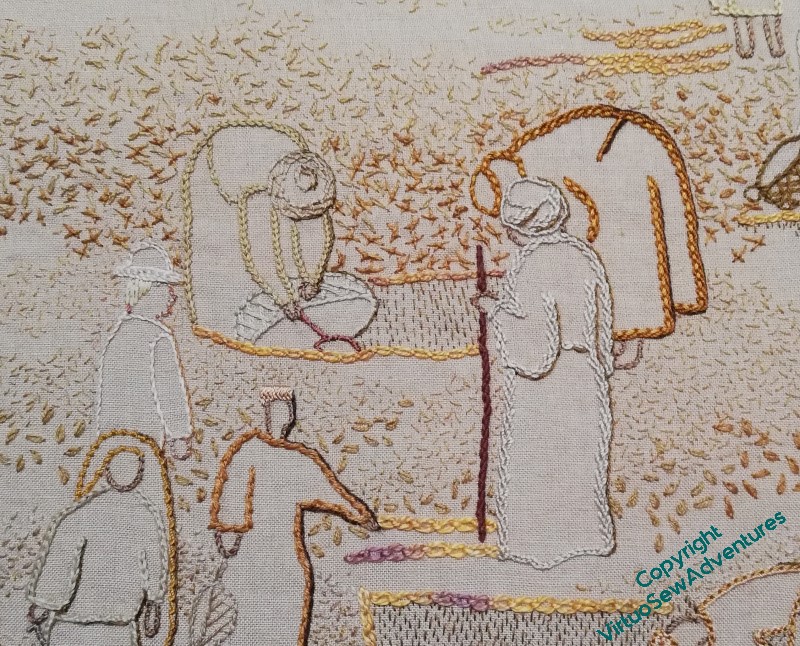
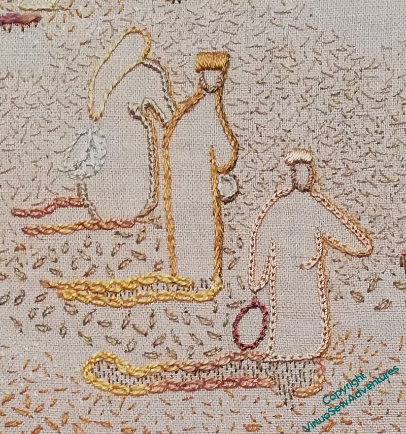
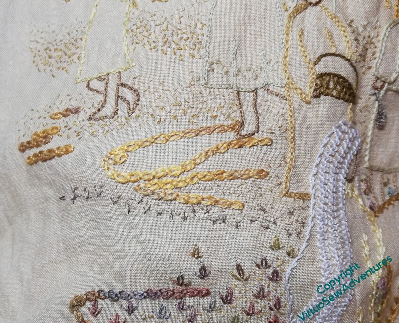
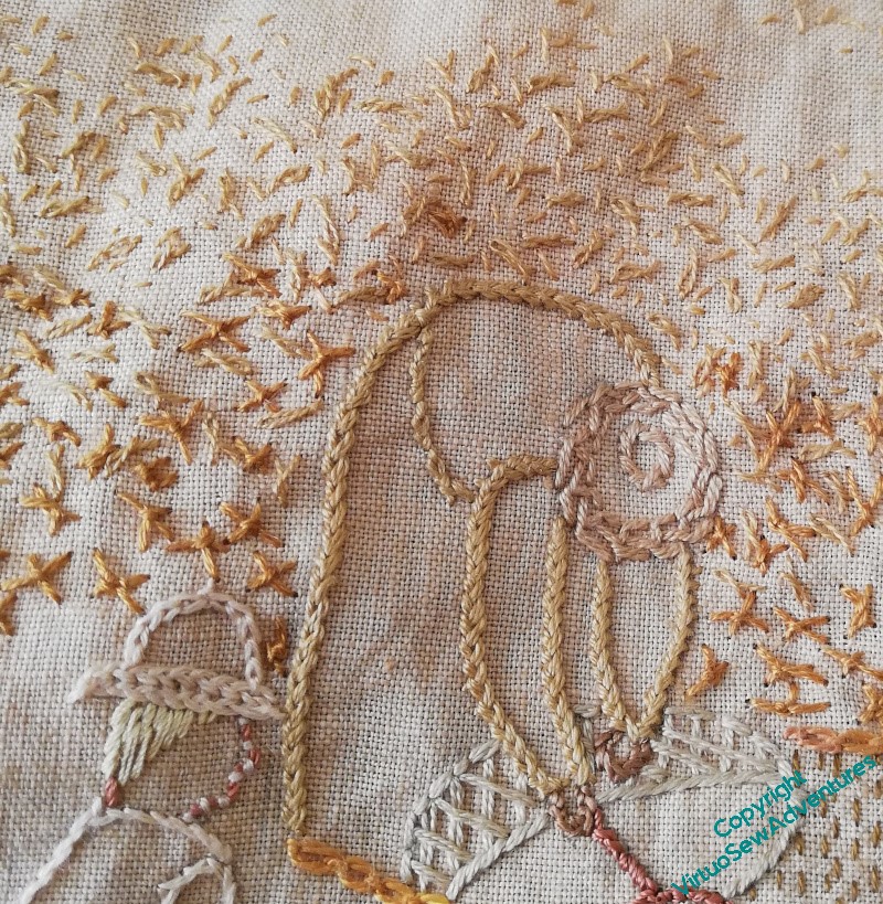
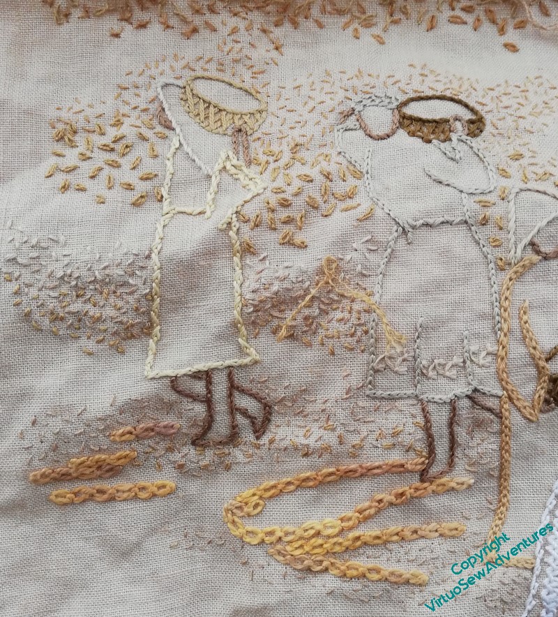
I started by tacking a shadow line along the edge of the Gufti with the staff, decided that it did indeed help, took out the tacking stitches, and started adding very fine stem stitch shadows in single strands of cotton or silk along the right hand sides of the figures.
I used different shades , and different levels of detail – I want the archaeologist in his pith helmet to remain only semi visible. He’s clearly consulting with the Gufti, but he’s not the focus of the flurry, he’s part of the pattern.
The middle distance figures gave me a little trouble, as the colours seemed a more emphatic, close to, than I remembered.
I’m looking across the room at them now, however, and they have settled back into place, just the slight thickening and darkening at the edge helping to make sense of the pattern that’s developing. Even the slightly darker basket, which I had doubts about when I’d stitched it, doesn’t unbalance the whole view.
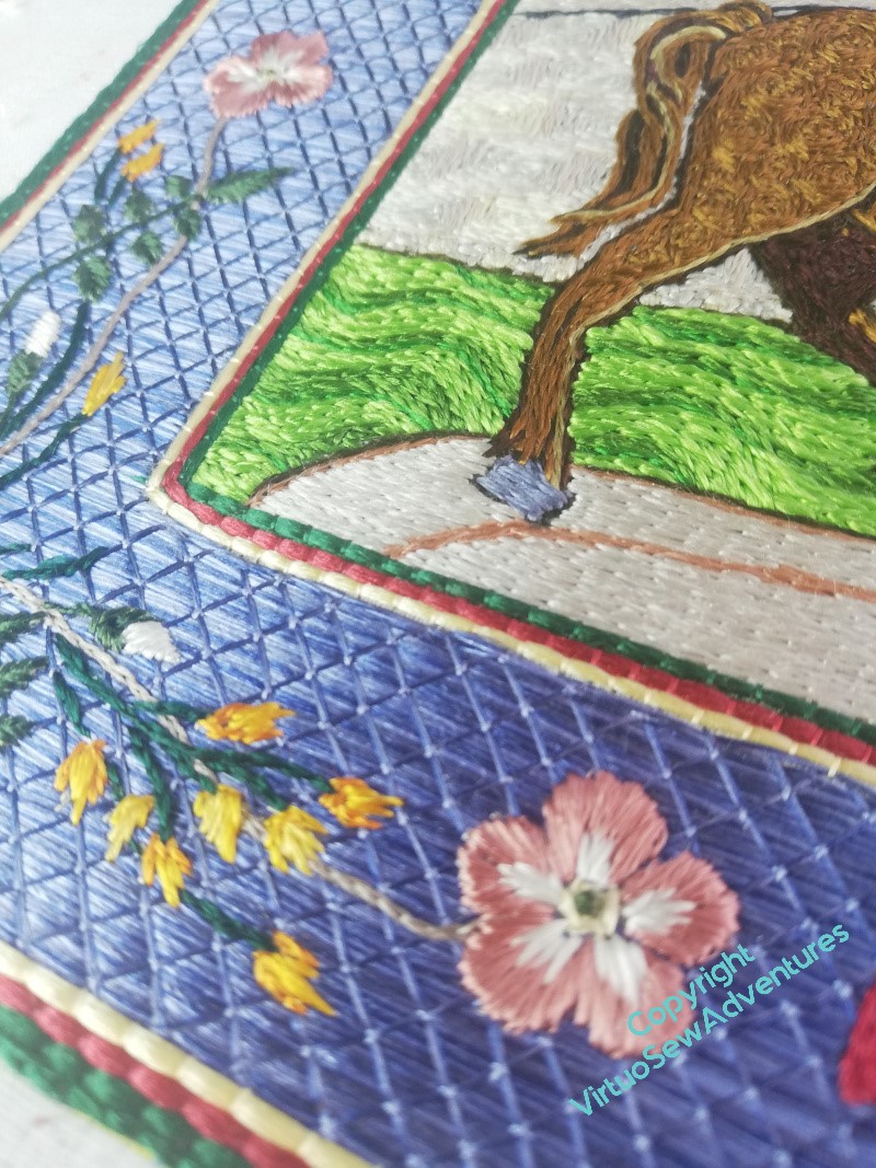
In this bit of foreground, you can see that I have been varying the amount of detail I shadow. Some of these figures may get a little more detail, to bring them forward even more.
I’m even wondering about putting a shadow on the edge of the creamy white veil the foremost figure is wearing.
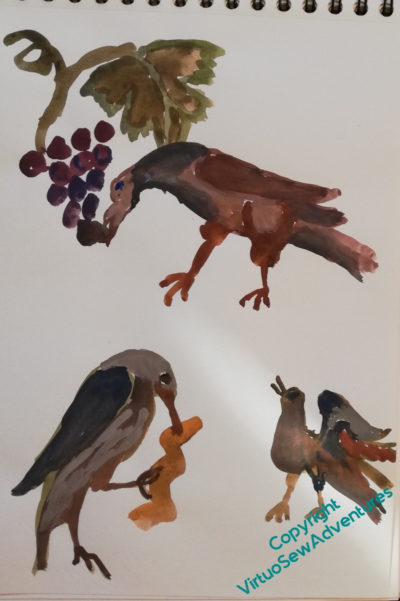
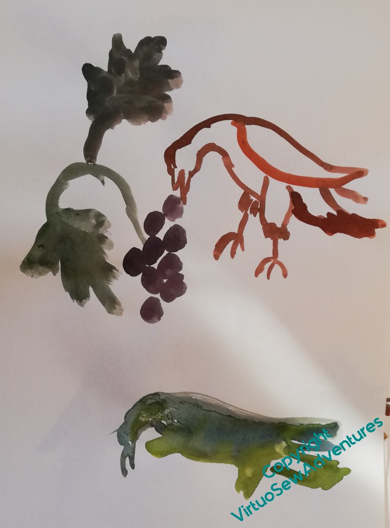
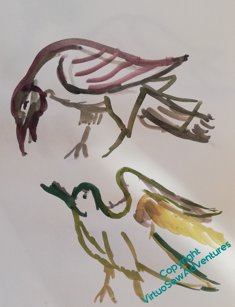
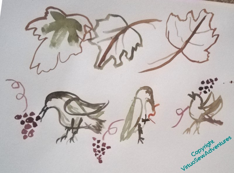
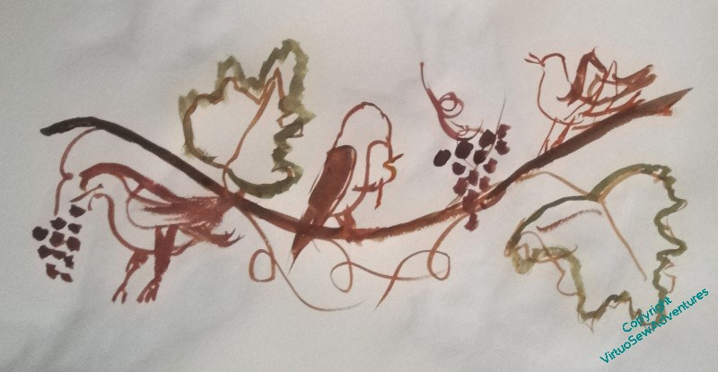
January’s Book of the Month for the Elizabeth Goudge Bookclub on Instagram was “Gentian Hill”, and that reminded me of an episode in that book that I’ve long wanted to depict in some way. In the book, the heroine, Stella, and the Abbé visit a local church where Stella has been entranced by some carved panels and asks the Abbé to explain their significance. The carving show birds, one eating a grape, one killing a caterpiller, one with beak open in song. The Abbé explains:
The bird with the grape in its beak is the penitent soul of man feeding on the true vine. The bird attacking the caterpillar is the strengthened soul of man fighting evil. The singing bird is the soul that has overcome praising God. You take them in that order, Stella.
Elizabeth Goudge, Gentian Hill
(And, for those twitching at the non-inclusive language, Gentian Hill was written in the 1940s and set during the Napoleonic War. One of the themes of many of Elizabeth Goudge’s books is that there are many forms of struggle and many forms of service, none less than another, even if some may be less spectacular!)
Now, as I’ve been adding final details to the Excavation, I’ve been reminded of how much I enjoy working in the hand, and I would like to devise a way to depict the images, singly or as one panel, in a way that is strongly textured, surface embroidery, that I can work in the hand as a rest from underside couching or attaching spots to border panels with invisible stitches.
So I’ve been thinking of basing the ideas and stitch choices on Mountmellick work, which is not entirely unsuitable when you consider that one of the other main characters, Zachary, is of Irish parentage, and the shapes of the birds on medieval images, because the church, of course, is a very old one.
Alas, thus far my playing with pens, paints and ideas hasn’t got me very far. It’s hard to balance three creatures that aren’t all looking the same way, and it doesn’t feel right to me to make them face the same way!
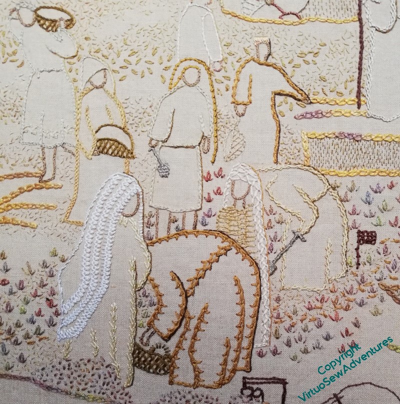
Having finished the title text and got to a point with the seeding where I think it is more or less complete, I pinned up the View of the Excavation over the lovely frame prepared for it, and then set it beside the Map, sat back, and stared thoughtfully.
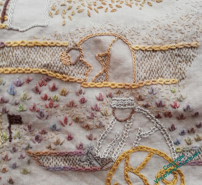
I think the conversation is beginning to happen, now. There are still a few infelicities – the area at the far right where the tete de boeuf stitch falls away from the trench, and the area above it where there’s a sort of funnel shape between the areas of seed stitches. I think, too, that in the far distance, the seed stitching maybe tracks the shapes of the people a little too closely, and I need to make the edges a bit wispier.
When summoned to act as Cardboard Programmer, or Rubber Duck(!), The Australian said that he was having a hard time making out some of the people, and could I put a very narrow shadow that would balance pulling them out of the scene with not emphasising them to the point of obliterating the dust?
And then I had another thought. I have always put them in this order: Map on the left, whatever else I was going to do on the right. Should I keep to that, or should I change my mind?
I love my worklight. It gives a wonderfully crisp and bright light to work from, and it can even be useful in bright daylight because it washes out deep shadows that confuse the eye. By and large, it also gives a better idea of true colour than the earlier one I had, which didn’t have the “throw” to reach from my side table to my hands, and tended towards the blue.
However, just every now and again, it doesn’t quite hit the nail on the head, as it were, and this is a case in point. That row of Knotted Cross stitch is plainly in too cold a colour for the surrounding stitches, and yet when I was picking the colour, using my worklight, the thread looked good, a warm darkish olive-brown. When I looked at the stitches having completed them, it looked much colder, just plain Wrong. Out it comes!
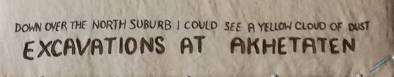
I tend only to unpick first thing in the morning, so rather than continue with the seeding, I went back at that point to the title stitching. And it’s finished!
It’s not entirely even, but neither was the stitching on the Map, and I like the unevenness. It recalls the unevenness of the ground, particularly as the dig advances across the area, and it is just the right weight to anchor the picture.
Working on this section has reminded me of just how much I enjoy working on embroidery in the hand. As I work on William, or on goldwork pieces, or even canvaswork, all of them in a frame with fabric held taut, there is something that I miss about holding the fabric in my hand, taking my stitches and wrapping my threads. I think I need to make sure, for the future, that I have a suitable “in the hand” piece on hand, as it were, to keep me connected to my first love of stitching – the stitches themselves.
Long time readers of my blog know that I use it, not just to talk about the embroidery I’m doing at the moment, but also as a place to put some of my ideas, in the hope that the Search facility will help me find them again, rather than having to paw (I use the word advisedly!) through stacks of paper and notebooks. This is one of those posts!
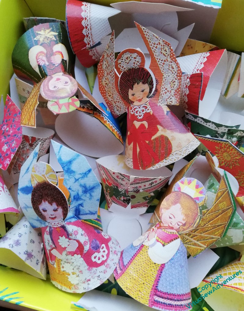
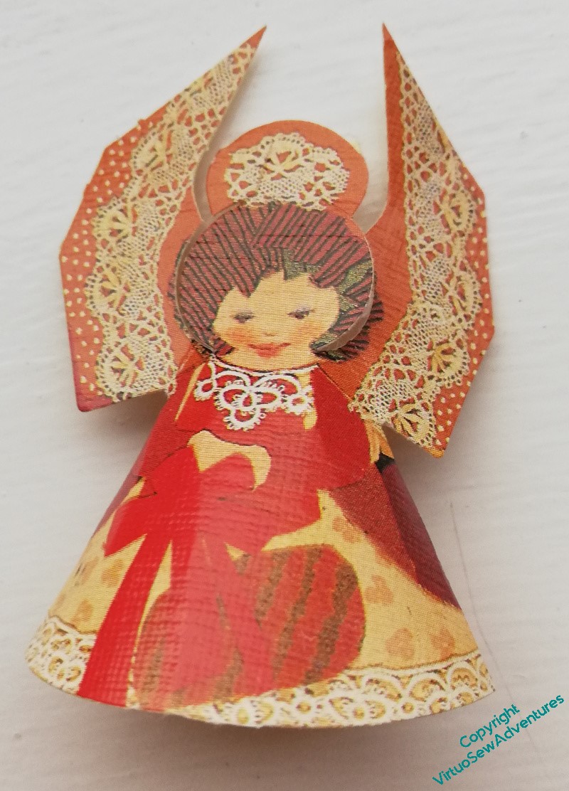
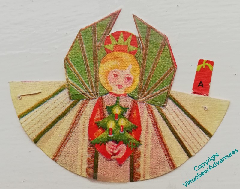
Some of you may recall that the Association of Mouth and Foot Painting Artists used to send out, not just cards, but little sheets that had angels printed on them. You could press them out and curve them into a cone shape, making a charming little Christmas decoration. I was reminded of them when we got the decorations out of the loft, and found a whole boxful!
It occurred to me that I could use a variation on that little pattern to create a needlelace Nativity scene.
That idea became a bit clearer when I looked at a few of them. If you look at this one, the angel’s wings have clearly been made to represent fabric with a bobbin lace edging laid over it, and if that necklace isn’t based on a piece of tatting, I have never seen tatting before!
Clearly, I would want to tweak the shape a little. Only the angel, of the characters in the Nativity, needs wings, and besides, I think a bit of variation in height would be advisable!
The basic shape can be seen when you open one of them out. The wings wouldn’t be hard to remove, for those that don’t need them. But the shape is fairly simple, and it would mean that I could use really gorgeous thread and stitch, allowing the thread and the stitch to do all the work.
I doubt I will be tackling the idea any time soon – I still have to work out how to create the Baby Jesus in the manger in much the same style! – but I think it would be fun to do.
I decided to continue to use Danish Knot Stitch across this area. It makes for a lot of raggedy and flyaway texture, which I think works quite successfully. Furthermore, even if my original idea for these panels was that they would be viewed from a distance, I have learned over the past twenty years that embroideries pull people in. There needs to be something interesting for everyone therefore – the big story, what you see from a distance; the small stories told by the patches; and the details and flourishes added in the working, which may not be appreciated by everyone (although in my experience, anyone who’s willing to pay attention can be enticed into our world!), but which will certainly add something for those deeply interested.
As I continue to work forward, however, I’m not using exclusively heavier and more textured stitches. My starting point is still pale seed stitches. These help to pull the whole thing together (I hope!) and give me a first layer of texture. That’s the dust underfoot and in the air, the “yellow cloud of dust” referred to in the text. The heavier and darker stitching is what pulls the figures forward, responding to the heavier and stronger stitches used to outline them. Then tiny, pale stitches will sparkle through and change the texture again.
Even as I come right into the foreground, I’m starting with seed stitches. I think they won’t go across the whole of the area with the tête de boeuf stitches, as I want to make sure that those stitches keep their authority. I will, however, have to do something about the edge you can see on the right of the topmost trench in that picture, maybe more tête de boeuf stitches, maybe more trench. Wait and see!