
About Rachel
View all posts by Rachel
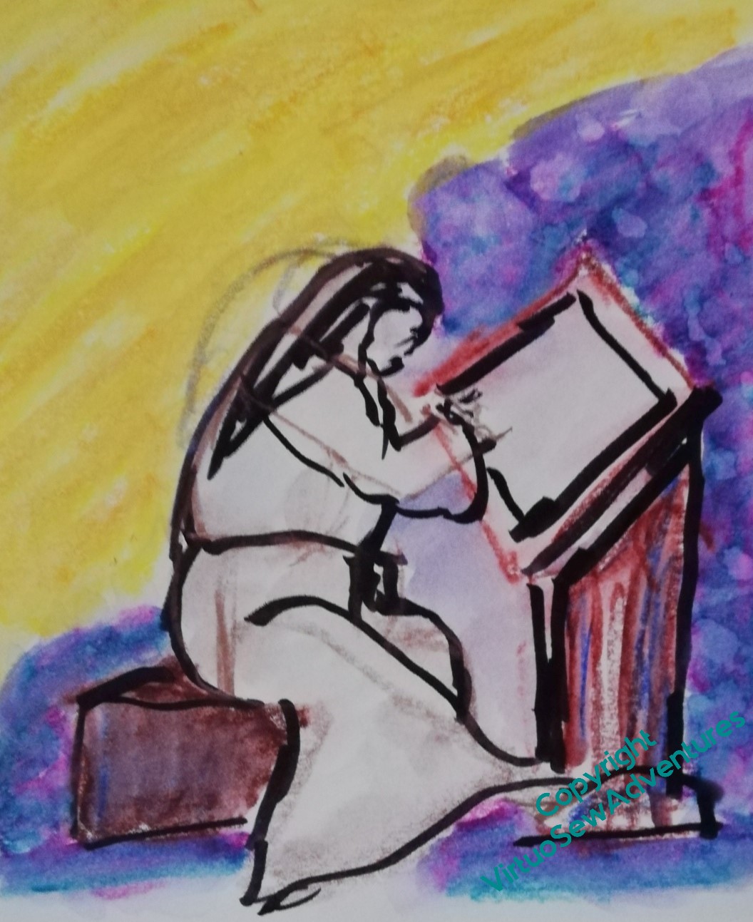
Mending with a Mathstodon
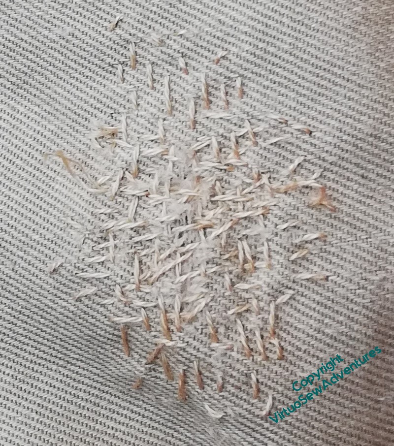
We noticed recently that there was an unexpected hole in a pair of The Australian’s trousers. Unexpected, because above the knee, nowhere near a pocket, and the surrounding fabric was in better condition than the hole would suggest.
I am sure I couldn’t achieve an invisible mend on a fine cotton twill such as this, so then it became a matter of considering Visible Mending – making the whole thing look deliberate and considered, rather than pulled together any old how. So, I asked, what sort of patch would you like?
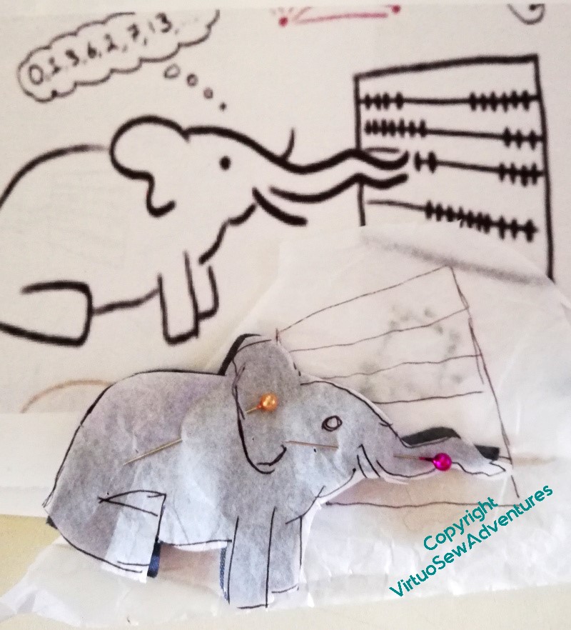
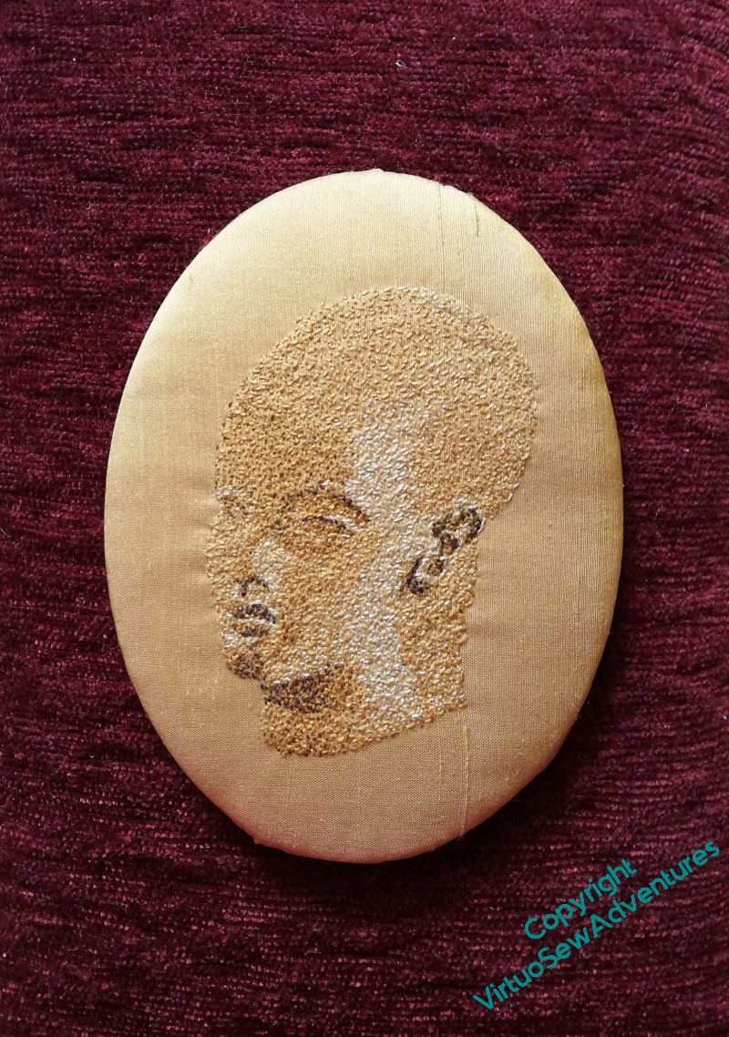
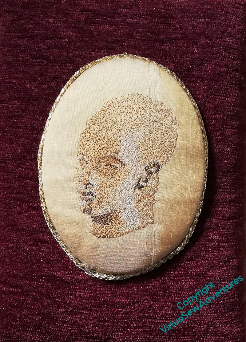
Which is how I came to be messaging The Australian’s co-moderator on the Mastodon instance, “Mathstodon.xyz”, to ask for permission to use the header/logo image he had sketched as the basis for an embroidered patch.
I did think of using the whole thing, embroidered on a larger piece of cloth, but I felt it would make the trousers a bit uncomfortable, so I am extracting the Mathstodon himself, and his counting frame, and I can always add more diagrams and formulae if the trousers wear in other places…
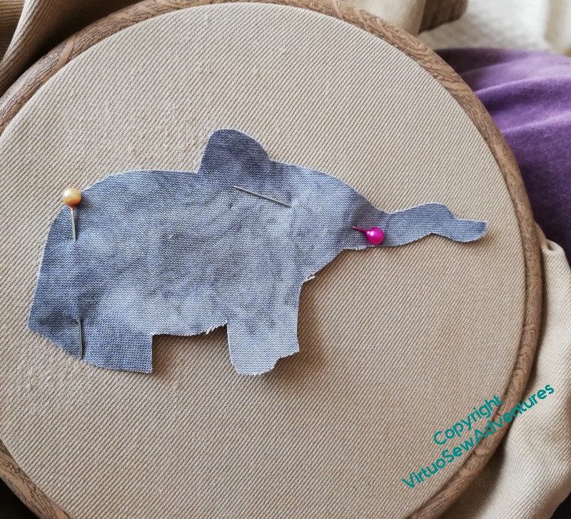
I wouldn’t normally use a hoop when I’m mending a pair of trousers, but it did make it much easier to keep track of where the darned bit was.
The Mathstodon himself is cut out of grey quilting cotton with a slightly marbled print, and I’m going to attach him conventionally over the darn, first held in place with small running stitches and then with buttonhole stitch around his edge, and a few extra details on the inside.
Beginning The Overlays
I had originally intended to screenprint the gauze overlays for the main Amarna panels, but it was proving difficult to find a way of doing it large enough, without excessive cost. Besides, since I have been sketching, painting, and drawing very much more often over the last few years, I’m much more willing to risk my arm (as it were) by doing it in a more immediate manner.
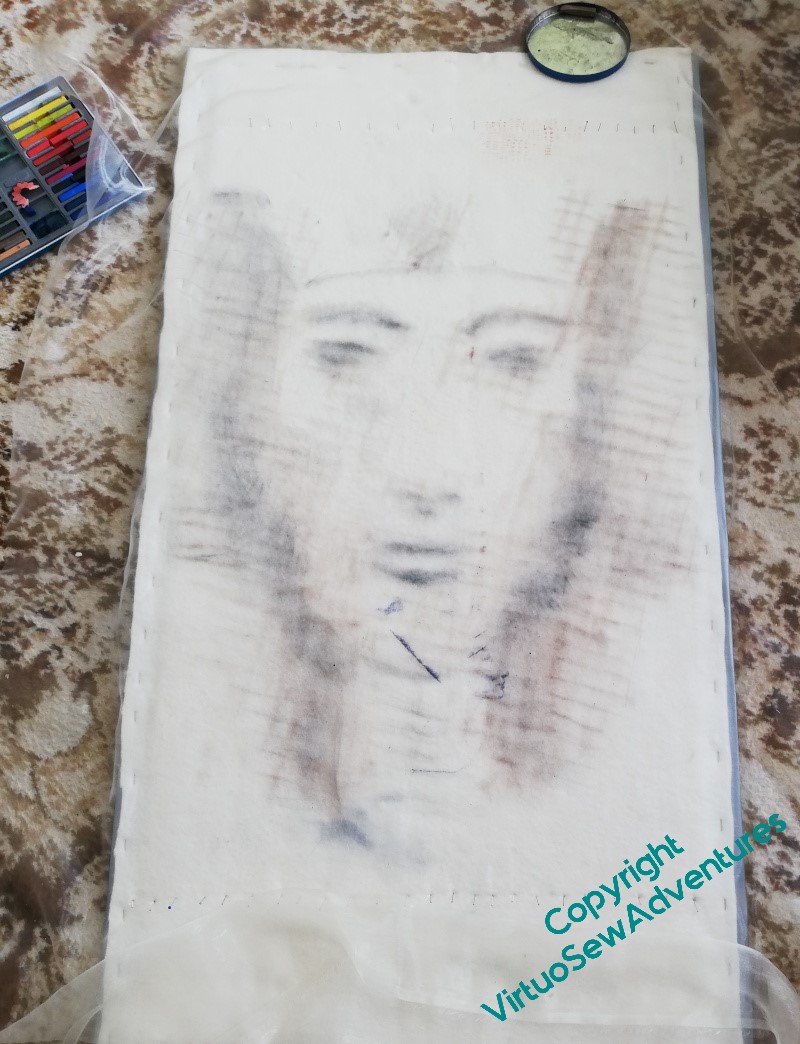
So I found a local printer who was willing to print out my manipulated images of Akhenaten and Nefertiti so I could use them as guides. They had a torrid time with a brand-new printer that kept on not doing as they expected, but they got there in the end, and I stretched my gauze over the printouts, attached to a padded board, fished out some brown inktense blocks, and got started.
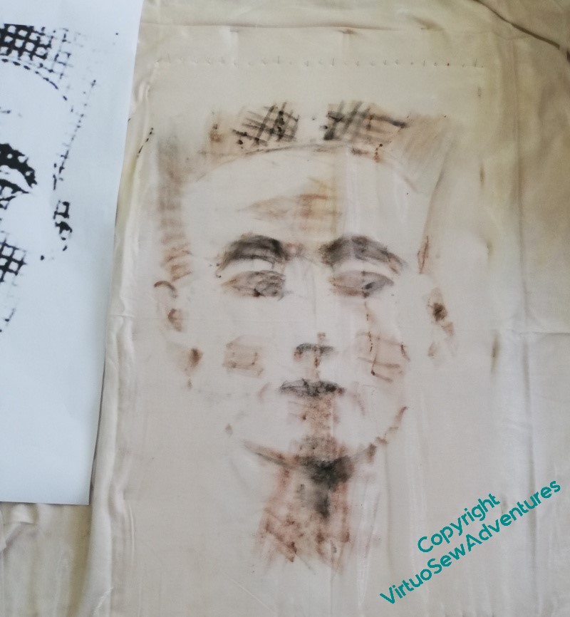
Of course it’s difficult to see where you’ve been on a gauze when the template (for want of a better term) is as strongly marked as these, so when I felt I’d been all over the image once, I drew out the template and went back in by eye.
I still don’t consider I have all that accurate an eye for angle and form, so that was truly terrifying.
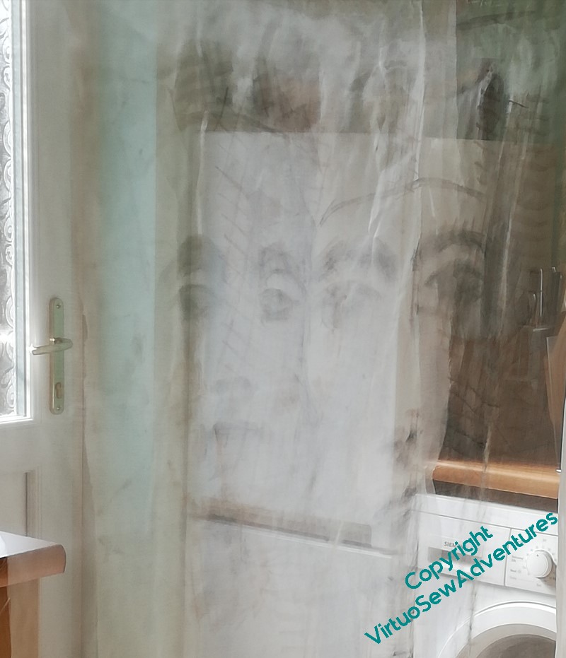
When I hung them from the laundry rack in the kitchen, however, they were “there and not there” in a very promising manner.
Whether or not these are the final versions I use (I’ve enough gauze to go again if they turn out to be the wrong colour or if I need to tweak the tones), will have to wait until I’ve been able to set them up in front of the panels, but until then, I think I can say that I’m very pleased!
More on Mother Julian and Rahere
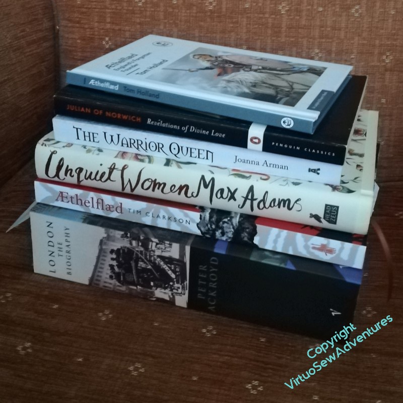
I have a steadily extending bookshelf of reference material. Not all useful, alas, but in this stage I never know what is useful until I get there, so I just have to keep reading.
I’m trying to plan the borders for my planned pieces – these are companions for William Marshall, after all, so the basic style of the designs needs to match his. So, for example, since Julian of Norwich and Rahere are both clerical figures, at least to a degree, maybe I can take into account the information that the “lilies of the field” mentioned in the Bible are probably Lilium candidum, which is native to the Holy Land. Perhaps I could include them, and scallop shells (emblems of pilgrimage), and maybe London Pride (scabious urbanum?) for Rahere? Or maybe lavender or one of the healing herbs? And for Julian, the lilies of the field with hazel leaves and nuts?
I’ve started also to think about the designs themselves. Among the references I’ve not shown in that picture, I have a book of Psalms illustrated with a variety of artwork from the medieval and renaissance period. The illustrations weren’t chosen with my needs in mind, of course, so this rather scrappy effort for Julian is based on a combination of several. I’d like to have a better drapery effect when I get there, although I have to be careful not to be too exaggerated – I can’t imagine anchoresses dressed in the height of fashion!
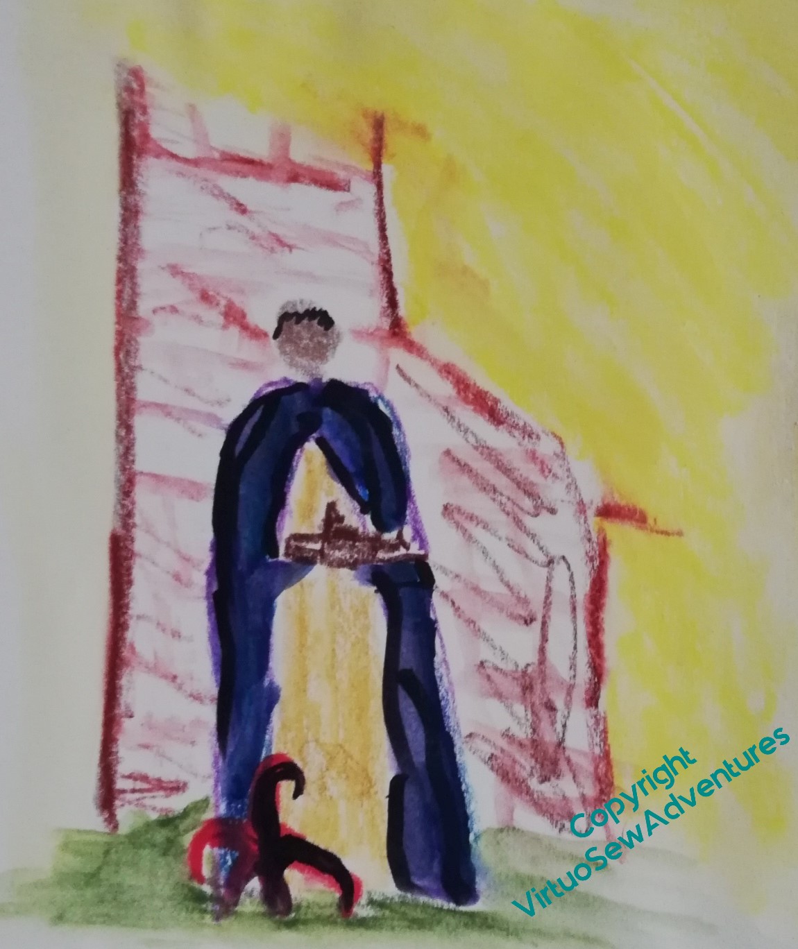
For Rahere, I can use the drawing of the effigy on his tomb as the basis, but in his hands will be a model of the Priory and Hospital of St Bartholomew The Great, and at his feet the jester’s cap symbolising the life he rejected after the loss of The White Ship. I may have building work behind him, the beginning of a tower or a wall.
When I made my first research visit to St Bartholomew’s, I didn’t look at the outside, which may prove to be a mistake. Fortunately I am sure I will get another chance to visit!
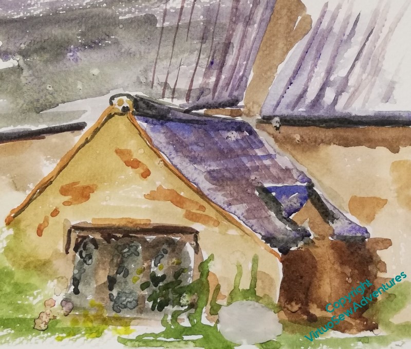
By contrast, when I visited Mother Julian’s Church, I didn’t do a sketch inside her cell – that would have involved being terribly in the way for the people preparing for a Flower Festival later in the week. I sat in the churchyard and painted the outside, instead. Norwich is a bit more of an epic to get to from the west coast, where we are, so I may have to be Even More Imaginative for Mother Julian’s surroundings!
Mounting Choices Again
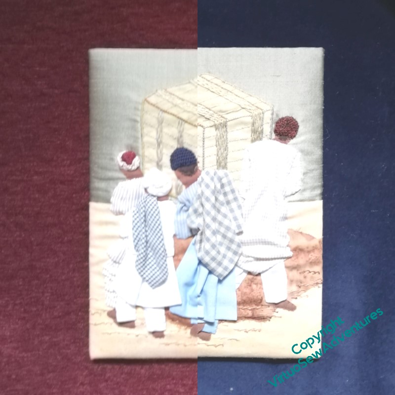
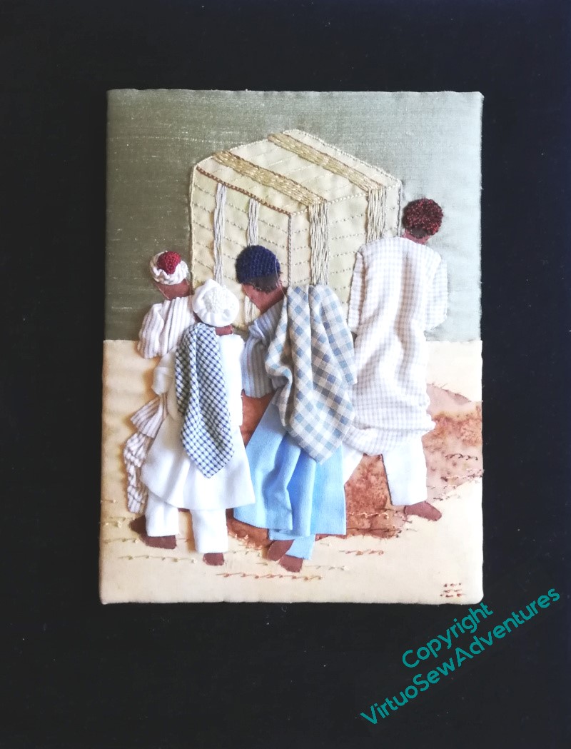
There were some quandaries about mounting “Loading The Felucca”. Burgundy? Navy? Copper? Brown? I posted these pictures on various social media sites – each of which picked a different preference, which wasn’t helpful at all, but at least left me free to apply my own judgement.
So I chose the same navy blue velvet I used for the Amarna Royal Family. All the other fabrics had something going for them, but the navy blue brought out the colours and shapes more emphatically and truly – although I fear you will have to take my word for it, as my photograph doesn’t really bring out the blueness of the velvet!
However, in the course of the final mounting process, I discovered that the embroidery was no longer visibly signed. Curses!
Then I checked, and neither was Ankhsenspaaten. Curses again!
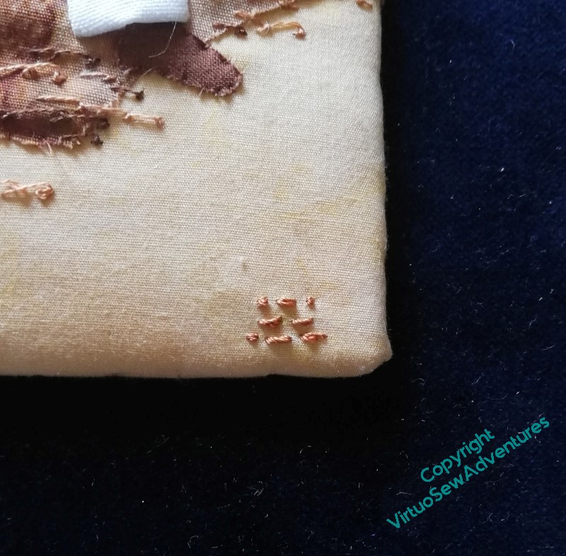
They are now…
Researching Rahere..
It’s going to be some while before I can start stitching on the other Medieval Movers and Shakers (I’m going to have to find a better title for that quartet, they’re going to drive me demented if I don’t!), but given I have much research to do, that’s no great difficulty.
I have been accumulating books – which is also rather a delight in any case.
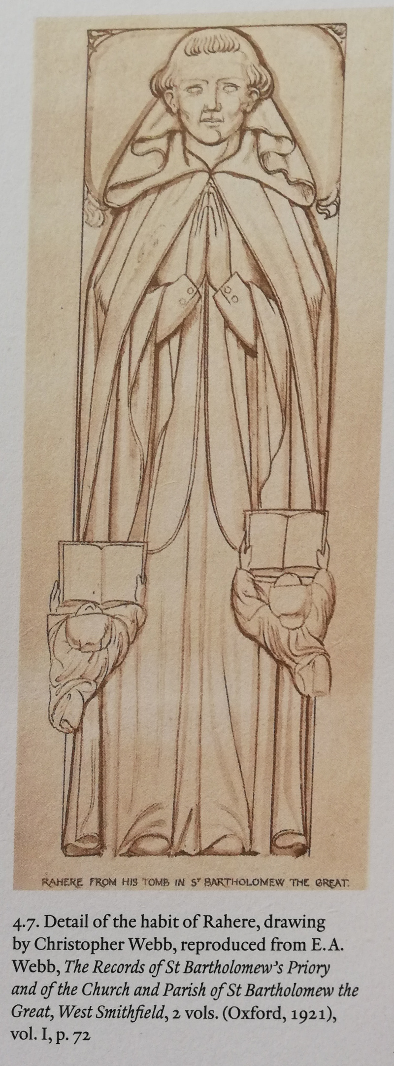
The history of the church Rahere founded duly arrived a week or so after our visit, and proved very interesting indeed. It included among the illustrations this engraving of the tomb effigy on Rahere’s tomb. The tomb was not made for Rahere when he died, but about four hundred years later, so one should take the likeness of the face with a pinch of salt, but I’m sure it will have got his Dominican robes right, so it may be useful in planning how I depict him. (I’ve just double checked – white cassock and black cloak, so for the purposes of the embroidery I can go for the look of undyed wool for the cassock, and dark greys and browns for the cloak).
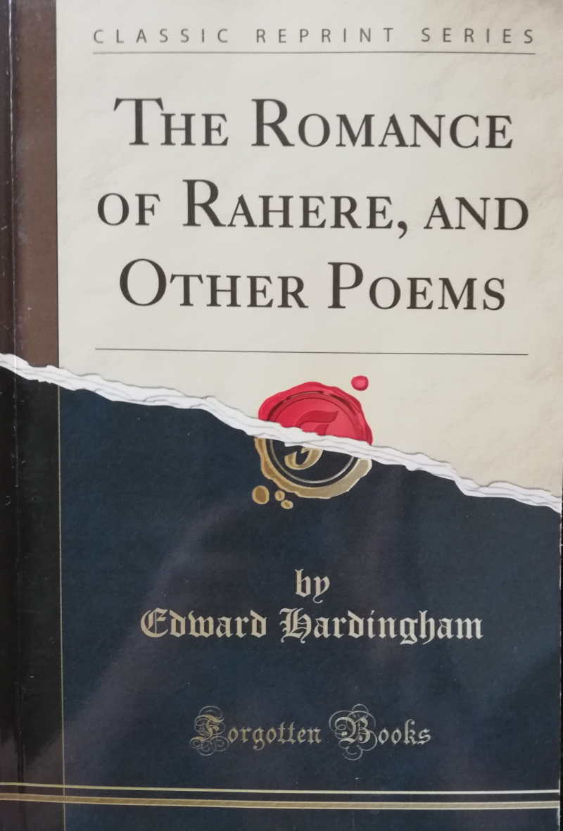
I also found a reference to an epic poem called The Romance of Rahere, thinking it might at least be atmospheric.
Well, no. It’s set in the Civil War, about the orphan daughter of the vicar of St Bartholomew the Great who is named after the founder (poor lass) and who dies in the church during a thunderstorm, leaving the boy who wants to marry her absolutely distraught, and becoming a soldier to seek death, but surviving and returning home to right the wrongs caused by his greedy and abusive father.
So not even remotely helpful!
In the Kipling tale in which he appears, “The Tree of Justice”, Rahere, the Kings’ Jester, is described as: “more of a priest than a fool and more of a wizard than either“, and his jester’s outfit as parti-coloured in black and red. There is so little information about the person that I’m going to be using that as the basis for my characterisation. My current idea for the embroidery design is to have Rahere in his Dominican Robes, with a model of St Bartholomew the Great in his hands, and his jester’s cap at his feet. The border – well, maybe the flower London Pride, maybe bells (for the jester) and scallop shells (for pilgrimage). We’ll just have to wait and see!
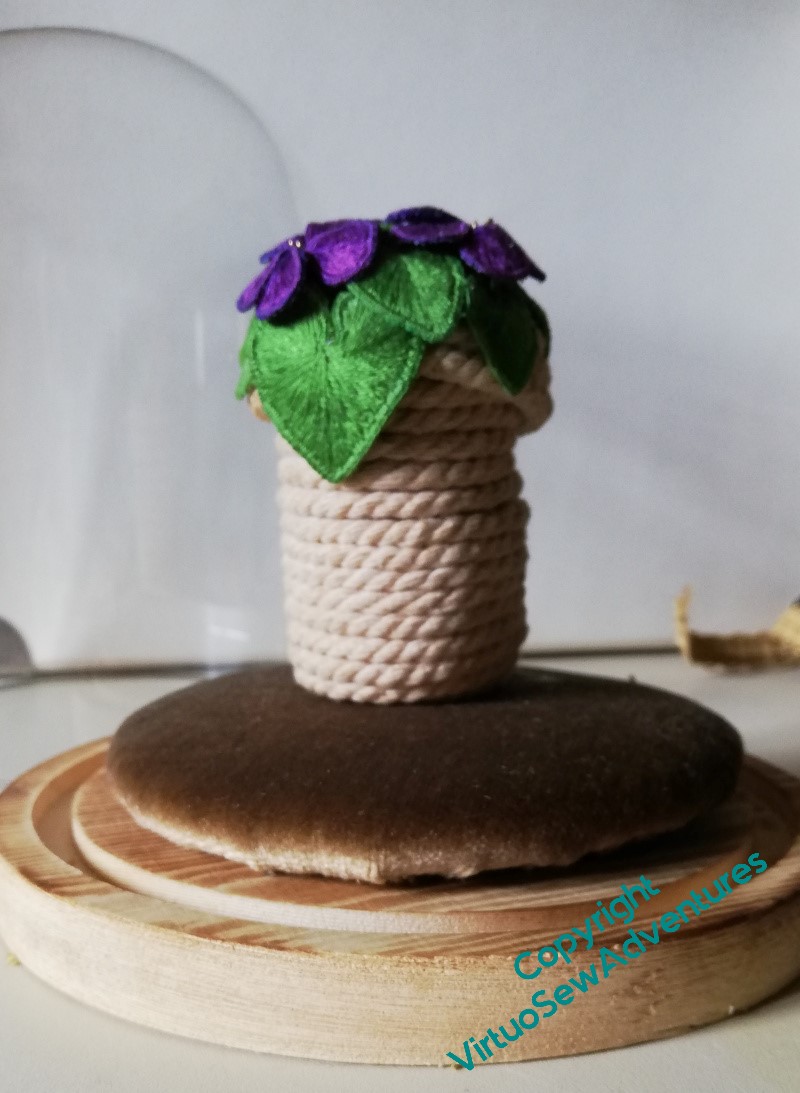
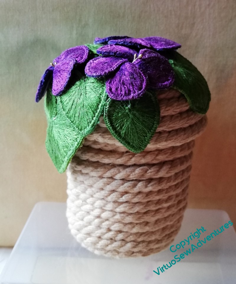
Cushion For The Coiled Pot
I clipped the edges of the cushion for the coiled pot, and laced the tabs together. That was a bit less bulky than before, but still clunky and rather unstable.
<thinks hard> I wonder whether this will work…?
I stitched (that curved needle again!) close to the edge of the card mount, using a strong, doubled, cotton thread. Fortunately I’d backed the card with some heavy pelmet vilene, which meant that some stitches went into that as well as the velvet.
Then, with great trepidation, I cut off the first tab. And then the one it had been attached to.
Ooh, the whole thing didn’t disintegrate!
So I carried on , and it still didn’t disintegrate (although velvet is a very messy fabric to cut!). I tried it in place – much better, stable, lower, neater. But yes, still shedding fragments of velvet. That’s easy to fix – a couple of layers of pva glue on the underneath (me, reaching for glue? who am I, all of a sudden?!), and there’s no more shedding.
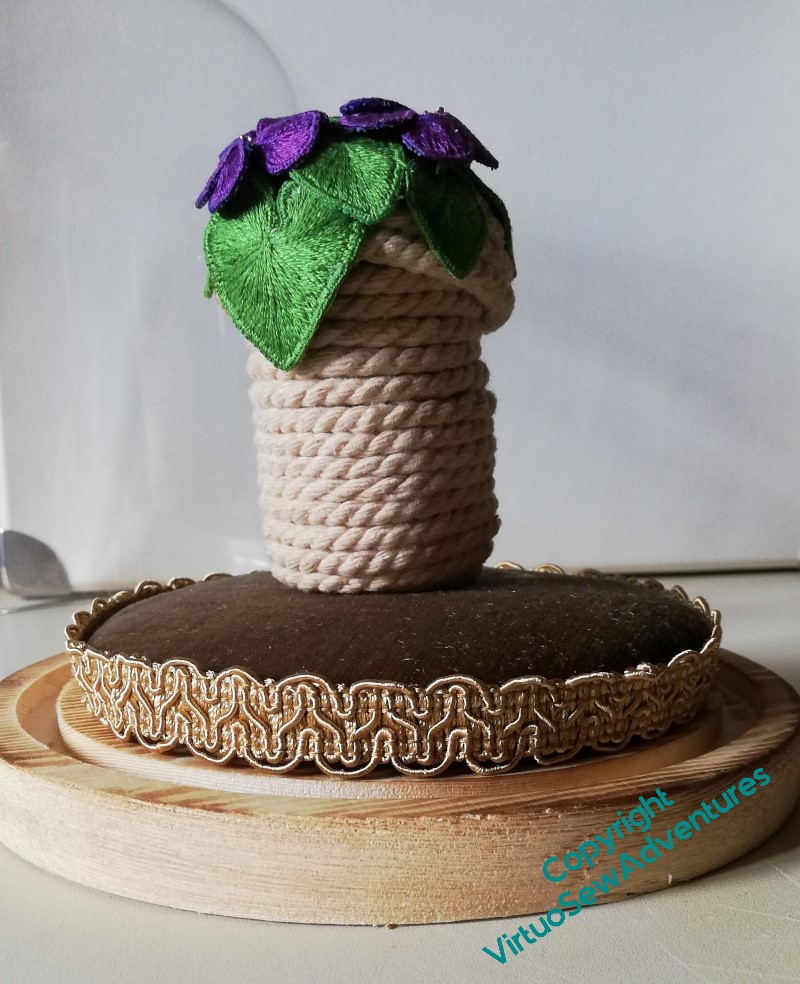
However, I do think it looks a little unfinished.
So, trimmed with a bit of furniture braid, which makes a neat little edge, slightly camouflaging what I’ve done and how.
If the daisy beads escape, it might help to keep them safe, as well.
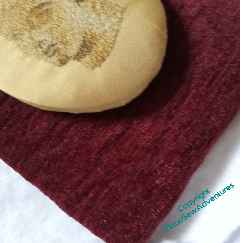
Mounting Ankhsenspaaten
After some thought, I decided to take the inspiration of mounting for the Head of Ankhsenspaaten from Victorian mounts for minaiture portraits, so I went to my local framer, who goes by the not-at-all-exaggerated business name of “Framing Genius” (seriously, quite apart from any headaches I may give her, I’ve seen some of the other things she’s been asked to do!), and we worked out what size of oval would work for this idea. Then her clever computer controlled cutter cut out an oval that was exactly the size and proportions I wanted.
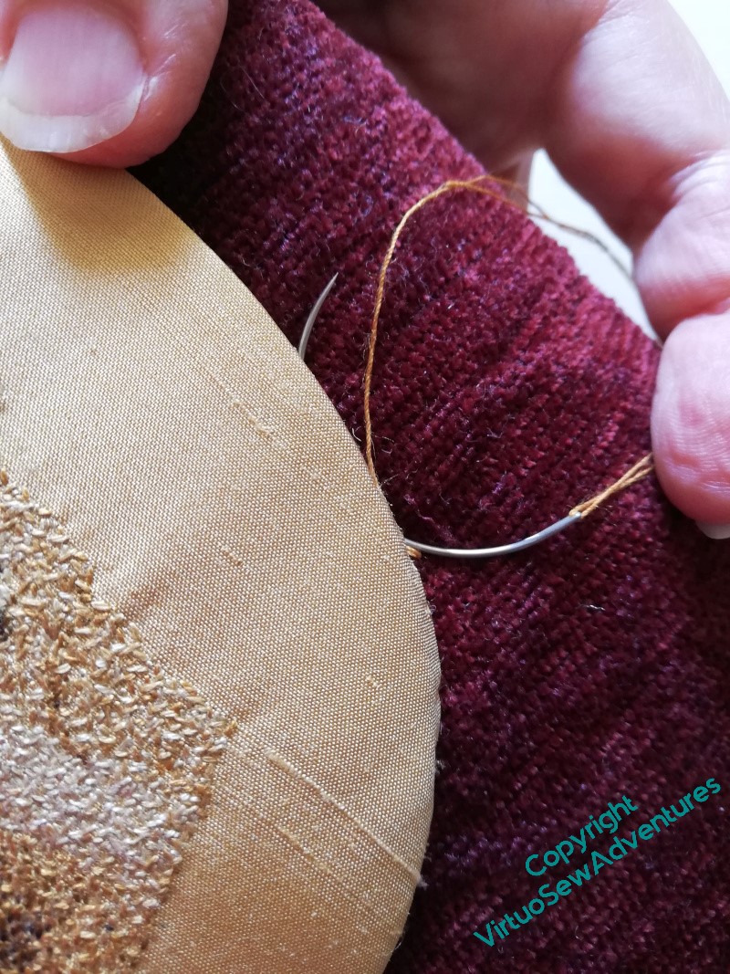
Further thought, and some playing with cards and fabrics, helped me to decide to use for her background the same burgundy chenille upholstery fabric that I eventually used to mount the Colossus of Akhenaten. None of the Amarna pieces are going behind glass – if eventual owners wish to do so, that’s their prerogative, but I like the immediacy of feeling you get, looking at a fabric or thread without any glass in the way – so the next job was to stretch the burgundy over a wooden frame and use that wretched curved needle to ladder stitch the two together.
I may be being unfair. I still don’t find a curved needle at all natural to use, but I am at least beginning not to whimper every time I look at it. It’s very useful for the purpose I’m using it for!
Once I had her neatly mounted, I sat back for some of my usual Thoughtful Staring.
The original inspiration sometimes had a cord or ribbon trim around the oval of the miniature – maybe as it stands the transition is a little abrupt?
I’ve a small collection of odd metallic cords bought at an Embroiderer’s Guild Sale, so I rummaged in that, and found something that might work.
Then I looked a little harder and realised that the thread I had used to attach the oval to the velvet would show. For the first time, I found a use for the Peri-Lusta Invisible Thread I found in my Grandmama’s workbox!
I’ve not got the gold thread quite correctly placed yet (I ran out of patience with myself at this point), so I need to spend a bit of time tweaking that, but I think where it is in the right place it is definitely improving the look.
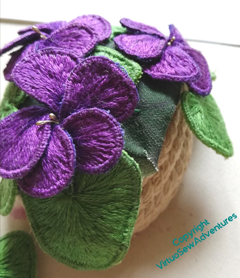
Violets in place
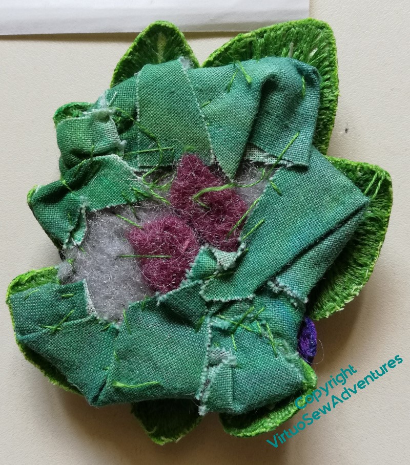
When I looked again at the back of the Clump, or Mat, of violets, it became clear to me why it hadn’t followed the contours of the little pot I’d made. The padding is much too broad, and much too inflexible. It was a sensible choice to do this when I was planning to include the Violets among the spots on the main panels, but when I began to look at assembling them, the Violets and the Daisy Beads drew closer together and started to look somewhat askance at the rest of what I planned.
I began to undo the padding, and found the whole mat disintegrating on me (not really a surprise), so I went back to the beginning. I made another piece of painted calico, redesigned the pattern of my Mat, pierced holes in the new calico and began to reassemble the whole thing, with only one small piece of felt to pad it, and some extra stitching to entangle the “legs” of my petals and leaves.
I had forgotten how many extra fingers and hands that process had required the first time around.
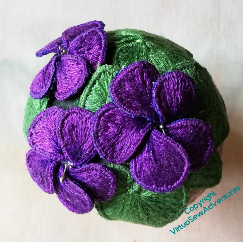
I got there in the end, I think we can say!
Reassured and making progress
After gazing long and hard at my layout, I decided that I wasn’t likely to improve it and that the thing to do was to just get started.
I’m determined to get to grips with Grandmama’s curved needles, and this is a perfect occasion to do so, because it’s so very hard to manipulate a straight needle to do what you want that even a curved needle feels like it is helping!
Grandmama’s set included three sizes, and I’m using the smallest, which is marked “lampshade”. I’ve always wrestled with a straight needle for lampshades, so who knows, this skill may prove transferable!
I’m using ladder stitch, or at least, something very like ladder stitch, and I’m beginning to feel that the curved needle genuinely does help me to make progress.
This is also the point at which I am made most aware that developing these panels into individual pieces that I work on separately has made it possible to achieve what I want. The panels aren’t huge (Placidus, when I get to him, will be much bigger), but if they were already attached to the Map or the Excavation, it would be nearly impossible to reach some of the angles I want to.
I’ve found it easiest to work on stitch lines facing away from me, and while this hasn’t been entirely straightforward in all cases, it would be altogether impossible if the turquoise panels were already attached to the sandy ones.
Especially the short ones, where I would find myself leaning over the entire height of the Map or Excavation!
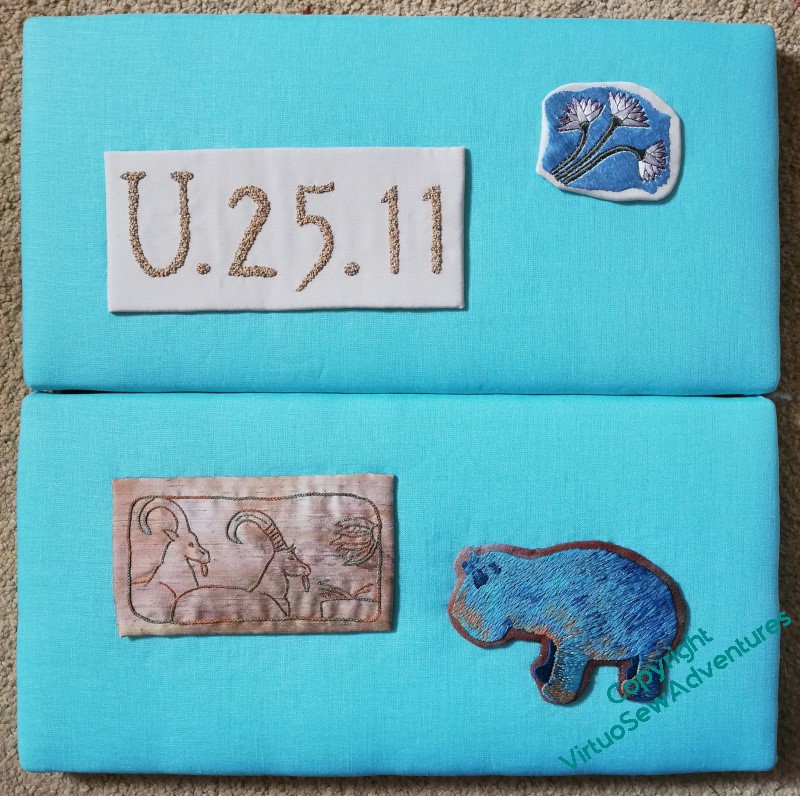
I do have some concerns that the linen will sag under the weight of the Spots, so I’ve set these aside for a couple of weeks, upright, to see whether I need to gather in any Unfortunate Happenings.
Spots laid out for attachment
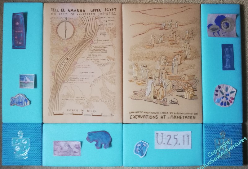
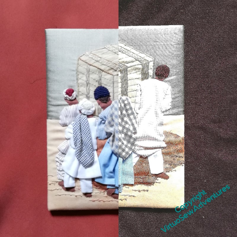
If you compare these two pictures, you will see what I meant by saying the embroideries had personality that the photocopies lack!
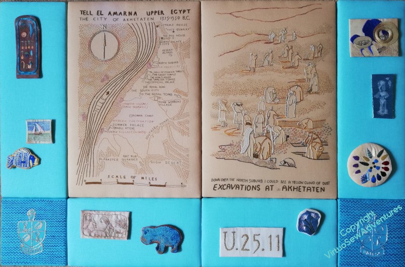
Some of it may be down to better lighting, but I think even the Map and the Excavation are looking brighter and happier.
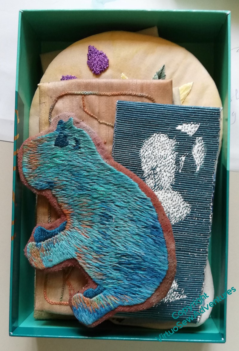
So now they are back in their box, ready to come out one at a time to be attached to the border panels.
The details of that attachment may require some wrangling, and as for the details of attaching the panels to one another – I’m still very unsure about how that will happen. At the moment my best guess is mirror plates, but if anyone has a better idea I would love to hear it!