
The Excavation – more progress
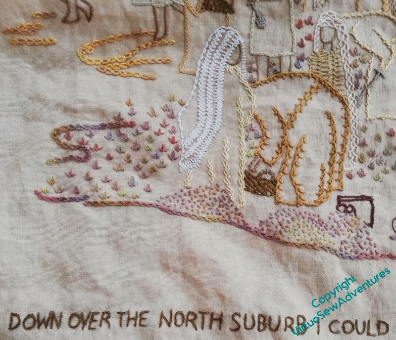
I was clear that the surtitle would be in split stitch, so I got started on that. It’s in a dark, plain colour, to be clear and readable and add weight to the bottom of the design.
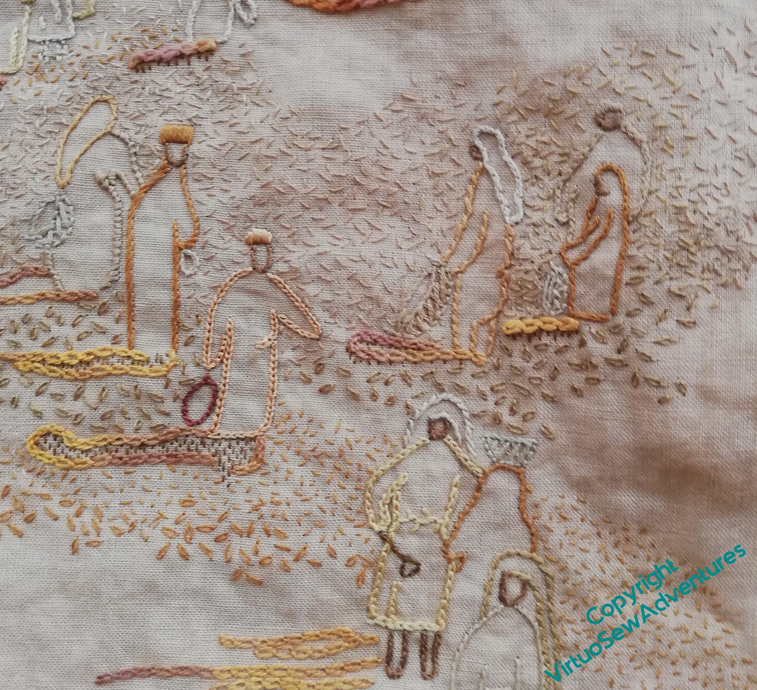
I definitely like the tête de boeuf stitches. They add visual weight, a good variation in colour, and although the colours in the thread are similar, the small seed stitch spoil heaps at the front look completely different.
I may yet find I need to add more stitches at the base, above the text, but of course, by now, you are all accustomed to the way I tend to build up these pieces as the elements occur to me!
The middle ground is, so far, not quite so successful. I am using small sandy coloured seed stitches, and they work at some distances, but not quite so well in others. It certainly doesn’t photograph well at present. I want to make sure that the colours aren’t too dark, because I want it to remain dusty, but developing this section will involve a good few extra layers!
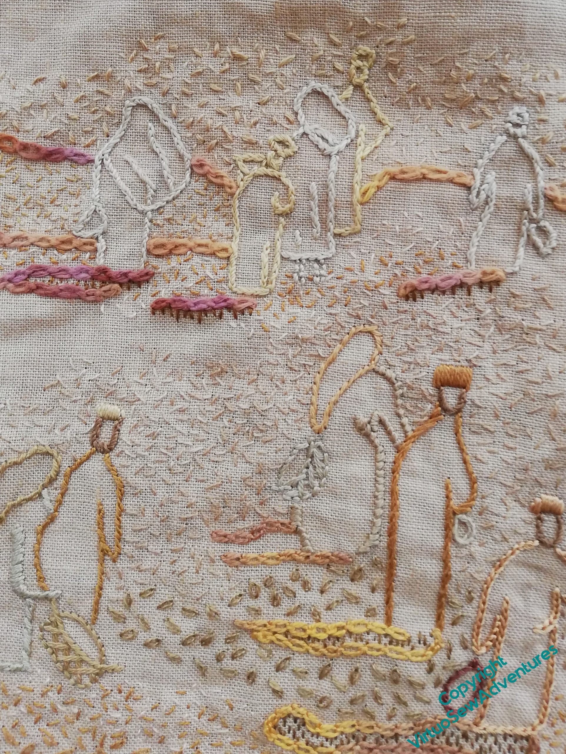
The distant section, I think, has worked. It does all look very dusty, and the distant figures are pushed out of the stitching and don’t vanish into the fabric as much as they did.
Adding the random single chain stitches in the mid ground has also helped. They may need some seed stitches scattered through them the meld the areas together, but I am hoping that each part of this scene will make more and more sense as I continue to work on it.
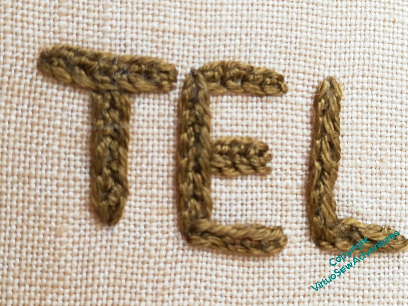
I haven’t quite worked out which stitch I used for the title on the Map of Amarna. Quaker Stitch? Whipped or Interlaced Reverse Chain Stitch? I even checked the early blog posts, where I read a somewhat elliptical:
For the main title I picked up one of the stitches from the Tudor and Stuart Masterclass – it’s lovely to find myself using a stitch I’ve learnt recently in a project I first started thinking about over fifteen years ago
Me, in 2012
Be warned by me – better recordkeeping reduces frustration!
Yes, it is building up to something that reads well without losing too much of the simplicity of understated figures in a lot of sand. I think that once you have your words in place, the amount and position of any more weight and shading you still need (if any) will be obvious. And if it is to balance The Map, then you will have a less trouble judging the effect.
Could it not be Holly Braid Stitch? If you made a row of each stitch on your guess list and compared it (back and front) of the Map of Amarna, maybe you can solve the problem.
Whatever stitch it is, it looks good! The excavators are building up nicely. xx
The seeding is working very well and it’s very much part of your style of working to evolve things while you stitch. I had to laugh when I read your comment about the title stitch. I’ve literally done something almost identical with a pendant I wanted to upcycle – the scribbled design and cryptic remark I left with it also meant nothing to me several years later! I’m pretty sure it’s not Quaker though – it looks a bit too wide and interlaced.
I love this piece, the colours are so delicate and well combined, nothing overtakes and the whole effect is a quiet view of the excavation. I love your mention of the dust as I see that too- perhaps that is what’s present in the blending of the colours…
Your stitchery is really bringing it all together isn’t it? I too love the subtle colours which integrate the figures without overtaking them. As Sue says, getting the words there as well will help you decide what more might be needed in the background, along with viewing it in relation to the map. As to the stitch for the heavier text, I have no clue, not being a great experimenter in stitches, but I’m sure you’ll work something out, I have faith in your expertise 🙂