
The Excavation – Further Dilemmas
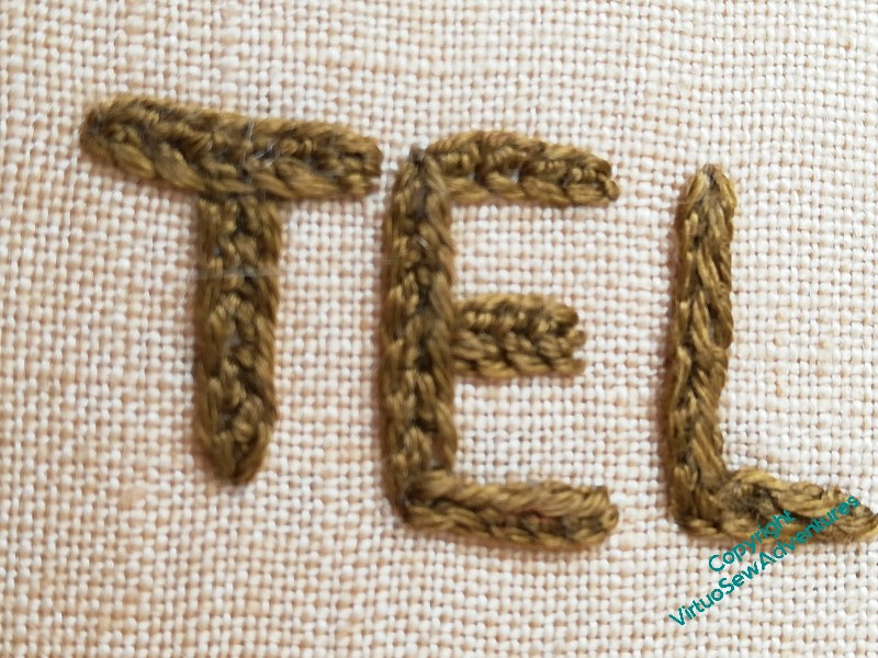
You may recall I was wrestling somewhat with the large title, still trying to work out what the stitch was. Since I had jumped the gun a little, and already have the Map stretched and stapled to the frame, I can’t look at the back, and I wanted to maintain consistency across the two panels, so I had to find out.
I did a little more rummaging on my blog, and finally found a reference to it!
So now I know what to do there, I can move on to my next dilemma..
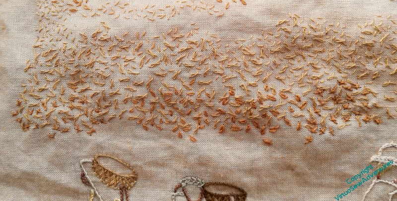
You can see, I think, that the uppermost strand of this section is in Seed Stitch, and the next is Twisted Chain Stitch. All single strand (honestly, what’s happened to me, I used to be all about chunky stitching with six strands in the needle!!) and random as far as I can make them. I felt that the lowest area of this section needed to be more emphatic, and tried a variant on Danish Knotted Cross, followed by single chain, followed by both of those in a slightly thicker thread, and then stood back and looked at them.
Even with my glasses, I was struggling to see any difference.
Now, I find myself wondering, does this matter, or does it not? How emphatic do I need to be, how much do I need to emphasise this mid-ground area?
Well, I am glad your lettering problem is resolved, because I couldn’t tell what that stitch is.
As for the speckles, I think spacing, density and colour make a lot more difference than specific shape – at a glance, anyway. Closer to, you may find a variety of shapes more interesting, and more interesting to work, but I wouldn’t worry too much. It’s all doing the same job.
I think another question you might ask yourself is how much more emphasis will you need when you come to the foreground, once the middle ground is complete. When I look at the image in a separate window on the PC from a distance I can definitely see a subtle difference between the two areas you are considering. In part this is because you have used slightly stronger colours, which brings things forward; also the extra detail in the knotted chain adds a little bit more texture. So, if the nearest ground needs to be distinguished from the middle, does your tete de boeuf gathering of plants do that, or are you going to add something else to evoke some dustiness in between the two?
Glad your lettering dilemma is sorted
Oh, I am happy you found the stitch you used for the title.
Concerning your dust problem, ask yourself: From what distance will this piece be looked at? As Kathy F said if you stand back you see the stitches differently from when you see them close up. With two stands in the needle the stitches look darker, don’t they? Should you need/want a stitch with even more structure, there is always Hyacinth Stitch
You usually come to a satisfying result. Happy New Year and continue enjoying your stitching.
Well done for finally identifying the stitch! I also find it difficult to see an appreciable difference but I also think that it might be clearer when you look at the whole balance of the piece. I suspect that after a turn in your creative subconscious the answer will come clear.