Tag: Silk thread
Still working on that border!
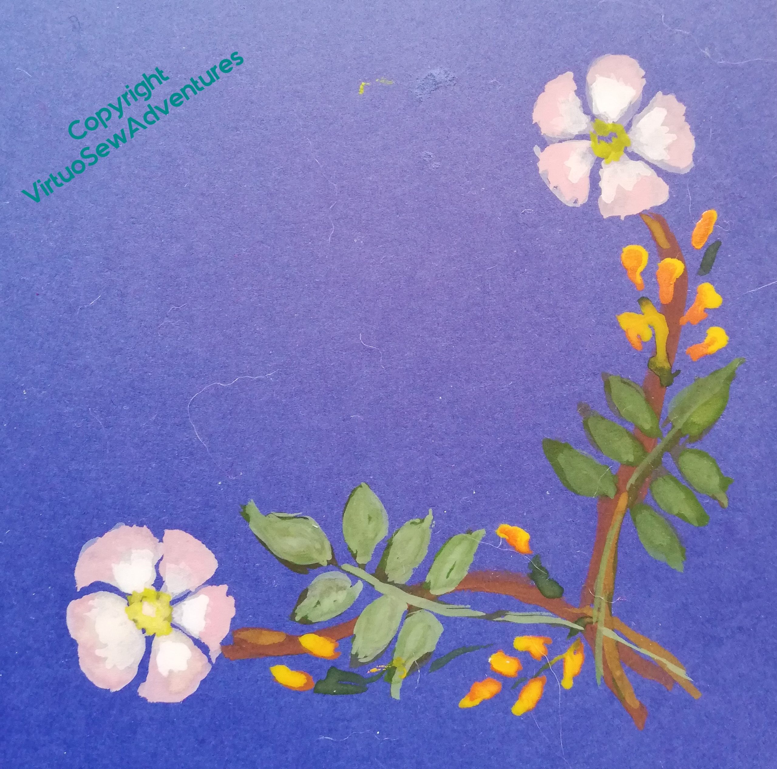
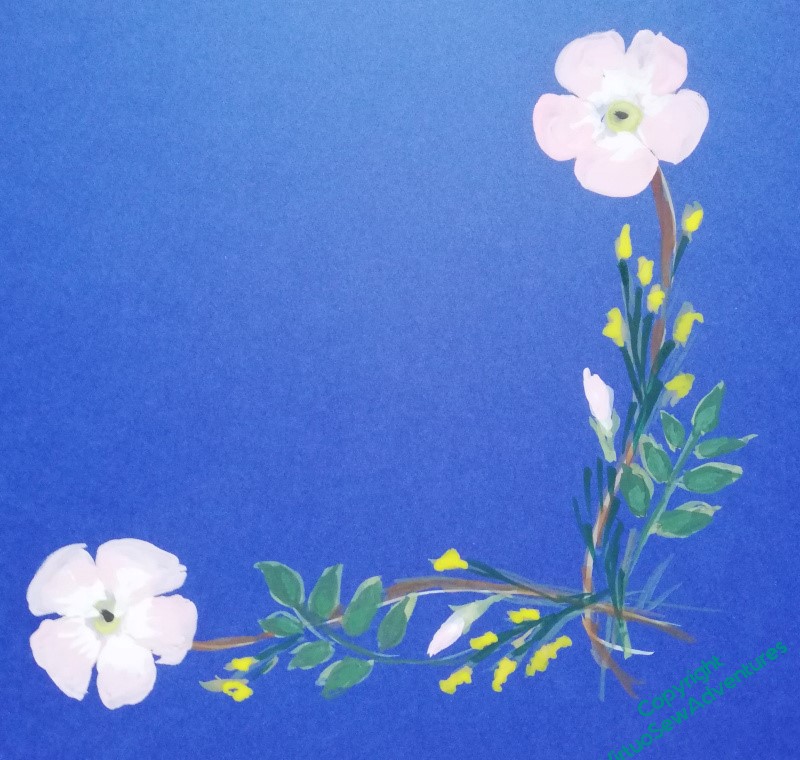
I continue to wrestle with the arrangement of broom and dog roses – my goodness, am I ever glad I’ve been working on planning with paint over the last two years or so! I do some exploration with digital images, but as it often results in a sore arm from mouse and trackpad manipulation, painting is a much better option. This selection of straight sprigs could be assembled into corner decorations, and potentially tweaked in size to fill a side or leave space for the Templar crosses.
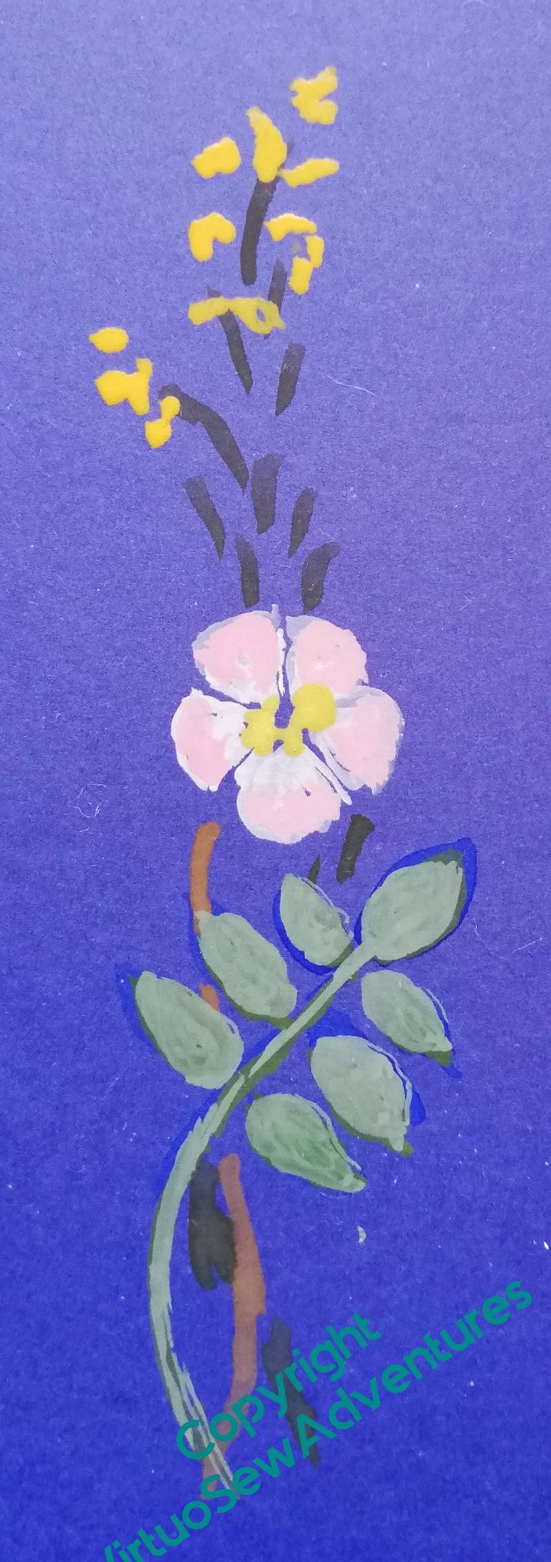
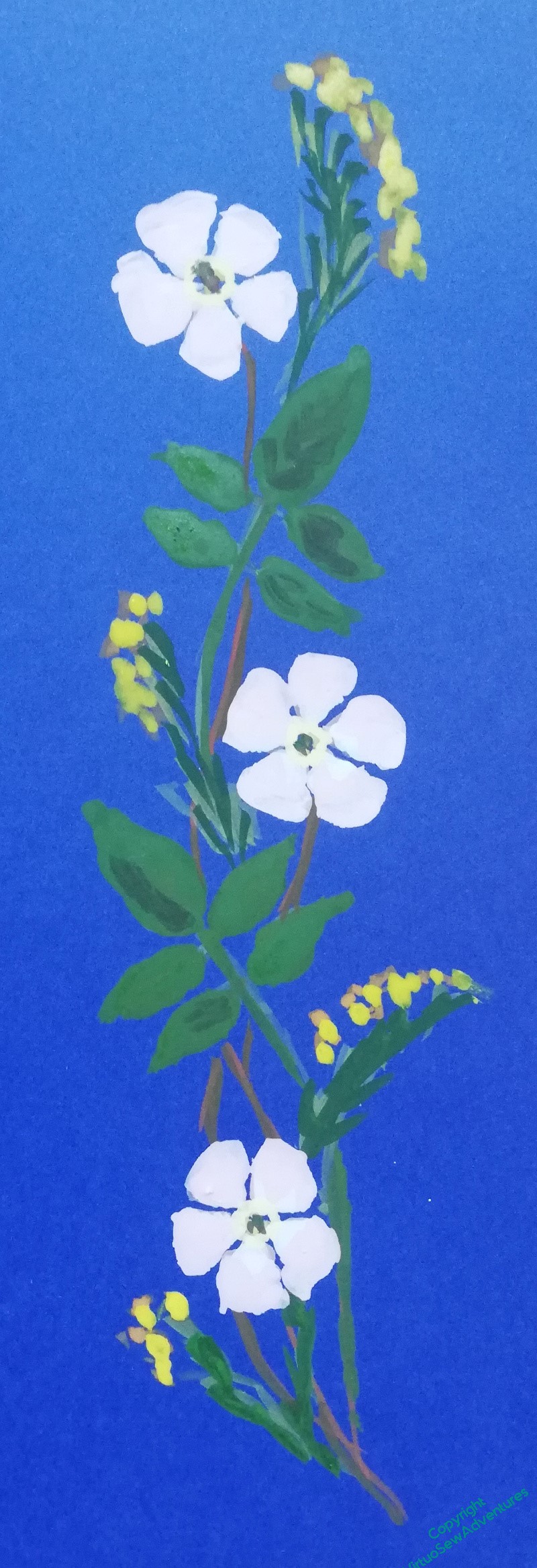

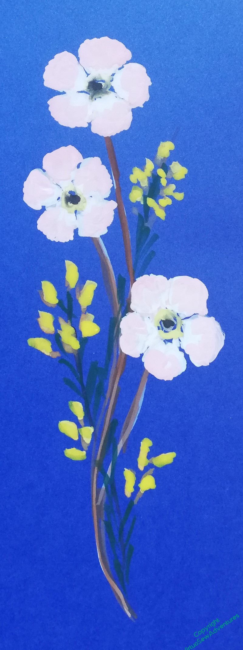
Indeed, I have painted so many straight sprigs and corner designs – so large, to make it easier to paint – that I’ve become quite blind and jaded with them, and can’t decide which I like. I did realise that I needed to put them against William and the chateau de Tancaville, so I photographed them and printed them out. And then told the printer to try something smaller and go again.
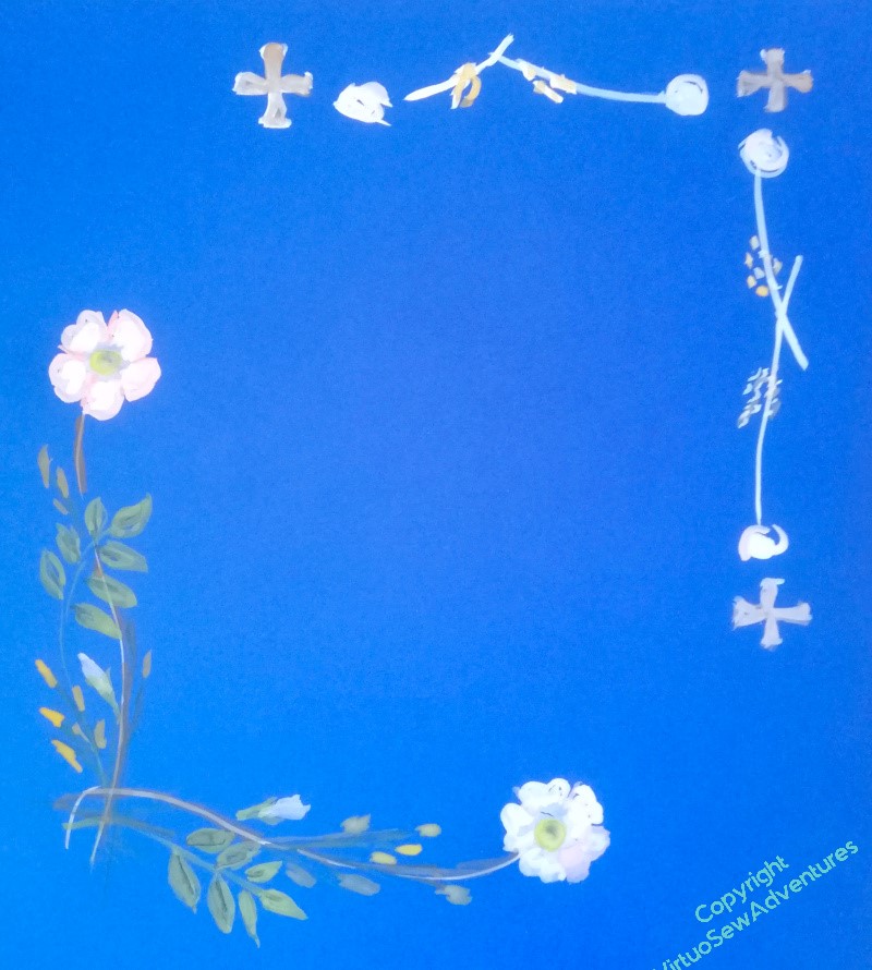
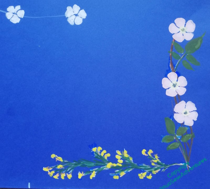
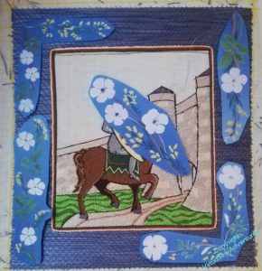
And that showed that those sprigs would have to be, if anything, even smaller than I had anticipated.
This tells me that I will have to be very much more careful about the colours I use, and the number of strands. I can’t afford to produce a border that looks muddy or confused, but equally, it mustn’t fight with William or his underside couched golden sky.
Tricky. Very tricky.
William’s Border – the background..
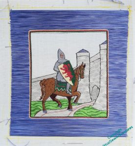
As you can imagine, it took me some time to decide on the way I was going to tackle the border. Since the “sky” is going to be underside couched in gold, it needed something to contain it, and I felt that it had to be a colour which wasn’t already dominant in the design – so not grey, and not brown.
Blue somehow became the obvious choice, and then I had to decide how to do it. I wanted the colour to have a bit of variation to make it less stark, but at the same time, calm enough to settle into the background. So I have three different shades of blue in the needle at once, and the base layer is surface satin stitch.
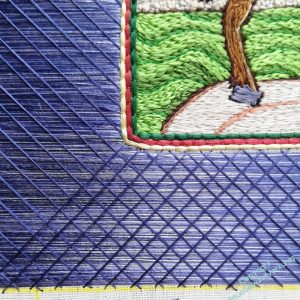
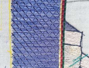
That isn’t at all stable, so it is going to have trellis couching over the top.
The first layer has a slightly watery look to it, not at all unsuitable for someone who travelled as much as William, but I wanted to calm it down some more, because, remember, it’s merely the background for broom and dog roses! So the hatching (the trellis part) uses the two darker shades of the three.
The final stage is tieing stitches, in the lightest blue. I’m really pleased with this, as it has produced the right control of the threads, and the light blue glints like a gem at the crossing points.
The outer edge will have the same as the inner edge, but in the reverse order. Soon I will have to finalise the ideas for the broom and dog roses, and when I’ve done that there will be no excuse to avoid the underside couching, the prospect of which is slightly unnerving me..
More thinking about that border design
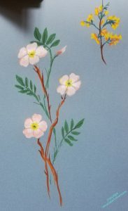
Once I’d got the panel done and got started on the background for the border, I knew that I was going to have a lot to do before the next stage of decorating the border. So I got out my paints, and started to play with the design elements I want to pull together – broom and dog roses.
My first effort, based on the drawings in the Observers Book of Wild Flowers, ended up as one of each, rather than a combination, so I knew I needed to think about that a little more; but I also realised that unless I worked out how the combination was going to be applied, I was going to end up doing a lot of work in the wrong direction.
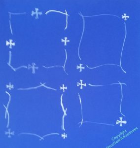
So. Layout. I had begun by thinking about a wreath, but somewhere along the way, it turned into sprigs, and then I started to think about adding another motif – the cross the Knights Templar used, for Temple Church, where William is buried.
Combining the idea of the sprigs with the Templar cross, I’ve got four possible layouts, one with a cross at each corner, one with the cross in the middle of each side, and one with crosses on the the diagonals. At the moment, I am leaning towards the one with the cross in the centre of each side. The corner crosses seem to make a less purposeful pattern, somehow, and the diagonals – well, depending on the final form of the sprigs, they may work in the end, but at the moment, I’m not at all convinced!
Moving on with William
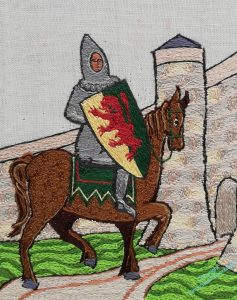
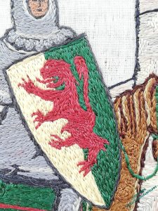
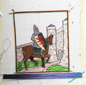
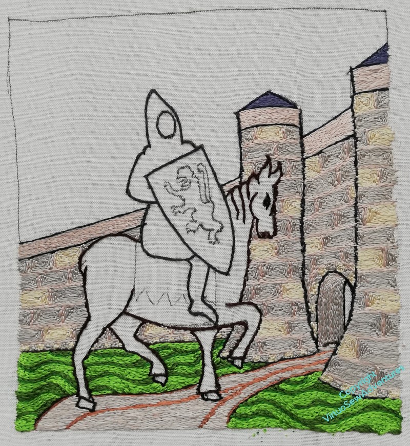
Here is William’s lion rampant gules (red), duly completed. As I’ve mentioned, technically the background should be gold and green (or and vert, in heraldic terminology), but I don’t want the gold on the shield to argue with the gold of the underside couching, so I’ve gone for a pale yellow instead. All things considered, I don’t think the lion is too bad, because he’s really rather small, so I didn’t have very much room for manoevre!
That said, I may choose to tweak him some more before the whole thing is finished..
Now then, I need to move on to the frame for this picture, which is going to be the backdrop for the twined roses and gorse. The main border will be blue, but as I was thinking about it, I felt that the junction between the picture and the border needed to be managed.
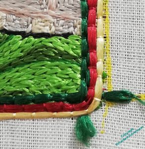
This is what I’ve come up with: single lines of William’s three heraldic colours framing the picture in laid and couched work. I’m intending to finish the other side of the blue border with the same, but with the colours in reverse order.
But before I get to that I have to do the blue border, and as I’m intending to use trellis couching, it will be a while yet – three layers of stitching, background, trellis and tie stitches all to do. I’m using thread from three reels of slightly different blues, so there will be some variation in the colour, although as I’m intending to use a single colour for the trellis, it should settle back into a subtle backdrop for the gorse and the roses.
Bemusements and puzzles
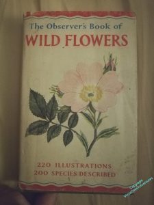
You may well wonder what on earth I am doing, posting a picture of the The Observer’s Book of Wild Flowers on an embroidery blog.
Well, I want to do a sort of illustrated border around William with “Planta Genista”, which I am told is the Common Broom, intertwined with roses. Broom, for the Plantagenet kings he served unflinchingly for sixty years or so, roses for the garden the Victorians transplanted him to when they dug him up.
However, I have a bit of a quandary.
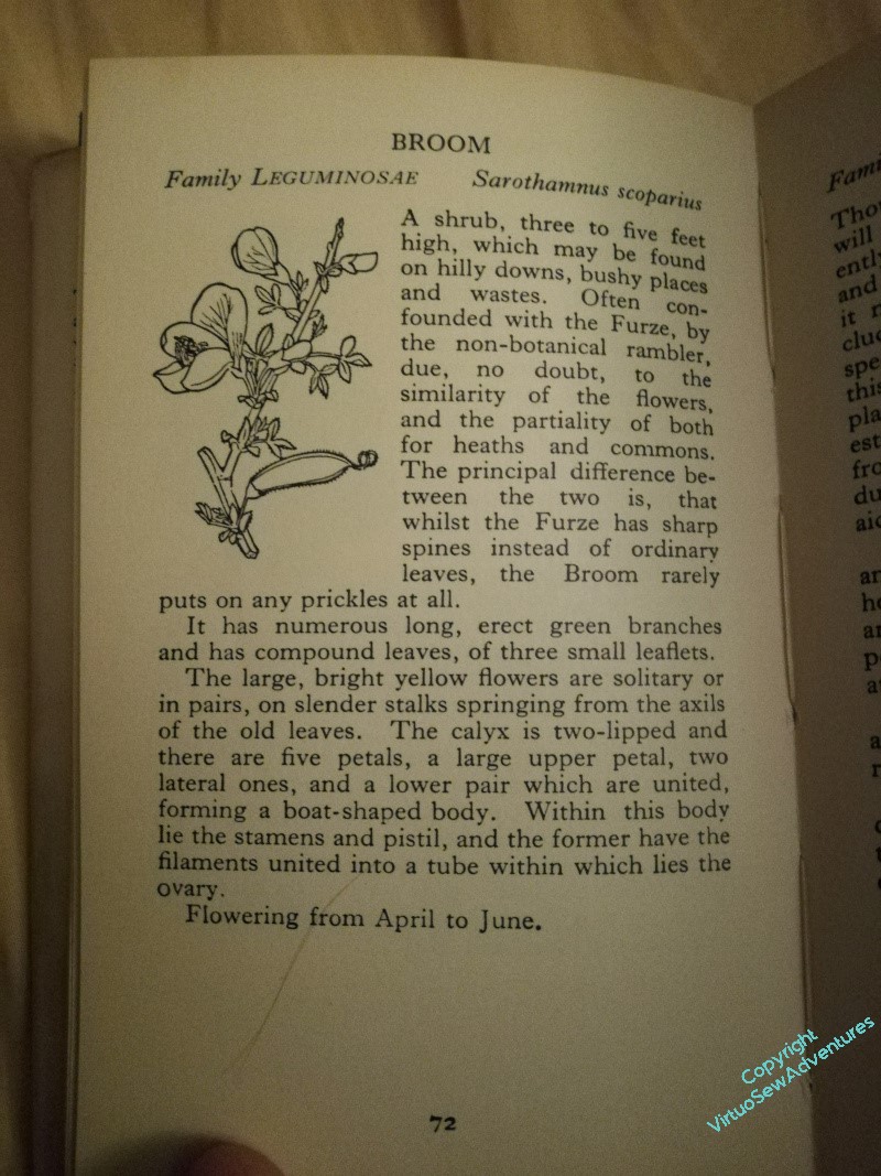
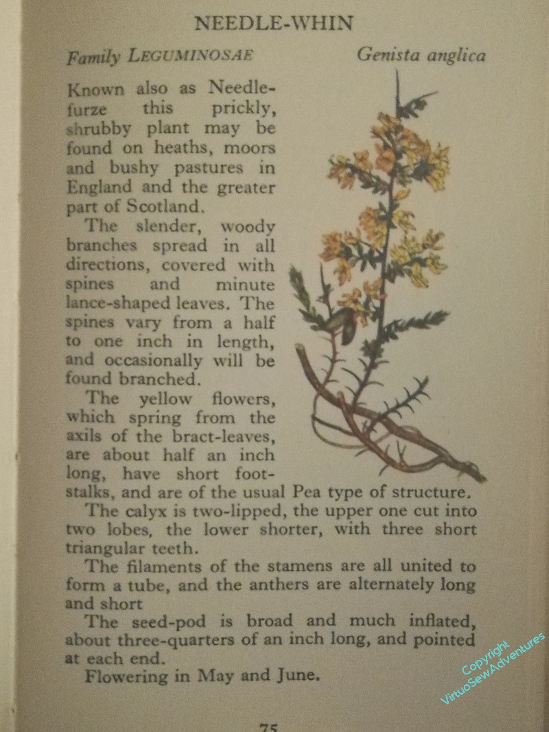
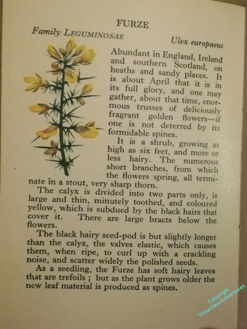
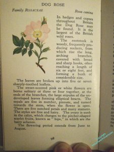
I would like to create the wreath myself, and spent more time than I like online, turning up pictures of bushes or else someone else’s border designs, so I thought I’d consult paper instead. Where I find “Broom” and “Furze” – and “Needle-Whin”, which I have never heard of, but carries the name “genista anglica”. And any one of those – or none – could also be the thing I know as “Gorse”.
I may find myself fudging that one slightly…
As for the roses?
Dog roses, I think. They are the roses William would have known, their simplicity may help me to balance the very spiky broom, and I think that pale pink and white will make great use of the pink and cream of the castle.
William Himself
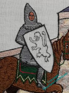
I started William with his leg in its mail, narrow highlight down the front and darker shadows around the back.
I’m going to try to shorten my stitches slightly on William, to emphasise the texture of the mail, and to help throw the shield forward. I want to make that, by contrast, as smooth and glossy as I can – part of the counterchange of texture I am pulling in to the whole piece.
The saddlecloth really does need a bit more red, I think. Something for a later moment.
I’ve tried to make the stitches on William himself suggest the shape of the body, except for the scalloped edge to the mail coif he’s wearing, which breaks up the shape, and adds a bit more detail. I find myself rather fearing that the scalloped edge on the mail coif is more reminiscent of a Fair Isle sweater than anything else, but I hope that the balance of the whole thing will prevent that.
I did the face in tiny stitches, using a single length of silk. Arguably the perspective is a bit off, the face more turned towards us than the head or boady, but I daren’t attempt to unpick it!
The shield stitchery is fairly simple in concept – I wanted to make the green and cream (it should be gold, but I don’t want it to argue with the underside couching) as smooth and straight as possible, and in doing so I didn’t really consider how I was going to address the failings in drawing the lion rampant.
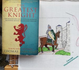
So this is how I am going to do it – by having a source picture ( in this case the cover art from Thomas Ashbridge’s biography of William) balanced beside me on the frame, and using it as a reference, rather as I used the photo when I was stitching Ankhsenspaaten.
When I have completed the lion rampant, I need to make my final decision on where the edges of the underside couched gold are to be, and work the border to make those edges crisp. So more silk to work for a while..
Adding the saddlecloth and other details
I still have some doubts about the tail I gave Mars, but I also still think that any changes are “tweaks” to be left until I have most of the piece finished and just need to balance it out.
And no, I’ve not forgotten that he needs reins and a few other pieces of tack, but those are details that I didn’t want to have to stitch around. I’m not quite sure how and where they are going to run, although as far as I’m aware William would have steered using reins held in the hands, rather than using the feet, as you see the riders of the the drum horses in mounted bands doing, or as I read the ancient Scythians did (although they were archers!).
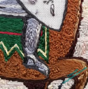
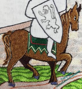
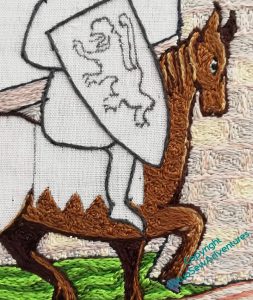
I wanted to do the saddle cloth in William’s heraldic colours, and I wanted the extra interest from the points, but I am not entirely sure I’m happy with the colour balance and shapes. I am wondering whether I should make the red line a little wider, or even fill that whole section in red.
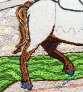
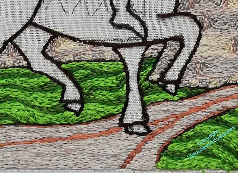
Another tweak I am considering is a couple of tiny stitches to highlight the blued steel horseshoes. I have light lines running down the horse’s leg, but not onwards, and while it’s the tiniest of details, I remember realising with some of the Thistle Threads pieces just how much of an impact a tiny detail can have..
I’ve couched several strands of silk together to make a headstall and reins, and again, there may be tiny details to add, when the shield is in place, to help create the right sense of William, as the wealthy and successful tournament winner, high in the favour of Henry The Young King, on a visit to the kinsman under whose auspices he trained, dripping in tournament bling, and generally showing off a bit.
He settled down as he got older, but given that his father was rather unsatisfactory, and even the Lord of Tancaville dropped him at an inconvenient moment in his youth, a bit of rubbing their noses in his success would be only human!
More on the Horse, hereafter known as “Mars”
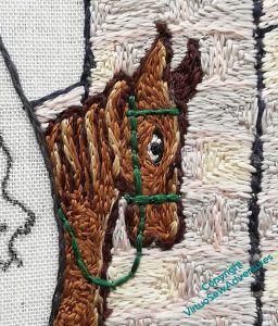
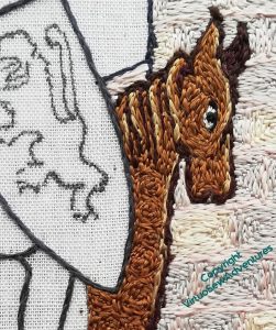
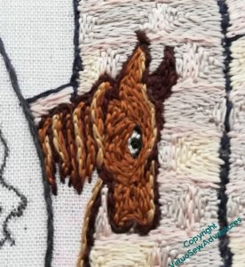
I do wonder whether the mane is quite luxuriant enough. Like the tail, if I decide it needs more, I can probably add some length; if I’d been thinking straighter, I might have given him a short cropped mohican, because I suppose you don’t want to give an enemy something to hang on to as you charge them down, which a mane might well.
But then, no-one suggests that warhorses had docked tails, so I may be overthinking this!
There are all of about six stitches of white silk around the eye (my flat silk from working the Amarna Family Group) and they seem to be just enough to make it suitably staring. This is clearly a Visit of Ceremony, and Mars is determined not to let the side down, so he is focused and crisp in his movements.
I’m going to give him a saddlecloth in William’s heraldic colours, so I am leaving all that unstititched for now. And I have made very sure that the darks help him to feel solid and stocky.
I did say that I would be going around in circles for quite some time!
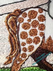
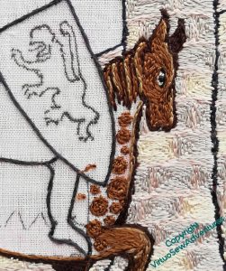
The stitching of the “dapples” in the same colour as the background give him a slightly thicker coat than a modern race horse, and I am hoping that the alternation of the textures will help knit the piece together, creating a a sort of counterchange: the shield and saddlecloth smooth, like the top of the wall and the path beneath his hooves, while the walls and horse are slightly rough, bouncing the light in different directions.
Incidentally, while I’m working this section, I’ve been thinking and planning for the “frame”, and the ideas keep changing beneath my feet. So if you were wondering where my plans were – the answer is “in flux”!
William’s Horse
William’s horse is going to need a name, isn’t he! At the moment, suggestions range from “Woros” (think about it for a moment…!) to “Champion The Wonder Horse” (I imagine his groom calls him Bob!) to “Jeff”, via “Mars”, “Thunderer”, and “Dobbin”. I think “Dobbin” is better suited to the horse in the canvaswork!
However, onward!
As it turned out, the colours I chose didn’t quite shade through each other as I would have wished, since two of them were too close together (however good the pictures, online ordering has hazards), so it took me some time to work out what to do.
That “what” turned out to include fishing out a pale cream from among my Thistle Threads reels, which included some filament silk, fortunately. It’s rather finer than the rest of the silk in this piece, so I need six lengths to match four from those.
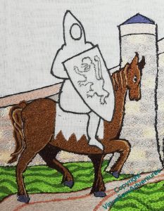
I do wonder whether the tail is quite luxuriant enough, but if it looks a bit spindly when the whole thing is finished, I can add more – although stitching over the wall is quite effortful!
Please note, also, the wonderful blued-steel hooves. Unless they are slate!
I know that roans are not usually shown as dappled, but I decided that I wanted some texture in the horse. I’m intending to make the shield as smooth as possible, and I think a bit of surface variation in the horse will increase the contrast.
So, I shall be going round and round in circles for quite some time!
The grounds around the castle
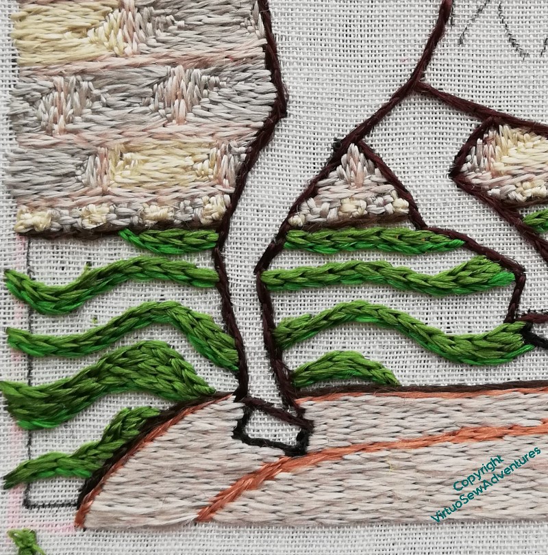
In her book, Tanya suggested using a slightly thicker thread for the ground (that is, more strands in the needle), to help it look a bit more uneven without interfereing with the glorious light effects of silk. I decided to vary the different colours as well, to help with that effect. This is the mid tone, although the “dark” isn’t so much dark as a different tint – that’s because I bought it online, and when I started stitching with it, it wasn’t quite the colour I thought it would be.
That said, I think it has turned out very well indeed. I enjoyed trying to keep the curves curving the way they needed to, varying the way each colour filled the allotted space, changing the way the lines flowed. It somehow does manage to look a little like an illustration in a book of fairy tales, partly because of the lines of colour, partly, I think, because the lightest of the greens is very much in that vein.
Not an Arthur Rackham illustration, obviously!
I love the way the grass has made the horse look much crisper, as though he’s conscious that this is An Occasion, and he’s putting his best foot forward.
But I do keep looking at him very panicked, to make sure that he’s not going to fall over. I once did a painting of an elephant, and it was only afterwards that I realised that the poor beast would have overbalanced and landed on his side with a rib-crushing Thump! if what I had painted had been accurate observation…

