
More thinking about that border design
Once I’d got the panel done and got started on the background for the border, I knew that I was going to have a lot to do before the next stage of decorating the border. So I got out my paints, and started to play with the design elements I want to pull together – broom and dog roses.
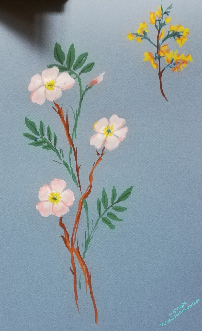
My first effort, based on the drawings in the Observers Book of Wild Flowers, ended up as one of each, rather than a combination, so I knew I needed to think about that a little more; but I also realised that unless I worked out how the combination was going to be applied, I was going to end up doing a lot of work in the wrong direction.
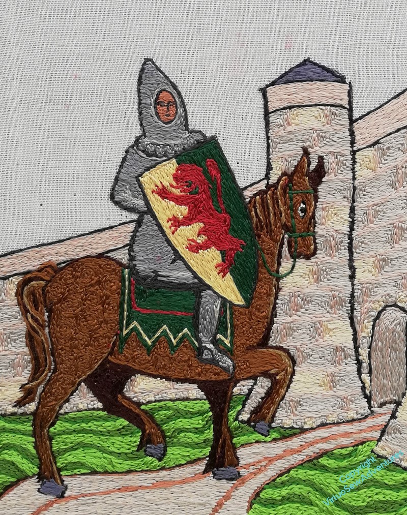
So. Layout. I had begun by thinking about a wreath, but somewhere along the way, it turned into sprigs, and then I started to think about adding another motif – the cross the Knights Templar used, for Temple Church, where William is buried.
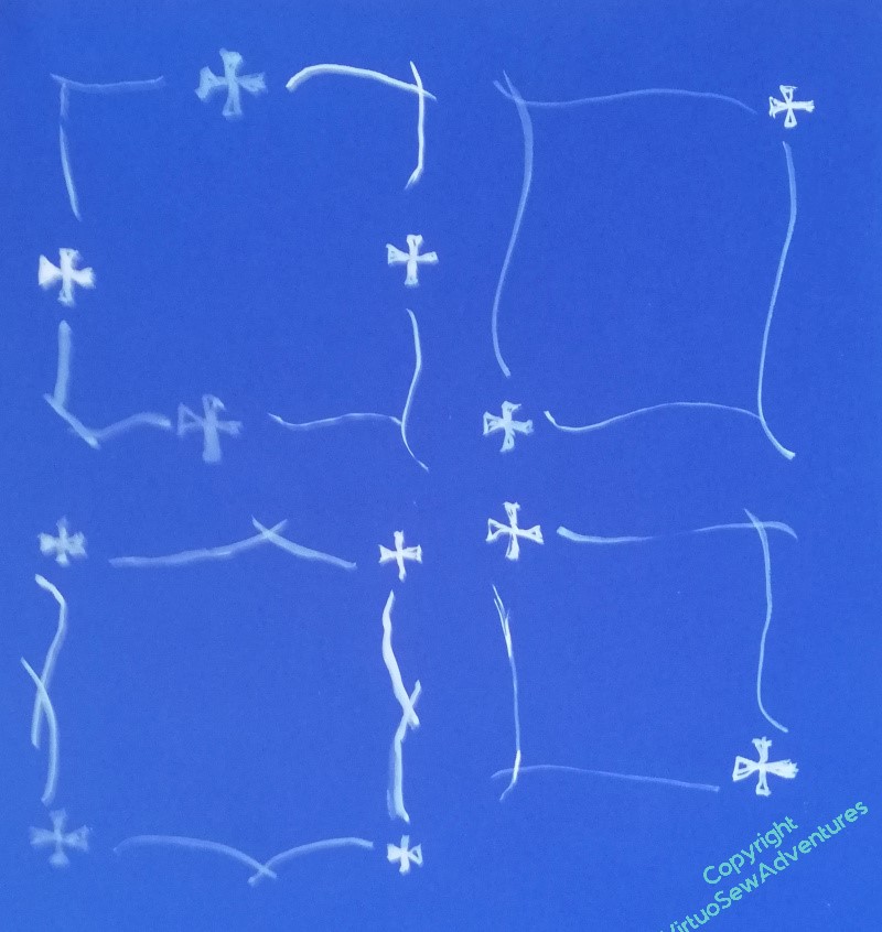
Combining the idea of the sprigs with the Templar cross, I’ve got four possible layouts, one with a cross at each corner, one with the cross in the middle of each side, and one with crosses on the the diagonals. At the moment, I am leaning towards the one with the cross in the centre of each side. The corner crosses seem to make a less purposeful pattern, somehow, and the diagonals – well, depending on the final form of the sprigs, they may work in the end, but at the moment, I’m not at all convinced!
Oh, yes, the middle-side crosses work better than the corner ones. They stand out for what they are (and what they stand for( more. Corner crosses are much more ignorable. Just a decorative nothing. We see too many of them on frames. Plus, that layout gives you an interesting angle to fill with your pretty sprigs.
How prominent are you planning to make the crosses? Will they compete with the flowers on your sprigs? Will the stems grow out of the crosses?
I like your choice – yes, cleaner. The others feel more distracting somehow… and your paintings are lovely. I have an Observer’s Book of Wildflowers and I love it.
I’m going to buck the trend here! I rather like the idea of the diagonals, one top left, the other bottom right. William and his horse, along with the tower, make a very strong cross shape already, and I wonder if crosses in the middle of each side might emphasise that too much. That might be a good thing of course, bringing a static quality to the whole design, but the diagonals might reflect that diagonal on his shield and the diagonal path his horse is taking towards the gates. All four corners would be too much I think, but one each at the slightly more “empty” areas of the image might provide a stopping point for the eye, give a bit of movement and allow more space for the flow of your flowers. Of course, I could be talking tosh!! I look forward to seeing your choice