
William Himself
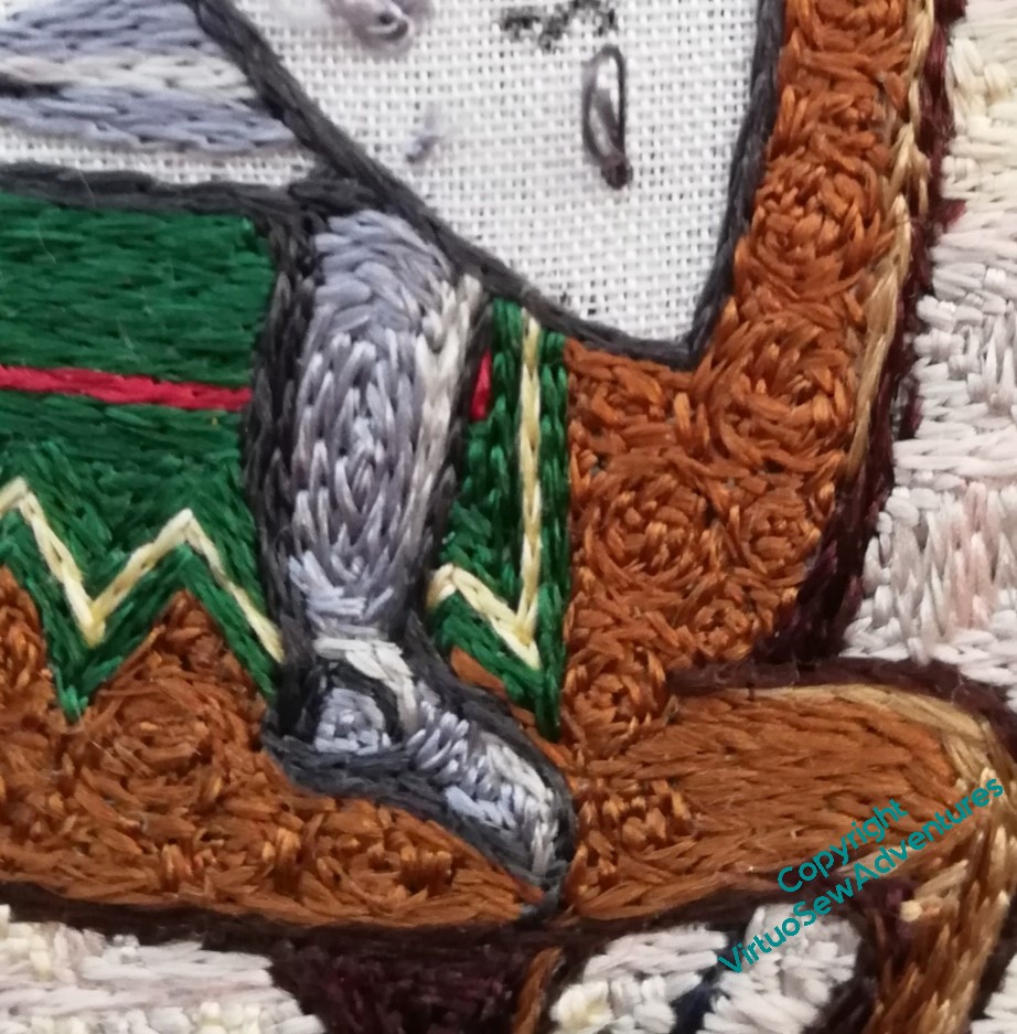
I started William with his leg in its mail, narrow highlight down the front and darker shadows around the back.
I’m going to try to shorten my stitches slightly on William, to emphasise the texture of the mail, and to help throw the shield forward. I want to make that, by contrast, as smooth and glossy as I can – part of the counterchange of texture I am pulling in to the whole piece.
The saddlecloth really does need a bit more red, I think. Something for a later moment.
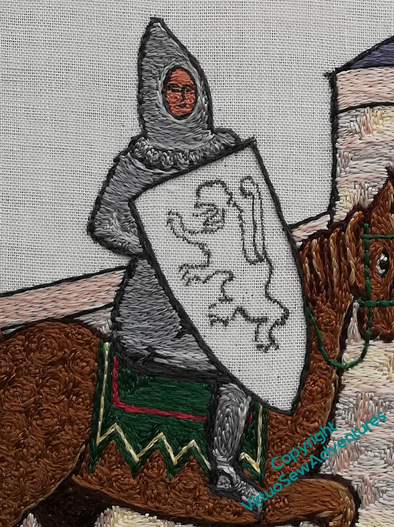
I’ve tried to make the stitches on William himself suggest the shape of the body, except for the scalloped edge to the mail coif he’s wearing, which breaks up the shape, and adds a bit more detail. I find myself rather fearing that the scalloped edge on the mail coif is more reminiscent of a Fair Isle sweater than anything else, but I hope that the balance of the whole thing will prevent that.
I did the face in tiny stitches, using a single length of silk. Arguably the perspective is a bit off, the face more turned towards us than the head or boady, but I daren’t attempt to unpick it!
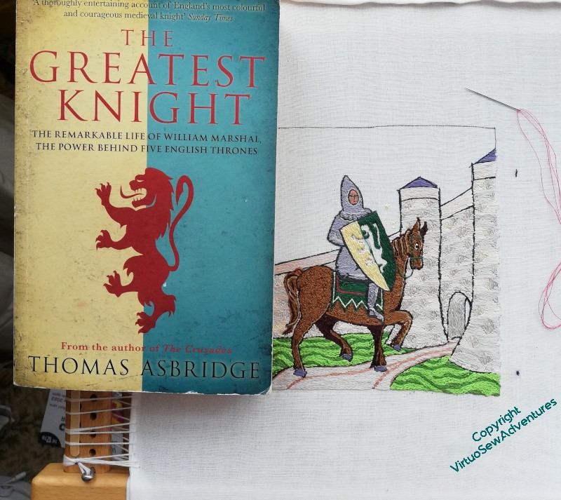
The shield stitchery is fairly simple in concept – I wanted to make the green and cream (it should be gold, but I don’t want it to argue with the underside couching) as smooth and straight as possible, and in doing so I didn’t really consider how I was going to address the failings in drawing the lion rampant.
So this is how I am going to do it – by having a source picture ( in this case the cover art from Thomas Ashbridge’s biography of William) balanced beside me on the frame, and using it as a reference, rather as I used the photo when I was stitching Ankhsenspaaten.
When I have completed the lion rampant, I need to make my final decision on where the edges of the underside couched gold are to be, and work the border to make those edges crisp. So more silk to work for a while..
Nice progress
Oh you have been busy, it’s all coming together really well isn’t it? I do agree with you about a bit of extra red on the saddlecloth though, I think because it is the same tone as the green it sinks back more than one would expect from a contrasting colour doesn’t it.
Looking at your trials for the path in your knot garden, I suspect the most successful stitch might be the herringbone one as it sits diagonally on the canvas, so easier to work in line with the paths perhaps? I like the variation in the thread too.
You’re making wonderful progress.
There is good gradation of the threads for the mail (leg) and the metal is really gleaming. Yes, a bit more red for the saddlecloth would be good.
You need to take your time on all the fine stitching. I hope you are not straining your eyes.
Changing weights of threads can be tricky and I think a bit of extra red will change the look of the saddlecloth.