Tag: Opus Anglicanum
More Planning for Aethelflaed
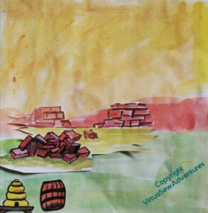
As I have thought about Aethelflaed and begun to plan the design of her panel, I’ve also begun to plan what the background will look like.
Brought up, as I was, in Chester, the obvious point in her life to choose is her defense and refortification of Chester. So the stone for the wall is the distinctive dark pinkish sandstone of Cheshire, and in reference the the beehives and boiling beer turned on the Viking assault, I have a barrel and a bee skep ready for deployment.
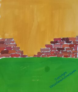
But I need something that I can try to place Aethelflaed against, and strong enough in colour to give me a start on picking her colours, so I’ve redone some of it to give me something to work with. Although I do feel that maybe the wall isn’t high enough.
While I’m working on the walls of Chester, I also need to work a bit more on Aethflaed and her horse. The pair of them are proving much trickier than William, mostly because examples of horsemen aren’t hard to find in medieval art. I only had to decide on a few tweaks of presentation and insert the appropriate coat of arms. Aethelflaed is being invented as I go.
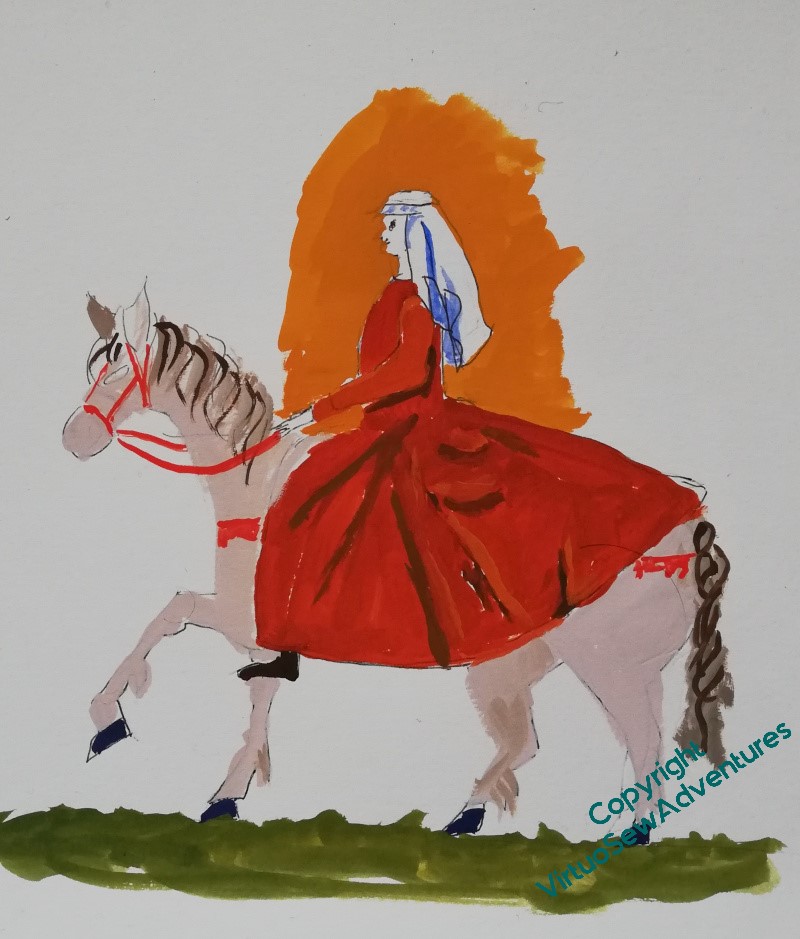
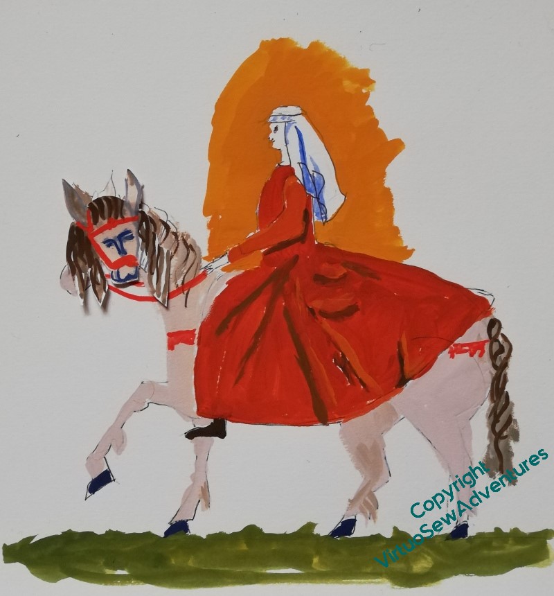
In fact, the invention, reinvention, and re-reinvention continues! I think the horse has become a little too long-backed, and needs to be a bit madder. And I’m not sure that Aethelflaed is in suitable proportion to him. What I might do is go back to the original horse, and indeed, the original lady, and then work forward (yet) again, using all the information I now have.
All this planning is keeping me from stitching, and I’m getting twitchy!
Another experiment in Trapunto..
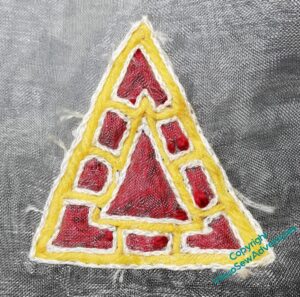
Remember this?
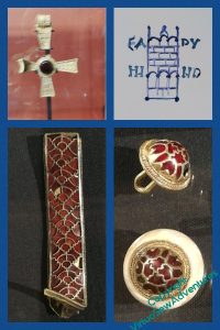
I wanted to have a go at creating some Anglo Saxon jewels as a possible ornament for however I end up displaying Aethelflaed. It was enough of a success that I felt that, with some fiddling around, I might be able to produce something suitable. And since this one was very much thrown together from things I had to hand, there’s a lot of fiddling around to do!
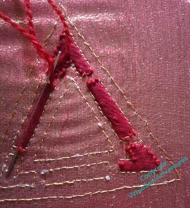
And here you see some of it. I went looking for materials, this time, and thought it through a bit more.
So, crimson gauze laid over gold tissue, laid in turn over calico for support. The gold tissue may be a good idea for the effect in real life, but it is a complete nightmare to photograph, and I apologise in advance for the peculiar changes of colour the fabric will undergo!
I used back stitch in a single strand, rather than split stitch in two, but took more or less the same approach to the outer channels, filling them with woollen thread. I was a little inconsistent in how I did so, which is why you see little bits of wool above the gauze – something I didn’t want, but struggled not to do. There must be a trick to trapunto quilting without going permanently demented, but I’m not sure I have it yet!
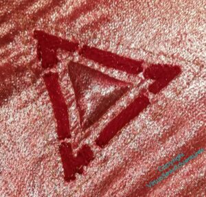
I should probably also apologise for my photography..
Anyway, the next bit was why I wanted to include the gold tissue in my sandwich of fabrics. If you look at the Sutton Hoo helmet and some other Anglo Saxon items, you will see that in some cases the gems look lighter than others, and it has been determined that that is because they’ve been backed with gold foil. I’m trying to get the same effect here, but in the case of fabric by inserting the filling behind the gold tissue.
This was very nearly as unnerving a proceeding as when I was doing much the same thing at the beginning of Akhenaten. You’d think I would have learnt sense by now, wouldn’t you!
More on Aethelflaed
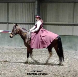
So, after my first two attempts at Aethelflaed, I had a fascinating day with my reenactor friend Vara, talking about the garments and decorations of the period, and she showed me this photo of her daughter riding astride, but in a modern riding dress inspired by early medieval garments.
Rowanne is apparently intrigued by what I’m doing, and has given permission for me to put this picture up, showing her and her horse Lola!
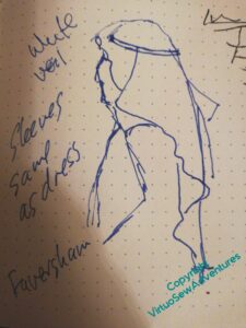
I also had a chance to do a sketch of a woman in profile, wearing the right sort of veil, complete with a fillet, with the added suggestion that Aethelflaed should be wearing a bright white veil, since that would be a sign of wealth and authority, and that sleeves would have been all in one with the dress.
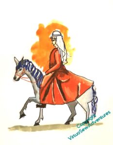
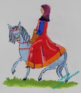
So, I’ve had a bit more to work with, and had another go.
This is better, I like the straighter back, and the dress covering the horse’s rump. But my goodness, if you compare her with Rowanne and Lola, she’s much too long in the body. I need to shorten her somewhat.
Furthermore, I think the horse has got too tame – back to the cross-eyed one staring out at the viewer!
But then, I think, I might be able to start playing around with placing her on the background and choosing colours for her. Which, my goodness, will be About Time!
Working on Aethelflaed
You may recall that the planning and designing of Aethelflaed is proving quite a long winded process, with a lot of repetition and rethinking going on.
I’ve been looking for medieval women on horseback, because I want Aethelflaed under her own steam, as it were – not lead on a palfrey, but mounted on her own horse, with the reins in her hands.
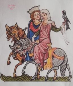
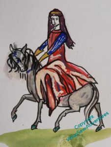
The best I’ve found so far is this one, which I think was in the Holkham Picture Book Bible.
I started with the lady, and began some alterations. I want her horse to have some personality, so I’ve turned the head towards us, and lifted it a little.
I’ve extended the skirts somewhat, and given the rider a veil that flies a little, held in place by a golden fillet.
But the high contrast suggests a silk or brocade, and I want something that suggests a sensible woollen riding dress.
Then I found some Viking and Anglo-Saxon reenactors and talked to them. And goodness, that gave me food for thought. In particular, yes, riding dress was indeed a garment that an Anglo Saxon woman like Aethelflaed might have worn. But Anglo-Saxon dressmaking was not at all like ours.
In particular, whereas we tend to have pattern pieces that start with the widest part, and remove fullness by means of darts, pleats, or gathers, Anglo-Saxon dressmaking started with the narrowest width and added fullness by means of gussets and gores. In fact, an Anglo Saxon riding dress would have a full circle’s worth of gores inserted into the side seams, resulting in something roughly like this.
But not quite. I’ve actually been to talk to my reenactor friends, and there are a few bits which don’t quite ring true. I have some photos to work from, so there is more to come…
Research for Aethelflaed
I think I’m going to try to do Aethelflaed next.
At the moment, my thought is to have her riding (side-saddle) towards the refortification works at Chester (which is where I grew up). I looked up “side-saddle”, owing to having some doubts about how recent or not it might be, and the history and techniques of riding sidesaddle seem more complex than would at first appear.
Of course they are.
There’s the technique you probably think of first, with a leg hooked up and the rider facing forwards (think Queen Elizabeth II riding Burmese to Trooping The Colour, way back when). The development of that design is credited to Anne of Bohemia, Richard II’s Queen, so it would be anachronistic, to say the least, for Aethelflaed. However… The older style is more like a chair set on the horse’s back, with a footboard, and the rider faces sidesways. Generally the horse is then lead, either by a someone on foot, or by another rider, but I simply cannot imagine Aethelflaed not being under her own steam, as it were. I suspect that she would just have a really voluminous skirt or a slit skirt or even just wear men’s clothing and ride astride. But that would not create the image I want, so I’m going to have to balance storytelling with other concerns. Well, that’s part of what is interesting to me, so that’s ok!
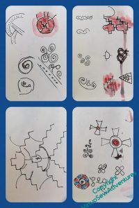
I had a lovely day out a little while ago to see the Staffordshire Hoard exhibition at the Museum in Stoke on Trent. It’s the closest source I can find for patterns that I might be able to use, and although none of these sketches or photos will be useable directly, I can, for example, imagine taking the style of that processional cross in the grid at the top, sketched in the grid to the side here, and using that at the cardinal points of the border.
I’m also wondering about taking one of the patterns from the pieces in the Hoard, and turning it into a border design, somehow. That might make everything a bit busy, so, more thought needed…
Research for Rahere
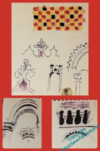
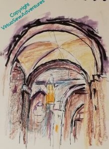
I had another chance to go to the Church of St Bartholomew The Great in Spitalfields recently, and managed to get in a solid couple of hours of sketching and thinking while I was about it. I did attract a bit of attention – someone came and asked whether they could take my photo as I sketched, and even photographed the sketch itself, but it was in the morning on a cold and wet Saturday, so there wasn’t too much activity. By the time the tour groups started to come in and obscure what I wanted to sketch, I was becoming chilled and clumsy and in need of food and a hot cup of tea.
I might use that coloured tile pattern in the border of Rahere’s panel, instead of a plain colour. I think I’d want to make the colours closer, to create the effect of a rich damask-type fabric, but I feel a bit wider variation is needed among the four panels. I want each of them to stand alone, but if they end up displayed together, they need to look happy…
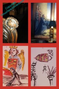
I had been wondering whether it would be legitimate to include scallop shells in the borders, to reference pilgrimage, since most often I have heard of the scallop shell being associated with the Camino to Compostela. Plainly the makers of the pews thought so!
I’m still trying to work out what to set behind Rahere. Arches? A single arch, maybe, with the gold underside couching within. That may be a bit too reminiscent of a halo, and no-one, as far as I know, has ever even suggested Rahere as a candidate for sainthood. If Kipling’s version of him has any veracity (it’s certainly not based on research – you might call it a possible emotional truth), he’s very much in the category of people who make for an challenging example – speaking truth to power is not a gift we all have, although we may all agree that it is important that it happens.
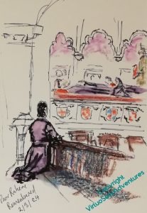
In truth I think he’s more valuable as an example to follow without the accolade. He is credited with founding an institution which continues to provide healthcare, 900 years after foundation, he is still remembered, and no one suggests that what he did is the less valuable for the lack of a sainthood.
As you see – he is still remembered.
Return to William, just because!
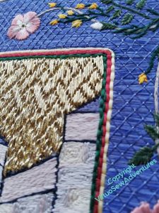
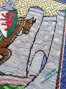
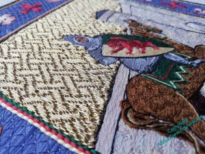
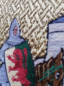
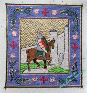
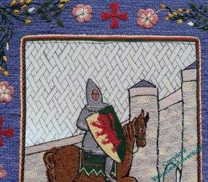
I thought people might enjoy some shots of William from different angles and in different lighting, both of which affect the gold and silk very strongly.
I don’t have much to say for myself, just – Enjoy (with a little editorial, as it were)!
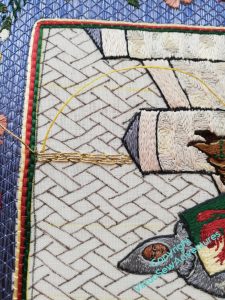
I had intended to fill in the end of the gatehouse tunnel with underside couching, but decided in the end it would make a lot less sense of the picture.
I was greatly relieved that the various oddities around the edges seem not to be drawling attention to themselves!
The lion rampant isn’t completely successful in terms of the details of stitch direction, I think, but I couldn’t see a better way to do it, and since when I put a picture on social media, someone was able to type their guess of the blazon (heraldic description) into a search engine and have “William Marshall, first Earl of Pembroke” pop up immediately, I think I’m just going to let well alone!
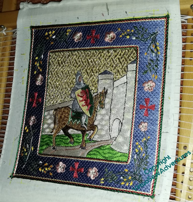
The points of light are couching stitches on the trellis couching. The flash doesn’t show up the stems in the border as well, but it does wonderful things for the stitch direction on the stonework and the dapples on the horse (Mars, we called him in the end, didn’t we?).
Finishing William The Marshall
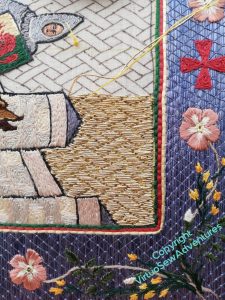
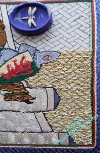
When we left William, I had just embarked on the underside couching, not without some trepidation, I have to say!
I stuck closely – one might say, religiously – to the advice about working underside couching that Tanya Bentham gives in her book about Opus Anglicanum. That is to say, no more than about half an hour at a time, no more than three sessions a day. In fact I think Tanya says 45 minutes, but I rapidly learnt that I lost focus and precision about the 33 minute mark, and two sessions were very much better for me than three.
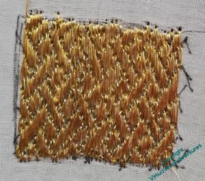
If you click on any of these pictures to expand them, (they should open in a separate window) you will certainly see some of the infelicities in my workings here – scraggly bits of fabric showing, unevennesses in the pattern, all sorts of misadventures. There were even a couple of points where the fabric, doubled though it was, gave way at points, necessitating all manner of ingenuity. I suspect that my tension was adrift, as I have a definite tendency to pull too tight on my stitches, especially if I’m concentrating on the unfamiliar.
However, judge for yourselves whether I shouldn’t be pretty pleased with myself…
I do, of course, have to work out how I’m going to mount him, and on what, and it may be that in the end the lines of red, yellow, and green framing the border will need to be redone in some fashion. I like them as an idea, but as I move on to Aethelflaed, Rahere, and the Lady Julian, how much of a unity do I want to retain, and how on earth would I embody it?
Getting Back To William Marshall
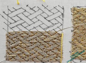
You probably recall that before Christmas I had started to practice my basketweave underside couching and had even got as far as drawing in the guidelines.
And there, I got stuck. Partly because my stitching frame was in the way of the Christmas tree and had to be folded down, and partly because I rather lost my nerve – the interval, you understand!
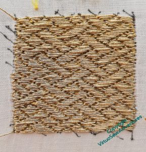
I decided to finish the test patch with the actual thread I’d decided to use, and then I would have No Excuse.
And in fact, this doesn’t look too bad, does it?
There are bits I’m less than chuffed with, but on balance, the pattern is fairly clear, clearer than on the previous piece, and I think I have to decide that any further improvement had better take place in situ, as it were.
So here I go!
I decided to start on one of the straight lines I drew at intervals to help make sure I stay on track, and slightly off-centre, so that any particularly egregious infelicities in the changeover aren’t bang in the middle. You may recall that one of the discoveries from the practice piece is that I am more comfortable working horizontally and away from me. So I will work from this point to the far edge, and then turn the frame around, and work to the far edge in the other direction.
Wish me luck!
Still Practicing Beforehand
As my regulars know, all too well, I’m not much given to practicing beforehand. Therefore, the sight of me practicing should give everyone a slight sense of discomfort – the world is out of joint!
For this first practice, I used a gold metallic thread that is a bit finer than the recommended one, but it was at least the right structure and type. I did improve as I went through it, sufficiently to then move on to the real thread for the next practice panel.
This seems to be going better. The thread is slightly stiffer and thicker, and having taken the suggestion that Tanya made, I tried every combination of working away, working towards, working left to right, and working right to left, until I found the version that worked for me.
Horizontally, and away from me, since you ask!
Anyway, I intend to finish the second practice panel before I start on the real thing, but in the meantime I have now sufficient belief in myself on this one to have put in the guidelines on William for the real thing.
Even that wasn’t entirely straightforward, as my lightbox substitute is a little too big to fit comfortably under the frame, and has a slightly fragile usb connector, but it is now done.

