
Tag: experiments
Making It Up As I Went Along – Part Three
Close Up 3
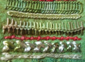
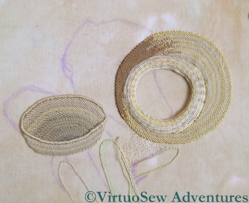
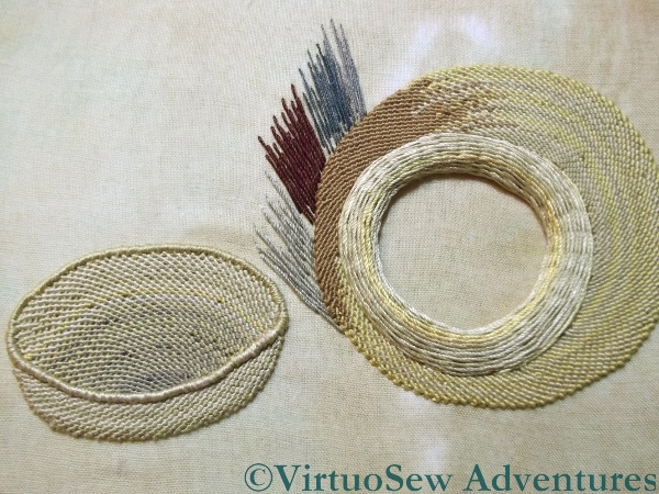
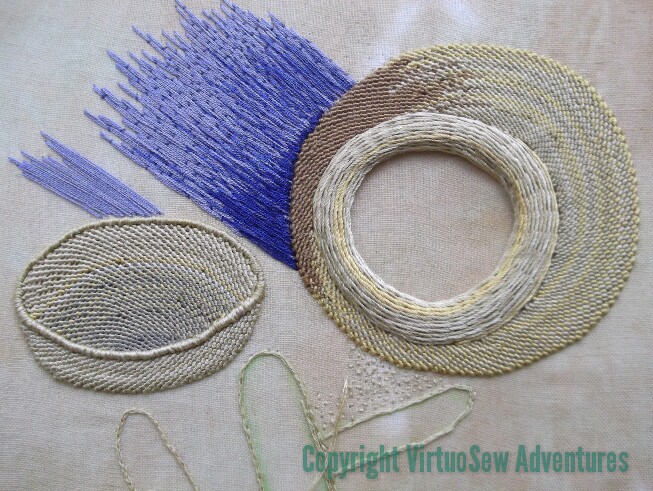
The final set of stitches for the sampler panel starts with Chained Feather Stitch, using very heavy plain pearl cotton
Braid Stitch (number eleven) is another stitch I’m fond of – I used it on the Frolicking Teddies Cot Blanket. It’s a stitch with a huge personality, so it needs to be used with care, but it’s a good one to have in the repertoire. The thread is another overdyed mercerised round yarn, and because braid stitch uses so much thread, it cycles beautifully through the colours and shows them off very well.
Stitch number twelve is Reverse Chain Stitch. This is a stitch I’d never used before the Goldwork Masterclass, but it is a very useful one, because for some threads it is much easier to work than conventional Chain Stitch.
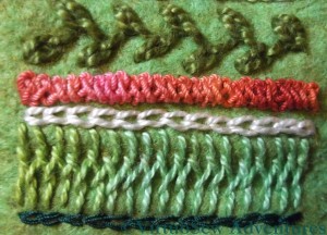
Stitch number thirteen is Cretan Stitch. This is a great border stitch, but because the thread I chose – an overdyed soft cotton – was in a green that was rather close to the colour of the felt, I decided to add a row of Chain stitch in a very dark green silk to define the edge. It balances the cream Up and Down Buttonhole Stitch at the other end beautifully.
Layout For Tools
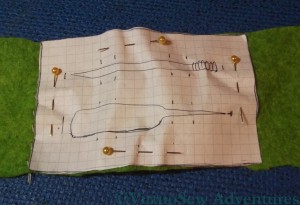
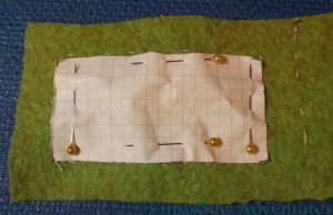
I double checked that I was happy with the layout for the tools by pinning an outline of the two wooden tools onto the felt.Since I used squared paper for the templates it was also very easy to plan where I would place the slits that would allow to tools to be held in place, and to line them up properly.
Then all I had to do was to make use of my mother’s buttonhole cutter to cut the slits – straight through the paper template – and reassemble the two layers. That was harder than I expected. I’d forgotten that felt is a very flexible material, and it bent and stretched itself, and needed to be coaxed back into shape, and then pinned firmly back into stability. Then I chain stitched down each spine, and blanket stitched around the edge….
Making It Up As I Went Along – Part Two
The idea of the sampler section was to give my cousin some inspiration for her own embroidery, and the chance to see what stitches look like in real life, since however good the book or the photo, it doesn’t come close to having the stitch there in front of you in real life! So I decided that it would consist of a sequence of stitches using a variety of threads. Naturally, I included some of my own favourite stitches!
Close Up 1
Here, the top one is Up and Down Buttonhole Stitch, using a stranded linen thread from DMC. I first used this stitch in the Persian Fantasy, and I’ve loved it ever since. In this case I’ve added to the ornamental effect by alternating long and short upright stitches.
The next is Diamond Stitch, using an over dyed pearl cotton from Stef Francis. This is a stitch I’ve never used before but often wanted to. I’ll use it again, I’m sure – it was rather fun!
The third – in standard Anchor pearl cotton – is Cable Chain Stitch, which is my favourite chain stitch variation. It isn’t always suitable, because it is a stitch with a very strong character, and sometimes something more subtle is needed, but I always enjoy stitching it.
The fourth is Ladder Stitch, which I struggled with so much on the Tudor and Stuart Goldwork Masterclass course. Here I have used an overdyed soft cotton (Stef Francis again) and found it so much easier to do!
The fifth is Heavy Chain Stitch, which I have found very useful a number of times. It produces a smooth, clean line, definition without texture, which can be hard to achieve in embroidery, which after all is a very textural form of expression!
Close Up 2
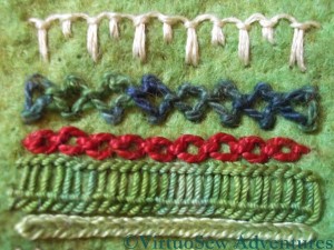
The first new stitch in this photo (sixth in the sampler panel) is Loop Stitch, this one in a round mercerised cotton. It’s another stitch I’ve not often used, but it provides a great contrast in texture with the Heavy Chain Stitch above it.
Stitch number seven is Coral Stitch (remember I used it for the little girl’s hair in the Holiday Traycloth?). I used another overdyed pearl cotton – one of my favourite threads, because it brings stitches to life.
Closed Herringbone Stitch is next, using an almost untwisted rayon thread. This produces a dense plaited effect – very glossy and dramatic.
The final row in this second photograph, number nine in the sequence, is a combination of Stem Stitch set beside Outline Stitch. I know it looks a lot like chain stitch, but the two stitches are mirror images of one another!
Making It Up As I Went Along – Part One
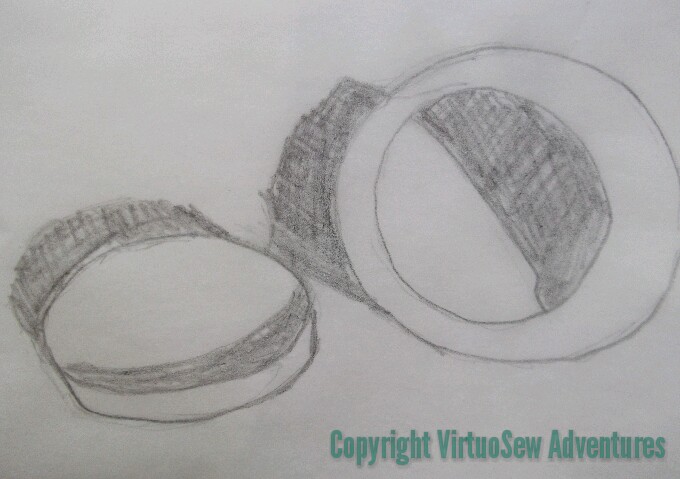
Since Christmas is over and the present duly received, I can at last show you the present I made for my cousin. She’s become interested in embroidery, and when I saw some hand made, beautifully-finished wooden tools (a mellor and a stiletto) at the Knitting and Stitching Show in Harrogate, I decided that I would give them to her for Christmas.
That was all well and good, but I couldn’t think of a suitable way to present them, so I decided to make a case for them. I spent some time sat in the picnic area at the show, sketching different possibilities and trying to work out what other supplies I needed to buy, and when, between mid-November and Christmas Day, I would be able to make it since I was still suffering from tennis elbow (I still am, but not nearly as much!). I was beginning to threaten to put together a kit and giving her that when one of the other ladies at the table pointed out that I would still need to make one as a proof of concept (a phrase I never expected to hear at the Knitting and Stitching Show!). She was right, because it evolved considerably in the process!
Final Layout Plan
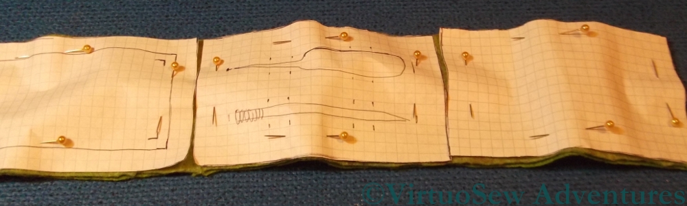
In the end I decided to make a case with three panels, using two layers of felt. I drew out paper patterns for each panel, and pinned them on to the piece of felt I had decided to use. I had considered putting a panel of canvaswork stitches on the front – I even bought a piece of congress cloth to use – but then decided that since she is interested in embroidery, it should be a panel of embroidery stitches.
Layout For Sampler Panel
As you can see, I also had second thoughts about the size of the sampler panel, and made it slightly smaller. That meant that there would be a wider border around the panel – always an improvement!
I ran tacking stitches around all the design elements to make sure I knew what was where, and then started thinking about the stitches to use for the sampler panel.
The Crock of Gold Hoard – The Ground And The Shadows
There’s been a frustrating hiatus in my stitching life of late – I’ve had tennis elbow, and have had to write up old embroidery projects for you instead of making progress on any of my current ones. I’ve been going stark, staring mad with frustration, because even holding a book has been painful.
Beginning The Shadows – Take Two
However, I’m beginning to get back to it at last. Cautiously, so there will still be older projects interspersed with the current ones!
I’ve been doing a few stitches here and there while I’ve been trying to rest the elbow, as much as anything else to gauge my recovery (or lack of it, as it sometimes seemed!). So now you can see that I’ve nearly outlined all the shadows. There’s just the shadow inside the pot to deal with and it occurs to me that I might need to find some tarnished purl to create the effect of the shadow on the metal inside!
Close Up Of Sticks
I’ve also made a start on the sandy effect seed stitches, in a small section between the pot and the sticks. That’s going to challenge my boredom threshold, even though I don’t intend to have the seed stitches all over the background!
This close up shows that I’ve also managed to fill in the first of the sticks, using split stitch filling. I need to add some highlights later, because as it stands it’s a little flat.
Still, it’s great to be back!
Dressing Cécile
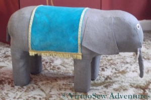
Cécile’s Saddlecloth
Once she was fully reassembled, with a neat patch across her tummy to hide the joins of the sides and ends, I was very keen to put back Cécile’s glorious turquoise velvet saddlecloth. I started sewing it on in the centre of each long edge – roughly where her spine would be – and worked outwards, to make sure that the saddlecloth didn’t end up squiffy. I’ve also not stitched too closely, because I want the fabrics to be able to move a little when I put my feet on the finished footstool and the padding “gives” a little.
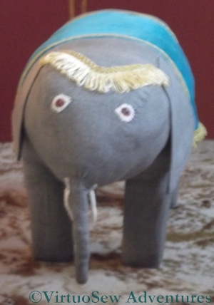
Cécile’s Browband
I should note in passing that while Cécile is unquestionably a darling, she’s been the most preposterously obstreperous pachyderm I’ve ever encountered. Getting her legs re-covered was hair-raising, getting the body attached suitably was a challenge and tidying up the undercarriage so that Cécile stayed in one piece involved the sort of contortions that make me wish I’d been doing yoga all my life!
Grandmama gave Cécile a browband of upholstery fringe – probably left over from one of the many lampshades she made – and that was the only real casualty of her years in the loft. Even a run through the washing machine didn’t revive it, so it was abandoned and replaced with a similar piece left over from a lampshade recovered by either my mother or myself. The tradition of keeping and reusing scraps is very strong in our family!
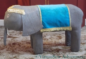
Cécile Finished!
So here she is, refurbished and back to her former glory. I was very fond of Cécile when I was a child, and I’ve enjoyed bringing her back to life.
Even it she was occasionally obstreperous!
Reconstructing Cécile
Face of Cécile
Allow me to introduce Cécile.
Grandmama made her for me when I was about two or three, we think, and I remember her as a constant and beloved part of my childhood. We rediscovered her recently in my parents’ loft, and I thought it would be nice to have her in my own living room, as a footstool and a seat for visiting children. Unfortunately, when I sat back and put my feet up, the stuffing collapsed, and Cécile began to look very sad indeed. So we skinned her (as it were!), washed the skin, and started looking for a suitable replacement for the padding.

Padding For Cécile
In the end, we used a spare cushion pad, and rearranged the stuffing slightly to leave the cover free to be stapled through. I think my grandfather must have made the basic internals – four sections of square wood for legs, screwed firmly into some equally solid half-centimetre thick hardboard.
I have all of Grandmama’s books about needlework and crafts, and there’s nothing like Cécile in any of them, so I think Grandmama must have made her up as she went along. I can’t imagine how she managed to assemble the whole thing unaided, because it took the combined efforts of my mother and myself to put the stockings on, and covering the assembly with the body was even more of an adventure.

Cécile Reassembled
But we got there in the end!
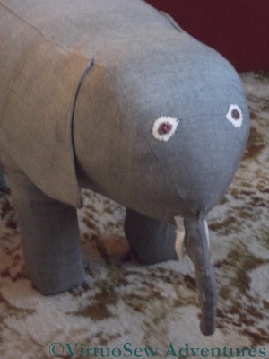
I added more stuffing while I was doing the assembly, to make sure that the finished piece would be nicely padded, and swapped the ears around – there was a hole in one side of one of them, which is now the underside.
I’ve also replaced the feet. Grandmama had glued small sections of carpet to the bottom and then stitched around the edge with wool. The carpet was looking distinctly sad and tatty, so I removed it – not without considerable effort! – and replaced it with two layers of grey felt.
Cécile is now reassembled, and just needs some of her finery re-instated. I’ll write about that when I have returned her to her former glory.
Crock of Gold Hoard – Those Wretched Shadows!

All Unpicked
When you last saw the Crock of Gold Hoard (here), it included some highly unsatisfactory shadows, and my mother and myself had pounding headaches and crossed eyes from deciphering the original photograph.
It took several hours of frustrating, painstaking unpicking, aided by tweezers, but I managed, and then started on the ground while I pondered the shadows. There are some sticks or something on the ground, and I want the ground to look sandy and speckled so I’m going to use seed stitches to create the sandy, gravelly look.
Simplified Shadows
There followed still more headscratching, sketching and puzzling (including experiments with photo-editing and watermarking on my tablet computer – that’s why there are two different copyright notices in this post!),
This example isn’t quite right – the shadow of the pot isn’t long enough, but it does demonstrate quite clearly that I’ve decided to simplify the shadows very considerably.
Shadows drawn in chalk
Since I’m removing the archaelogist and his hands, as well as the confusing shadow of the post which is out of the picture, I’ve decided I might as well simplify as many of the other shapes as I can. As I’ve said before, I’m not a needlepainter, and I’m not aiming for complete realism. Still, getting the shadows right will do much to make the design seem realistic enough.
I’m sure the detail of the shadows will change, but I’ve now drawn in an outline of those simplified shadows in chalk. I’ve even remembered that the pot has shoulders and a raised rim.
Crock of Gold Hoard – Problems with Shadows
Trialling Shadows
I mentioned in my last post that I was somewhat troubled by the question of the shadows that I need to have in this picture to “anchor” the Crock and its lid in space. Since the silk I used for the Crock has a sheen, my original idea was to try to find a matte thread to help keep the shadows in the background.
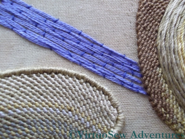
Another Trial
I had three dark, “shadowy” colours in a linen thread, and tried those first. I wasn’t happy either with the colours (too dull and drab for shadows cast by an Egyptian sun) or the texture (rough and scratchy), so I tried a soft lilac-y blue stranded cotton, couched down with a darker blue. That was better, but not really dark enough.
Wrong Shadows In Stitch
So this on the left was my next attempt. I like the shading effect and depth of colour that I’ve managed to achieve, but I can already tell that the shape of the shadow is absolutely wrong.
So I packed it up, and took my problems to my mother, who is an artist, and has a much more practised analytical eye than I have.
At which point, we realised that the shadows were rather more difficult even than I’d thought.
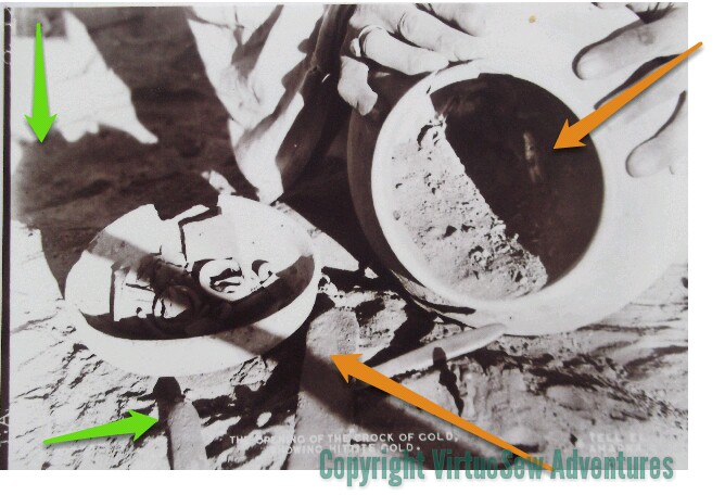
Difficult Shadows
A lot more difficult! The amber arrows indicate (approximately) what appear to be two conflicting light sources. Since the ground appears to be uneven, this must be a photo taken on site during the excavation. The vertical green arrow in the top left corner is pointing at a shadow which is clearly of something on top of a pole somewhere out of the picture. The other green arrow points to shadows show that the ground underneath the lid isn’t as even as a careless glance would at first suggest.
I’ve got a lot of unpicking to do!
Something I didn’t quite think through

Not quite thought through...
I’m really not at all sure what to do with this. It’s an abandoned experiment that I recently rediscovered, and which is nagging me more than somewhat! I really should finish it, or do something with it. It was originally intended to be a traycloth, and I’ve also run out of the thread I was using to hem the piece. So, since I can’t remember what that was I have some unpicking to look forward to, whatever I decide to do with it.
I wanted to play with the idea of stitching the background, rather than the design. I also wanted to take advantage of the fact that Caron Collection colourways are dyed onto different threads (in this case, a fairly fine single-strand thread, and the heavy three-stranded type).
As it stands, I’m not happy with it. Maybe I chose to make the pulled work too large (it goes over four stitches in each direction), maybe it is too dark. Maybe I just haven’t done enough stitching yet?
I still think that doing most of the stitching in the background – a little like Assisi work – would be an interesting variation. Back to the drawing-board!
A Needlelace Embellished Blouse
I must have worked the Needlelace Embellished Blouse when I was sixteen or seventeen – probably it was about the third or fourth project that I did, ever. Once I’d got hooked on embroidery – which happened over a piece that I’ve yet to show you, partly because I’m not sure where it’s hidden itself – I went from technique to technique and project to project almost without drawing breath!
I wanted something “Floral-inspired but modern”, I remember, so my mother suggested a pentagon for a flower and triangles for leaves. Thus:

The Geometric Floral we designed for my Needlelace Embellished Blouse
We divided the pentagon into triangles, because I wanted to use three different needlelace stitches (and also because it would be more interesting that way), and transferred it to a boat-necked summer top with a V at the back.
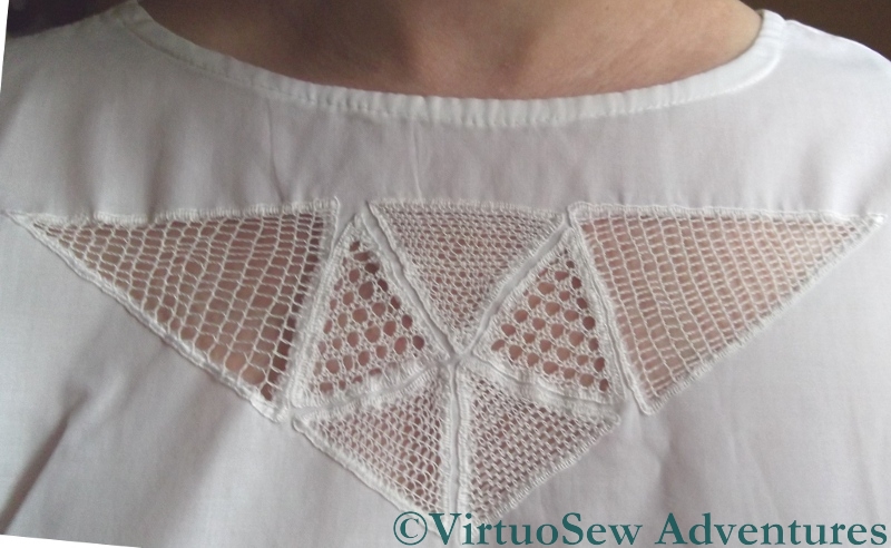
Needlelace Blouse
It’s hardly surprising I gave needlelace a try – both Grandmama and my mother had worked needlelace embellished table cloths, so it was in the air, so to speak. It’s also not surprising that I didn’t attempt another tablecloth. Even then I knew that I didn’t have the patience for that size of project!
Needlelace Close Up
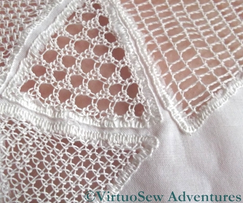
The triangles forming the flower I worked either in Pea Stitch or Corded Single Brussels Stitch, and the “leaves” were Corded Point d’Espagne. There’s a Needlelace Tutorial starting here on a lacemakers’ website for those who are interested. Then I buttonholed the edges (the wrong way round, I think, now I look at the photo again!) and, with much trepidation, cut away the fabric at the back.
And it worked! I wore the blouse quite a lot for a few years, and now I’ve found it again I suspect I’ll be wearing it some more – although not this year <shiver>!