
Tag: design elements
More on the Wreath, and Other Details
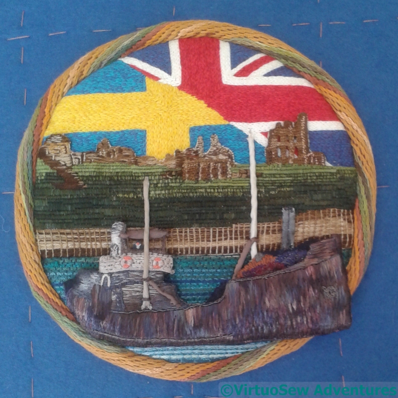
Mast Spars and Wheelhouse
In the end I covered the twisted cord (actually a bamboo and cotton blend knitting yarn) for the mast and spars with silk ribbon, which was more than slightly fiddly to achieve. There’s a collar around the mast, which, in an echo of the lifebelts, is a loop of buttonhole stitch. That was even fiddlier (is that a word? It is now!).
And Great-Grandfather’s wheelhouse has acquired a roof, made of several layers of buckram covered in silk ribbon, with buttonhole bars for the struts holding it up. That was also fiddly!
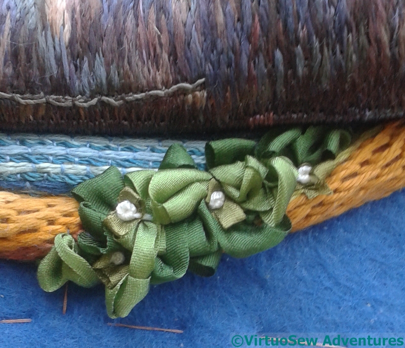
Detail Of Wreath
So, on to the wreath itself. That involved three different colours of silk ribbon, in two different width. I briefly considered something like the folded “leaf” shapes using wrapped parchement you sometimes see in 17th Century work, but in the end I decided I didn’t want to create anything too formal here, because it wouldn’t match the flow of the stitching. Sometimes a formal section provides a framework for everything else to clamber over, but here I felt it would create stopping-points, interrupting the eye as it moves around the piece. So the ribbons were knotted and looped and caught down in a sort of flowing chaos. White stranded silk French Knots, representing white berries, provide subtle accent and punctuation.
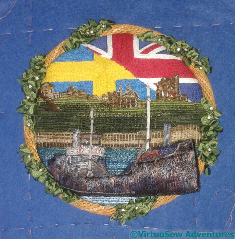
Wreath And Rigging
As you see, the wreath is now in place, with just a few white berries – white for peace.
I have quite a few more little tweaks to make, details to emphasize, maybe a bow-wave to add, but this is the original sketch brought mostly to life, and provides me with some hope that all that thinking and working will have a good result.
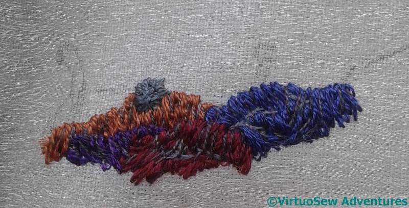
Progress on the wreath
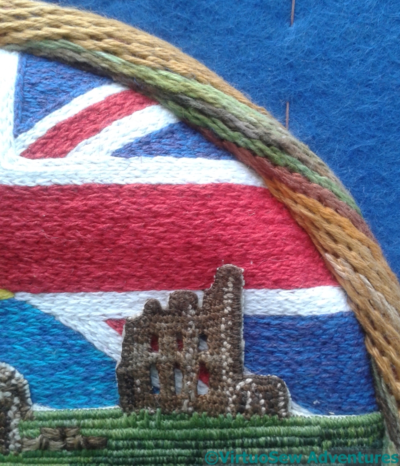
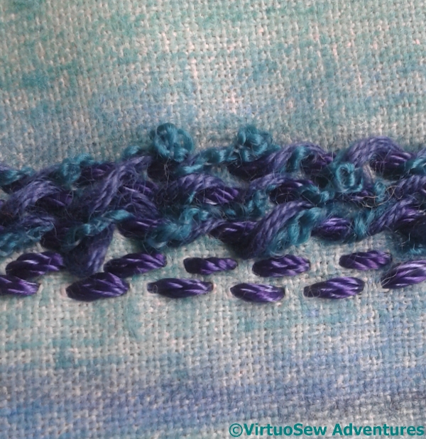
Raised Stem Stitch Band
The last time I used Raised Stem Stitch Band, it was for the rim of the Crock of Gold, and it went around concentrically.
This time I wanted to create the twisting appearance of a rope frame, so there was a little trial and error involved in working out how to make it work. Here you can see that there are green sections (which will be under the wreath) and yellow sections with differing shades to help create the rope effect. It’s not the classical version that runs straight along the axis of the foundation stitches, but I think it has worked rather nicely! That’s a relief…
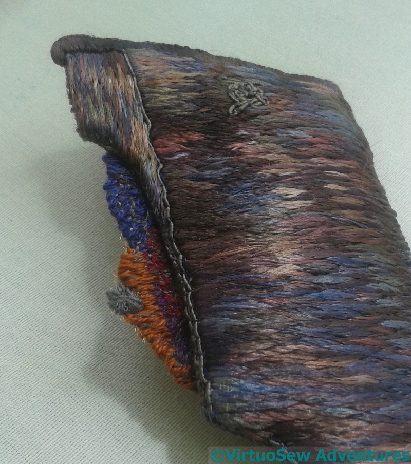
Rope And Wreath
It is a little lumpy, perhaps, but the shades of thread do create some shaping in the rope section, and I think the wreath itself will help to enhance that.
You can begin to see that the weight of stitchery is making the fabric sag, in spite of the backing. It’s just as well I did back it!
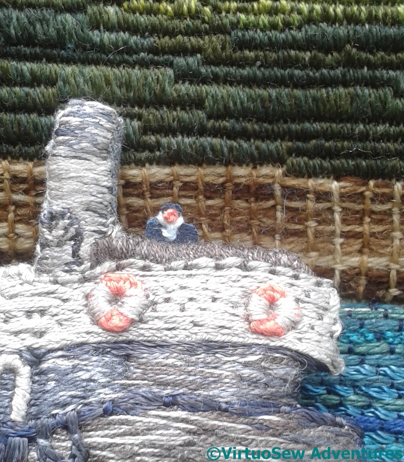
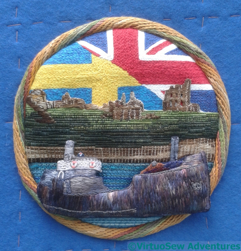
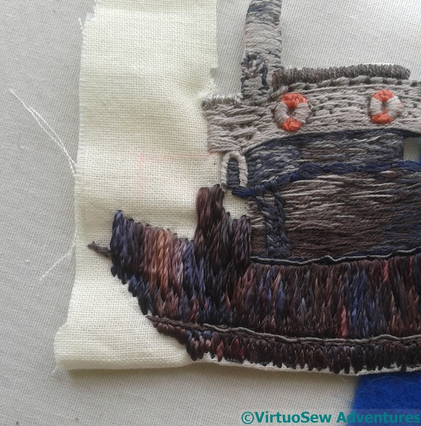
On The Bridge
Another close-up, this time to show Great Grandfather in his place on the bridge.
He’s tiny, of course, and many onlookers won’t even notice him. But he’s there, the one human element in the piece, standing for all the hundreds of thousands of men and women involved in the war effort, military and civilian alike.
Details to think about
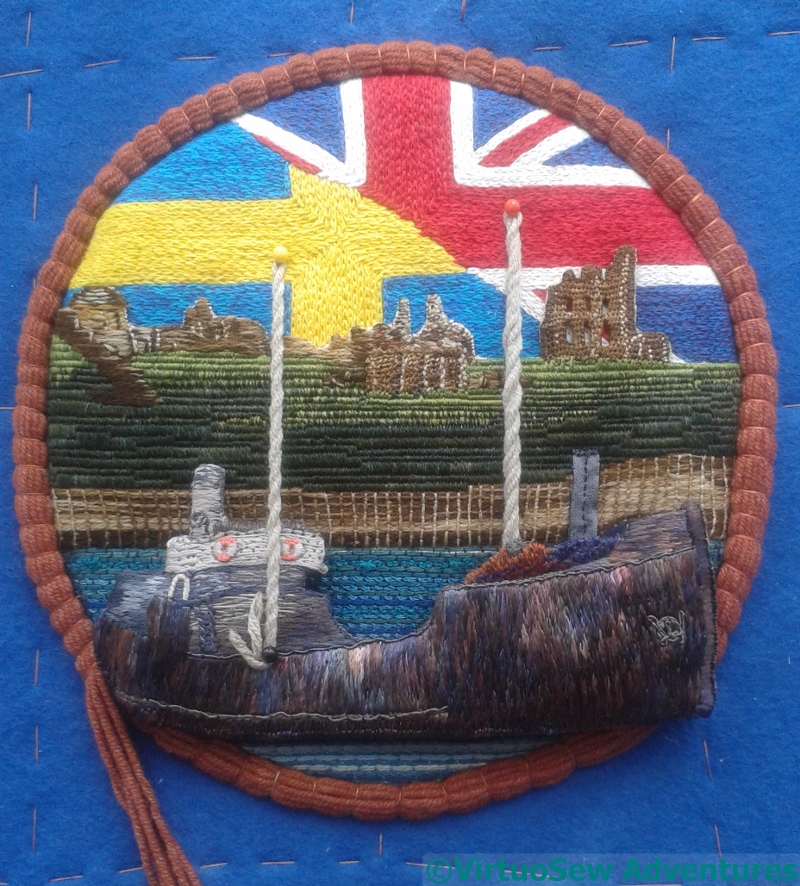
String Padding with Test Masts
While I was working on the string padding and testing the placement of the vessel section, I was able to test the placement and height of the masts.
These are too high, but they are in roughly the right place, which is a step in the right direction, at least!
And, however much I may have wished to, I can’t simply use twisted cord. I’ll have to cover the masts with something…
Planning Wreath Placement
Leaving that point to ponder, I finished the string padding and removed the vessel section, leaving its shadow in place. You may note that I’ve added a funnel, and a bit of extra padding for the deck cargo!
I want to weave a wreath around the rope frame, in such a way as to set off the ship, rather than argue with it. The green tangles of thread helped me to do so…
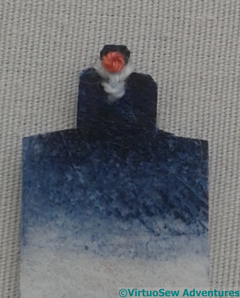
WatchKeeper
Finally, I had another hard look at the photo and realised there was a watchkeeper on deck.
So here he is: buckram painted with inktense, a French knot for a face, and a knot of white thread for his scarf.
I’m going to say that this is Great-Grandfather, on watch as his ship leaves the Tyne.
Continuing to make progress
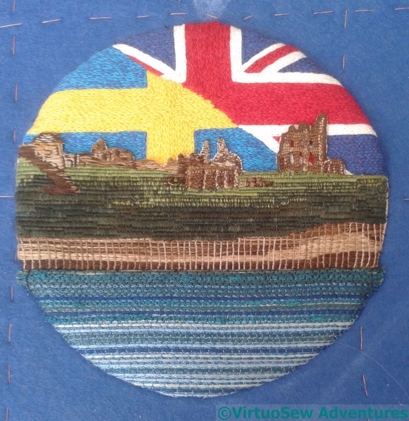
Sea Attached
Once the sea was done, of course, it had to be attached. Again, a gathering thread, and tucking it around the edge of the buckram-and-padding base. That wasn’t too much of a trial,as it turned out, and once it was done, I could sit back and look at it.
I’m really quite pleased. There is a lot to come, but I think this makes a very strong start. In particular, the headland and the priory stand up well to the flags which could so easily dominate, and the sea supports both. Good!
Ship Shadow
Not that much of the sea is going to be on show, but I’d rather do the whole breadth and not have to worry about exact placement. It’s also quicker to do the whole breadth than it is to do short intermittent sections!
I want the vessel to be strongly raised, sailing out at the viewer, so before I attach the ship, I attached an underlayer, using wadding covered with printed cotton. It’s just tacked in place here, but you can see that I’ve set it to run out over the frame, when that is in place.
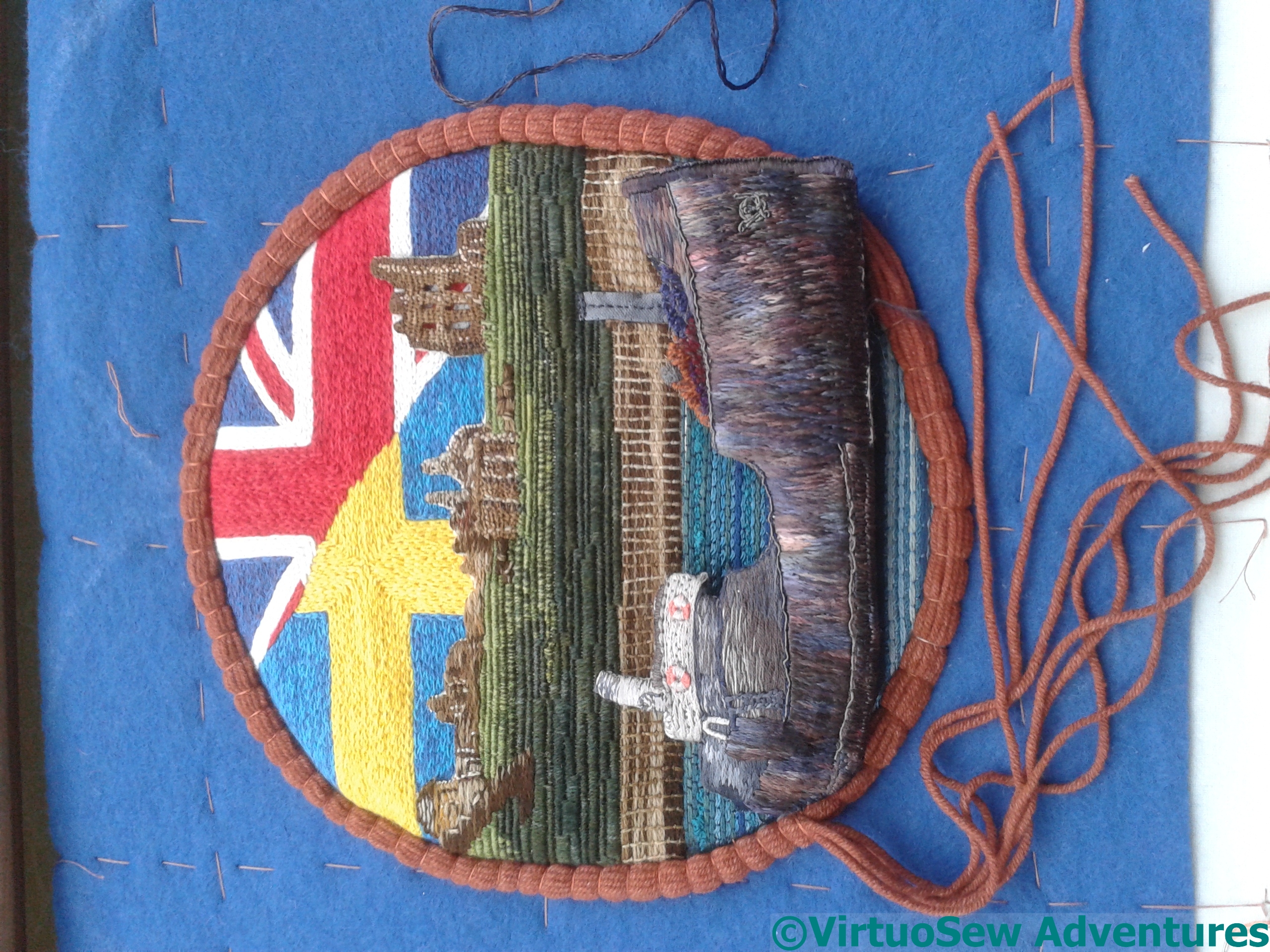
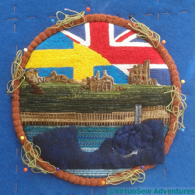
Padding The Wreath
The preparation for the frame is underway in this picture. I’ve used several layers of string padding, and overlaid the ship piece to give a bit more of a hint of how it is going to look.
My idea for the wreath is to start off with raised stem stitch band, for the “rope” section, and then build on that base layer for the wreath. We’ll see how that goes…
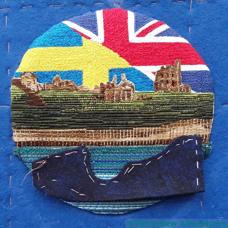
Working on the vessel
Adding To The Stern
Once I had the roundel started, I was able to finish the vessel – which, like the flags, I’d not done quite enough of !
By finish, I mean stitch the last bit of the stern that I need, and then cut out, and turn in the edges. Then go around the edges again, covering them with gimp or stitchery in suitable colours to hide the calico.
Tarpaulins
I also stitched an odd little fragment over a piece of gauze. This is going to help represent the deck cargo in the bows. The colours are quite dark, and stitched-in creases in grey helps to make it a bit more weatherbeaten.
Deck Cargo Added
Then there was still more padding to add, and the deck cargo to put in place.
This angle on the bows allows you to see the extra gimp running down the edge, and how much extra padding I’ve put in. You can also see the deck cargo – I cut close to the top edge, and then used the fabric below to attach it to the back of the vessel.
Moving on to the Sea
Failed Sea
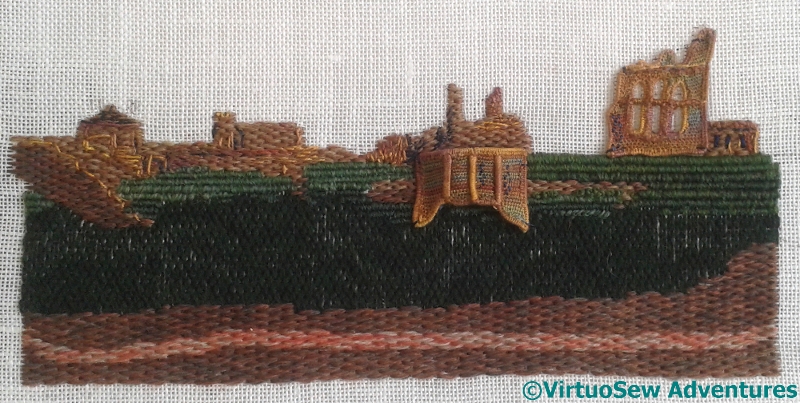
Having got the headland attached, I moved on to the sea.
I began by colouring a piece of fabric with Inktense and aloe vera gel, and then started to work whipped running stitch across the width for the sea. The idea of the colour was to keep the fabric from showing through.
Don’t like it. Not one bit. The fabric was too tightly woven for the threads I want to use, and it wasn’t growing quickly enough.
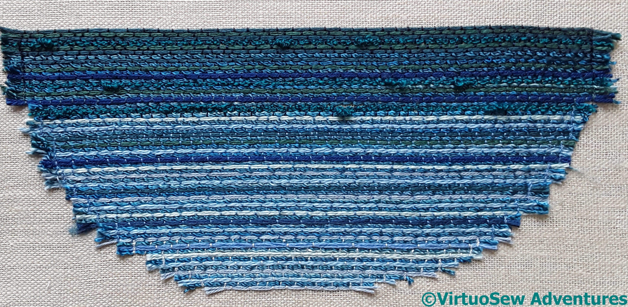
Sea Completed
Fortunately that was the only false start. The second version was rows and rows of couching. I used a less finely woven fabric, although that mattered less in any case when I settled on couching. This gave me the change to make good use of some textured yarns to create the impression of a slightly sullen, lumpy sea.
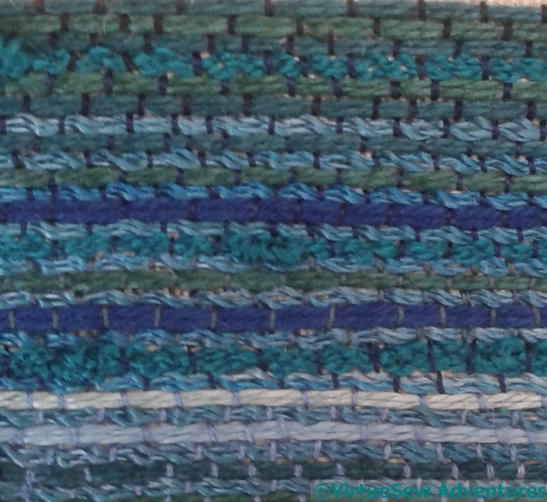
Couched Rows
After the first few lines, I used an overdyed rayon spiral yarn as the “standard sea colour”, and alternated it with variety of other threads, couching them down with different tones of thread and lightening as they came forward towards the front. The tones of the couching threads help to modify the colours of the couched threads.
Actually Beginning the Appliqué
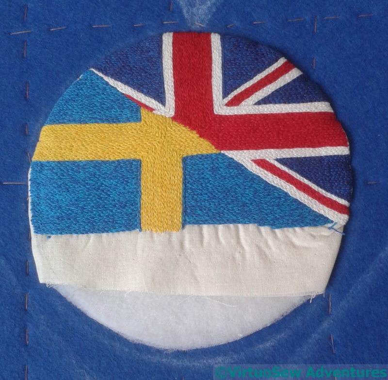
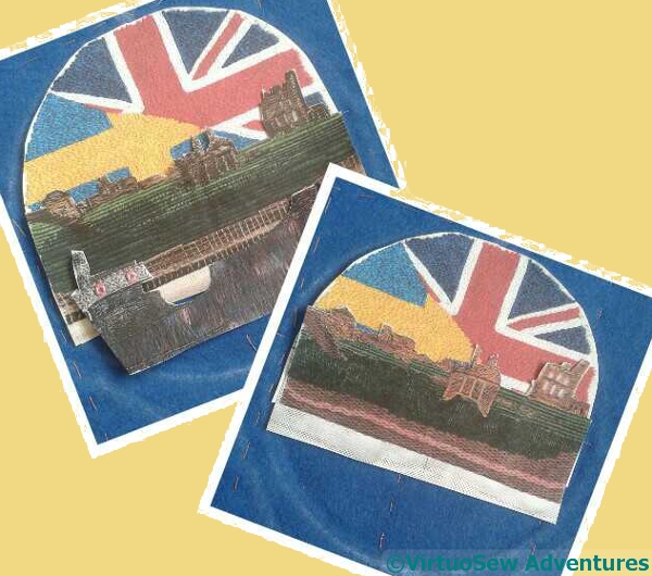
Flag Sunrise
Once I had extended the flag sunrise -by nearly half an inch in all directions, just in case – I ironed it, and then ran a gathering thread around the curve. I’ve cut a circle of heavy buckram and another of wadding, and stretched the flag sunrise over the top.
Before I tried to attach it, I flattened it very thoroughly, and trimmed away as much of the excess fabric as I could. Then I fitted it into the circle I’d drawn on the backing fabric already, and stitched it down. Since there will be a frame around the outside, the stitching doesn’t have to be invisible, but as a matter of pride it does have to be neat, even and the next thing to invisible…!
Pinning The Headland
The next stage was to add the headland. This didn’t happen all at once, because the first thing to do was to remove the sky. Since there are a variety of edge treatments here, some of the fabric was folded back, and some of it was simply trimmed very closely.
It took two days of stitching time, and it drove me completely mad with frustration!
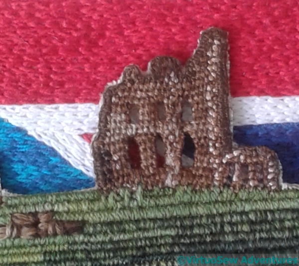
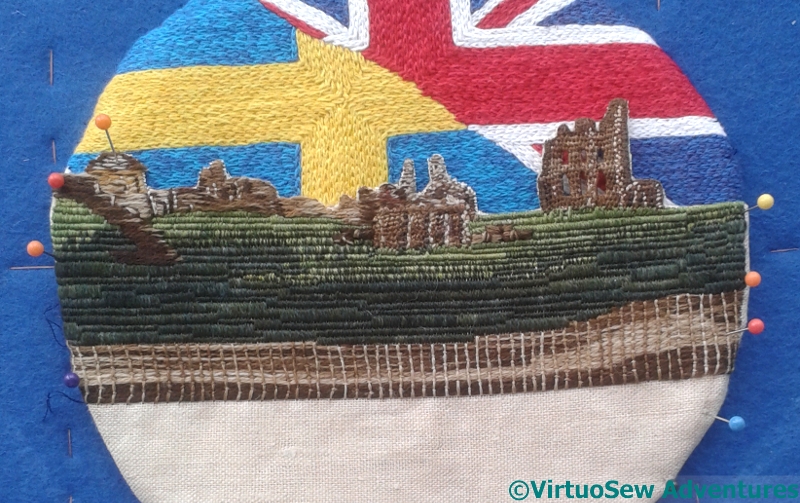
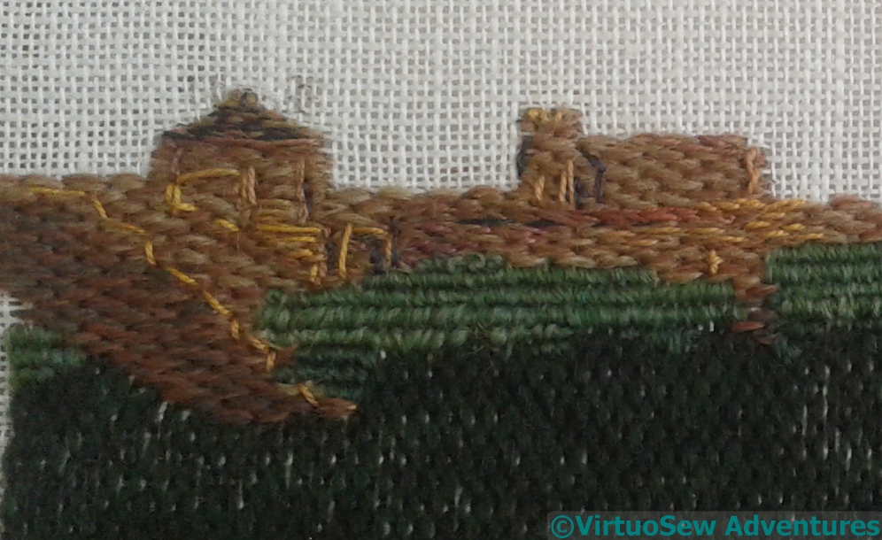
Flag Through The Windows
However, one element which worked exactly as I hoped that it would was the ruined priory’s windows. This is version two of the headland, and the ruin hasn’t been wired. I just invented a way to keep the windows open as I was doing it. Removing the fabric behind this square inch (barely) of needlelace took nearly as long as the rest of the sky put together, but it was worth every minute, and every quiver of anxiety as I pulled threads away.
Just as I hoped, you can see the flag sunrise through the windows!
Beginning to think about assembly
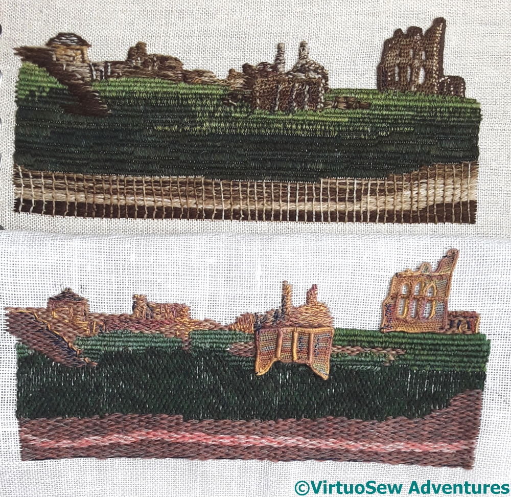
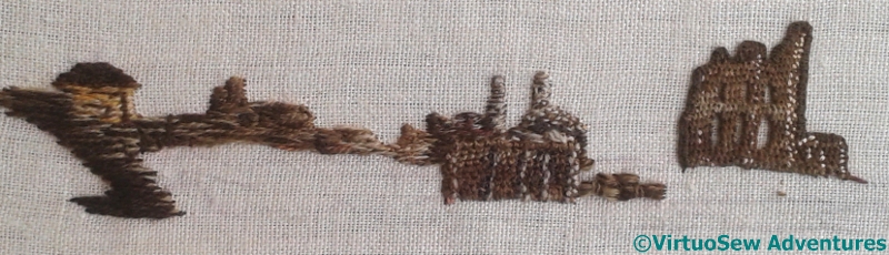
Direct Comparison
Here’s a direct comparison of Version One with Version Two – and it doesn’t help my decision making one bit!
That said, when I put a similar picture up on Instagram and Twitter, the top one (version two), of which I had considerable doubts as I was stitching it, was overwhelmingly the favourite of those who responded.
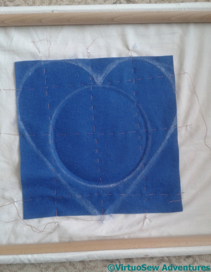
Outlines In Place
So while I continued to think about that, my next step was to attach the fabric provided for the heart shapes to a backing fabric and draw the shape on it, together with the circle for the roundel. Since the fabric supplied is only just big enough, and there are going to be many layers to my appliqué, I want to ensure that it remains stable and controlled during the layering. Attaching it to a backing fabric and then stretching the backing fabric in a frame seems to me the best way to achieve this. It’s also a very good use for the remaining “good” section of a lovely cotton sheet I had put my foot through!
Photocopies
I made photocopies of the flag sunrise, the headland, and what I have done of the ship so far, trimmed them close, and made an unwelcome discovery. Neither the flag sunrise, nor either headland was quite as wide as I wanted them to be, which is a little worrying when you consider I could have sworn I used some form of measurement!
Still, onwards and forwards….
Tynemouth Priory, Fourth Installment
A New Approach
So, version two. Different threads and colours, slightly different techniques.
I haven’t wired this, and I have worked the buttonhole stitch facing outwards to make a firm edge. I’m planning to cut away a section of the fabric to allow the windows to be windows…
The thread is silk, again, but a heavier thread this time, and I have tried a slightly different approach to the windows that conceals the edging a little more. It seems clunkier, but it might stand up to the “flag sunrise” a little better.
Details On Second Approach
Again, a slightly different choice of materials and stitches, and when I went back over to add my extra layers of detail it was specifically using the photograph again. I hid version one away where I wouldn’t be able to see it!
I became a little worried at this point, because the slightly heavier stitching, and the fact that my dark colours were darker, made the whole thing a bit spotty, especially at close quarters. But of course, I was worried at the same point on version one, so I decided I would have to keep going.

Priory Version Two Complete
So I did – the grass used trammed and then untrammed satin stitches in rows, and then the cliff face, after much thought, I worked in Bayeux Stitch. With the variety of tones and layers, it looks less cliff-like, but more stitched, which I think is a good idea.
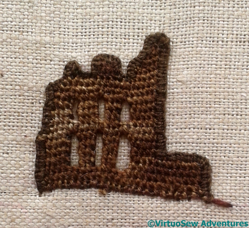
Tynemouth Priory. Third Installment
Adding Details By Eye
The result of all this staring and stitching is that I have layers and layers of stitches built up, creating details and changes of tone and colour. It’s surprisingly hard to do, partly because looking requires so much concentration, and partly because all those layers of stitching start to become difficult to stitch through (this is probably no surprise…).
After much staring and stitching, and the addition of a cliff face in a variant of Brick Stitch, I decided that the best thing to do was to tack the needlelace into place, and take a good hard look at the result.
Needlelace Tacked To Check
I expect to add other details during the assembly phase, so the fact that the joins between the needlelace and the main piece are so obvious isn’t something that worries me. I rather like the raised effect of the needlelace – it might even create tiny shadows through those windows
Something does worry me, however. The stone is very yellow, which is not only inaccurate, but may argue with my “flag sunrise”, and the whole thing may fade into the background more than the “heraldic” feel of the piece would dictate. It’s surprisingly hard to anticipate from a skein what will be the overall stitched impression created by a thread – the choice of stitch and the orientation of that stitch can both affect the result, even before the possibility of selecting the parts of a thread to use (wasteful, I know, but sometimes magical!)
Suddenly I can see myself working a Version Two….