
Tynemouth Priory. Third Installment
Adding Details By Eye
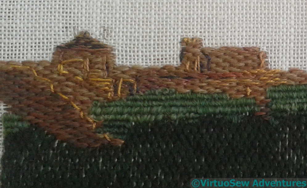
The result of all this staring and stitching is that I have layers and layers of stitches built up, creating details and changes of tone and colour. It’s surprisingly hard to do, partly because looking requires so much concentration, and partly because all those layers of stitching start to become difficult to stitch through (this is probably no surprise…).
After much staring and stitching, and the addition of a cliff face in a variant of Brick Stitch, I decided that the best thing to do was to tack the needlelace into place, and take a good hard look at the result.
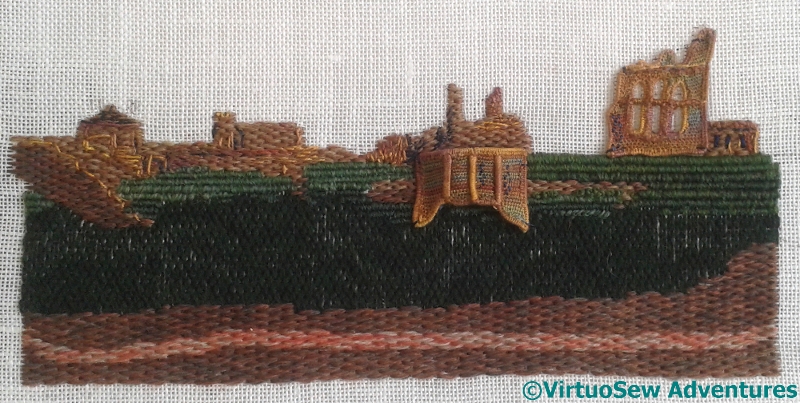
Needlelace Tacked To Check
I expect to add other details during the assembly phase, so the fact that the joins between the needlelace and the main piece are so obvious isn’t something that worries me. I rather like the raised effect of the needlelace – it might even create tiny shadows through those windows
Something does worry me, however. The stone is very yellow, which is not only inaccurate, but may argue with my “flag sunrise”, and the whole thing may fade into the background more than the “heraldic” feel of the piece would dictate. It’s surprisingly hard to anticipate from a skein what will be the overall stitched impression created by a thread – the choice of stitch and the orientation of that stitch can both affect the result, even before the possibility of selecting the parts of a thread to use (wasteful, I know, but sometimes magical!)
Suddenly I can see myself working a Version Two….
LOL, I know what you mean by it’s getting harder to pull the needle through. I did an applique and advanced silk shading piece for my RSN diploma. I ended up silk shading a buddhist monk through a layer of calico, topped by a layer of dupion silk, half of the monk sitting in top of a loosely woven thick raw green silk and the whole monk backed by a thin layer of closely woven linen. Pushing #12 needles through 3 or 4 layers of fabric for silk shading is not much fun. I cursed so much and broke 32 needles. Hurt my fingers very much. And then got told off by my mum for having damaged my fingers so much and that I could get a very nasty infection. Luckily I didn’t. And yes I would do it again when the piece calls for it :)! Good luck!
The details are great – it’s all coming together nicely. xx
I like the sticky outy bit.
when I was a kid my mum was working in tynemouth for the day, so off I trotted to see the castle, money in my sweaty little paw. The custodian looked at me, saw I was alone, and said, ” go sit on that grass over there, and in ten minutes I have my lunch break and I have to go and walk the dog, no one mans the office whilst I’m gone”
You’ve made so much progress on this piece! It’s beginning to look like a book illustration–I can really visualize the scene. 🙂
It is looking so good! Where you feel the stone is too yellow, could you perhaps add some shading with a Pigma pen?
I think you are looking at it too hard. Give it a rest and a good think before you start version 2.
Your details and the impression of the image is really coming together nicely. Looking from a photo to your work and making decisions does get easier I have found.
It is an impressive piece of work, and looks good to me. Take a break and when you come back you might see its beauty. I think the fact that there might be shadows in the windows will add a lot of realism to this piece.
Very impressive indeed!
Very good textures of the layers of stitches.
I know it sounds weird, but looking at it without my glasses on, really brings the whole thing together. Whether the colour is right or not, the shading and highlights are perfect. If I didn’t know it was a very out of focus piece of embroidery, I’d assume it was a very out of focus photograph. And that is a compliment!!
I do think the lighter yellows give more of a hint of the sunrise shining off parts of the building, though it may not, in fact shine that way. I very much like how the further back one sits, and am reserving judgment on the front one, though I think I’m going to like it, too.