
Tynemouth Priory, Fourth Installment
A New Approach
So, version two. Different threads and colours, slightly different techniques.
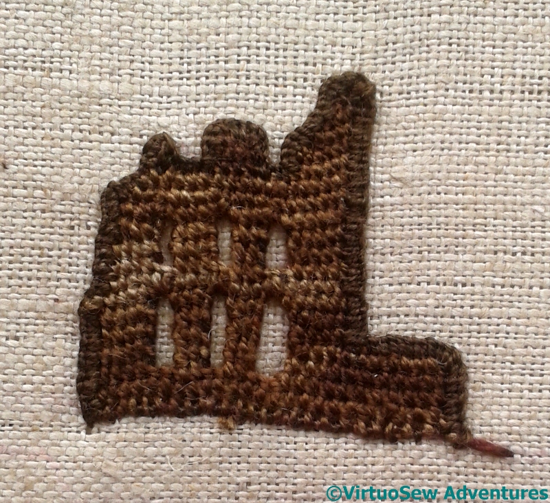
I haven’t wired this, and I have worked the buttonhole stitch facing outwards to make a firm edge. I’m planning to cut away a section of the fabric to allow the windows to be windows…
The thread is silk, again, but a heavier thread this time, and I have tried a slightly different approach to the windows that conceals the edging a little more. It seems clunkier, but it might stand up to the “flag sunrise” a little better.
Details On Second Approach
Again, a slightly different choice of materials and stitches, and when I went back over to add my extra layers of detail it was specifically using the photograph again. I hid version one away where I wouldn’t be able to see it!
I became a little worried at this point, because the slightly heavier stitching, and the fact that my dark colours were darker, made the whole thing a bit spotty, especially at close quarters. But of course, I was worried at the same point on version one, so I decided I would have to keep going.

Priory Version Two Complete
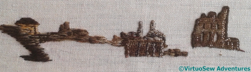
So I did – the grass used trammed and then untrammed satin stitches in rows, and then the cliff face, after much thought, I worked in Bayeux Stitch. With the variety of tones and layers, it looks less cliff-like, but more stitched, which I think is a good idea.
The colours do look better and, as you say, more able to fit in with the sunrise. I liked the look of version one, and I hope it finds another picture to live in. But as part of the whole heart, yes, this one has the simplicity that it needs to keep its place in the composition without fighting the sky or overwhelming the boat.
I like the way surfaces are catching the light.
Its looking amazing.
I like both versions, so I’m no help!
I like the cliffs, nice to see laid and couched used modernly
I had a peep at your post with the first version and in my opinion they are both good but the second is better. I especially like the grass in the second. So it was worth making it all over again!
Having compared the two this is definitely my favourite! The buildings look more like ruins and the cliffs work much better. xx
I do like the the effect of the light, but I love the ruins in the first version!
This looks amazing, I hope you are happy with it.
The colours are coming together.
I think I will hold off on saying which I like best until I see the finished piece. As it is I like both versions 1 & 2.
I find all your work fascinating and and so intricate and ‘fine’. I can’t wait to see this work completed.
I do like the green parts better on this version. I think I need to “live with it” a day or two to know if I like the rest better. I was a little partial to that sun streaking, as I think of it, on the other version. But of course, I’m not seeing them in person, and I’m not seeing all the things that will go with these bits, either. I have every confidence that you will use the best part for the final piece. You have an excellent artist’s eye.
Very interesting to scroll from one version to the other. I definitely prefer the grass on the second version but very torn between the two Priories.