
Tag: design elements
Not quite starting over…
Well, what with putting her away over Christmas and then taking some time to make a decision about what to do next, it’s been a while since you saw Aethelflaed..
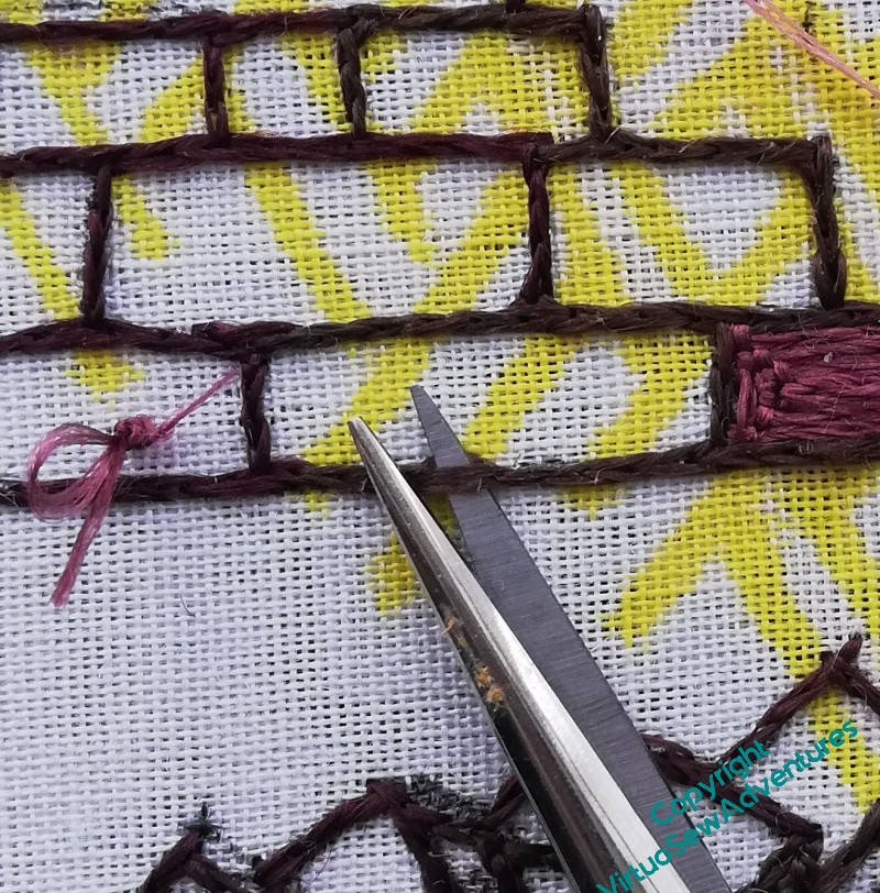
And here I am, snipping and snipping away at all of the wall outlines, the blocks I’d already stitched, and even the pile of blocks ready to be reused.
All gone!
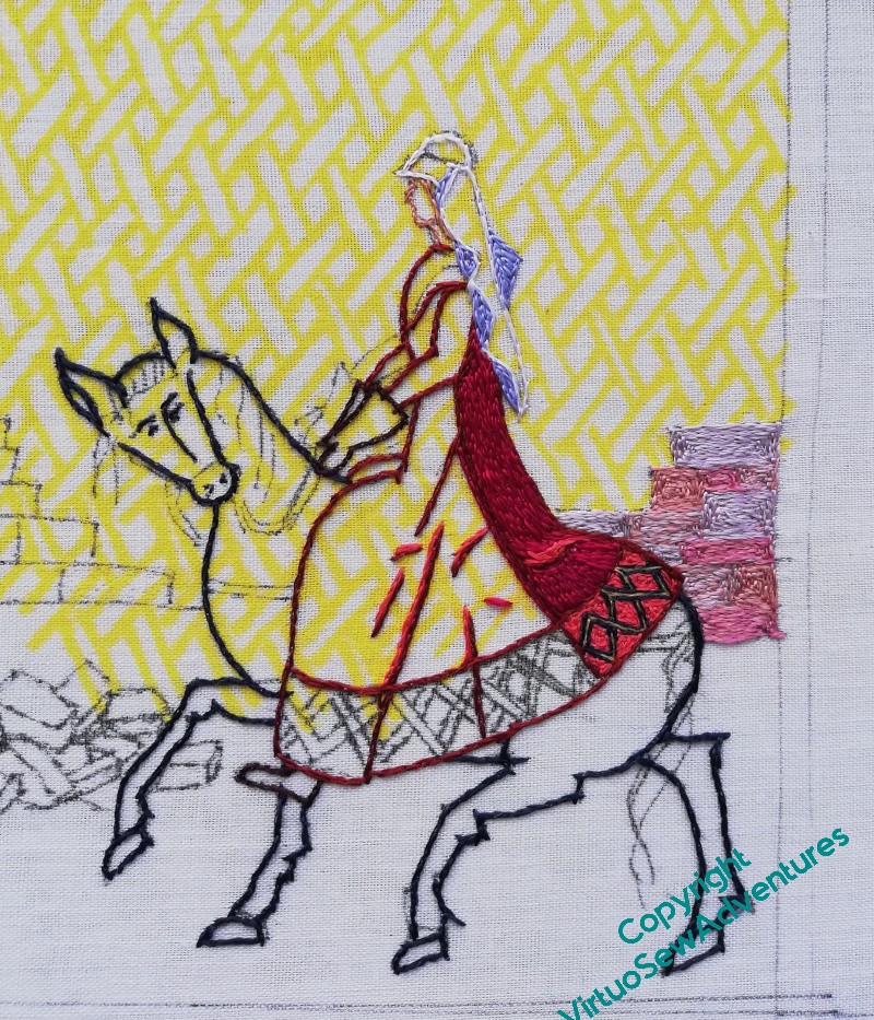
And now, the section behind her and her horse is reinstated, using a mixture of blends and a couple of single colours. The tones are much closer together than they were originally, and I’ve also chosen not to use the dark outlines and dark “mortar”. This will help to create a more subtle background, while still having the pinky-orange of Cheshire sandstone. I’ve seen all these colours in various bits of Chester’s Walls – I’ve just chosen, this time, not to include the much darker browns and plum colours which are also there.
So much of representational art, whether it be painting or embroidery, comes down to a question of editing. What do I want to emphasize? What do I want to play down? How can I balance the colours, the shapes, the patterns, to tell the story I want to tell?
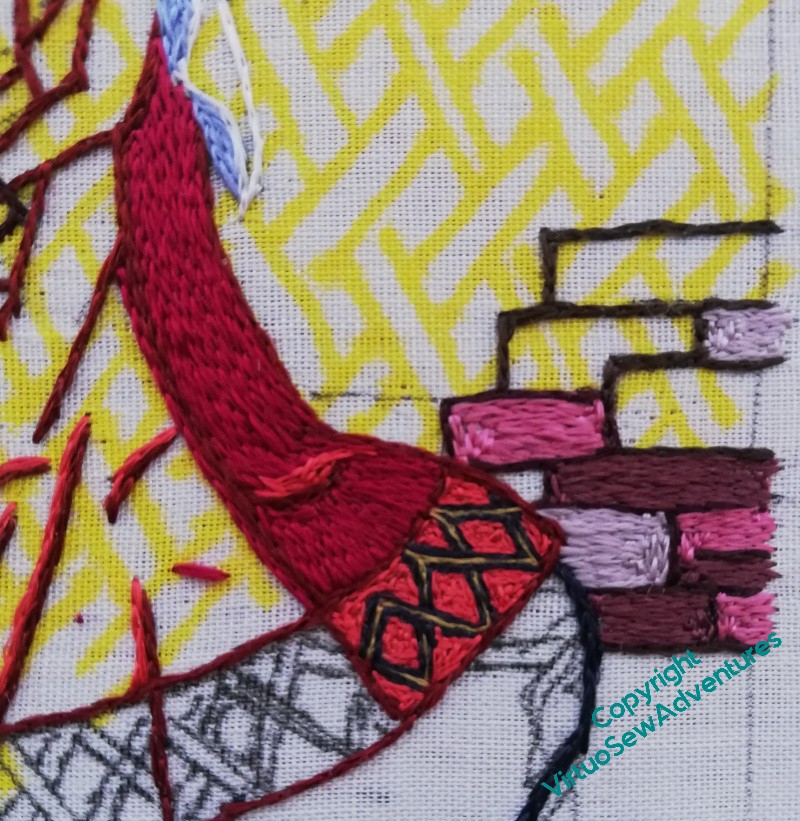
Looking at the newly worked section from further away, I think I’m happy now that the wall will pull back as I need it to.
Now I just need to keep going!
Rebooted!
Having a Twixmas project has become part of my year for more than one reason. Firstly because usually I have to hide away my main project, as the table I work beside takes the Christmas tree. But secondly, and in some ways more importantly, it helps me “reboot” myself. Last year in particular, I ran out of “me” before I ran out of year, by quite a few weeks, and sitting quietly doing something I didn’t have to do any planning for turned out to be a proper reboot.
Because I’ve come up with ideas for making progress with Placidus, who’s been losing forward momentum for quite a while, as well as having ideas for another embroidered coat..
Placidus first. We’ve been remembering the description of the fresco in “The Herb of Grace”, and it’s slightly mad, the characters of Placidus, his horse and dogs, and the stag all a bit big and out of scale with the forest, and with little vignettes of animals in the spaces in the canopy.
Placidus had stalled because I’d got caught up in having the design planned out before I started. It’s going to be a big design, and for all my drawing and design skills have improved enormously over the years, a very taxin one. So, the reboot is to do what I did, in fact, with Amarna – start doing fragments that will be part of it, and worry about assembly when I get there.
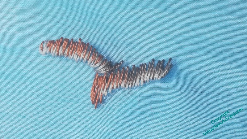
Shortly after having that thought, I found myself watching a documentary in which Hamza Yassin was on the track of Britsh birds of prey, and remembered a bit of blue gauze I have in my stash.
Well, now.
So I started with pausing the documentary and taking a few photos of one of the hawks. Then I found the gauze and drew a very light outline in one corner of it. I’m going to be freestyling this one – part of continuing the reboot and reminding myself of my True Love in stitching.
Having Doubts…
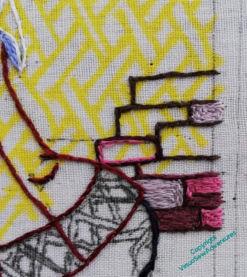
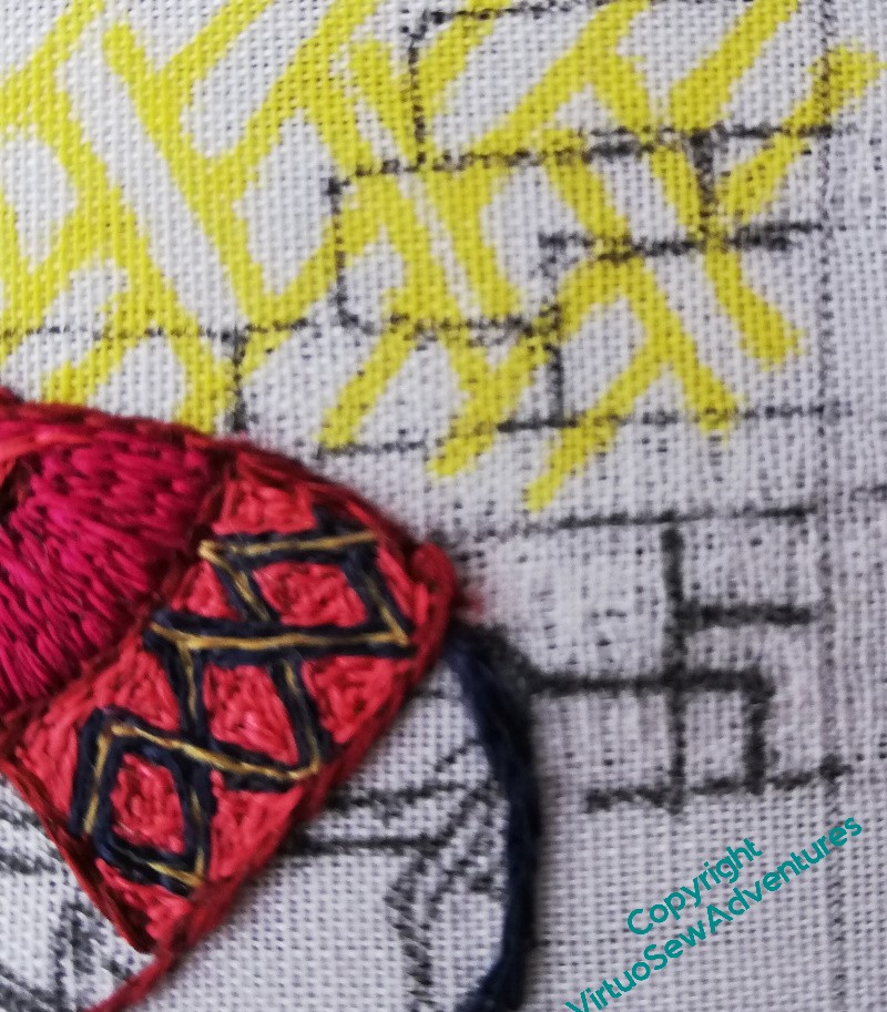
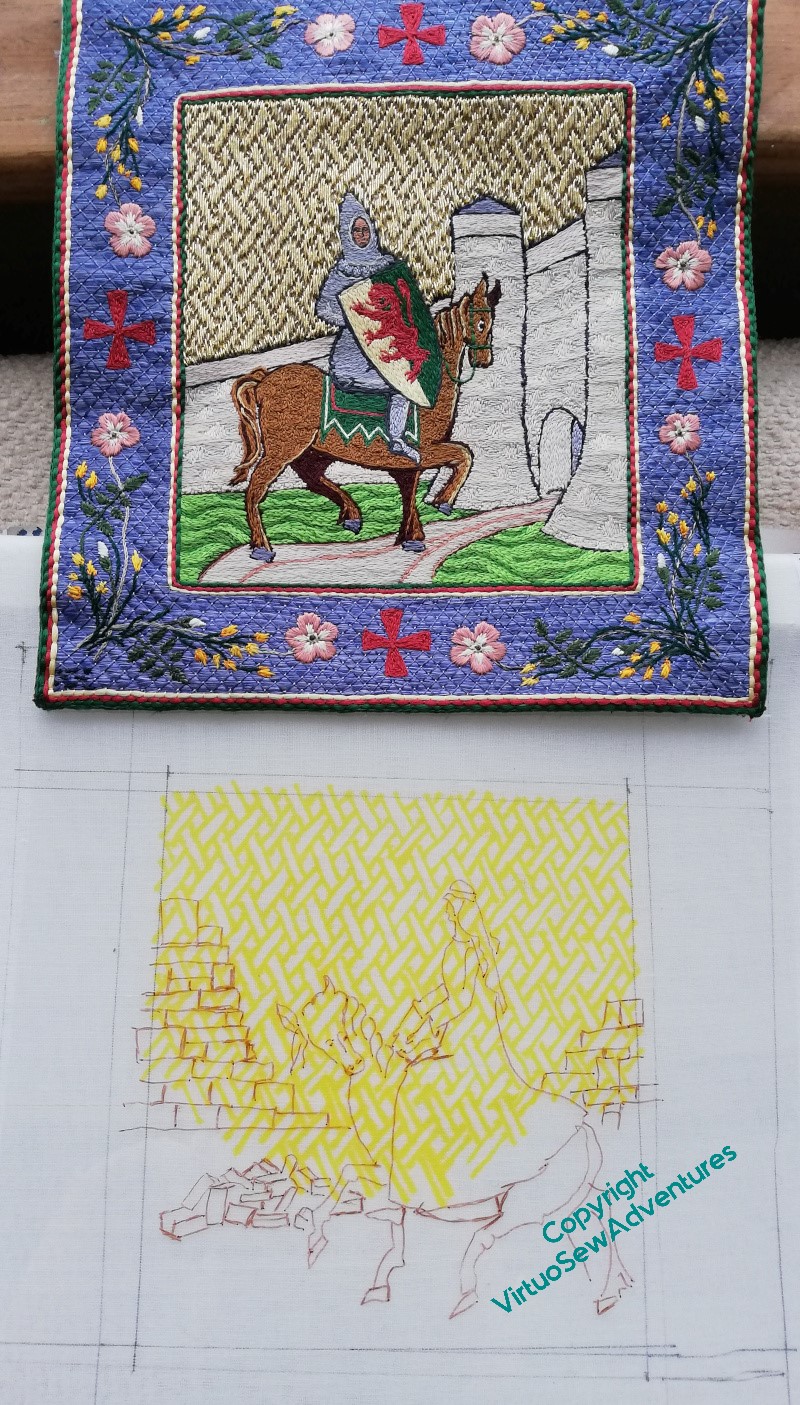
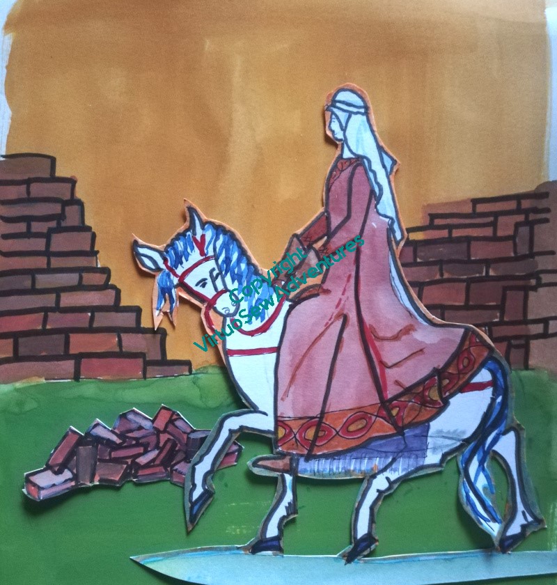
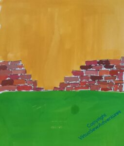
You may recall that I became concerned about the wall and the colours beside Aethelflaed’s riding dress. I filled in some stones, and had even more doubts.
Cheshire sandstone is an absolute horror to depict in stitch or paint – every time I’ve tried in the past I’ve missed in one direction or another. So I’m not especially concerned that this version is proving exasperating too. I just need to find a way to create something I can live with. And indeed, something that Aethelflaed can live with!
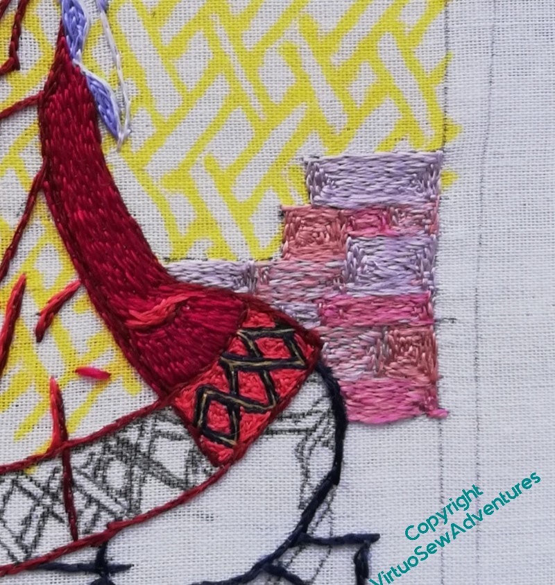
The sensible thing seemed to be to do the back panel of the dress and then look seriously at the combination. So here we are, back panel of the dress, including the bright, dramatic, interlaced pattern on the border.
I do need to retweak the highlight on the skirt, somehow, but I have dress and the border in place, and I think the wall colours are definitely going need a bit of tweaking.
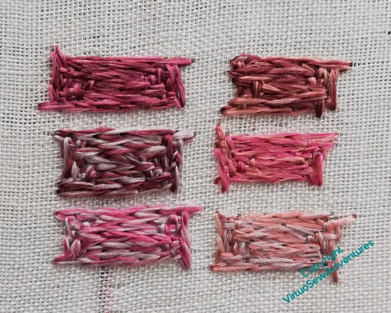
So with the idea in mind of blending colours to make the walls sit back from Aethelflaed a little more quietly, I did some experimentation.
Now I have to make some decisions, of course!
Aethelflaed Begins to Progress..
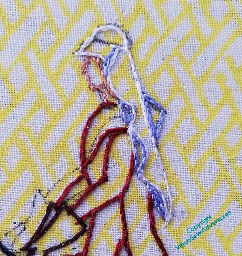
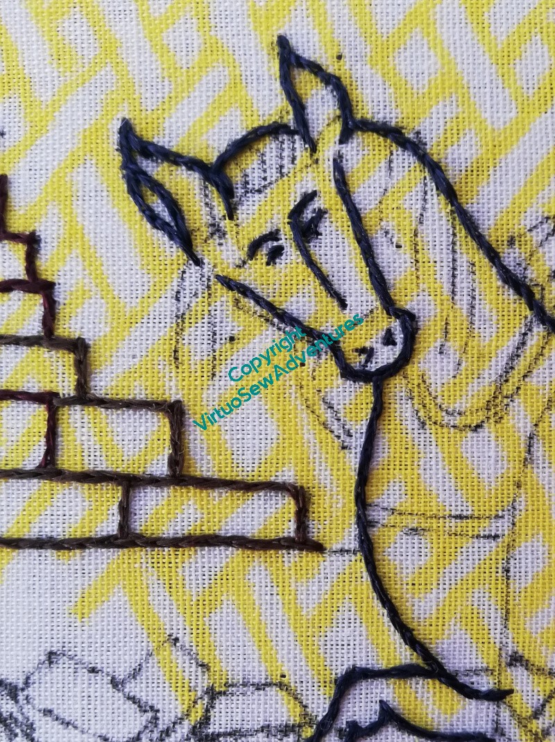
The first stage is to outline everything, so here goes…
Since a white veil would have been an important part of the outfit, I’ve made sure the shadows are outlined in blue. That will make the white seem whiter, making the day seem sunnier.
I’ve given her mittens, rather than gloves – that may be cowardice (no fingers to do!) – but it will make for simpler shapes. How much the Medieval Movers and Shakers will wander from a truly medieval style and sensibility, I don’t know as yet, but I’m trying to keep my wanderings within reason.
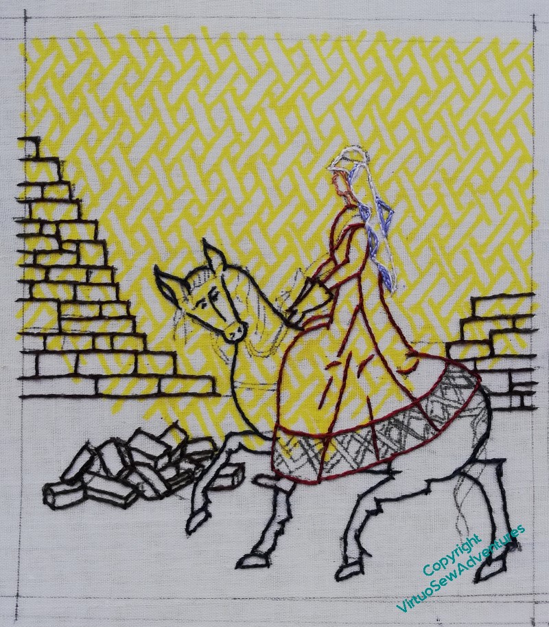
Anyway, here we are, all principle outlining completed.
It barely shows, but the stones are outlined using three different shades of dark brown. It shows a little more in real life, and it might helpd to create slightly different impressions on patches of stonework. We’ll have to wait and see about that!
I’ve left the horse’s headstall and harness unstitched – I’m going to stitch that over the top of the main horse stitching.
I’ve not really tackled the grass, even in thought. I’m intending to make it tussocky – another contrast with William Marshall, approaching his kinsman’s well-kept castle, with undergrowth kept back from the walls. But how – I’ve no idea as yet!
I have another problem, anyway. I’ve started to put the walls in, and I’m more than a little concerned that the contrast of the stonework, if I continue like this, is going to be much too high, pulling the wall forwards and dominating the picture.
I can’t have that – Aethflaed is the one I want people to see. Her work comes after her.
So now I’m wondering about blending the colours to soften the change. That feels like a rather un-medieval thing to do, somehow, so I have to decide whether that’s a point I’m willing to concede.
Raising A Needle At Last
Having at last settled on a design for Aethelflaed, there was a certain amount of jockeying around to get the size right and everything in order to start stitching.
As you can see, I’ve got William prepared to be mounted, but he’s still unmounted, which makes him easy to compare. The direction of the designs are contrary, there will be more red and brown in Aethelflaed, and I think the white horse will be rather necessary to help lift it.
You will see that I’ve already added the guidelines for the planned basketweave underside couching. I found adding them later really nerve-wracking, so this time I put that in first, and then the important bits of design went over the top, in a different colour and more precise line..
I was able to gather some of the threads from among those I used for William, which has helped. Partly because it’s always good not to have to buy more than you need, but also because it will help the series “talk” to one another if the palette of colours has some continuity. And then some of the others were passed on to me by Sue from TortoiseLoft (thank you, Sue!).
It has occurred to me (very recently) that if I keep the same blue background in the border, that will also keep the conversation going among the designs. I’m also considering winding the roses around the barrels and skeps, again to keep the conversation going.
But finally – FINALLY!! – I’ve managed to get started!
I’ve used three different browns in the outlines of the stones of the wall, and a very dark blue-grey for the horse.
There’s much more to do, but my goodness, I’m glad to have begun. I know Aethflaed must have been feisty but her embroidered representation has been living up to every bit of it.
Now, what would she have called her horse?
Getting there at last…
Definitely getting there now. The horse is madder (a bit), and shorter-backed. I think when I stitch it, I may give it a clipped, standing mane, instead of the flowing locks – another contrast with William Marshall’s horse Mars.
Aethelflad herself is taller, and the contrast is closer, in keeping with the idea of wearing a sensible woollen riding dress to visit a building site.
I’m not sure about the saddlecloth – that may be something I will choose not to include.
I wonder whether Prior Rahere and Mother Julian are going to take as many iterations?
I think I’ve got it now.
I’ve added a border, and decoration around the neckline of the dress, both of which have helped. And I’ve cut out the pile of building stone and Aethelflaed herself, and moved them around a bit to make a layout I’m happy with.
Gosh. It’s taken a while!
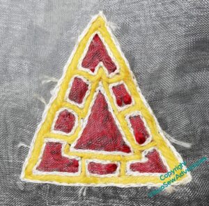
Second Trapunto Jewel
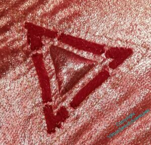
We left the second trapunto Jewel looking like this: crimson gauze over gold tissue, with red wool stuffing the outer, broken channels in the gauze, and something stuffing the central triangle from behind the gold tissue.
And it looks like a good start, doesn’t it?
But some of my more alert readers may be thinking, hang on, didn’t you say something about doing the narrow gold channels first?
Well, yes, I did, but that was when I was filling the channels trapunto-style. I decided to try something else for this next one. I used a gold metallic chainette yarn – the same for all of the gold stitching – and after some thought, picked interlaced Cretan Stitch, to create some of the effect of punched or engraved gold surrounding the gemstones. At this point you can see I’ve only done the first part of the outer line.
I had to invent something for the short sections joining the outer and inner triangles!
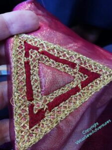
Finally, I decided that the edge needed a bit of help and ran a line of chain stitch around the outside.
In terms of the effect, I think this is a great success. However, I’m not sure this is the right scale for Aethelflaed (in terms of size it’s an appreciable fraction of her finished size) and the gold chainette was a bit of a pest to work with. I was stitching in public, so no swearing.
There was, however, muttering…..!
More Planning for Aethelflaed
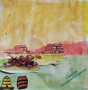
As I have thought about Aethelflaed and begun to plan the design of her panel, I’ve also begun to plan what the background will look like.
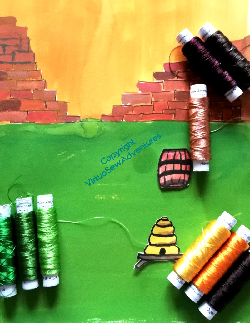
Brought up, as I was, in Chester, the obvious point in her life to choose is her defense and refortification of Chester. So the stone for the wall is the distinctive dark pinkish sandstone of Cheshire, and in reference the the beehives and boiling beer turned on the Viking assault, I have a barrel and a bee skep ready for deployment.
But I need something that I can try to place Aethelflaed against, and strong enough in colour to give me a start on picking her colours, so I’ve redone some of it to give me something to work with. Although I do feel that maybe the wall isn’t high enough.
While I’m working on the walls of Chester, I also need to work a bit more on Aethflaed and her horse. The pair of them are proving much trickier than William, mostly because examples of horsemen aren’t hard to find in medieval art. I only had to decide on a few tweaks of presentation and insert the appropriate coat of arms. Aethelflaed is being invented as I go.
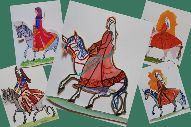
In fact, the invention, reinvention, and re-reinvention continues! I think the horse has become a little too long-backed, and needs to be a bit madder. And I’m not sure that Aethelflaed is in suitable proportion to him. What I might do is go back to the original horse, and indeed, the original lady, and then work forward (yet) again, using all the information I now have.
All this planning is keeping me from stitching, and I’m getting twitchy!
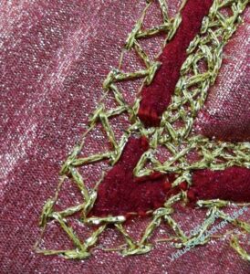
Another experiment in Trapunto..
Remember this?
I wanted to have a go at creating some Anglo Saxon jewels as a possible ornament for however I end up displaying Aethelflaed. It was enough of a success that I felt that, with some fiddling around, I might be able to produce something suitable. And since this one was very much thrown together from things I had to hand, there’s a lot of fiddling around to do!
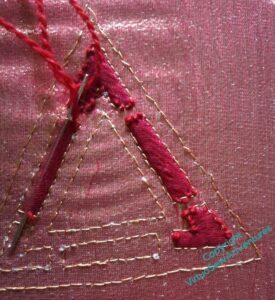
And here you see some of it. I went looking for materials, this time, and thought it through a bit more.
So, crimson gauze laid over gold tissue, laid in turn over calico for support. The gold tissue may be a good idea for the effect in real life, but it is a complete nightmare to photograph, and I apologise in advance for the peculiar changes of colour the fabric will undergo!
I used back stitch in a single strand, rather than split stitch in two, but took more or less the same approach to the outer channels, filling them with woollen thread. I was a little inconsistent in how I did so, which is why you see little bits of wool above the gauze – something I didn’t want, but struggled not to do. There must be a trick to trapunto quilting without going permanently demented, but I’m not sure I have it yet!
I should probably also apologise for my photography..
Anyway, the next bit was why I wanted to include the gold tissue in my sandwich of fabrics. If you look at the Sutton Hoo helmet and some other Anglo Saxon items, you will see that in some cases the gems look lighter than others, and it has been determined that that is because they’ve been backed with gold foil. I’m trying to get the same effect here, but in the case of fabric by inserting the filling behind the gold tissue.
This was very nearly as unnerving a proceeding as when I was doing much the same thing at the beginning of Akhenaten. You’d think I would have learnt sense by now, wouldn’t you!
More on Aethelflaed
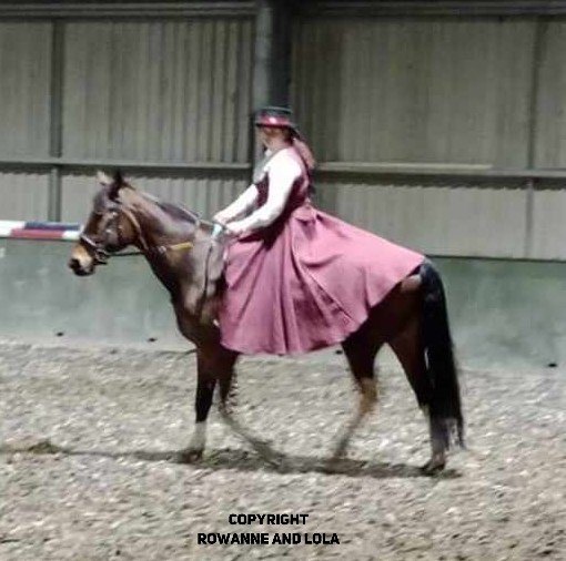
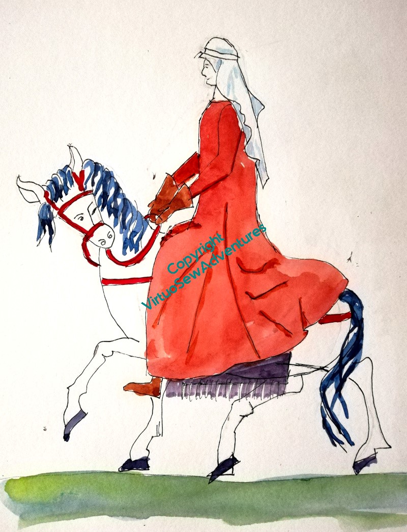
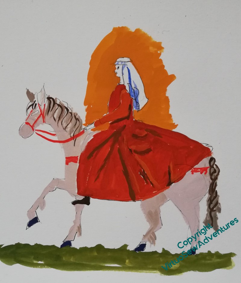
So, after my first two attempts at Aethelflaed, I had a fascinating day with my reenactor friend Vara, talking about the garments and decorations of the period, and she showed me this photo of her daughter riding astride, but in a modern riding dress inspired by early medieval garments.
Rowanne is apparently intrigued by what I’m doing, and has given permission for me to put this picture up, showing her and her horse Lola!
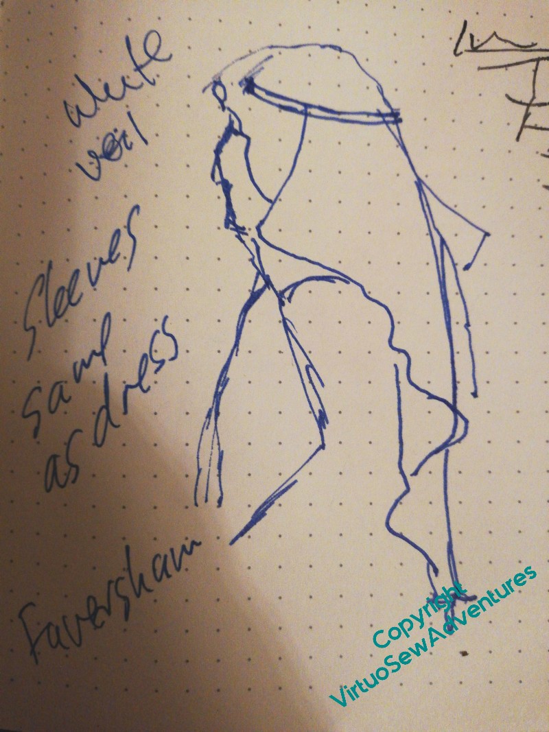
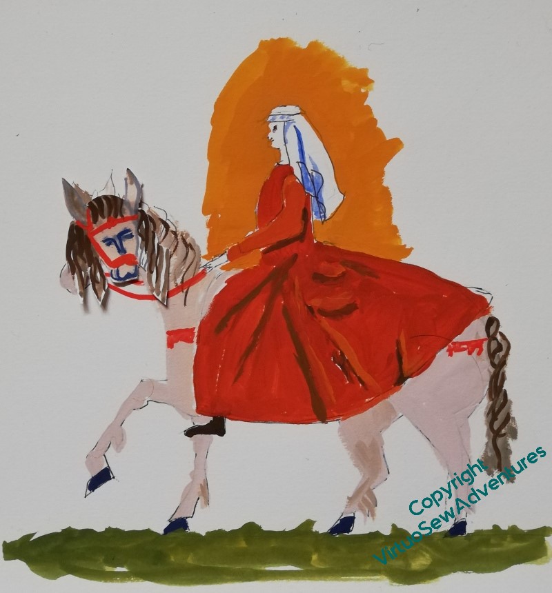
I also had a chance to do a sketch of a woman in profile, wearing the right sort of veil, complete with a fillet, with the added suggestion that Aethelflaed should be wearing a bright white veil, since that would be a sign of wealth and authority, and that sleeves would have been all in one with the dress.
So, I’ve had a bit more to work with, and had another go.
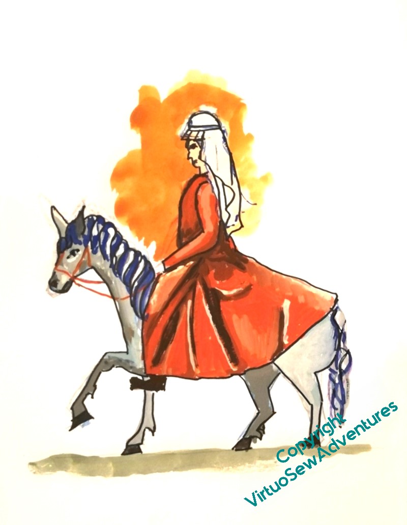
This is better, I like the straighter back, and the dress covering the horse’s rump. But my goodness, if you compare her with Rowanne and Lola, she’s much too long in the body. I need to shorten her somewhat.
Furthermore, I think the horse has got too tame – back to the cross-eyed one staring out at the viewer!
But then, I think, I might be able to start playing around with placing her on the background and choosing colours for her. Which, my goodness, will be About Time!