
Tag: Needlewoman Magazine
An Old Bookmark
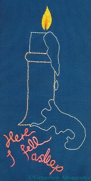
Bookmark from The Needlewoman
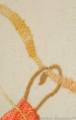
This design came from one of those Needlewoman Magazines. It was inside the back page with the competition results, as a sort of bonus.
The most difficult thing about it was finding the fabric – navy grosgrain ribbon, four inches wide. I recall that I bought the last length in the shop, which was enough for two bookmarks, but as it was cream, I dyed it with Permanent Blue Quink.
I stitched the first one as a teenager and gave it to one of my cousins, and the second has remained in the back of one of my stitch dictionaries ever since. Now, however, I’ve decided to fish it out and use it for more Long and Short Stitch practise. The design is drawn on with quilter’s pencil, so the first thing was to backstitch around the whole thing so I didn’t need to worry about rubbing the design off.
I’m using silk threads, and as you can see from the text, some of them will be variegated. As it is such a closely-woven fabric, it’s rather a trial to stitch on, but I think the flame shows it will be worth the effort!
A view from my bookshelf. . .
Two Of My Books
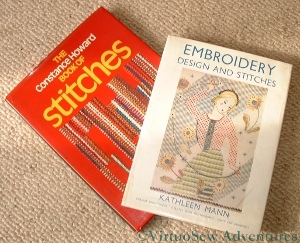
Like so many of us, I have probably several shelves’ worth of books about embroidery scattered around the house. Some of them never make it back to the shelves because they are always beside me as I work (Barbara Snook’s “Embroidery Stitches” and Yvette Stanton’s “The Right Handed Embroiderer’s Companion“), some of them are put aside for study when I have leisure (when will I learn?), but the rest of them are shelved (not all in the same place) ready to be pulled out to give me entertainment and pause for thought.
One of those is Kathleen Mann’s “Embroidery Design and Stitches”, first published in 1937. Kathleen Mann trained at the Royal College of Art, but went to teach at The Glasgow School of Art, at about the time this book was published. Looking at the stitch diagrams and the design ideas she presents, they are very much of the Thirties, of a particular modern, exuberant style that occasionally is found in the designs in that stack of The Needlewoman Magazine that I inherited. So it is not surprising that in the text I find her bewailing the fact that so much of the embroidery of that time was backward-looking, expressions not of modern sensibility but of indebtedness to the past. Certainly if you look at some of the “Jacobean work” designs in The Needlewoman, some of them are rather stiff, dark and charmless. A little oppressed by scholarship, perhaps, like some of the authentic performance practitioners in the early music movement (for an antidote to that problem, if you like baroque music but don’t take it too seriously – get to a performance by Red Priest!).
When I look at “Constance Howard’s Book of Stitches“, further along the shelf, I find the stitch samplers illustrating it also speak vividly of their time – in this case the 1970s. Strong, bold, and abstract, often using heavy fabrics and threads – certainly much heavier than would have been used in the Thirties – and not quite so “careful”. Perhaps, more accurately I should say – the embroiderer clearly has a good technique, but chooses for the purposes of her sampler to vary the size and shape of some of her stitches, sometimes rather chaotically.
Then again, I have been reading one of Jill Paton Walsh’s “Imogen Quy Mysteries”, in which part of the plot turns on the dating of antique patchwork quilts from both the pattern and the fabrics used (print styles can be dated).
Suddenly I find myself thinking – what are we doing? What am I doing? If someone were to look at my embroidery in thirty, forty years’ time, how will it appear to them? Stiff, derivative and uninspired? Or will it speak of the times in which it was made? What is it that is characteristic of our time? When we look at a film made in the Eighties, we don’t need to see the end credits or look it up on IMDB.com to know that it was made in the Eighties, yet at the time, had we seen it, the clues we now use wouldn’t have registered at all.
Of course, we can learn an enormous amount about embroidery and embroiderers by studying and replicating past work. I don’t think Kathleen Mann would have disapproved of that, and I certainly don’t. I enjoy the exuberance of Jacobean work, and I am fascinated by the two online university courses I am following.
But it is an interesting question for all of us who create anything, all the same. Is my work modern, current, inspired by the past, or is it hidebound by the past, backward looking, a pale imitation of past glories?
The Persian Fantasy Finished
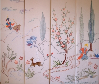
Finally Finished, Mounted and Up On The Wall
As far as I recall, I spent one month each on the first two panels, and then two months on the third, and three months on the final panel. I only embroidered in the evenings when I got back from work, probably not more than a couple of hours each night.
The closely packed fly stitches forming the poplar trees are largely responsible for the length of time the final panel took. I’m not the most patient person and I was nearly at screaming point with fly stitch by the time I had finished them!
The panels are mounted over padded wooden frames. I couldn’t find suitable two-way hinges to make a folding screen (and if I’m honest, we don’t have anywhere where such a thing would be useful!) so I simply hung them on the dining room wall. I don’t think anyone who has come for dinner has ever failed to comment!
Stitching the Persian Fantasy – Four
There was so much going on that I consciously reused yarns, colours or stitches across the four panels in order to maintain some semblance of order. In fact as I moved on to each panel I would lay the completed ones side by side on the living room floor and scramble around putting piles of coloured threads on them. It must have looked highly comical, but my parents (I was still living with them when I embroidered these panels) were kind enough not to laugh. Besides, as long as it works…!
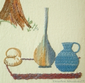
Crags worked in Caron Collection "Storm" (I think!)
I chose to use one of the Caron Collection threads for the basic outlines of the closer landscape, using Up and Down Blanket Stitch, my favourite blanket stitch variation. I’ve done a bit of hunting because it’s one of the more obscure variations and finally found it at the bottom of Sharon B’s Stitch Dictionary page on blanket stitch variations. For the further landscape or clouds (I never did quite work out what they were), I used a different colour range but the same stitch.
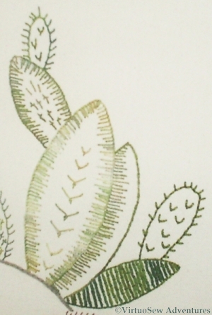
Some of the Cactus Plants
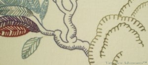
The cacti were worked in a variety of stitches, partly based on the lines of the original transfer, but then extrapolated as the stitches and threads suggested themselves. Although I did use several variegated threads in the flowers and the cacti, most of them are pearl-cotton types, and there is a certain unity provided by the use of the same set of threads wherever those forms appear. There are fly stitches, feather stitches, blanket stitches and sword stitches in this small section. I’ve diagrammed Sword Stitch at the end of this post.
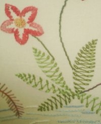
Large flowers with leaves worked in Chained Feather Stitch
The leaves for the largest flowers were worked using chained feather stitch – I had never worked it before and thought it looked fun. I caught down the long connecting stitches with a single strand of cotton, and was delighted to realise that that gave me the effect of a shadowy vein – one of those serendipitous effects that one cannot foresee, but only rejoice in.
The large flowers had centres of Whipped Spiders Web stitch and the outlines were worked in Rosette Chain stitch. The stems were simply a very heavy rayon cord, couched in place. They may well have been the most straightforward element of the entire four panels!

Sword Edging, or Sword Stitch
I couldn’t find a diagram of Sword Stitch on the internet anywhere so I spent a bit of time with a vector drawing package and Barbara Snook’s “Embroidery Stitches”, published by Batsford in 1963. I’ve redrawn the diagrams, changing them slightly where I thought the original used a strange order. When working a row, she seems to recommend working from right to left. The only other advice she gives is that the longest arm should point downwards – clearly that is the blade of the sword.
Stitching The Persian Fantasy – Three
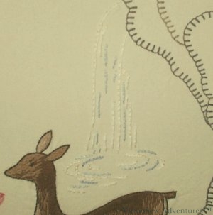
The Waterfall from the crag
I tried very hard to get a photo that does justice to the waterfall here, because it is another example of what I mentioned when I was discussing the gazelle, but I’ve not succeeded very well, I’m afraid.
The interesting point about the waterfall is that it looks like a trivial piece of design – just a few lines – and yet when I came to embroider it, I realised that it would be spoilt if I added “watery” effects with sparkling thread or metallics. I ended up stitching it very simply in stem stitch, using three colours of pearl cotton.
In real life (I wish I were better at photography!) this looks more like a waterfall than a few simple lines have any right to. I’ve looked at this panel over breakfast for ten years now, and I still can’t work out quite how the designer managed to do it!
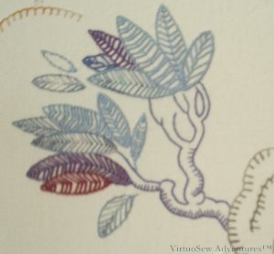
Tree On A Crag
This tree is a different matter. It doesn’t look much like a real tree, and it isn’t intended to. It is a purely decorative, “tree-ish” element of the design.
I’m coming to realise that the success of these panels rests partly on this balancing act, in which some of the elements look more realistic than others.
Something for us all to try, perhaps!
Stitching the Persian Fantasy – Two
The Prince's Picnic, Panel Four
I enjoyed working on the prince’s picnic on panel four. The tall carafe is created using a variegated knitted ribbon (from Stef Francis), and has been used as if appliquéd. The inspiration here was those strange lustre-glazes that show widely differing colours in different lights, and I had great fun choosing particular sections of the yarn to create the effect. The blue jug is much more homespun (sorry – couldn’t resist!), using a Soft Cotton, this time inspired by coiled clay pots – a technique I remembered trying at school, although it was much easier in embroidery! Then there was the loaf of bread, using three shades of a plain matte, round cotton yarn, and the rug (or table – I’m not sure which) bordered with a complex border stitch in a strongly textured yarn.
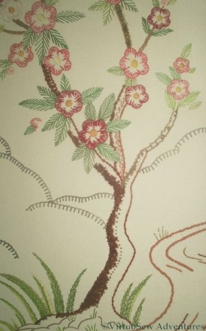
The Flowering Tree on Panel Three
The bark of the flowering tree on Panel Three was worked using various bouclé and other effect yarns, couched to the surface randomly. The basic design is so stylised that I was careful not to be naturalistic. I used a variety of yarns from a Texere Yarns Inspirations pack and caught them down with a single strand of stranded cotton, in loops and wavy lines. The flowers and leaves were working in plain stranded cottons. The flowering tree was already so dominant in the panel that it really didn’t need much in the way of emphasis from the yarns other than the bark. The tall grasses at the foot of the tree are in stranded cotton too, using feather stitch. I’m not sure that I would do this panel in the same way now, although I think that using satin stitch and long and short stitch, as in the original, might make it look a little serious, rather than decorative and fun.
And I wanted it to be fun.
Stitching the Persian Fantasy – One
I’m glad to say that stitching the Persian Fantasy screen was just as much fun as I hoped it would be! I didn’t follow the instructions in the magazine, not least because it called for “Anchor Flox” , and no-one I could find even knew what that was! I’ve since discovered that it was a very shiny thread, something like a pearl cotton, but made of rayon. I was going to stick with a single type of thread, and conventional stitches, but my mother suggested that I should Be More Adventurous, so I was. I have been grateful to her ever since, as I had enormous fun playing with the threads and stitches.
The four panels show
- the hero out hunting,
- a gazelle in front of a waterfall, perhaps the object of his hunt,
- a flowering tree, and
- the hero again laying out a well-deserved picnic to share with his lady who so far has not appeared.
It is very stylised, very Thirties, but clearly inspired by early Oriental silk paintings. I have a couple of modern ones in a similar style, in fact – inherited from Grandmama, along with the lacquer box!
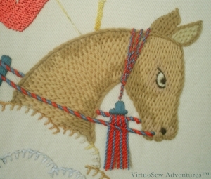
The Prince's horse, staring fiercely at his quarry
My knowledge of horses is limited to the direction in which they are going, but I remembered hearing from my horse-mad cousin that horses can get pretty shaggy, and that the lovely glossy look you see on a racehorse is due partly to the horse having had a good haircut. So when I came to do the prince’s steed on the first panel, although I didn’t want him glossy (I wanted the Prince to be glossy), I did want him to look cropped rather than shaggy. So I chose tapestry wool and brick stitch, slightly bent to follow the direction of the coat. I gave him a darkly staring, focused eye, like a warhorse on the Bayeux Tapestry, and matched his reins to the Prince’s clothes, using two colours of Anchor pearl cotton, matching the two colours of Anchor Marlitt rayon thread, twisted together to create cords. The fringe on the headpiece was created using twisted single lengths of pearl cotton, the raw ends plunged and the twisted cords hanging free. I’m still pleased with the horse, and I don’t think I would do him differently now.
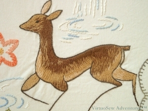
The running Gazelle on Panel Two
The running gazelle on the second panel makes a very good contrast with the Prince’s horse. She was worked using long and short stitch in Paterna crewel wool, with some mixing of colours in the needle, and I quite explicitly aimed for a slightly ragged look around the haunches, although in keeping with the very stylised feel of the whole design, I worked a neat, careful, dark outline of stem stitch. I particularly like the way the designer has made her very clearly a design, not an animal portrait, but at the same time, the single lines for the lower legs are so very reminiscent of the fragile-looking legs of gazelles and other deer.
Part Of The Bow, Panel One
The Prince’s bow is worked using Braid Stitch, using a mercerised variegated cotton. Archaeological and historical records show that the ancient bows could be very highly decorated while still retaining all their power as a weapon, and I was thinking of descriptions I had read (archaeology is another interest of mine) of bows using horns as the ends, and laminated wood (lamination was invented earlier than you might think) for the main section, all decorated with gold wire inlay. Naturally, all you can see on the embroidered bow is the inlay!
The Persian Fantasy Screen
Photo of the Persian Fantasy Screen in The Needlewoman
There was one project in those magazines that I positively ached to do, but it was a four fold screen inspired by the Rubayat of Omar Khayyam and Grandmama did not have all of the four magazines that it was in. I resigned myself to looking wistfully at the picture, and got on with life – O-levels, A-levels, degree.
Then Grandmama died, and I inherited the black lacquer box. I tried to work out whether I could re-create the transfers I did not have from the photograph of the screen, but my skills with a pencil were not up to the task. And computers, in those days, did not have the fabulous range of image editing facilities now available at the click of a mouse.
Needlecraft magazine was launched. I subscribed promptly, and wrote to the Letters page, describing the panels, naming the issues, and asking, could anyone provide me, perhaps, with a photocopy of the missing stitch diagram? They could, and they did, but then of course I had to find some fabric.
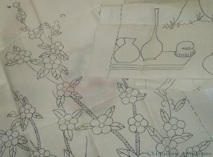
Full Size Transfers of the Persian Fantasy Screen
I was still looking, when a rather bulky parcel arrived in the post, which changed the direction of my search. My correspondent had the actual transfers, but she had wanted to check with her daughter to see whether she wanted to stitch the screen before sending them off. Suddenly, instead of looking for a fine fabric to produce the panel at the size of the stitch diagram, – much more excitingly – I was looking for a somewhat heavier, upholstery-type fabric..
I also had to gather my nerve. I’d seen the pictures and sketches in the magazine, but I hadn’t quite realised just how big those panels were – each one is about eighteen inches wide by five foot high!
I finally found some material, thanks entirely to a family friend who at that time owned a weaving mill in Lancashire. A loomstate cotton twill – so rather than having all the various bleaches and finishes applied, and the fabric shrunk to its’ finished state and difficult to embroider, it was perfect for playing with heavy ornamental threads, and the soft creamy colour would provide a pleasant and restful background.
How It All Began
My grandmother first taught me to embroider (there must be thousands for whom that is true! ). She was an extremely skilled embroideress, who learnt when she was living in Westmorland during the war with her own two children, her sister and her sister’s children. Her teacher, Miss Hunter, has even passed in to family legend – a little, dumpy lady in black crepe (old fashioned even then) with very sharp scissors hanging from a silver chain at her waist, and quite scarifyingly high standards. If her students’ work failed to meet those standards, snip, snip, snip, and out it all came. To this day, unless we pay close attention, we sometimes put tablecloths embroidered by Grandmama on the table the wrong way up, and we always pay as much attention to the back as the front.
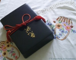
The Magical Lacquer Box
Once Grandmama realised I was well and truly hooked, she allowed me to look inside a black lacquer box that had always fascinated me. Inside I found some rather tatty, but utterly enchanting, copies of The Needlewoman Magazine of the nineteen-thirties. Some of them even still had the free transfers still with them.
In short order, I’d turned a design for a photograph album cover into a teacloth (I still have it somewhere), made a runner for my dressing table using a repeating pattern (now in use in another room), and embroidered a dragon on the back of a linen dress. My history teacher complained that that dress took her mind right off her prayers in Assembly when I wore it for school one day!
Unfortunately, Grandmama died a couple of years later, but she’d taken great delight in what she had seen, and left me the magazines and her worktable. I still think of her when I am embroidering, and I still want to show her any piece of embroidery that I’m particularly pleased with.