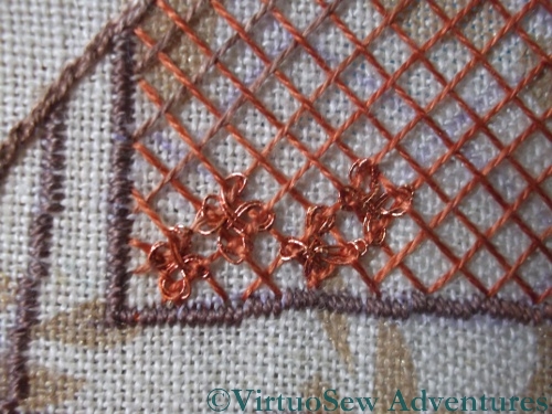
Two Bottom Corners Completed
As you can see, my recent obsession with this panel is paying off. I’ve finished the two bottom corners of the panel, and sunk all the loose ends. The red of St Joseph’s robe is enlivened with the rust sprinkled through it. Under normal lighting it barely shows, but it does make a slight difference, and with a strong side light, it warms up the red and increases the contrast with the blue of the Virgin’s robe. Good. I’d hate to have to unpick it!
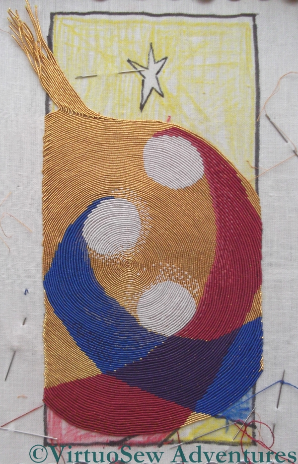
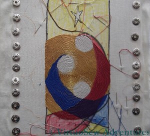
Progress So Far
The view of the whole thing shows that I have now only got the star to do in silk – all the other design elements are in. I still have to add St Joseph’s halo, but I’m running slightly short on the cream silk thread and I want to get the star in before I start going back to the haloes.
I’ve also begun to correct the curve of the Virgin’s robe. At the moment it is much too straight, so I am trying to curve it some more.
In fact it is the tidying up of small details such as this which might interfere with my ambition to have this finished by mid-November. I’ll have to continue to tweak until it looks right, and who knows how much I will need to do?
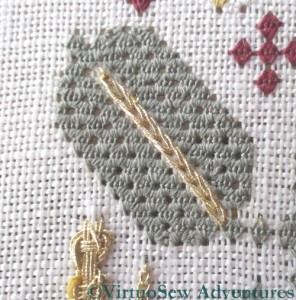
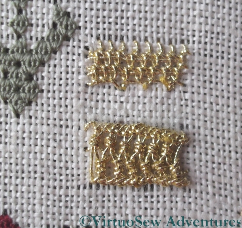
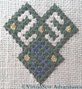
Heavy Chain Stitch
I’m only adding a few stitches at a time to the Spot Sampler, partly because I want to take my time, and partly because I’m rather keen on the Christus Natus Est panel at the moment and seem to spend most of my daylight stitching time on that.
I was a little disappointed with this Heavy Chain Stitch when I worked it, because it seemed rather thin and attenuated. I tried using my laying tool to keep the loops open and reduce the abrasion of the yarn, but since the laying tool is a sharply-pointed piece of metal, it presented its own hazards. I might work the other leaf of this pair in the other thread to see whether it creates a different effect.
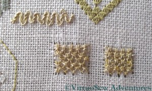
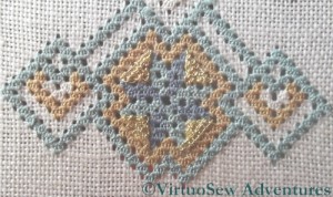
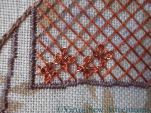
More On The Sampler
The two stitches shown here are the Up and Down Buttonhole Stitch variations. In the alternating variation, I realise now I look at the close up, I forgot to include the “return” or straight stitch across at each level. Yet another stitch to re-do in the margins!
The bar at the top is Diagonal Half Guilloche Stitch, and it looks much tidier at the proper size, rather than in close-up!
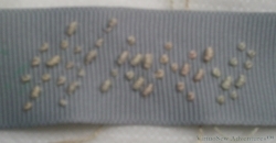
"S.S. Camberwell" in Morse code
I spent a lot of time in practising stitched Morse Code, in order to arrive at the best way of producing an ornamental but legible effect.
Eventually I settled on this as the best option. The Morse letters are laid out diagonally, using Colonial Knots and Bullion Knots (respectively the dots and the dashes). I discovered that I could mark up the ribbon with the Morse code one word at a time and then stitch over it, making the work slightly less unnerving than if I had had to work it without markings.
Satin Edges
My husband wrote a little programme that took the text, converted it to Morse code and then rendered it as a graphic that I could then print out at the appropriate size. That made it possible to mark up the ribbon before I stitched it. I pricked holes – dots and dashes – in the printout, laid it on the ribbon, and marked the ribbon with a quilter’s pencil. A variation of the prick-and-pounce method, I suppose you could say!
However, before applying the stitched Morse code to the piece itself, I created a padded border using fine wadding and satin ribbon. I wanted to ensure that the edges of the panel did not show through the border, and as it turned out the petersham ribbon was rather fine and showed everything underneath it.
The end is in sight! And even at this point, I have to confess that I was very pleased with the way this was turning out. I hadn’t expected that it would turn out so well with quite so little upset!
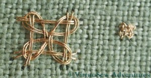
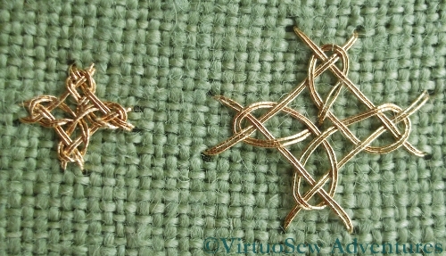
Four Sided Interlacing Stitch
The stitches for Month Sixteen are stitches that create prominent large “spots” of intricate pattern. They are simple enough in concept – there is a foundation of straight stitches, and an interlaced pattern worked around the foundation. Naturally, the actual working of the stitch proves to be less than entirely straightforward. I try to vary the scale of the stitches I work on my practice cloth, but in the case of Four Sided Interlacing Stitch when I was trying to work it as a counted stitch, the only variations I could create successfully were “Huge” and “Tiny”. At the smaller scale shown there is really little point in using an interlacing stitch like this, and one might more sensibly choose something a little simpler to work. At the large size, the effect of the metal thread is diluted by the background fabric.
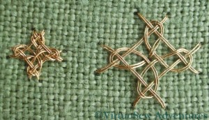
Diagonal Four Sided Interlacing Stitch
In the case of Diagonal Four Sided Interlacing Stitch my two different scales worked slightly better.
I know, by the way, that in the case of one of these stitches, I made a mistake in the foundation layer which lead to a further mistake in the interlacing. I can’t find it now, and I’m going to be intrigued to see how often I get these stitches right, when I start working them on the sampler itself!

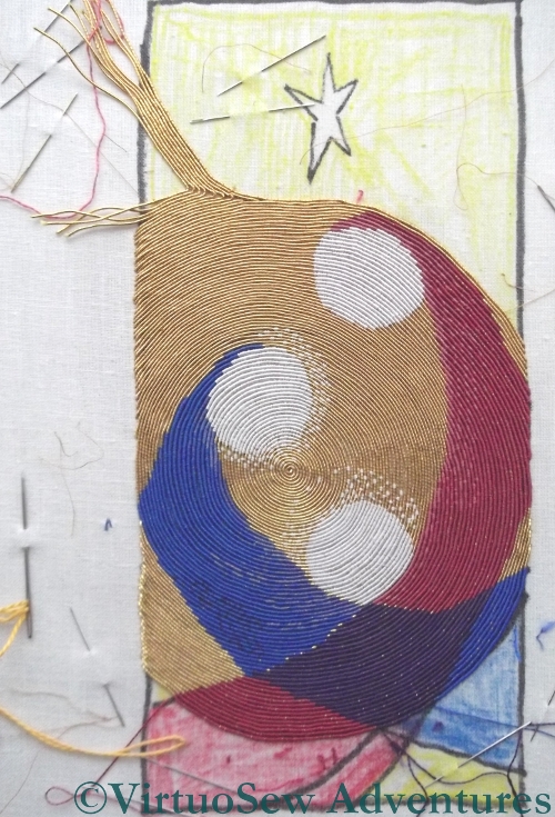
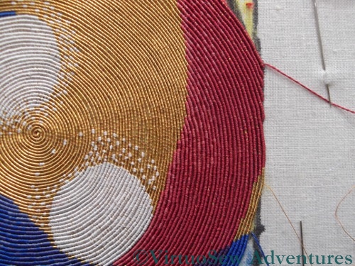
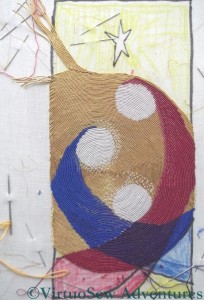
Progress Up To Now
I’ve now got to the stage where I’ve started to leave uncovered gold thread at the bottom, and the sections of silk are reducing in size again. I’ve introduced a third shade of red into St Joseph’s robe, as well. It barely shows in most lights, but I think that it will make a difference in the end, by creating a sort of “ripple” in the appearance of the colour.
While I’ve been stitching I’ve been trying to see whether this interpretation of my mother’s original design says something different to the other versions. What occurs to me now as I look at the photo is that the shape of the Christ Child reminds me of the many Renaissance Nativity paintings in which He is shown with arms outstretched, prefiguring the Crucifixion.
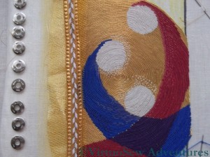
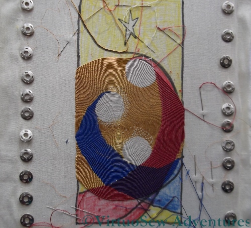
Thought For Mounting
I’ve also been thinking about mounting the piece when it’s finished. I went to the framing shop and looked at their gold card (all much too green), and then thought, since it’s a textile piece, maybe the mount should be textile too. There’s a fabric shop just around the corner, and although they didn’t have anything that was immediately suitable without alteration, they did have a sort of flimsy “cloth-of-gold” which gave me an idea. I’ve overlaid two layers of amber net over the cloth-of-golf in this photo, and the trimmed the edge with a piece of braid I found somewhere else. If I do this it will be nearly as much work as the embroidery was, so I’m hoping that I might have another idea soon!
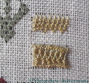
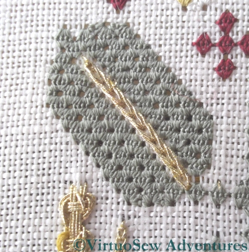
Detached Buttonhole with Return, and ZigZag on Ladder Stitch
I’ve been persevering with adding the goldwork stitches to the Spot Sampler. Tricia set up a Yahoo Group for the course so that we could help each other out, and I posted some of my headaches to that.
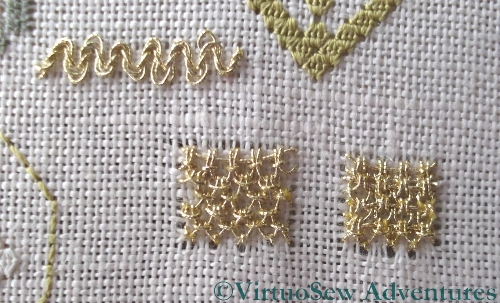
I received a good many helpful suggestions, and on top of that, Tricia posted a very long response on the Question and Answer blog, which included the reassuring detail that when she’s reverse-engineering the stitches, she uses the point at which the thread sheds to help her determine whether she is really doing the stitch that she’s trying to. Some shredding is to be expected, then…
Gold Queen Stitches Added
I think I’m doing better now, as I am finding there is rather less shredding (although there is still some). I suspect my tension is sometimes too tight, and Tricia has suggest that my Ladder Stitch in particular could do with being loosened up a little. Having the tension too tight will abrade the thread further as I make each stitch.
Gold Detached Buttonhole with Return
The detached buttonhole with return that forms the first embellishment on the large pattern at the bottom of the sampler was rather a surprise. It’s more raised than the photo of Tricia’s finished piece suggests, and I got into a tangle working it, although that is because the position of the stitches on the frame were not as comfortable to work from some angles as others. I find myself wondering how RSN needlewomen manage with those large slate frames!

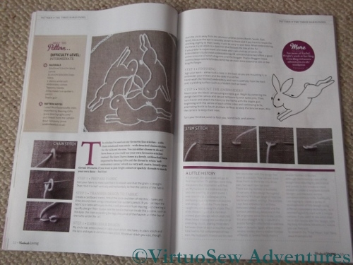
Article In Handmade Living
Some time ago I worked on a project I couldn’t tell you about, and this is it. There’s a new magazine in the UK – I think this one is issue 4 – which is called “Handmade Living”. It covers a huge variety of subjects, from knitting and embroidery to handmade soap and natural skincare. In order to bring all these subjects together, the editorial team have themes in mind for each issue, and when I suggested a few ideas to the editor, she thought that The Three Hares would fit nicely in the “Folk” theme. The Three Hares is a very old design, so she was absolutely right. It’s appeared all along the Silk Route…
I chose to use several of my favorite stitches, and worked the design as simply as possible. I’ve had a few ideas about using the design to experiment with some of the embroidery and needlework styles I’ve not played with yet – there are plenty of them, after all! – and it seemed sensible to start with a simple technique.
And by the way, if you’ve come to visit my blog after reading the magazine – Welcome! I hope you enjoy what you read…
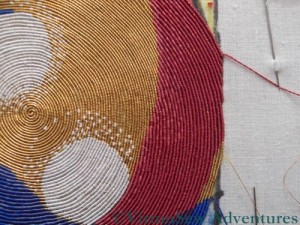
Both Edges Reached
I’ve become rather obsessed with making progress on the Christus Natus Est panel. Now that the spiral is finished, and the gold couching only stretches from edge to edge, that progress becomes easier to see.
In particular, not only have I managed to finish the top of St Joseph’s head, and run two or three more rows across the bottom of the panel, but I’ve started to fill in the gap between the spiral and the breakaway line. In fact I’m not sure that I am entirely happy with it – I may have begun to use single threads on both sides of the triangular shape a little early, which leaves some gaps in the coverage.
I will have a lot of tidying up and corrective stitching to do, even when the whole fabric is covered with gold. I need to finish the Christ Child’s halo, and put St Joseph’s in place. I also need to correct the curve of the Virgin’s gown, which is a little flat and straight.
I don’t yet know whether I will stitch rays coming from the star. I think that decision will be made only when the rest of the piece is finished.
I’m beginning to think about the mounting and framing of this piece. I think it will need a wide mount, because such a vibrant piece will need plenty of air between itself and the frame. One possiblity involves a mount covered in cloth of gold or gauze, and trimmed with braid or crystals. If I can’t find a suitable fabric, I will have to hope for a mount card in the right shade of gold. A cream mount would look insipid, and a mount in one of the colours would contend for attention with the panel itself. It’s just as well we have a good framing shop nearby!
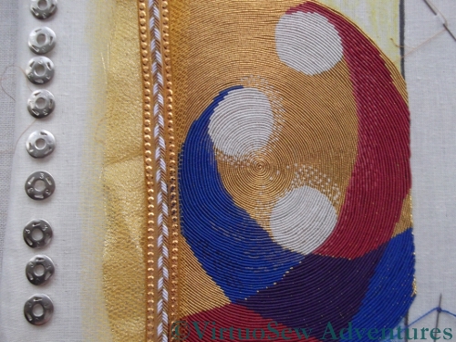
Close-up of the right-hand edge
I’ve been making more progress, and in fact passed another milestone this past week.
I’ve reached the right-hand edge and started to stitch just on the top section for a while. Suddenly it feels quicker, because although I’m making progress at the same rate as before (the stitching itself hasn’t speeded up!) I sometimes manage two or more rows in a session, and the sections of design that are covered are side-by-side, and thus more noticeable.
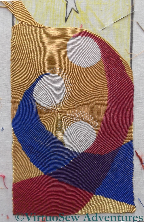
A View Of The Whole
So here is the whole thing to show the progress that I’ve made. I’ve unpicked and removed the line of gold I put in following the black line, because in fact it isn’t running exactly where I want it to, even if it is running along the line I drew.
I sink the threads in batches at the end of a session, which means they don’t slow me down when I’m nicely “in flow”, but it looks neat and easy to understand when I get back to it. When I’ve reached the black line (the correct one!) I shall stop working on the top section and work on the bottom section until that is done, then I will have the last section to work which should go more speedily as there will only be one colour to stitch.
I’m beginning to have hopes of finishing this in time to use it as a Christmas card. Now I just need to work out how to frame it…!
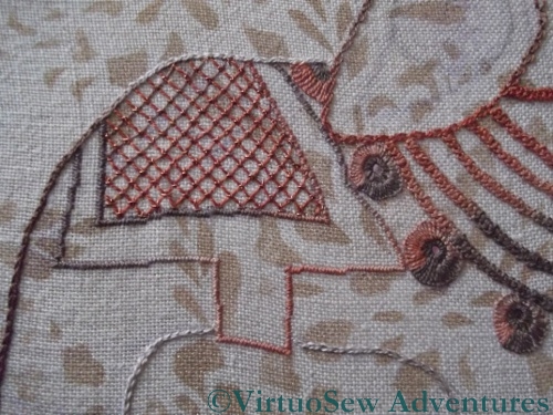
Trial of Interlacing
You may recall that last week I said I was thinking of working one of the new interlacing patterns on the Elephant’s saddlecloth. I ferreted around in my box of metallic threads and found several golds and coppers to choose from. Finally I chose a warm copper, and looked up the instructions for the interlacing.
I really didn’t like the look of it at all. Somehow it looked tangled and rather moth-eaten, instead of exotic. Not A Good Look, so out it came.
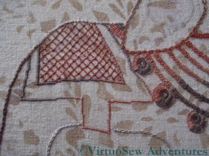
Final Decision
So in the end I decided to use ordinary trellis couching. The couching stitches are upright cross stitches in the copper thread, over a silk foundation. It looks a little dull in the photo, but in real life the little sparkle of copper “lifts” it nicely, and I think it will work well.
You might also notice that I’ve finished outlining him, using the thread that shades from brown to cream. It means that his edges aren’t always emphasised to the same degree, which I think is a good thing.
Artists talk of “light and shade”, and we usually interpret that as meaning simply that the patterns of tone are what build up a recognisable image. To an extent that is correct, in that if the tones are wrong, a picture won’t work well. When we are talking of a design of lines rather than shapes, however, it’s less obvious what we mean. I am trying to create a pattern of varying densities of stitching as well as colour, and in the end what I hope to have achieved is a pleasing rhythm for the eye to follow, not “sticking” anywhere, but not frantically jolting from one part of the design to the next.
Tricky!