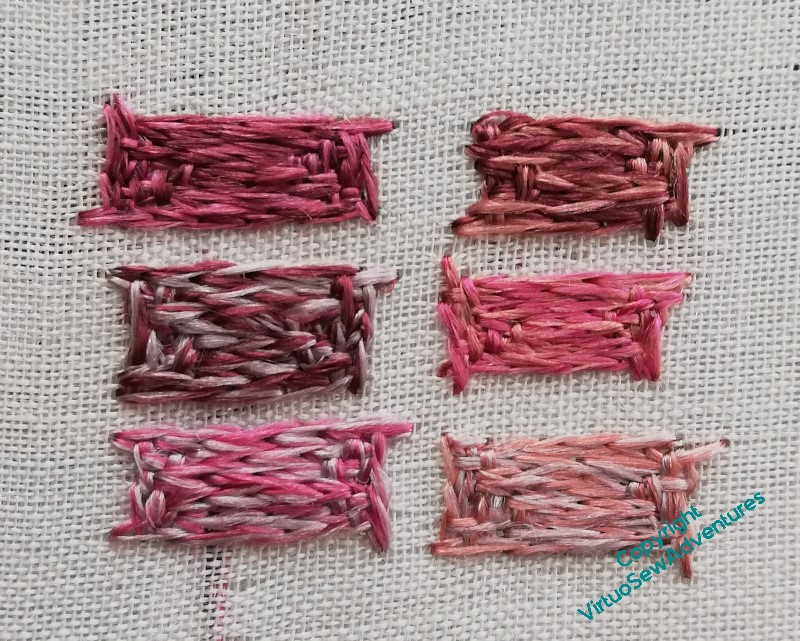
Category: General Embroidery
Working on the Brockis
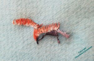
You may or may not be able to see that there’s a drop-shadow effect in these photos – I learned from the mistake of the hawk, as I mentioned, and mounted the green gauze on a frame before I started. I rather like the result when I set it down for photography, and it gives you a much better sense of the view I got as I stitched.
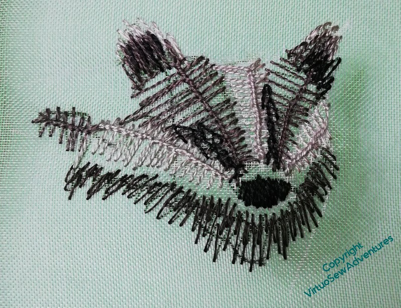
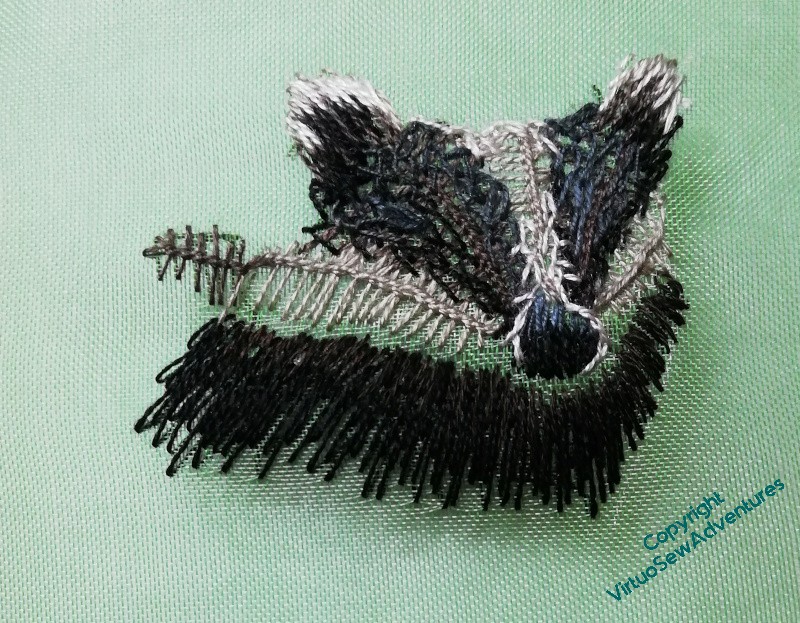
Ordinarily, I would be very concerned about working on gauze – the hawk is virtually satin stitch to ensure there’s nothing grinning through the gaps – but I have a feeling that this is going to evolve as I work on it. Regular readers will know by now that if I’ve convinced myself that something is necessary for the effect I want to achieve, I grit my teeth and do it, even if I don’t think I’ll enjoy it – although by the alchemy of Achieving What I Aimed For, it’s amazing how often I do in fact enjoy it!
My brockis is going to be peering out at the main scene from behind a tree, so he’s going to be on the ground, in amongst the undergrowth, and probably backed by darkish fabric and stitch. That being the case, gaps in the stitching might in fact enhance the sense of depth in the whole assembly. I want him to have rather rough fur, so he’s not going to be satin stitch, is he?
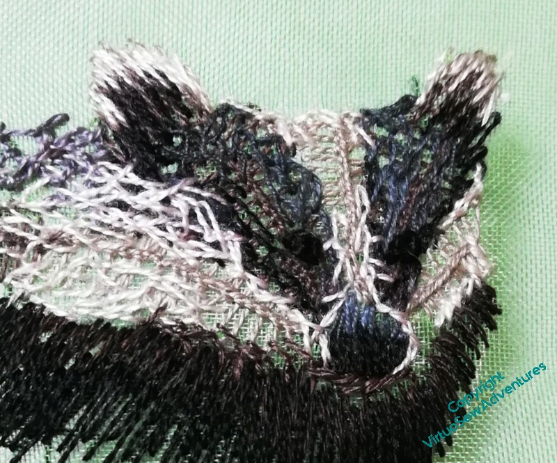
So my brockis is made, again, purely freehand, referring to the photo for guidance, but simply in layers of stitching. I’ve used silk, cotton, and linen threads, and a tangle of Vandyke stitch, Cretan Stitch, feather stitch and alternating twisted chain stitch. The silk came from the same stash as the silk I used for the hawk, the linen is a Stef Francis yarn I bought for the Dreams of Amarna that never quite worked in any of the projects, and the cotton is ordinary stranded cotton, but only single strands.
I’m rather pleased with him.
More Thoughts on a Coat..
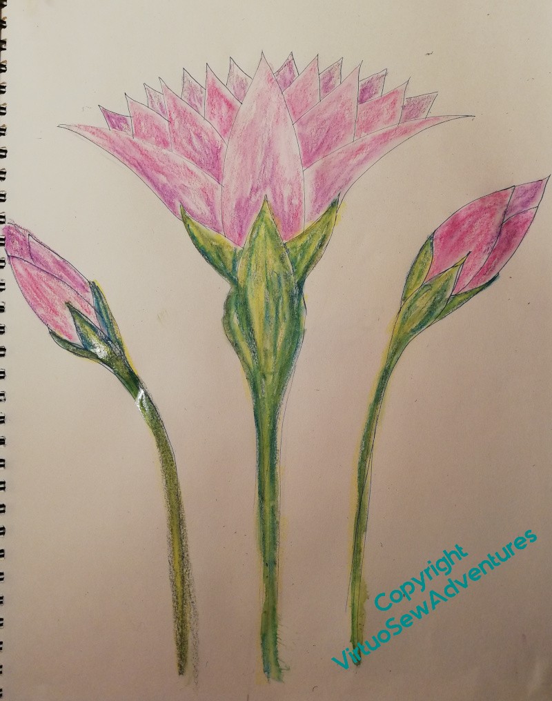
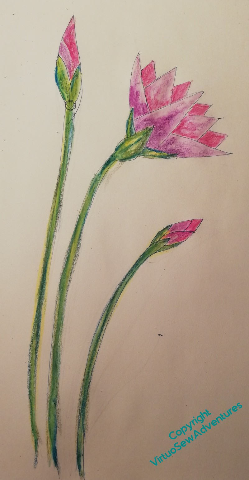
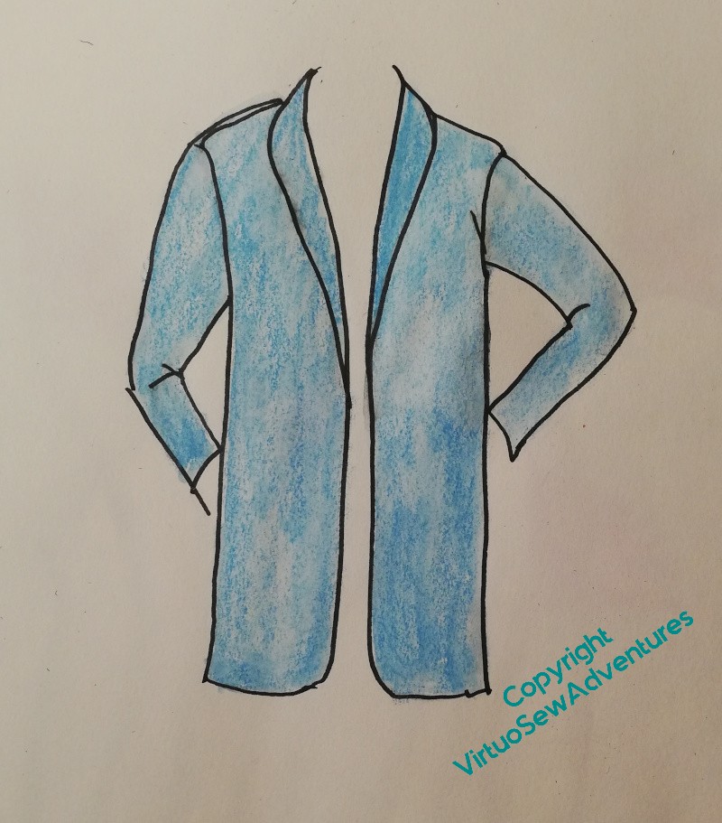
I want my design for the Lotus Coat to be big and bold, maybe a bit blousy, so what I have here may be a bit formal, and need rethinking.
Well, happy to do that, I had a lovely morning in the studio playing with these ideas, and I think what I have now is a good point for further play.
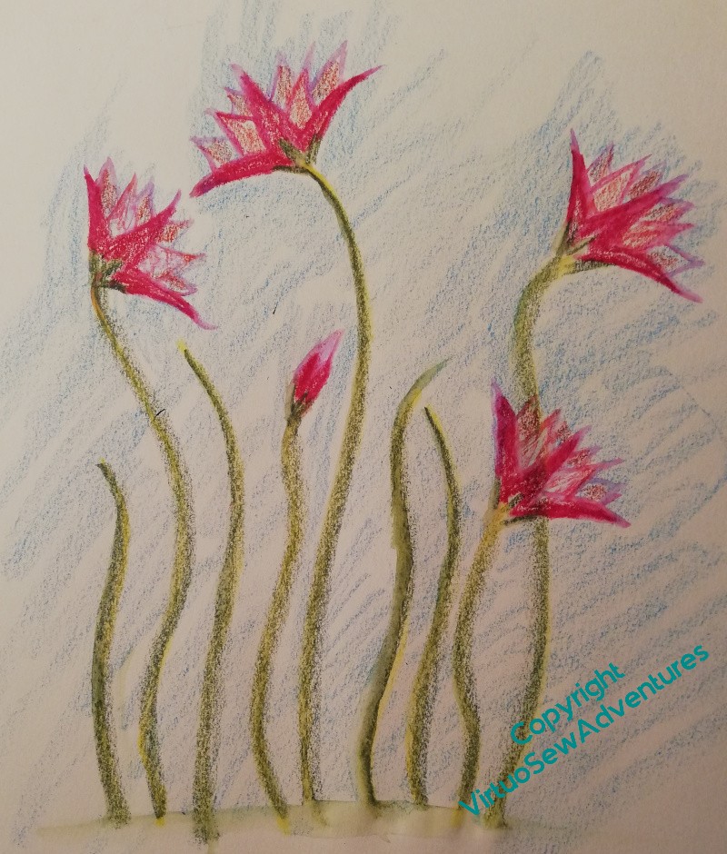
The idea of this set of designs is that the single lotus in the image to the right here will reach almost the whole way across the top of the back, from one seam setting in the sleeve to the other, while the supporting buds will be set in fact a little lower than they are shown.
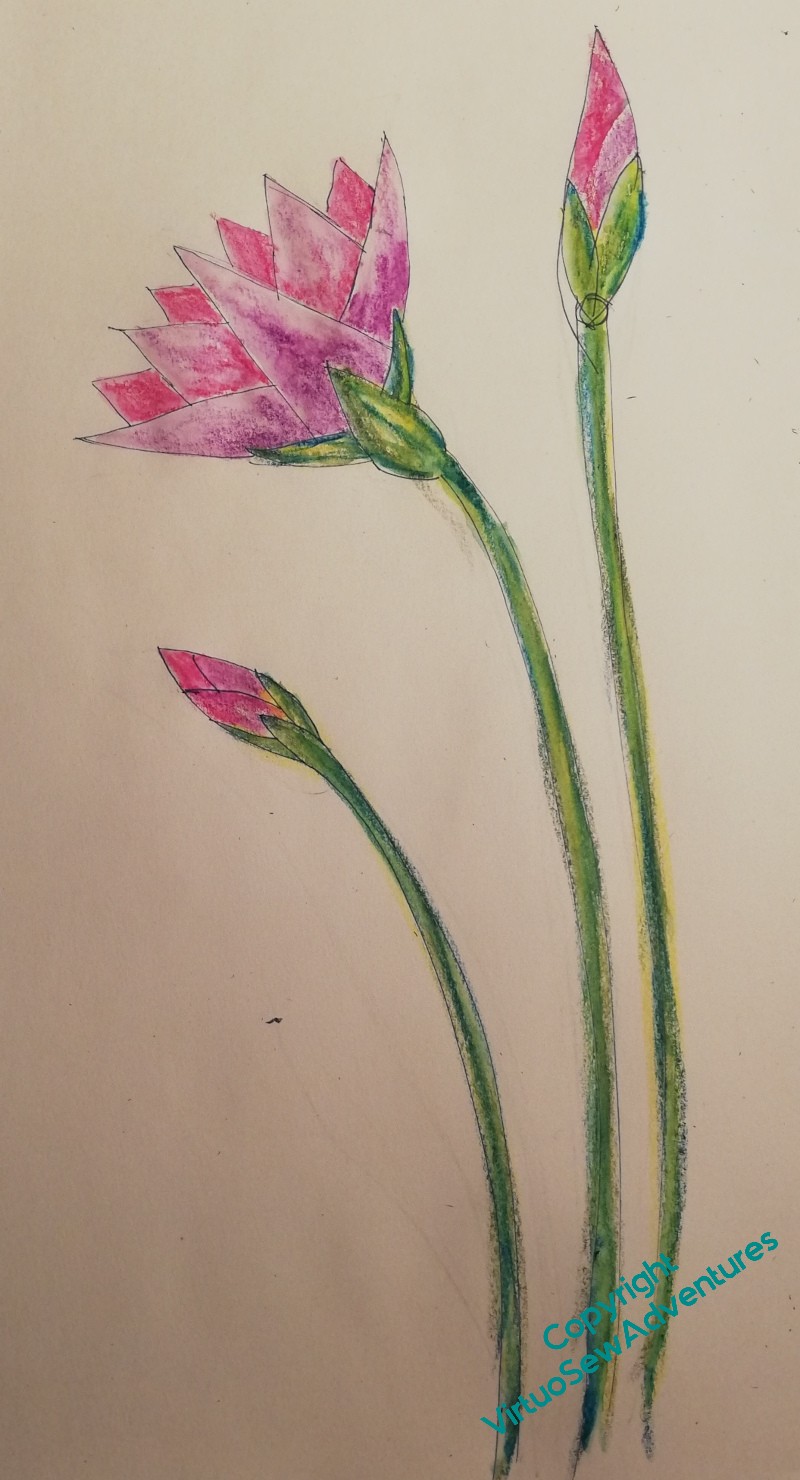
Meanwhile, on the front there will be something very similar on the left and right front.
I don’t want to make these identical – that would be too formal. So I want to create something that looks balanced, that doesn’t make me look as though I have one shoulder higher than the other.
I’m also planning how to actually achieve all this. At the moment, I’m thinking that I will try to find a light, loosely woven silk fabric that I can dye to match the tweed and stitch on that. Then I can do the stitching and be making the Coat at the same time. I’m not much of a dressmaker, so it might take a while. So I’ve ordered some samples from Whaley’s of Bradford, to try stitching on.
And for the stitchery? At the moment, I think, lots of line stitches in varying shades of white, lilac, and pink, using relatively heavy threads (at least in comparison with Aethelflaed’s filament silk!). Opportunities to use my favourite chain and feather stitch variations, to layer up stitch and effect – I might even find some angora or similar for some slightly fluffy areas. Not so densely stitched, perhaps, that you can’t see the silk, and through it, the tweed.
Of course, by the time I get to doing the stitching, I may have an entirely different idea…
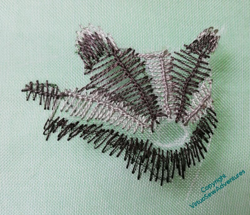
Another observing animal for Placidus
Elizabeth Goudge’s book “The Herb of Grace”, which gave me the idea for Placidus, is set in a pilgrim inn near to some ancient woodland, and in her writing she regards the trees and animals of that woodland as very much part of the world the family inhabits. She wouldn’t, I’m sure, have considered herself an environmentalist, but only because she probably couldn’t imagine considering herself as other than part of the natural world. Certainly the fictional fresco maker she imagines would have done so.
My reboot over the period between Christmas and Epiphany has suggested that since I want to have a welter of animals observing the scene, maybe I should just start on them. Once I have enough to make a start, that might help me with the trees, the rocks, and the stream. Then Placidus with his horse and hounds, and the stag will have somewhere for their drama to take place.
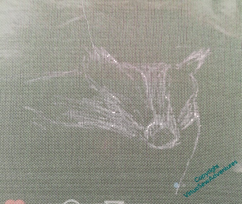
It was the Herb of Grace that told me of the word “brockis” as an old name for a badger, and over on Patreon, the writer Anne Louise Avery has a character she calls “Grey Brock”, whose adventures are often illustrated with a photo of a badger paying very close attention. I’ve used that photo as my starting point, and sketched my brockis on some green gauze (on a frame, this time!) using a white gel pen.
And can we just pause there to celebrate the fact that I sketched this, freehand, on a difficult surface with an indelible pen, and ended up with a recognisable badger? Even last year, I don’t think I’d have managed it!
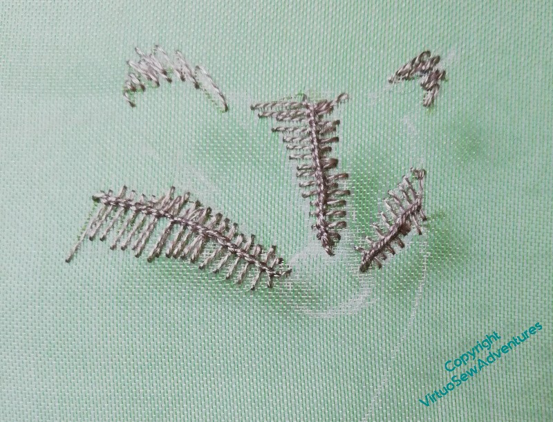
The animals are going to be quite experimental, I think. Certainly there won’t be a lot of long and short stitch. I want a lot of rough and ready texture and an excuse to experiment.
So the first layer of my brockis is actually vandyke stitch in a middling creamy beige that will help, I hope, to create some depth in his fur.
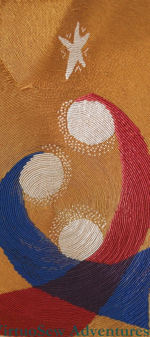
Lotus Flower Coat – starting to plan..
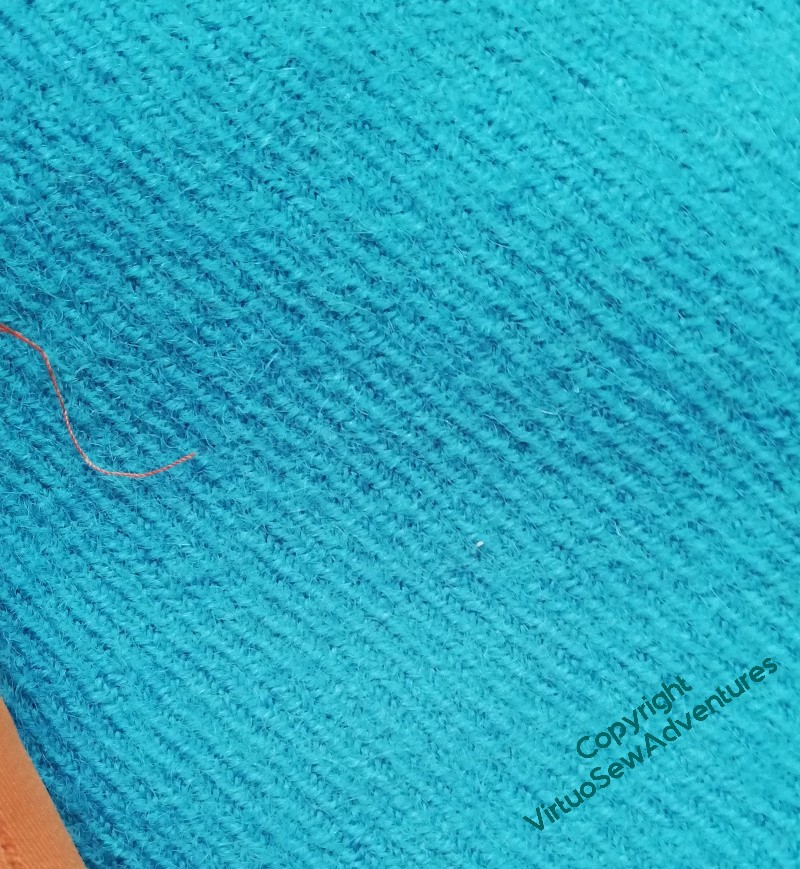
When we visited last year, my aunt gave me a lovely length of faience blue tweed, and although I could, of course, make a skirt (another skirt!), the idea eventually came to me to make it into a sort of cross between a cardigan and a jacket – something that I can wear with lots of things, that makes a good additional layer in our cold house, but looks cheerful and casually smart.
I thought about the colour, and some variant on the Egyptian Lotus Flower pattern seemed like a good start. Then I thought some more, and decided that the very graphic, formalised versions used in border patterns would want to be used formally and make the garment too formal. The tweed is relatively unfulled, and widely sett, so anything too structured won’t work well.
Something like this, I think. It’s a Simplicity pattern from the Seventies or early Eighties, and it won’t be hard to lengthen. It will be lined (which the pattern doesn’t call for), but there are few pattern pieces and almost no shaping.
Naturally, it won’t be going to go undecorated…!
Maybe a border pattern?
Somehow, no. I’ve not done one before – the Coat of Many Flowers has a swathe across the middle, and the Jacket of Many Stitches has the pattern dripping down from the shoulders – but I think it might end up looking a bit obvious, and a bit formal. I’ll still think a bit more about this one, but I’m pretty sure it won’t be this.
Watch this space, as they say…
Hawk in a clear blue sky…
A good, optimistic start to the creative year, here, with my first bit of stitching for Placidus – who’s only been in the planning stage for a decade or so!
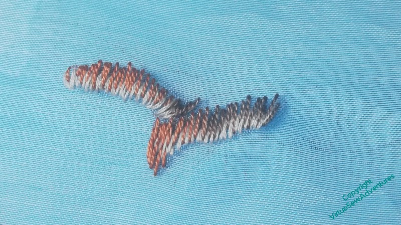
You will see from the progress pictures that I was absolutely rocketing along the edge of catastrophe curve here, very little planning, and just alternating staring at my source and stitching. This is the way I tackled Ankhsenspaaten, and a few other pieces, and it’s very much the way I prefer to paint. But it’s highly uncertain as to success, and I may come back in a few years and try again.
Clicking through will show you how little guidance I’d put on the gauze, and how little it showed once there. Furthermore, I was in such a fever of impatience to start that I used neither frame nor hoop, working in the hand instead. I won’t do that again.
(Until next time I do it..)
I’ve mostly used silk perle, which is lovely, and the particular bundles I’m using I’ve had in my stash for decades. I use it, but it’s quite fine, and until recently I’ve preferred to work with rather more solid materials. We also discovered, when my grandfather’s carer boil washed a tray cloth I’d embroidered for him, that the colours aren’t washfast. Not a problem in this case: a panel hanging on the wall, using a wild mix of materials, is unlikely to be boil washed unless by someone deliberately seeking to destroy it.
In the meantime, if it is to work in the eventual piece, it will need to be savagely blocked or pressed to get the crinkles out of it – not because my tension was tight, but because the stitching is filling up the spaces between the fabric threads and making them move and misbehave.
I don’t mind – I’ve already pinned it out, and I’m just so pleased to have made a start on the Vision of Placidus at last!
Update: I showed this to The Australian, who immediately started singing the Hawthorn team song (Australian rules football). Go, Hawks!
Rebooted!
Having a Twixmas project has become part of my year for more than one reason. Firstly because usually I have to hide away my main project, as the table I work beside takes the Christmas tree. But secondly, and in some ways more importantly, it helps me “reboot” myself. Last year in particular, I ran out of “me” before I ran out of year, by quite a few weeks, and sitting quietly doing something I didn’t have to do any planning for turned out to be a proper reboot.
Because I’ve come up with ideas for making progress with Placidus, who’s been losing forward momentum for quite a while, as well as having ideas for another embroidered coat..
Placidus first. We’ve been remembering the description of the fresco in “The Herb of Grace”, and it’s slightly mad, the characters of Placidus, his horse and dogs, and the stag all a bit big and out of scale with the forest, and with little vignettes of animals in the spaces in the canopy.
Placidus had stalled because I’d got caught up in having the design planned out before I started. It’s going to be a big design, and for all my drawing and design skills have improved enormously over the years, a very taxin one. So, the reboot is to do what I did, in fact, with Amarna – start doing fragments that will be part of it, and worry about assembly when I get there.
Shortly after having that thought, I found myself watching a documentary in which Hamza Yassin was on the track of Britsh birds of prey, and remembered a bit of blue gauze I have in my stash.
Well, now.
So I started with pausing the documentary and taking a few photos of one of the hawks. Then I found the gauze and drew a very light outline in one corner of it. I’m going to be freestyling this one – part of continuing the reboot and reminding myself of my True Love in stitching.
Having Doubts…
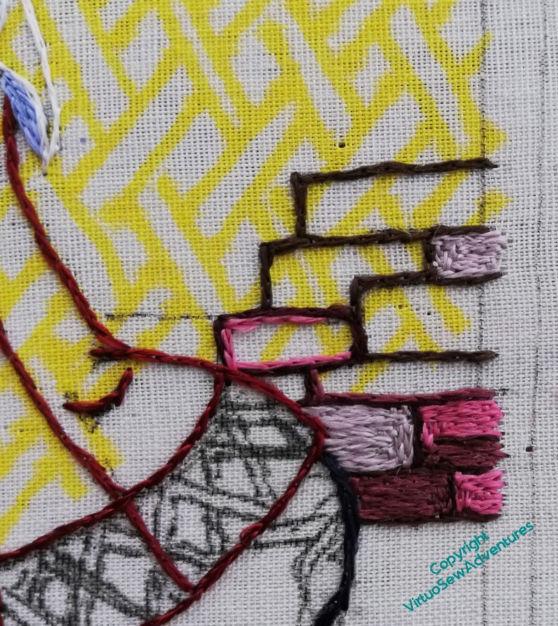
You may recall that I became concerned about the wall and the colours beside Aethelflaed’s riding dress. I filled in some stones, and had even more doubts.
Cheshire sandstone is an absolute horror to depict in stitch or paint – every time I’ve tried in the past I’ve missed in one direction or another. So I’m not especially concerned that this version is proving exasperating too. I just need to find a way to create something I can live with. And indeed, something that Aethelflaed can live with!
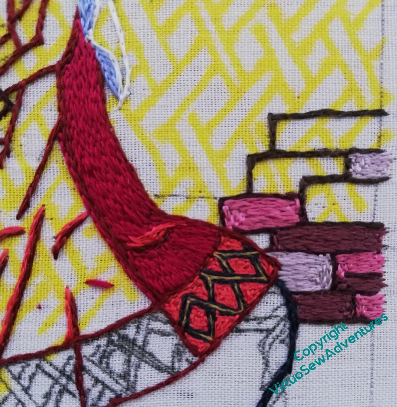
The sensible thing seemed to be to do the back panel of the dress and then look seriously at the combination. So here we are, back panel of the dress, including the bright, dramatic, interlaced pattern on the border.
I do need to retweak the highlight on the skirt, somehow, but I have dress and the border in place, and I think the wall colours are definitely going need a bit of tweaking.
So with the idea in mind of blending colours to make the walls sit back from Aethelflaed a little more quietly, I did some experimentation.
Now I have to make some decisions, of course!
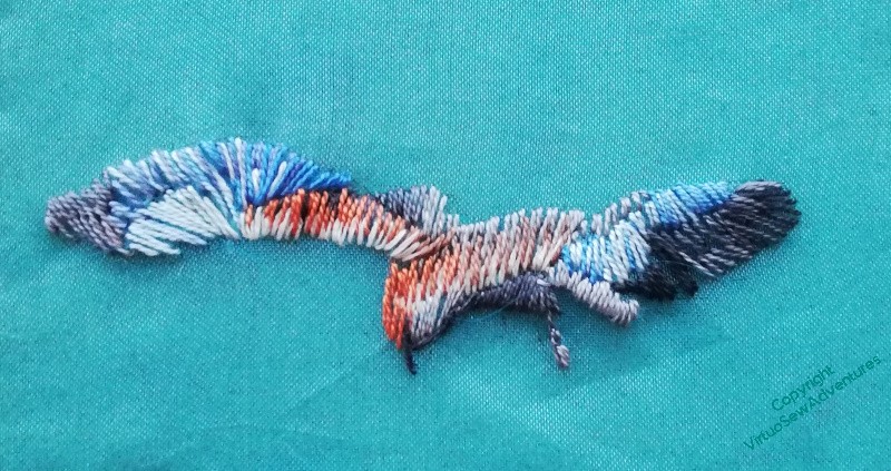
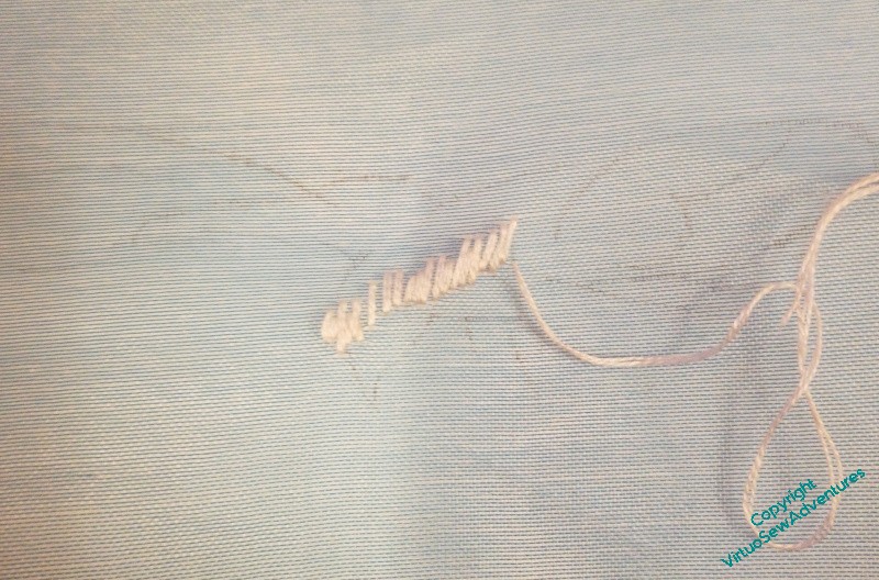
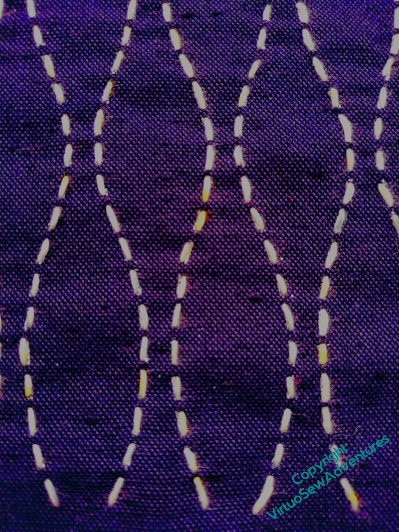
Sashiko – something more complicated
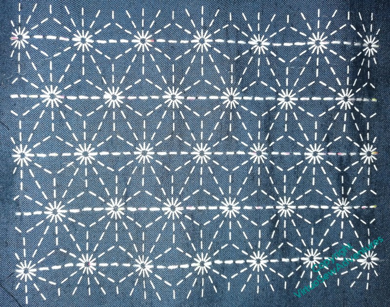
I said the next one would be rather more complicated, didn’t I..!
The pattern is vaguely floral or vaguely snowflakelike, depending on your sensibilities. Since I’ve been finding it very hard to work out which line I’ve done and which I haven’t, loooking at the front, I thought the best thing to do would be to show progress from the back. Please forgive the changing colours – I refer you to the light in rainy Decembers in England!

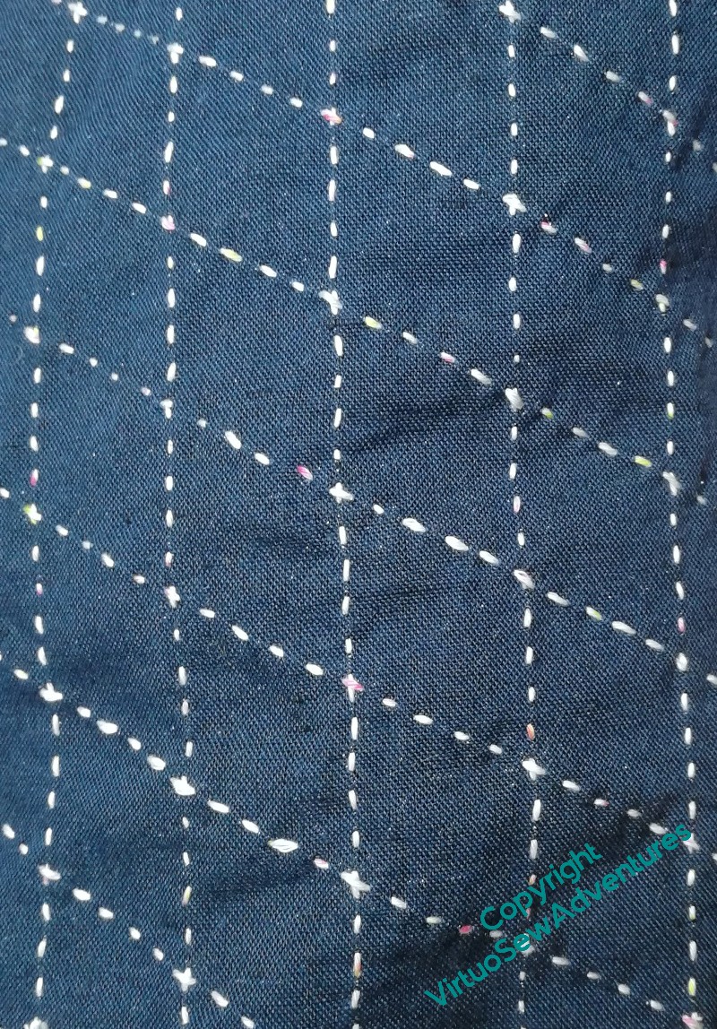
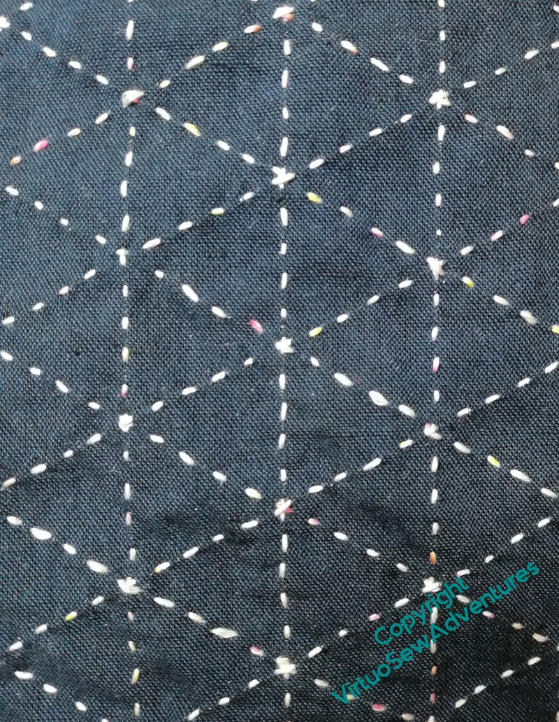
When I got to the middle of the sequence, I started to have doubts about how I was going to finish the pattern in a neat and tidy fashion, and I was wondering whether I was missing something or it was really going to be a bit messy on the back.
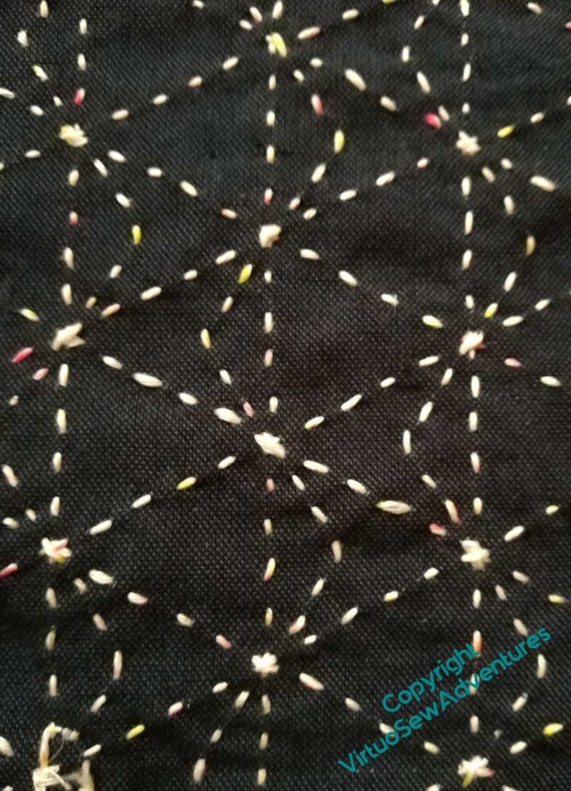
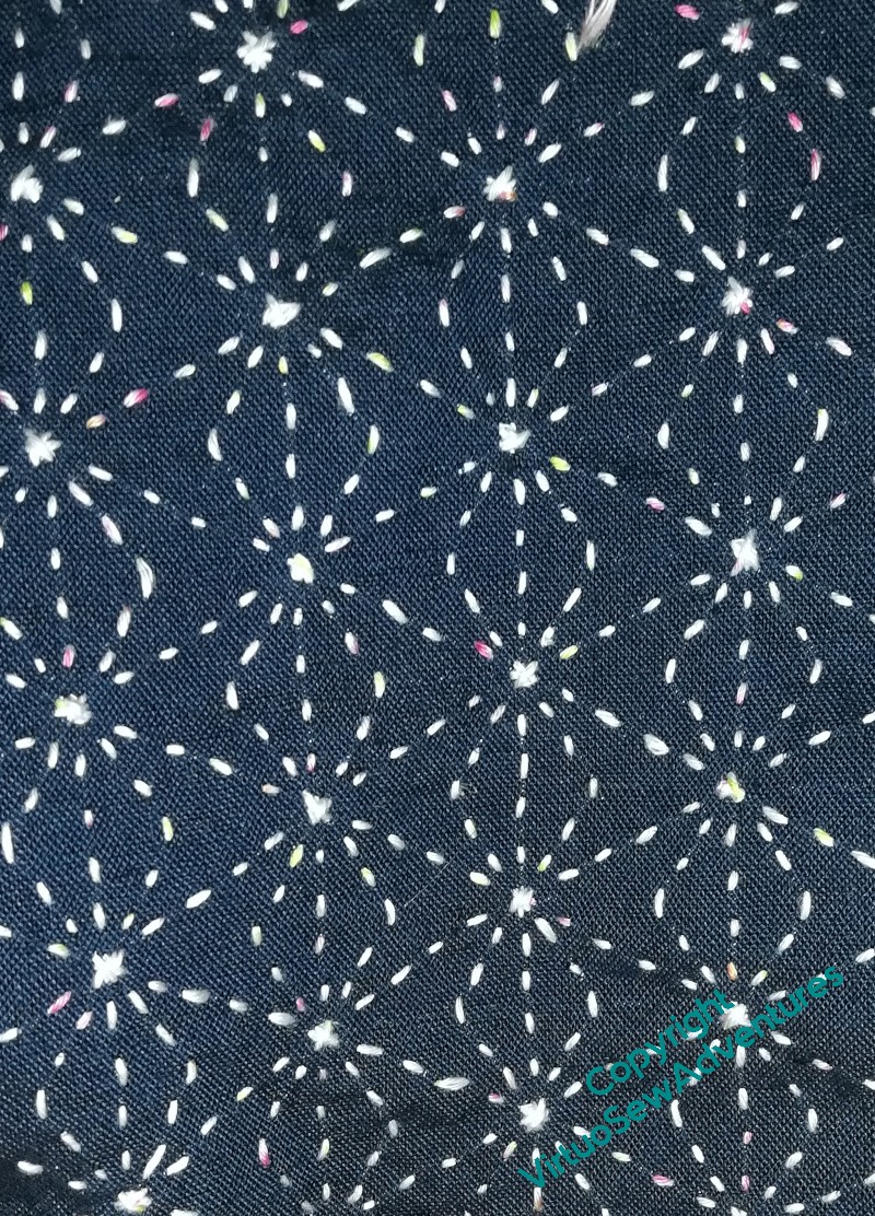
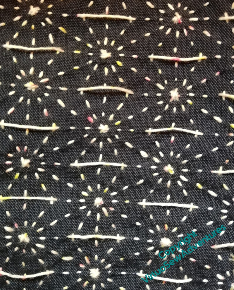
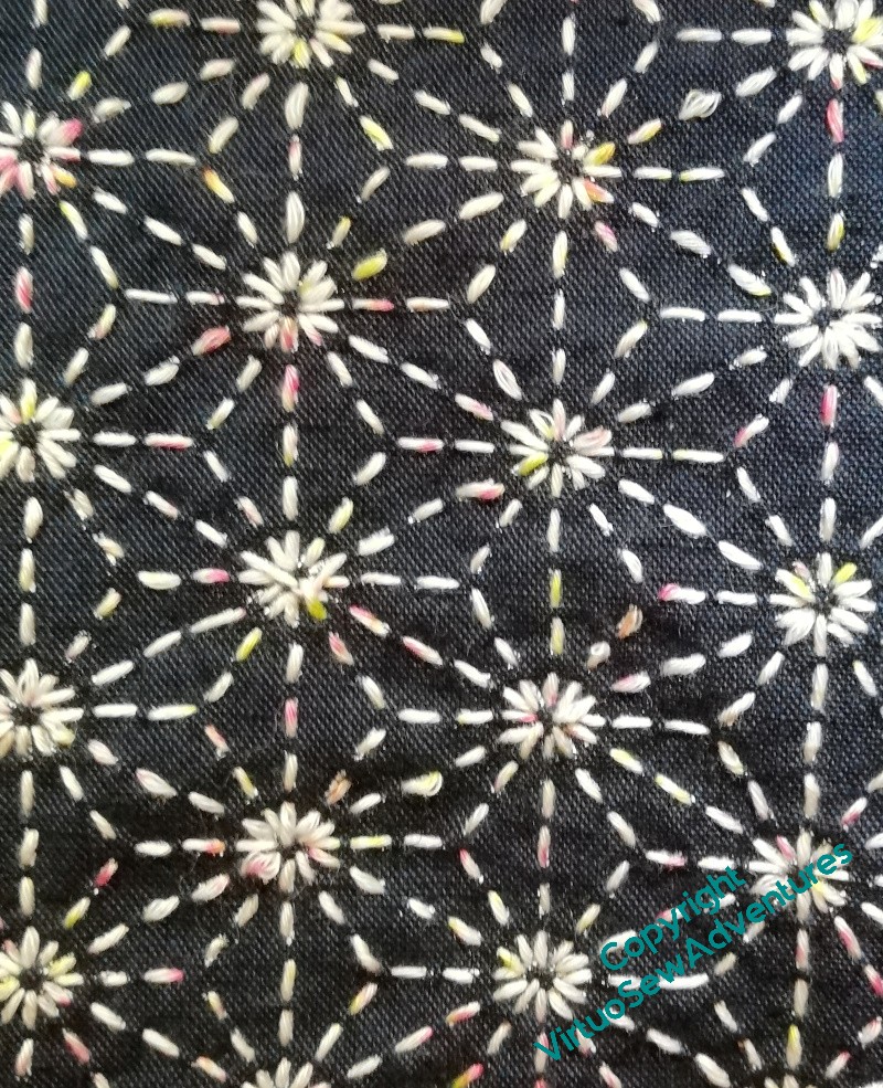
Then it occurred to me that I have a graph theorist in the house (The Australian), so I consulted him. I explained what I’d understood to be the principle, and that I was afraid I would have to have long floats on the back. The Australian looked at the pattern, pointed, and said “There’s a degree three vertex there, so yes, you’ll have some long floats!”
As indeed I did.
But it does look pretty when it’s done, doesn’t it!
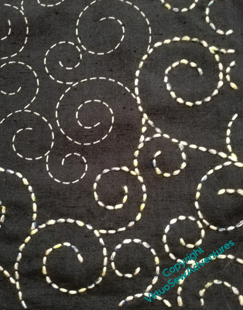
Sashiko – following instructions for a change!
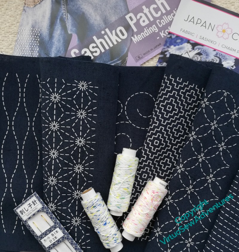
You may recall that for the past few years, for the period between Christmas and New Year, I’ve bought myself a kit, or put together a kit, of something I don’t usually do, that will involve me in following instructions. So, for this year, when I went to the Harrogate Knitting and Stitching Show in November, I bought myself a “Sashiko Patch” packet, some thread, and some needles – quite long needles, and quite strong, because the idea is to rock the needle through the fabric to take several stitches before pulling the thread through – so I was told.
When I opened the packet, I discovered that there weren’t really any instructions, but as I understand it sashiko is worked in rows of running stitches that cross each other to create the finished pattern.
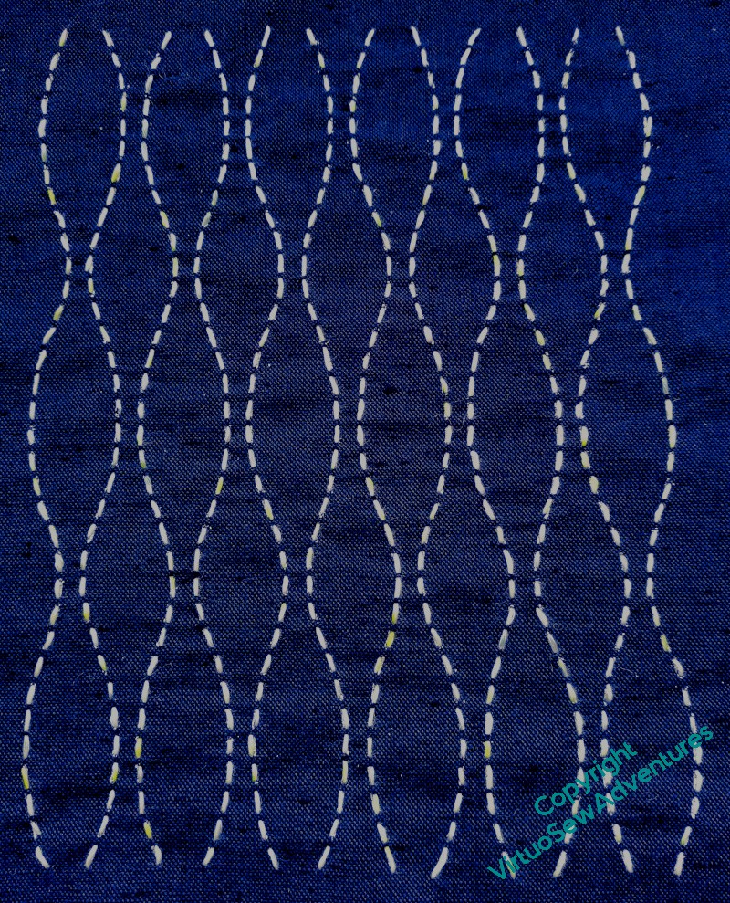
Or not. The first one I tackled was relatively simple, single rows of running stitches in a wavy configuration. I think the finished effect is a bit like a very stylised bark pattern, and it went quite quickly.
The next one (see the fabric in the first picture) isn’t going to go nearly so quickly…!
Happy Christmas!