
Tag: William Marshall
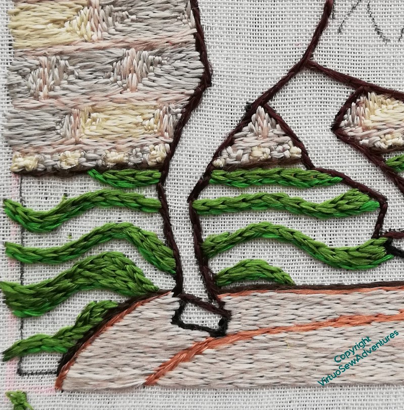
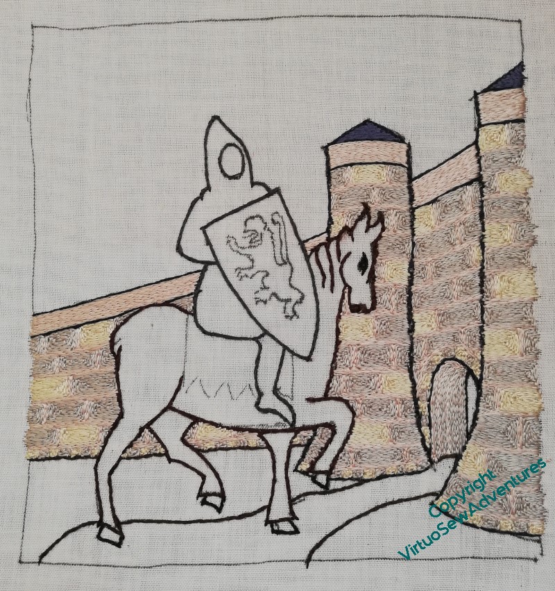
The grounds around the castle
In her book, Tanya suggested using a slightly thicker thread for the ground (that is, more strands in the needle), to help it look a bit more uneven without interfereing with the glorious light effects of silk. I decided to vary the different colours as well, to help with that effect. This is the mid tone, although the “dark” isn’t so much dark as a different tint – that’s because I bought it online, and when I started stitching with it, it wasn’t quite the colour I thought it would be.
That said, I think it has turned out very well indeed. I enjoyed trying to keep the curves curving the way they needed to, varying the way each colour filled the allotted space, changing the way the lines flowed. It somehow does manage to look a little like an illustration in a book of fairy tales, partly because of the lines of colour, partly, I think, because the lightest of the greens is very much in that vein.
Not an Arthur Rackham illustration, obviously!
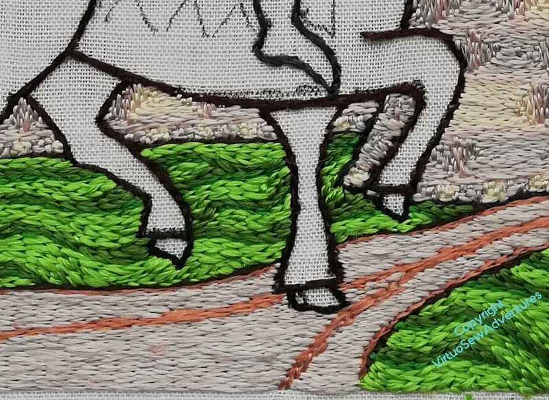
I love the way the grass has made the horse look much crisper, as though he’s conscious that this is An Occasion, and he’s putting his best foot forward.
But I do keep looking at him very panicked, to make sure that he’s not going to fall over. I once did a painting of an elephant, and it was only afterwards that I realised that the poor beast would have overbalanced and landed on his side with a rib-crushing Thump! if what I had painted had been accurate observation…
The road in to the castle
It took a certain amount of puzzling to come up with a choice of colour for the path. I wanted it to help to anchor the scene, but at the same time, I didn’t want it dark enough to challenge the horse, and it seemed logical that it would share some tones with the stonework of the castle. I wanted some wheel ruts as well, although of course they run togther into a single line quite soon.
And then there was stitch direction to think about. A stitcher’s thinking is never done!
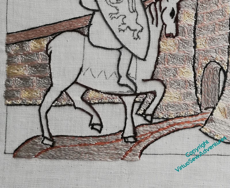
Well, a bit of thought, and the stitch direction was obvious – horizontal. The stonework is angular and archway is vertical/follows the curve, so horizontal seemed a good contrast.
Similarly, I settled on using both the pink and the grey from the stonework in the needle. I thought the yellow might brighten the road a bit too much for comfort!
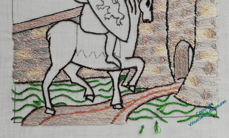
Once the path was done, I could move on to the grass. I thought of doing some rather mad tussocks, going up and over the castle walls, but in the end it seemed to me that the area close to the castle wouldn’t be neglected to that extent. Whichever fairy tale I want my viewers riffing off, I don’t think the briar-overgrown castle of Sleeping Beauty is the one!
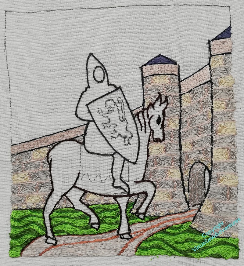
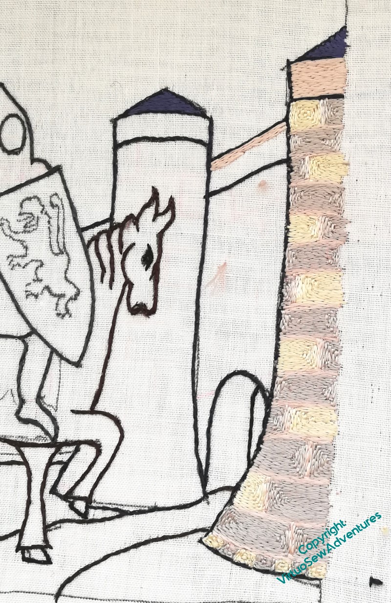
William’s Castle
I’m trying to work this systematically (I may also be slightly anxious about tackling William!), so the first thing was to finish the castle.
And there’s a lot of castle…
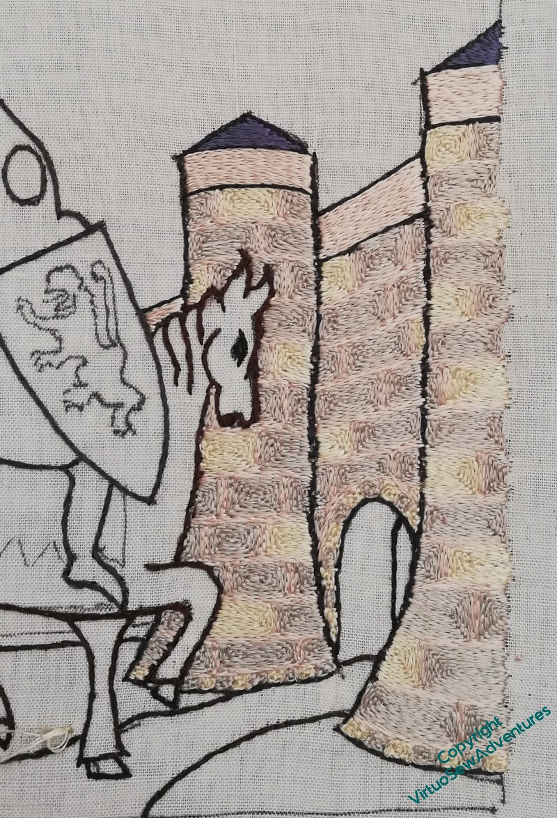
The yellow blocks appear only on every other row, and I’ve tried to make sure that they never line up. Once I’d worked the gatehouse itself I carried on to work the wall behind it, and then paused for thought.
The interesting question at this point was to decide how to work the wall inside the gatehouse, the “tunnel”, if you like. I wanted some evident difference in relation to the blocks of stone in the walls, and in the end, settled on alternating rows of grey (stone) and pink (mortar), turning them vertically, following the curve of the arch as best as I could. As I went deeper into the tunnel there were more lines of grey between the pink, although to say the difference is subtle is to rather understate the case!
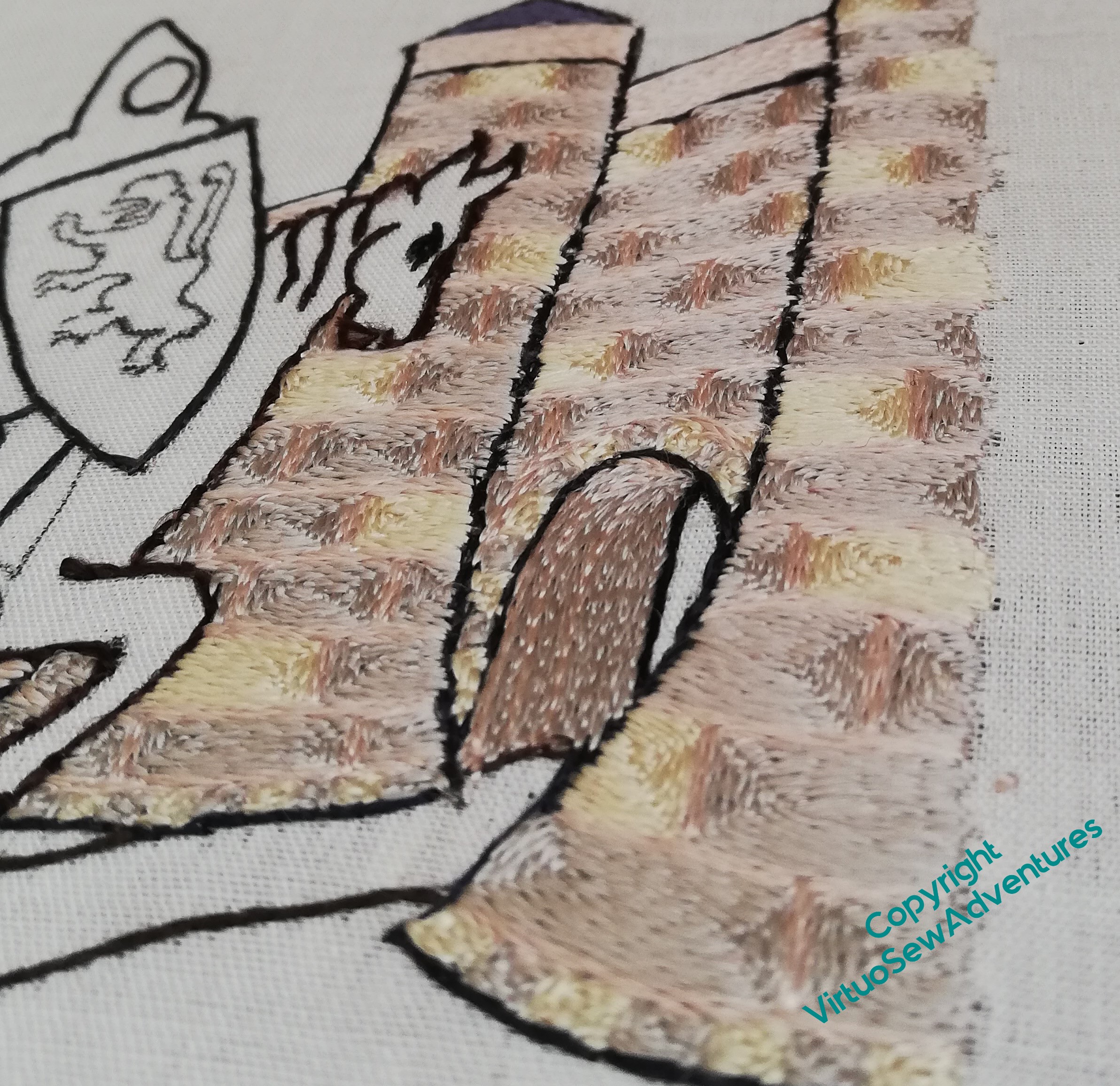
It is a constant delight to look at the way the silk changes in appearance as the stitches change direction, and even more so to change the angle of view, so I suspect you will see a good few shots like this over the course of the piece.
Doesn’t it look lovely – and don’t these quiet, pearly tones help to create the fairytale atmosphere I’m looking for!
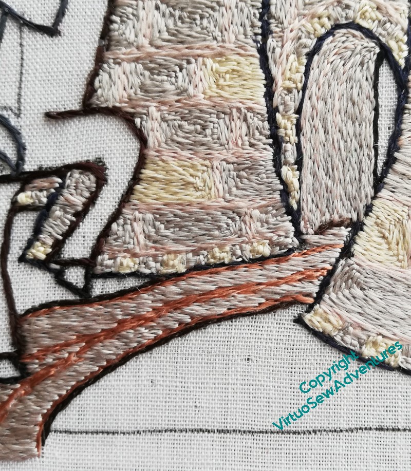
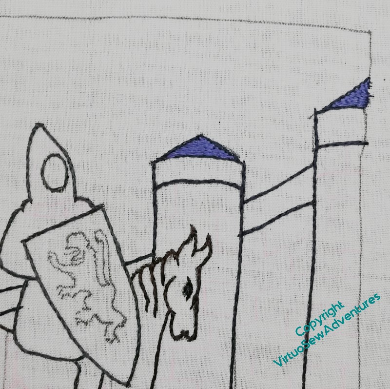
William Marshall – first Turret
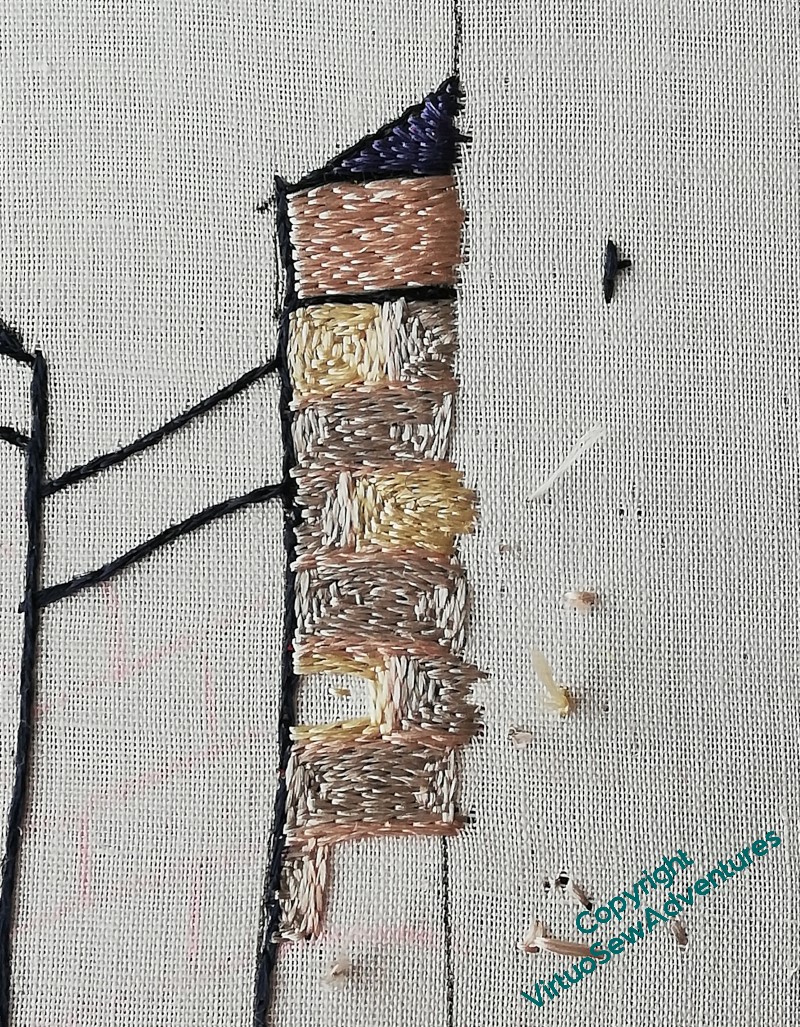
I had three colours for the stone – a grey, a cream, and a pale rose. The idea is to echo the colour variation you often see in stone when you start looking, but also, at least some medieval masonry made ornamental use of colour variations. Again, remember that I am looking for a faintly mythological feeling to this, not a historically accurate one, so I don’t mind that I’m tweaking my representation of the Chateau de Tancarville until William’s kinsman wouldn’t recognise his own home. He might, after all, rather like what I’ve done!
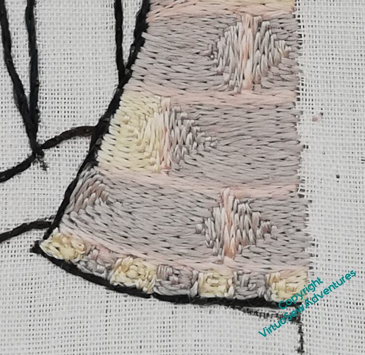
I put some thought into whether I would use all three colours in the walls, and if so how, but in the end I decided that since the “sky” will be underside couched in gold, it would be better to put the rose or the grey on the topmost course. Grey felt a bit too lowering, like a stormy sky, and William had quite enough squalls to face in his life, so I chose the rose, and used it also for the mortar.
The narrow course at the base seemed to need a different treatment, still in the the same vein. I used six strands instead of the four I’m using elsewhere, and made a little narrow chequerboard, without any suggestion of mortar.
And here it is, the first turret of the gatehouse complete. I was a little anxious lest the sameness of everlasting split stitch prove exasperating or otherwise offputting, but as it turns out, that’s not the case. I’m finding the different effects of stitch length and direction endlessly intriguing, and while I don’t expect to spend the rest of my stitching days entirely on split stitch, I’m certainly expecting to enjoy William.
William Marshall – beginning to stitch
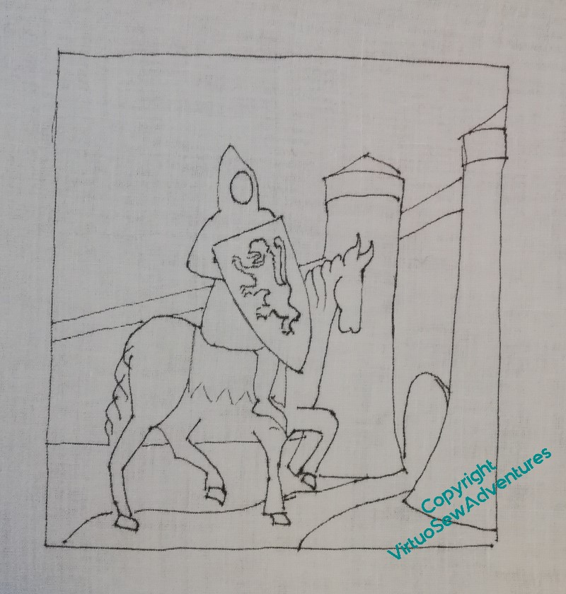
I have a small lightbox now, so I used that to transfer the design. It was a bit of a battle, because the lines showed through so clearly I couldn’t be sure I’d got them all.
And I hadn’t – spot the non-deliberate mistake!
However, one horse’s belly can be added freehand. I haven’t put in the lines for the reins, either, because I’m anticipating putting them over the top of the stitching below, and that layer of stitching would cover the design lines anyway.
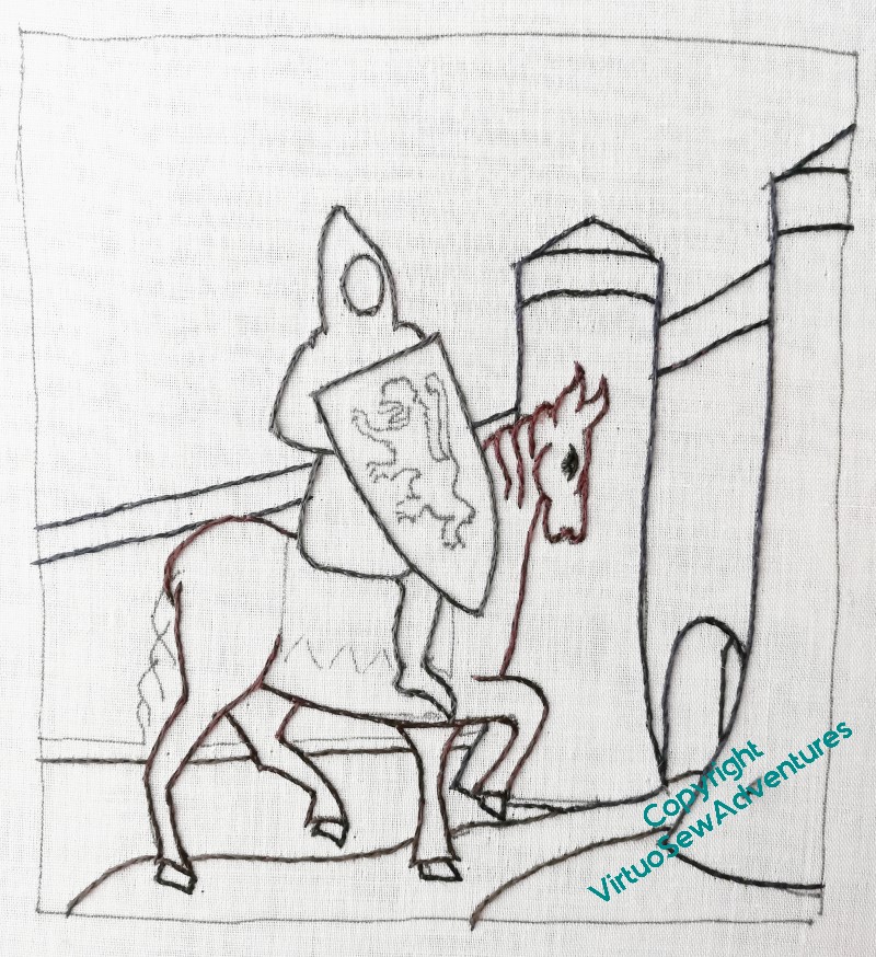
When I began the outline, I used the darkest thread I have, “Ebony”, and it looked a bit monolithic. After a couple of comments from Tanya Bentham, I unpicked it all, took the opportunity to restretch the fabric, which had sagged, and reinstated the outlines with some variation – navy blue for the building, brown for the horse, and dark grey for the armour. They are all very dark colours, so there’s only a slight difference, but there is a difference, and already the design looks livelier.
So, once I had the outlining in, I started with the conical slate roofs on the gatehouse turrets.
At this point, I should admit that those conical roofs are not remotely historical. The seventeenth century engraving that gave me the view of the gatehouse I liked the most didn’t have conical roofs, and I think I can be pretty certain that in William’s time those turrets probably had a man-at-arms on patrol, and no roof.
All that said, I’m not doing an entirely historical piece. I’m telling different stories here, and I want a slightly fairytale/mythological quality to the image. I think the conical roofs help with that.
Ready to Start on William Marshall…
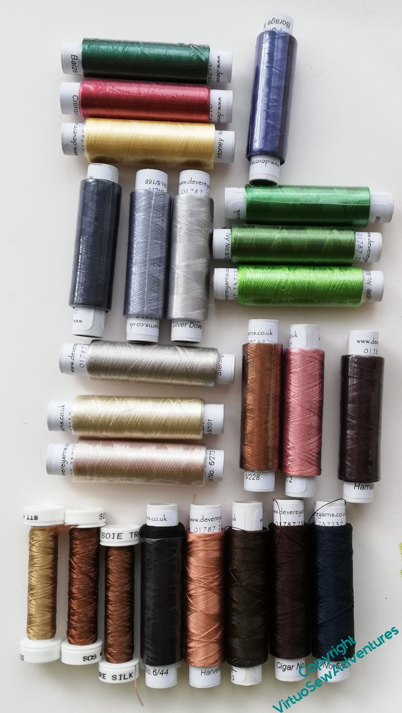
Having spent some time in my stash, deciding that mixing even filament silks might be a bit unpredictable, I finally pulled myself together and placed an order with Devere Yarns. While I waited for them to arrive (it didn’t take long), I went back to Tanya’s book and read the early technique sections again. Homework is always more fun when you’re interested.
I do have some darks left over from the Amarna Family Group, so the outlining is sorted. I’ve got three stone colours, three shades for William’s armour, three greens for grass, three shades for the horse, the three heraldic colours for the shield, and a blue for the slate roofs on the turrets.
The blue is probably also going to be the colour I use for the border.
The Victorians remodelled Temple Church, where William is buried, found a strapping six-footer that they believed – based on what we’ve been told of him – to be William, and in due course, reburied him, and everyone else they’d moved, in the garden. So I’m planning a silk border, of blue laid-&-couched work, embellished with roses (for the garden) and common broom (for the Plantagenet kings he served so faithfully).
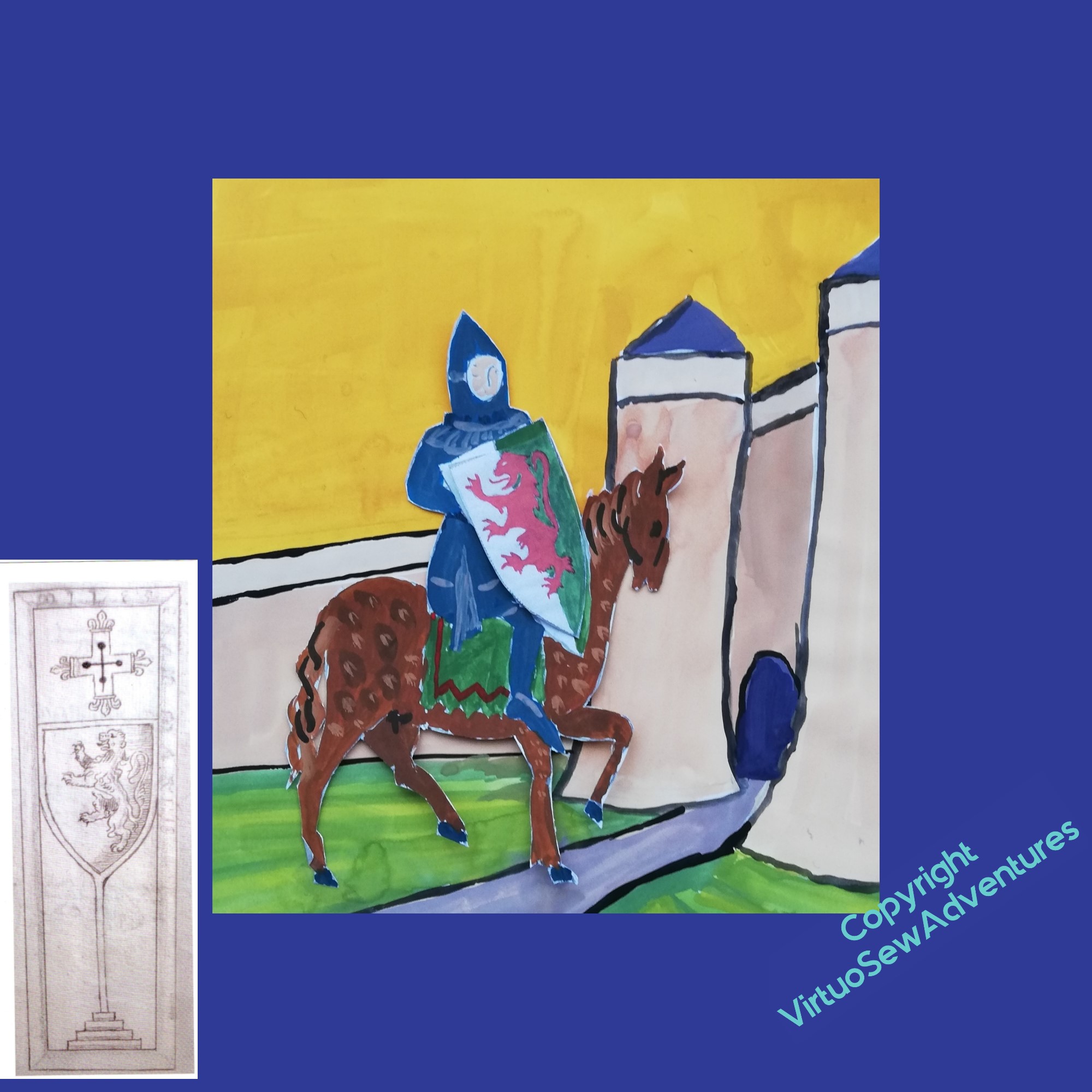
The grave slab is shown in a leaflet I got when we visited, which is no longer in existence, but is shown in an engraving from the 17th Century, and was thought to be associated with William. The lion looks right, anyway! I’m wondering whether to include that in my design for the border in some way, and if so, in what orientation..
More on William Marshall
Since I’ve always been interested in heraldry, and deeply distrust online search results, which so often depend on something unexpected in the search terms, one of my bits of research involved an email to the College of Heralds, asking about William’s coat of arms. I received a commendably prompt and completely unperturbed reply from the Officer-in-Waiting, Rouge Dragon Poursuivant, telling me that:
“The left-hand side of the shield, from the viewer’s point of view, should be Or, meaning gold (or yellow). The right-hand side should be Vert, meaning green. The lion should be Gules, meaning red, and it should be rampant, meaning it is upight and standing on its left foot with its right foot slightly raised off the ground.”
You’d think embroiderers emailed for advice every day of the week! Maybe they do, of course…
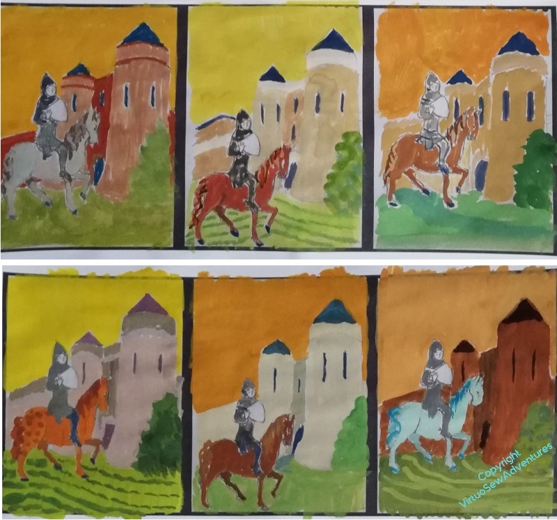
I had painted a whole series of variants on the design, and then had another thought, namely – maybe I wasn’t exploring all the variations possible. I attempted to do the exploration on my computer, but went to bed that evening with a ligament in my arm squealing. Back to the paintbox!
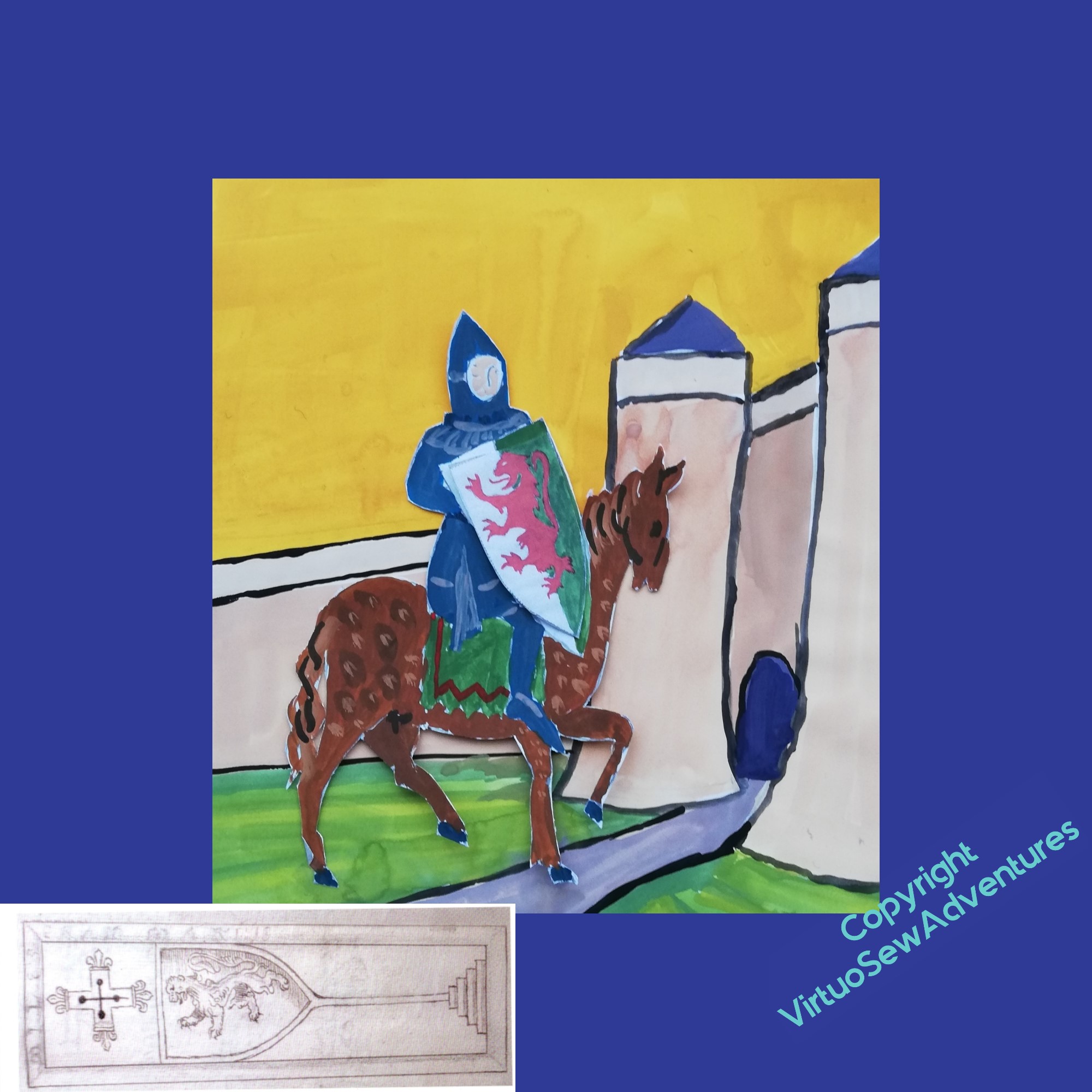
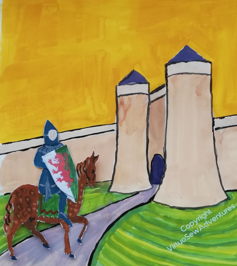
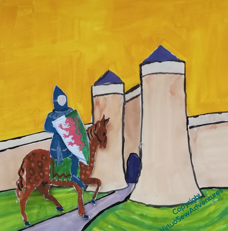
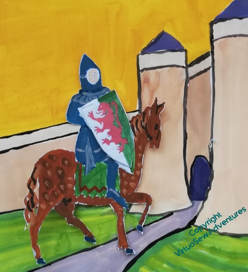
So I fished out one of my largest blocks of paper, and painted the chateau with a bit more wall on either side, and an actual path, and then painted a separate William, so that I could move him around on the background and experiment with cropping.
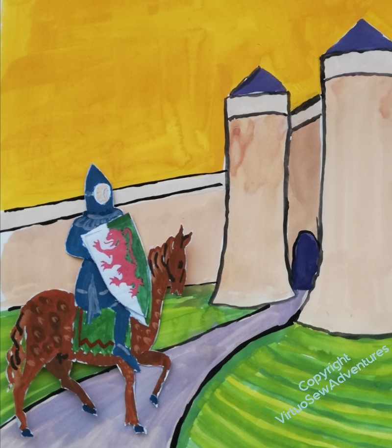
I’ve left his shield as white and green in the design for now. I intend to use underside couching for the “sky”, but I’ve not yet decided whether to use couched gold or silk thread on the shield, and making sure the colours are different in the design will help me to remember I have a decision to make.
I’m still havering, but encouraged by Tanya Bentham, who wrote the book that started me on this, I’m thinking about the third of the four options in this post. As Tanya pointed out on Instagram, in the medieval period people messed around with scale and perspective quite cheerfully, so I have no need to make sure my knight will fit through the gate!
Thinking about a new project…
One of the things you need to know before you dive enthusiastically into family history is that the horrors are just as likely as the heroes. In our case, a land dispute at the turn of the 19th Century saw some ancestors of my maternal great grandmother getting their family tree professionally investigated and drawn up. They didn’t get the land (although what the Professor of Music at Cambridge wanted with land in London escapes me), but “The SheepStealers”, as we call them, have been updated ever since. As far as I can tell, we’ve got ancestors on both sides of every civil dispute since the Norman Conquest, so we can pick our favourite distant ancestor depending on our own historical hang-ups.
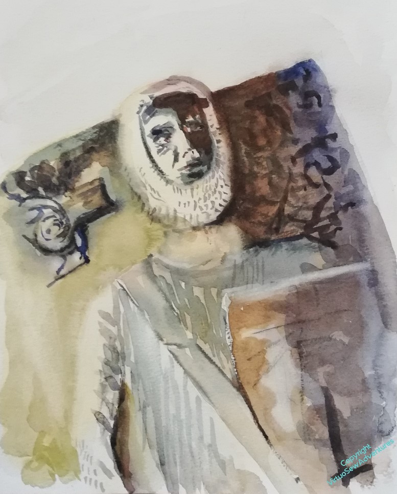
My mother, in particular, was completely thrilled to find that William Marshall, “the Greatest Knight” was on there. We went to his burial place in London, (pre-Covid) and I painted this watercolour of his effigy when I got home.
Fast forward some years, and Tanya Bentham of Opus Anglicanum blog, has published a book about Opus Anglicanum, which has got me thinking I would like to do some. I will probably do one of Tanya’s little heads to get the hang of the idea, but, being me, I decided that I would, as Ophelia (didn’t quite) put it, “wear my Opus with a difference”.
So I’ve settled on Umpteen-Times-Great-Grandfather William as my subject, on a visit to the Château de Tancarville, where he had his knightly training as a teenager. As you can see, I’ve got out my gouache to try to pick the right balance of colours, bearing in mind that the sky is going to be underside couched in gold. I can’t decide whether to make his horse a chestnut, a roan, or a grey – although given it’s opus, I get the impression I could make the horse blue and get nothing but praise!
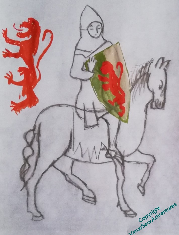
One of the changes I’m going to make to the knight I’m adapting for William, is that I’m going to make his shield a bit bigger, so that his correct coat of arms (this was from memory so I need to look him up) is clear and it is obvious that I’m not doing just any knight, but specifically William. I think I should do something different with his hand, as well as remembering to give his horse reins and a saddlecloth.
So, I need to get to grips with William’s real coat of arms, settle on my colour scheme and order my silks.