
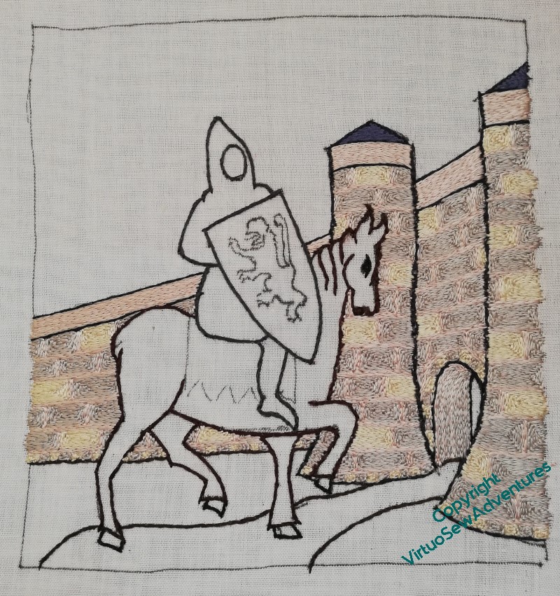
William’s Castle
I’m trying to work this systematically (I may also be slightly anxious about tackling William!), so the first thing was to finish the castle.
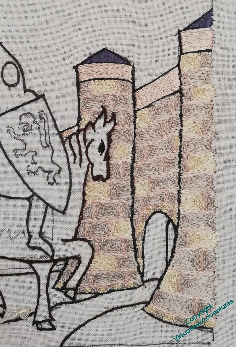
And there’s a lot of castle…
The yellow blocks appear only on every other row, and I’ve tried to make sure that they never line up. Once I’d worked the gatehouse itself I carried on to work the wall behind it, and then paused for thought.
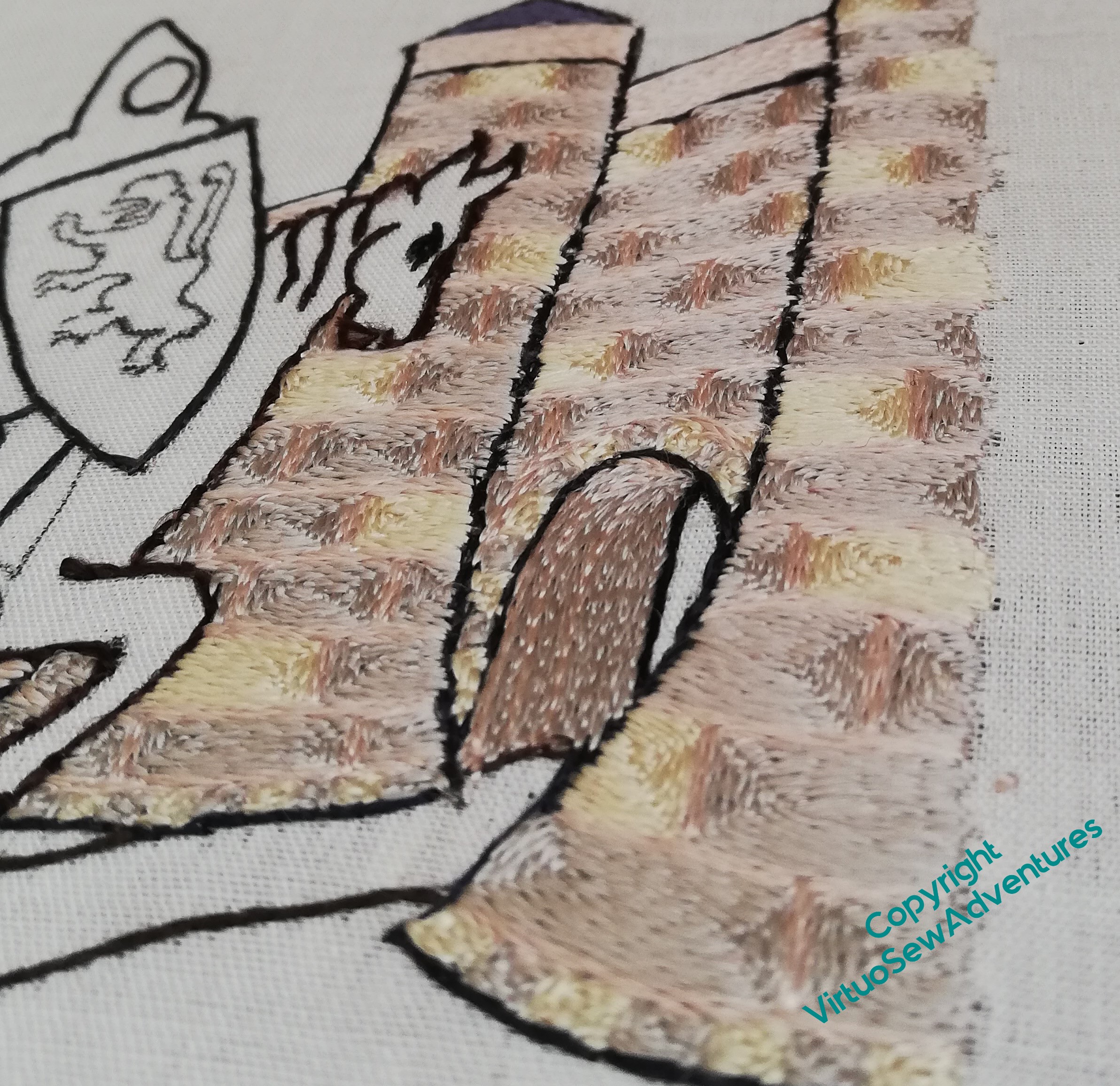
The interesting question at this point was to decide how to work the wall inside the gatehouse, the “tunnel”, if you like. I wanted some evident difference in relation to the blocks of stone in the walls, and in the end, settled on alternating rows of grey (stone) and pink (mortar), turning them vertically, following the curve of the arch as best as I could. As I went deeper into the tunnel there were more lines of grey between the pink, although to say the difference is subtle is to rather understate the case!
It is a constant delight to look at the way the silk changes in appearance as the stitches change direction, and even more so to change the angle of view, so I suspect you will see a good few shots like this over the course of the piece.
Doesn’t it look lovely – and don’t these quiet, pearly tones help to create the fairytale atmosphere I’m looking for!
That is a fine castle, and the arch works well. I could have gone and taken pictures of the one up the road for you, but that’s dark red sandstone (and not entirely original, as Thos. Telford got his mitts on it). The dimensionality of the silk direction really works beautifully on the stones and the arch.
The shimmer of silk thread really adds life to a scenery. You can see how the wall and the arch change as the shadows created by clouds over the sun play on the stonework.
I think the blend of grey, pink and yellow is just perfect.
This work is already delightful, but I am also looking forward to William’s appearance.
My art teacher at school had a motto pinned up on the wall “think big, think happy and paint the background first” so your lovely wall is following her good advice! The colour variation with the light on the silks is really lovely isn’t it, it’s creating such a tempting castle for him to enter 🙂
I think doing the background first was a great idea. William will stand out well against the colours you have chosen.
It may be subtle to see but it is actually there and would have a different effect if it wasn’t.
Yes it does look lovely.
It’s looking glorious and I bet even better in real life.
The castle walls are such an interesting colour and the archway looks good, needing to be darker to give depth.