
About Rachel
View all posts by Rachel
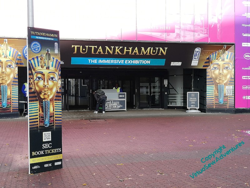
An Egyptological Outing..
Just because I have completed my Egyptological Embroideries (possibly not for ever…!) and have moved on to the early Roman period (Placidus) and the Early Medieval period (Aethelflaed), it should not be taken to mean that my interest in Egyptology has waned..
In fact, I heard of this Immersive experience from Alan Murphy, who helped me turn my manuscript and pictures in to a book, on behalf of the Embroiderers Guild. He and his wife saw the exhibition – Experience? – in London, and loved it. But they were there on the last day, and the next venue was to be the Glasgow Exhibition Campus. Well, that’s ok, there’s a train up the west coast that goes to Glasgow, and the Exhibition Campus has its own station on the local rail network. So off I went…
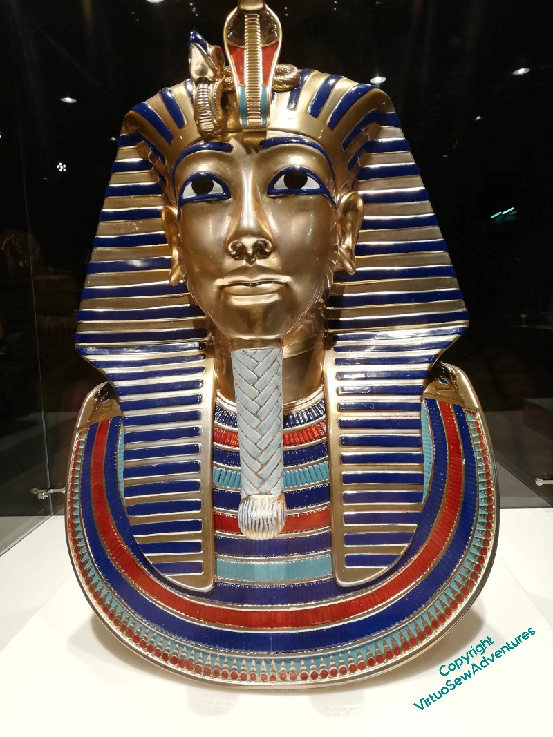

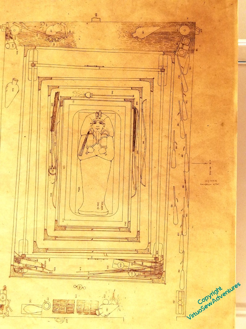
Like most of the major travelling exhibitions of this type, it began with a sequence of huge information boards, establishing context and ensuring that everyone has some similar understanding of the subject of the exhibition. In this case, that covered a canter through the history of Ancient Egypt, and the Eighteenth Dynasty in particular, and then a further exposition of Howard Carter’s career. Then, guarded by a spectacularly moody six-foot animated Anubis, pacing between a pair of mirrors, there were two rooms of reproductions of a variety of finds from Tutankhamun’s tomb, as well as some of the drawing and reports made by Carter at the time. All interesting, nothing I’ve not seen before in one or other exhibition over the last twenty years.
However, the finds were not really the point of this exhibition. That came from a huge hall on the walls and floor of which were projected a whole series of images and realisations, some relating to the excavation, some to the buildings and geography of Egypt, and some to Tutankhamun hiself.

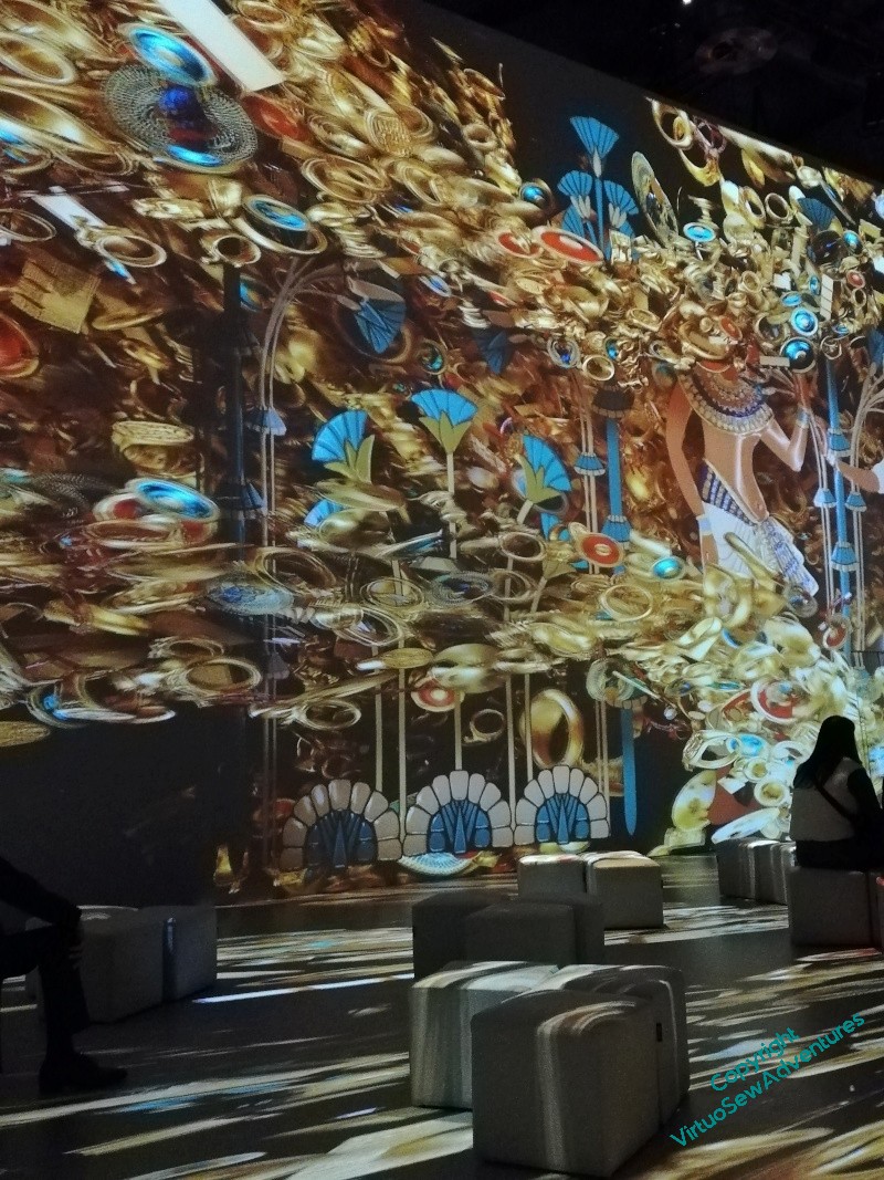
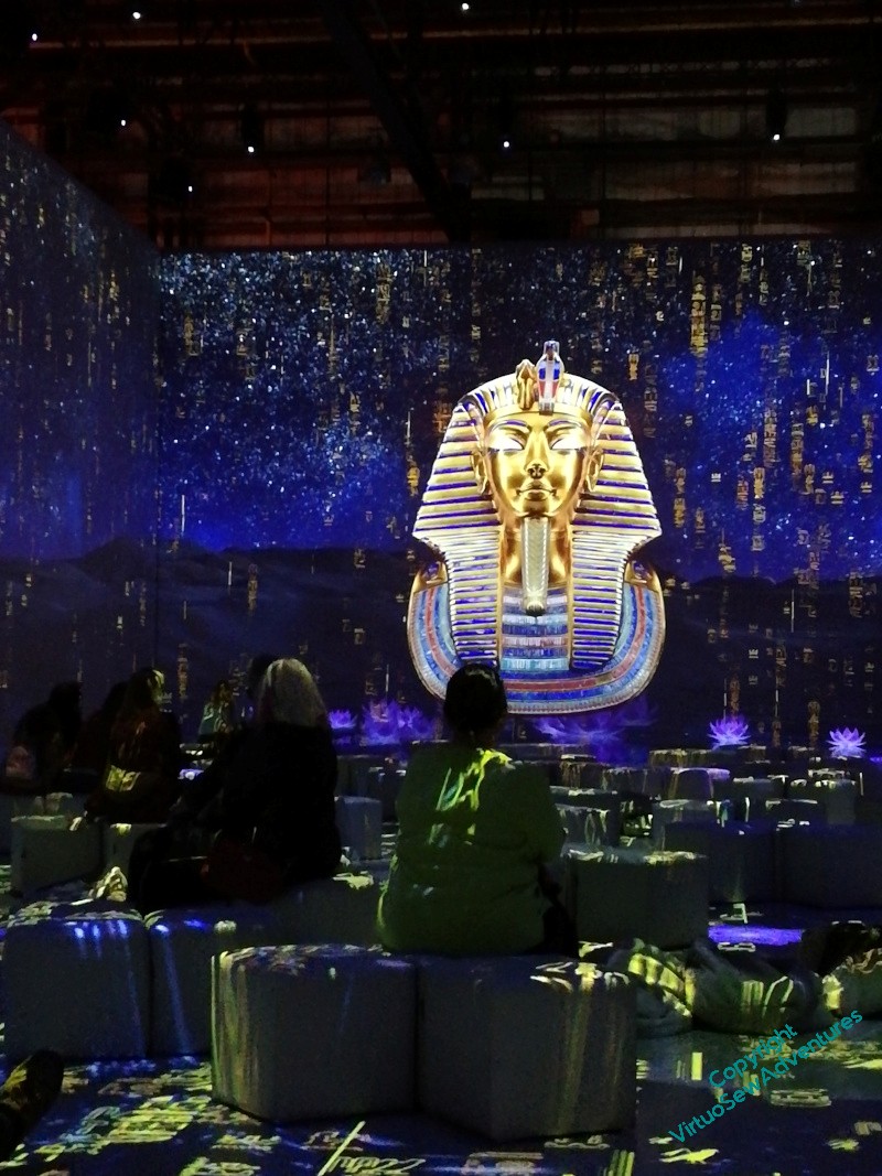


These were surprisingly magical, in spite of the occasionally rather overblown script and very tremendous music, and I happily sat through it all twice, before moving on to the next section, which I can’t show you, because it involved Virtual Reality headsets. Again, these mixed realisations of ancient Egyptian belief – the journey of the pharoah’s soul from his tomb to his judgment before the gods – with a tour of the camp where the Egyptologists were based.
Now, I’m not automatically an enthusiast for technological presentations, because it can be very hard to balance the technology and the story. The idea of the immersion in this created world is wonderful, but it’s easy to jolt the viewer out of it with anything slightly out of whack. By and large, that didn’t happen to me. I was enchanted by much of what I saw, entertained by almost all of it, and delighted to find myself able to raise a lantern in my hand as I toured the excavators’ camp.
And it gave me some more sources for the Lotus Coat, when I get around it, so you will probably see more of my Pictures From The Exhibition…
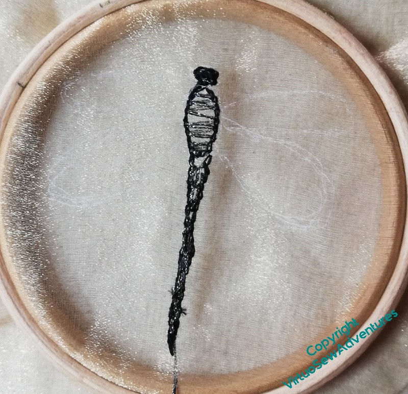
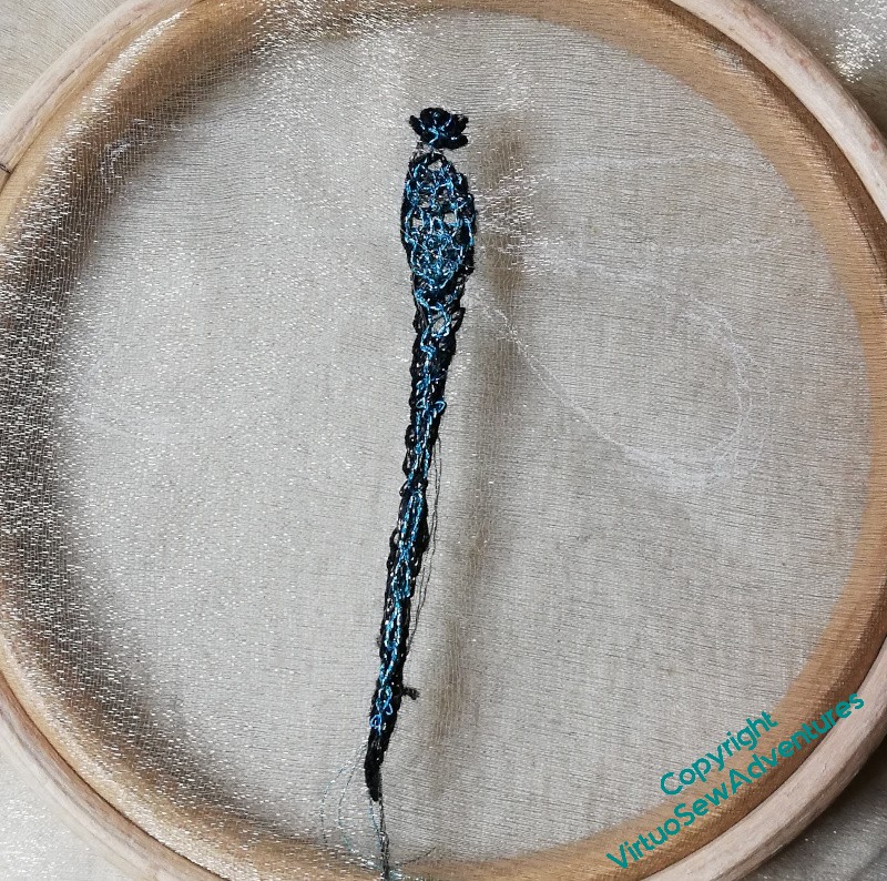
Dragonfly – first trial..
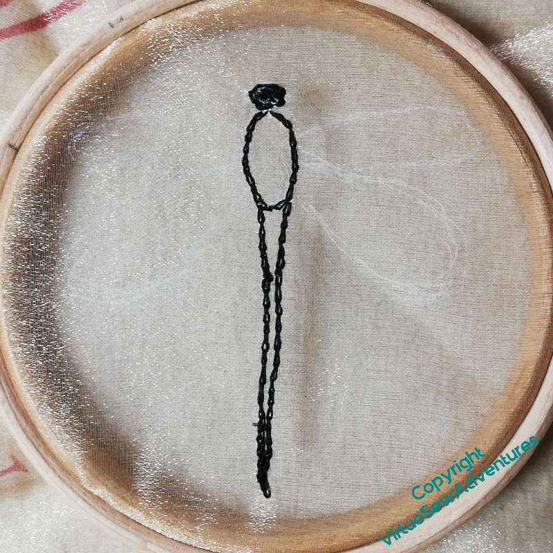
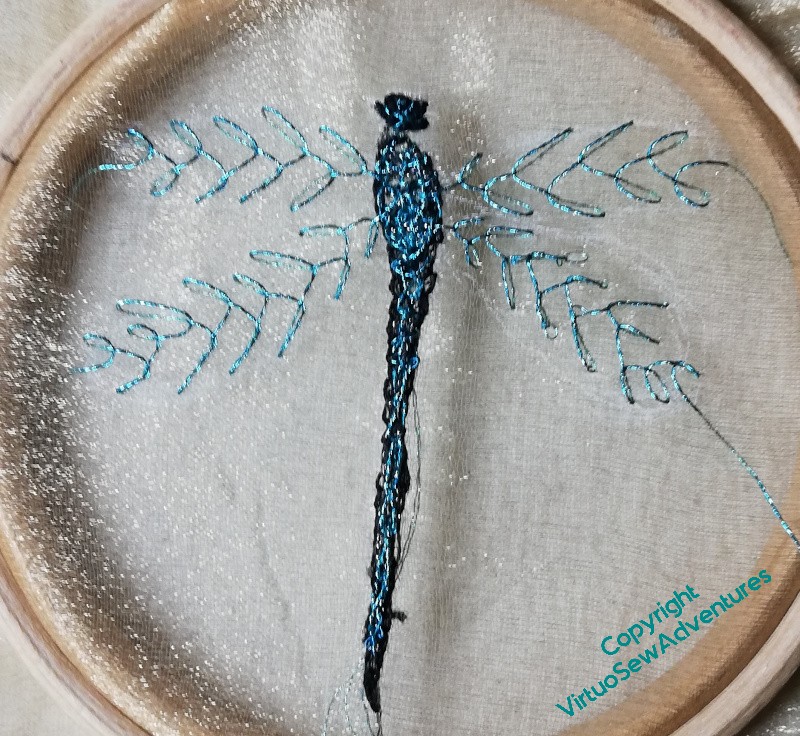
I find dragonflies and damselflies absolutely enchanting. I’m not entirely sure that I’ve got the right sense of delicacy and enchantment here – the threads are a little clunky, maybe, and the metallic thread wants a conditioner or something else to protect it as I work. I wanted to use a longish thread so that I didn’t have lots of tyings-off, but that just meant more opportunity for tangles.
I outlined the body and then worked straight stitches across in a dark metallic thread. The intention was to work needlelace type stitches in the coloured thread, catching into the dark straight stitches. The idea was that that would modify the colour slightly.
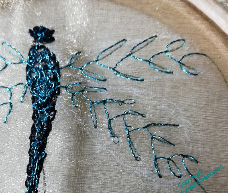
It has worked after a fashion, and the feather stitch veins on the wings also work after a fashion. But not quite.
I need to think of ways to finish off the veins in the wings so the stitches don’t unravel – glue? fraycheck? enclosure?
And I think I maybe need to do it again, smaller, and using a single strand.
Thinking aloud about Placidus..
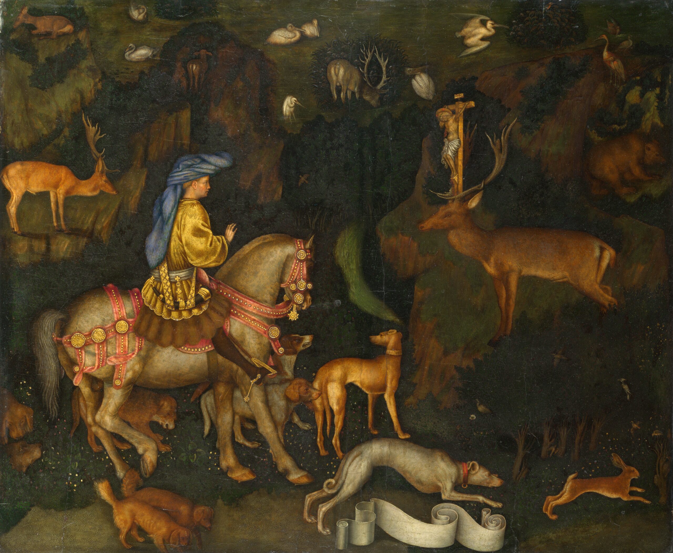
This images is from “Pisanello – The Yorck Project (2002) 10.000 Meisterwerke der Malerei (DVD-ROM), distributed by DIRECTMEDIA Publishing GmbH. ISBN: 3936122202.”
If you really look at this painting, it has a rather otherworldly quality. The animals and the figure of St Eustace (he changed his name when he converted) all seem rather stiff and the landscape makes very little sense. It almost looks as though the figures are painted on top of a map of the forest, rather than being part of a scene.
I suppose when you consider that it is a painting representing an encounter with the numinous, it needn’t make sense. And perhaps he is depicting the moment after the event, when everything winds back a little.
I want to depict, if I can, the moment itself. The pulse of – Something – from the stag, the dogs and the horse and the man all astonished, skidding to a stop from a headlong chase. But also – and my little Animal Vignettes should help with this – the sense that this is happening in a forest with other creatures going about their daily activities. Some will be observing, aware; some, like the little Fawn, totally oblivious. My thought at the moment is for the stag to have bounded up onto a convenient bit of rock, and started a waterfall, which references the water of baptism. I’m finding it hard to design a landscape that makes sense.
Maybe Pisanello had that problem too! There’s no reason to believe the artists of the past had it any easier than we do…
Finding the right references for horses reined in from a gallop is so far proving impossible, and so many other things are proving elusive, too. I originally planned to have a frame of scrollwork with the symbols of the four Gospels in the four corner, then I thought I would extend the animals into the frame, and now I don’t know at all.
This is another case when I find myself agreeing with Degas (“If it were easy, it would not be fun!”). It is the difficulties and the challenges that give me something interesting to ponder, and devising my improvisatory stitching technique for the animals is giving me some interesting stitching.
A website for Dreams of Amarna

The Dreams of Amarna book and project now has a website!
Not without some muttering and spluttering, I admit. Many years ago, I had some understanding of designing websites – quite simple ones, but still, I could do it.
That is no longer the case. There is altogether too much to deal with, too many different browsers and devices, too many changes of standard and best practice, not to mention technologies.
So instead, I used one of the templating services, said to provide an intuitive interface for developing a reliably working website.
I would argue that “intuitive” is entirely the wrong word, but after about five do-overs, I got there in the end.

It’s not wildly complicated, and it is no substitute for this blog, which will continue as before. It’s not meant as a substitute.
It is meant, in fact, to make life easier all round. For anyone specifically interested in the Dreams of Amarna, anyone who wants to help me plan and prepare the hoped-for exhibition, anyone who wants me to give a talk for their group – there’s a single point on the web where they can find me, and from which they can contact me.
I should probably have tried to get it ready earlier, but then, I hadn’t had Bernard Rose’s fabulous product and author photoshoot before…
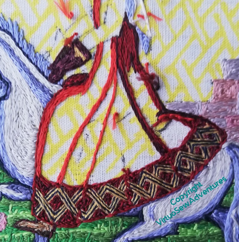
Aethelflaed’s Dress – going round again!
Just so we know where we stand…
Before I went through the reboot, I’d the back panel stitched and some dark lines in place – shadows and stitch lines. It’s not right at all. It looks unthought-through, and the drapery isn’t draping in a way that makes sense even in a medieval fashion.
So in the end I took it all out, ornate border and all, and started again.
I’ve broadened the decorative border to have two navy lines and three gold, and given it a darker background.
Then I turned one of my resource photos into greyscale, printed it out and stared at it. I’ve also stretched out the colours a bit to emphasize the lights and the darks.
So now, I want to translate what I’ve seen to the slightly different cut of Aethelflaed’s dress, and the slightly different style of Opus. That may be a bit tricky.
First thing to do was to remove all the unhelpful darks already in place. I think I just need to start all over again!
So here is the start of starting all over again. Light at the front, quite broad, and some new highlights. I may have to think a bit more about the border, but I believe that will be easier to do as the rest of the dress comes together.
I also need to get the sleeves in. There’ll be a contrast here, the sleeves of a contrasting shift or under-dress, and that will help the image to make sense from a difference.
Mary The Pekinese again
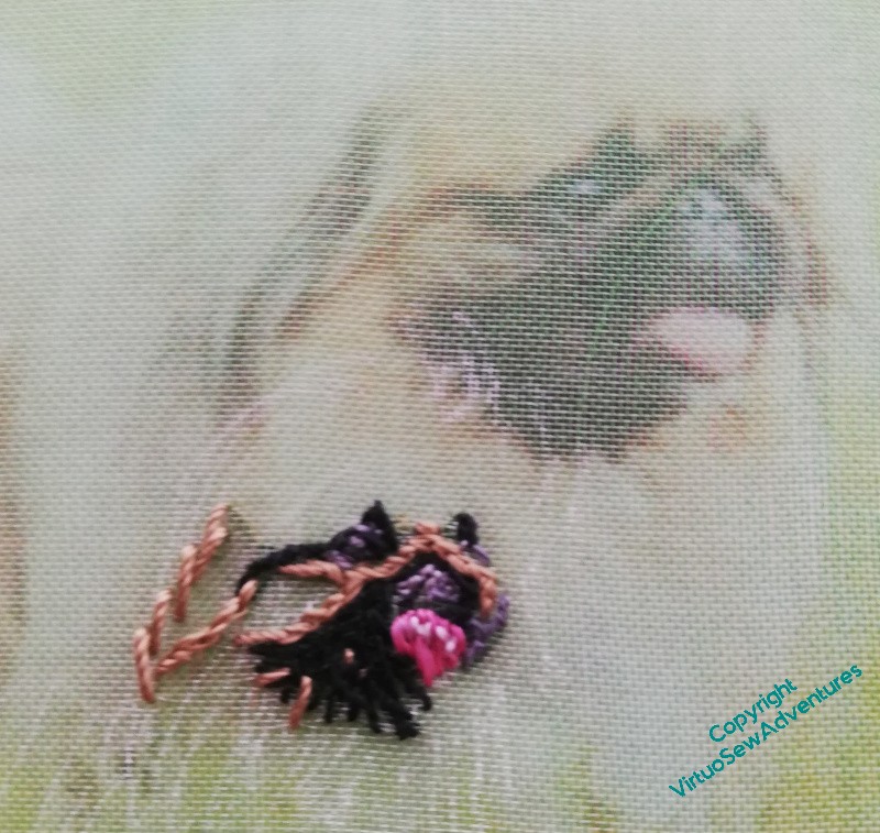
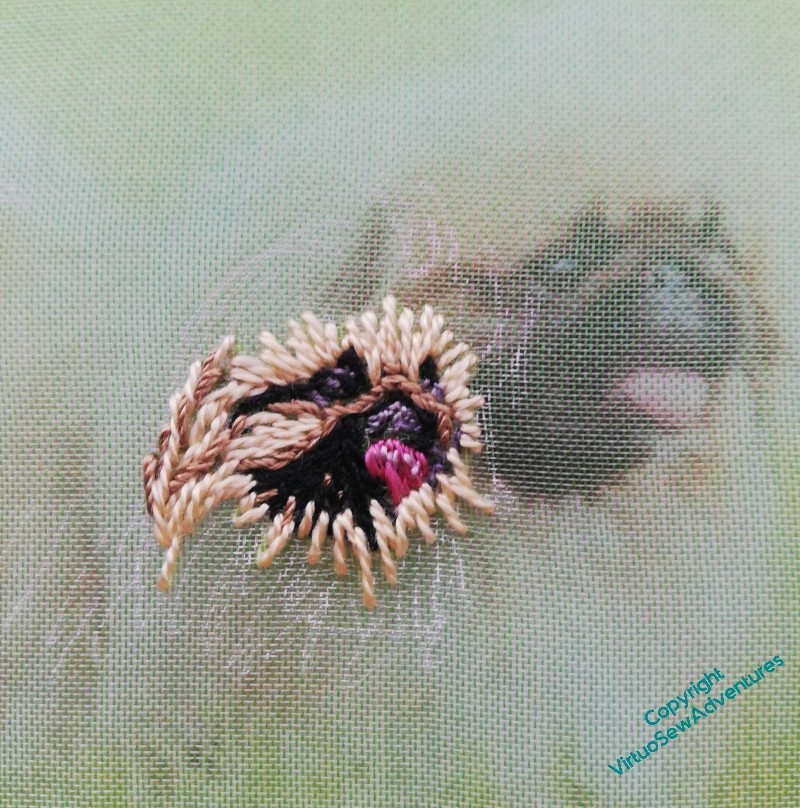
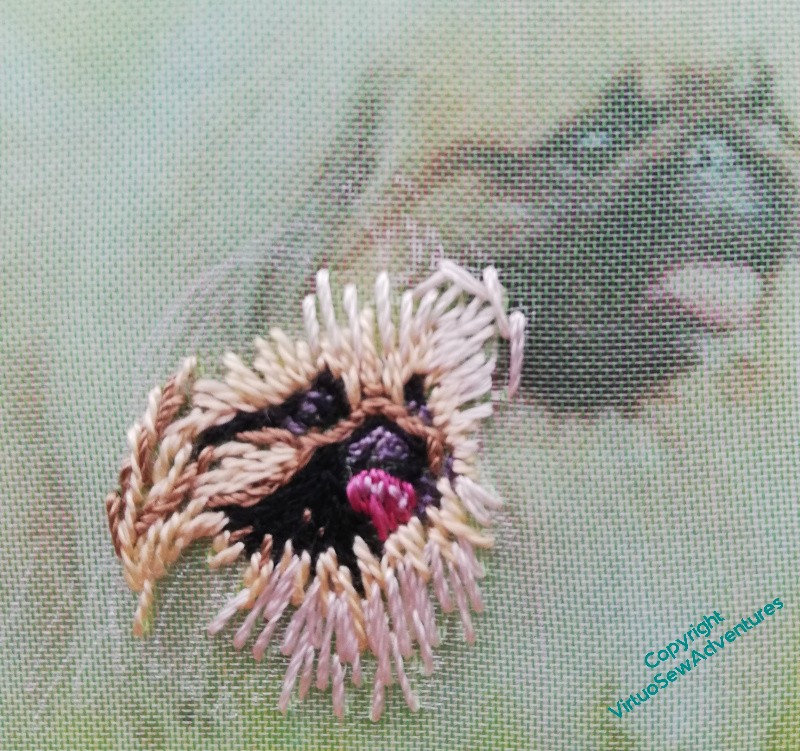
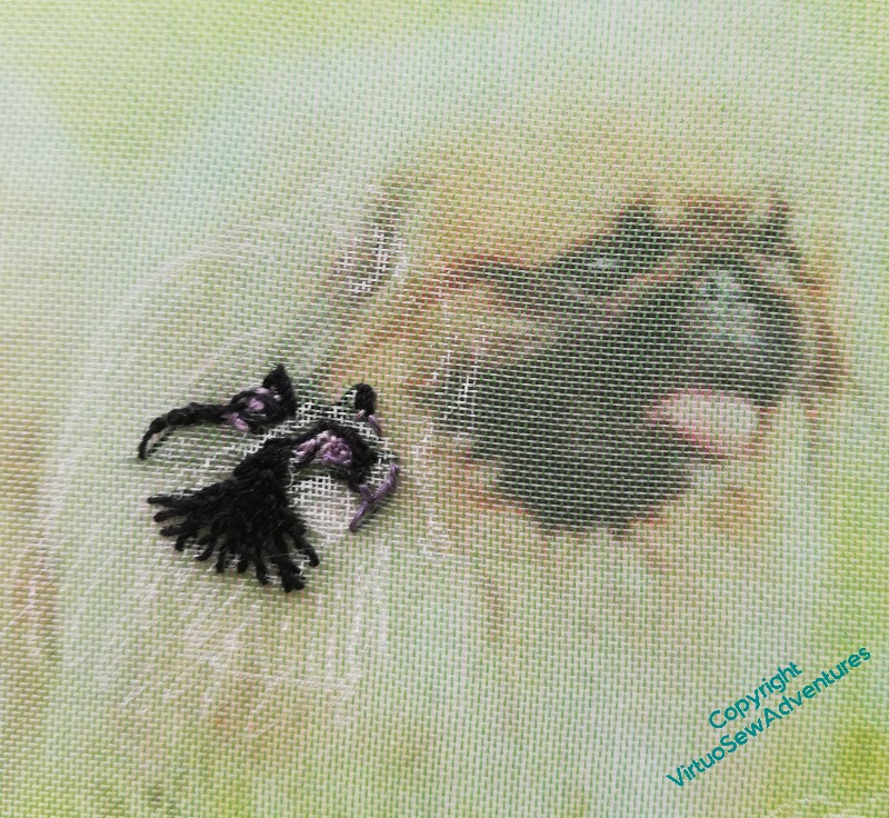
It’s quite hard to explain what I mean by the improvisatory, painterly approach I’m using for the assorted Animal Vignettes for the Conversion of Placidus project, so since Mary the Pekinese is relatively simple compared with some of the others – mostly straight stitches, rather than the tangle of Cretan I used, for example, for the little rabbit, I thought maybe a sequence of photos was the best way to show you what happens.
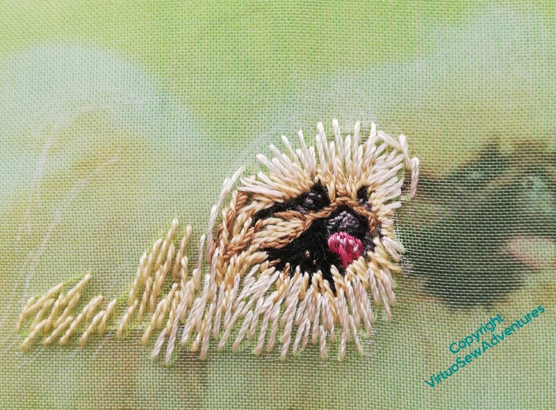
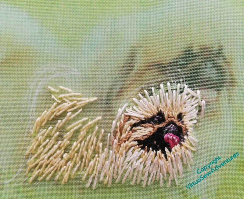
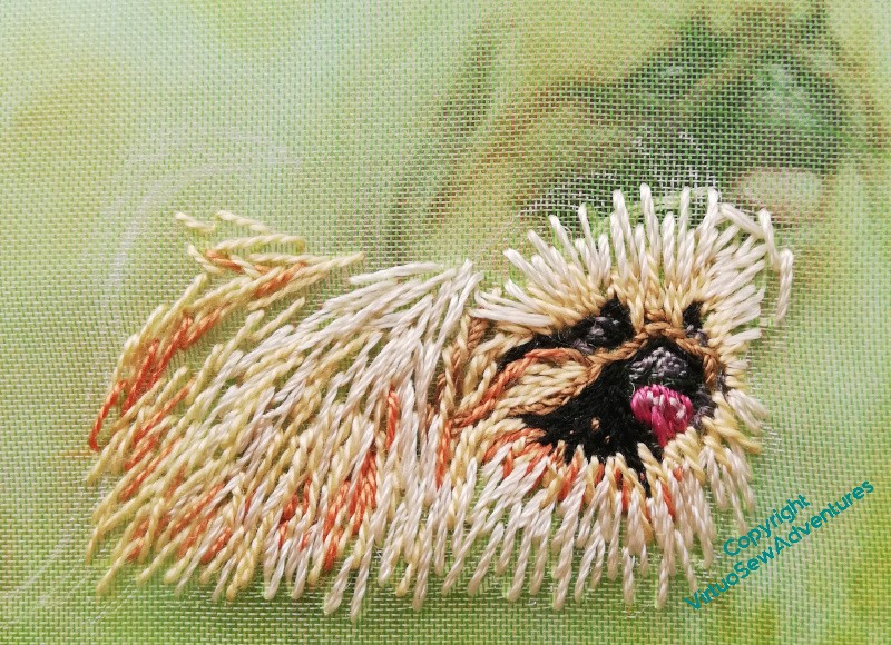
In each case I’ve put the frame on top of the photo I’m using. The finer, subtler details of the fur don’t really show through the gauze, but it does give you some sense of how I am selecting my threads to capture the impression of colour and texture that I’m working from. I’m not concerning myself at all with what fibre the thread is made from – if it does what I want it to do, I’m using it.
I’m also recollecting a quotation I found, attributed to the painter Edgar Degas : “If it were not difficult, it would not be fun!”
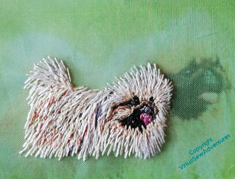
Worth the effort, though. I do think she’s turned out rather well!
Beginning on Aethelflaed herself. Again.
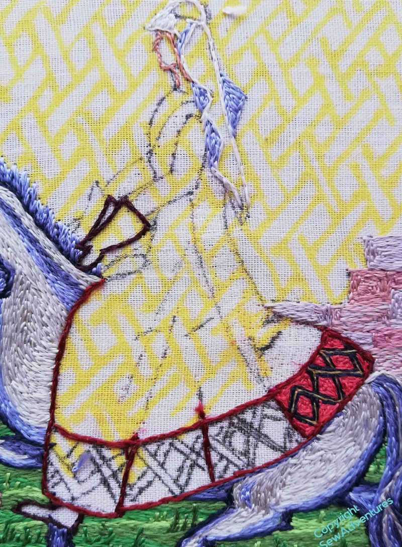
Sigh. When last you saw Aethelflaed, I was about to start unpicking the back of her riding dress.
It’s done now. As regular readers of my blog know, I don’t unpick unless I really can’t avoid it and I’m sure I can do better. If I have no idea what to do differently, I leave well alone until I can come up with a Plan.
Well, I have a plan now. I’m changing up which silks I use, going for something redder and with less blue in it. Here’s hoping that the border still works, but that would be a serious trial to unpick (as though a panel of straight split stitch weren’t already a trial!).
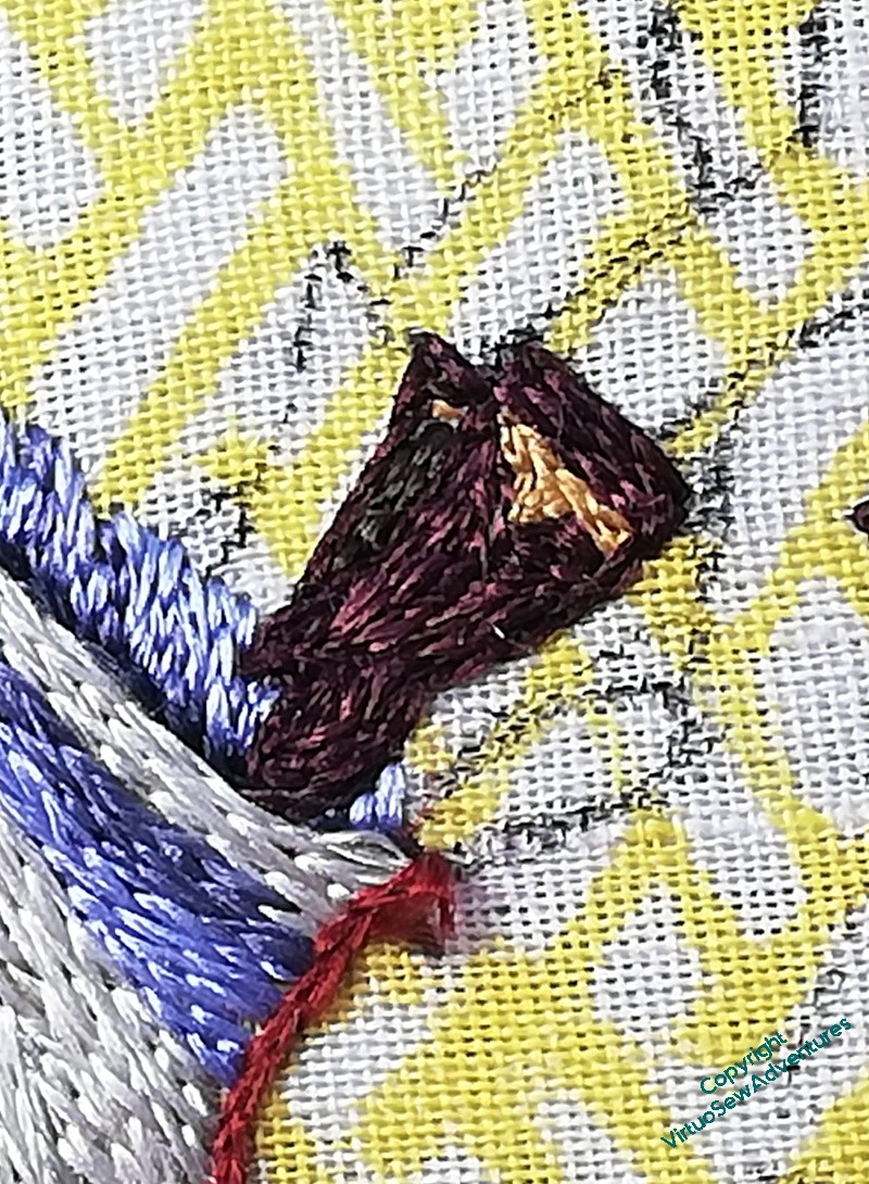
You can tell I’m not entirely sure of myself, however.. I have worked her gauntlets first!
You may recall I designed them as mittens, rather than gloves with fingers, because I could not imagine that fur lined mittens weren’t a thing for a noblewoman riding, and besides, it let me escape doing her hands. I will have to do hands for Rahere and Julian, but until then, I’m ducking it.
I gave the gauntlets a narrow border of yellow, thinking of a silk or metal braid that might have been used as a trim.
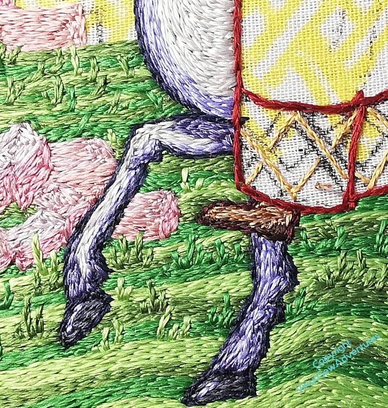
Then I decided to make sure she was shod. Practical brown ankleboots, with extra reinforcing down around the heel. I’m not sure whether stirrups were in use at this point, and in any case, I think it’s a detail I don’t need to add at this stage.
And now I really can’t put off that dress any longer!
Very Exciting News!
My most long term readers may recall that when I first started this blog, it was for accountability, in a sense.
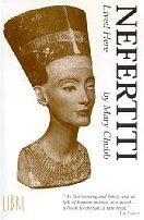
I had plans for a two-panel embroidery inspired by the book “Nefertiti Lived Here”, by Mary Chubb, and with Life the way it is for all of us, I thought the only way I would keep at it was if I’d said, in public, that I was going to do it.
Well.
Some twenty-odd years later, that two panel project turned into 27 embroideries, 117 watercolours, and A Book!!
You may think I’d have nothing left to say, given how much I wrote on this blog as I was making the pieces, and when someone said “Why don’t you write a book?”, I rather wondered about that myself.
But it turns out that with the distance of having done a lot of other embroidery since, and a lot of painting, and a lot of thinking, there’s actually a lot to say. Not about the technical aspects; there are plenty of books of technique that as specialised books have the space to explain techniques in detail. But as someone who developed their own approach to design and design development, what I can do is share some of that approach.
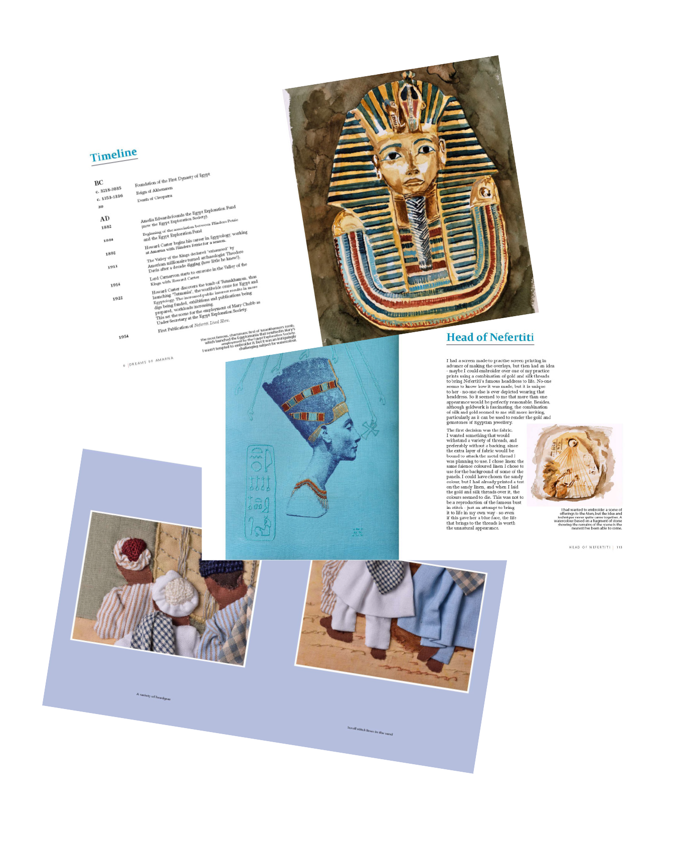
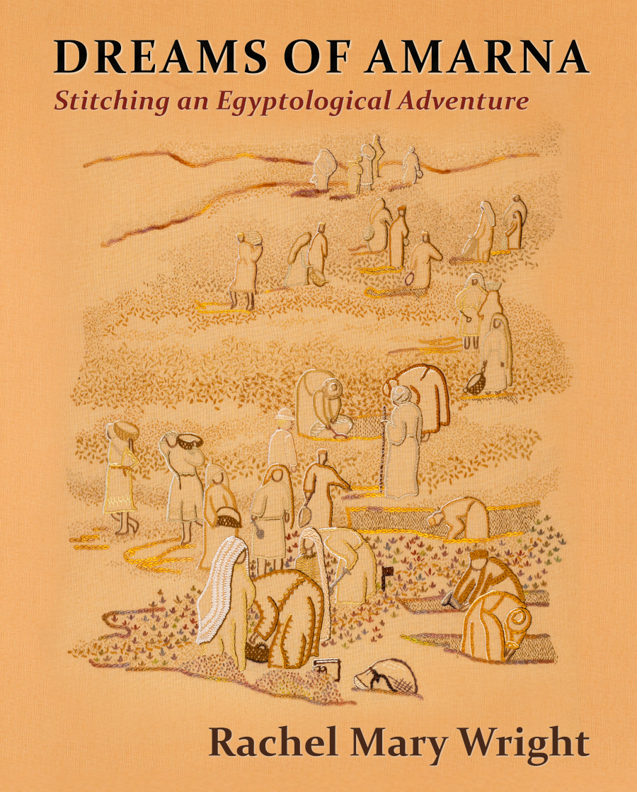
The Embroiderers Guild have now published “Dreams of Amarna – Stitching An Egyptological Adventure”, and it is available to buy from their webshop now. It is copiously illustrated, with photographs by the wonderful Bernard Rose, showing embroideries and paintings, all done by me. I am thrilled to bits, and I hope you will love it, too!
Starting Mary the Pekinese
Now, although the starting impulse for the Placidus panel is the Pisanello painting (and I will be saying more about that in another post), it is also Elizabeth Goudge’s story, woven around an imagined version on an ancient wall. In the book, “The Herb of Grace”, the painting is already in the air, in your mind as you read, long before the mischievous young twins start pulling wallpaper off the pantry wall to reveal an ancient fresco.
So although I’m not intending any humans other than Placidus himself to be in the painting, the family dogs are definitely going to be in there, and I am starting with Mary the white pekinese.
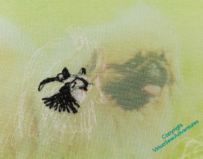
And here we go again – the sketchiest of outlines, a piece of gauze, and the sort of breathless pause you take when you Definitely Don’t Want To Ruin It.
As you can see, the stitched version isn’t the same size as the source photo, so I can’t quite lay the gauze over the top to find where to stitch, but I can compare the shapes I’m creating. The black thread (good grief, I’m using black thread!!) is a fine silk, as used on the woodpecker.
The grey thread here in the highlights is from a gorgeous variegated silk eight strand thread. I think I may have bought it for “Leaving The Tyne“, but to be honest, at this stage I have no idea! It’s going to be useful, though, because I have several shades to pick from within a single length..
And I am already startled by how well Mary the Pekinese is looking.
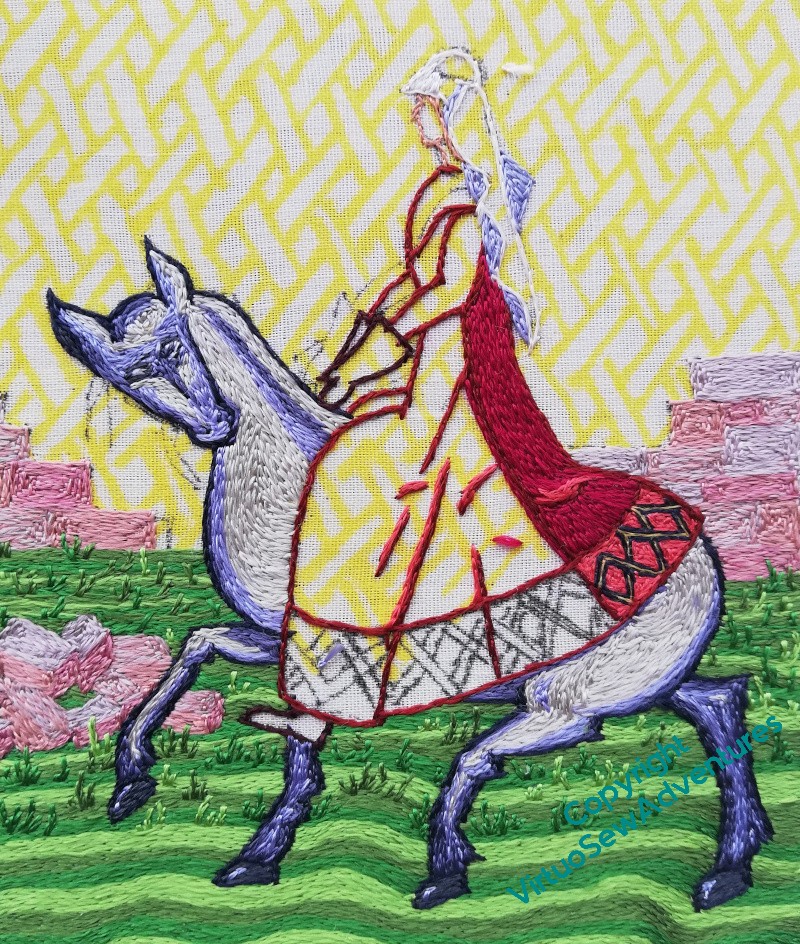
Mane, Tail, and Headache!
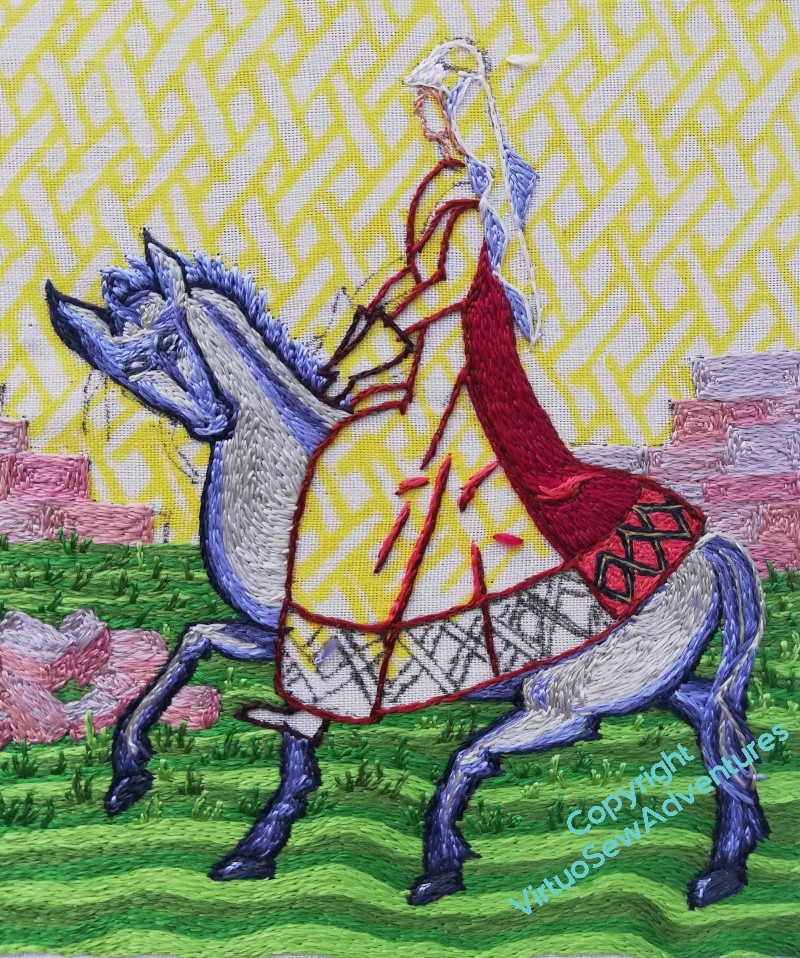
I still need to find a name for this horse.
However, there’s time for that. Keep stitching.
The mane and tail didn’t take too long, and the horse is looking bright and neat. I think the image as a whole is working so far (thank goodness, it’s an awfully time-consuming technique to end up dissatisfied with!), so I’m happy to keep going.
I might be able to get back to the tussocks soon, but in the meantime, close ups.
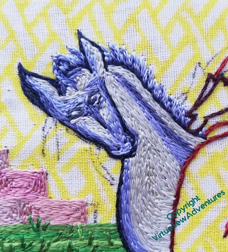
I chose to do a short standing mane for this horse, rather than the flowing locks for William’s horse, but gave it a little quiff of a forelock as well.
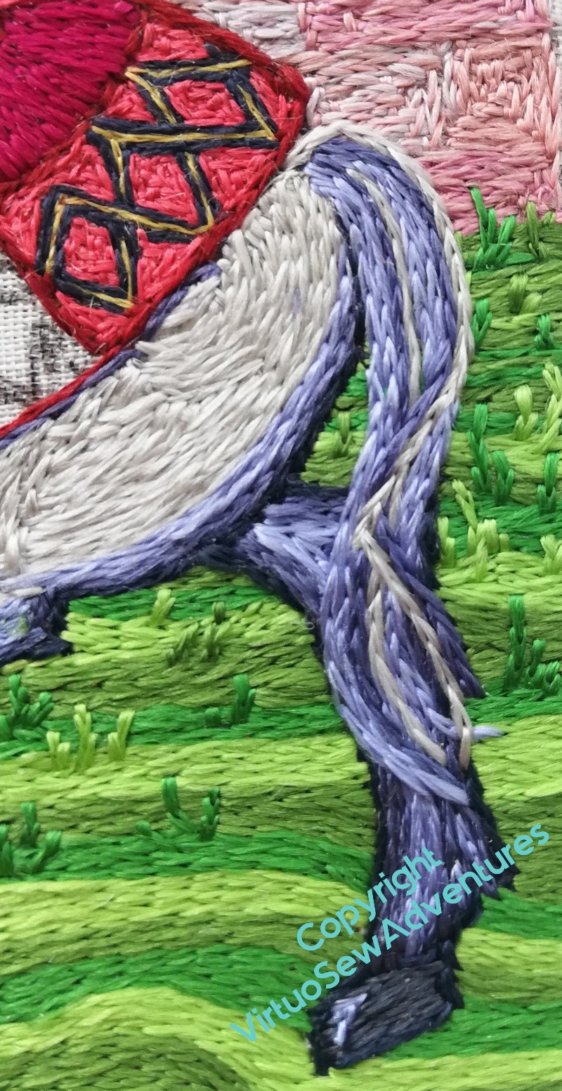
I was trying to create the effect of flying strands crossing over in the tail, but instead I’ve got a kink in it. I might have to do something different there, but until I’ve worked out what, I shall leave well alone!
I have another problem.
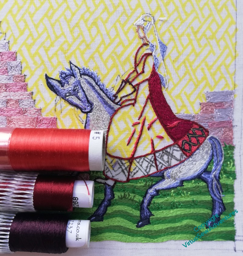
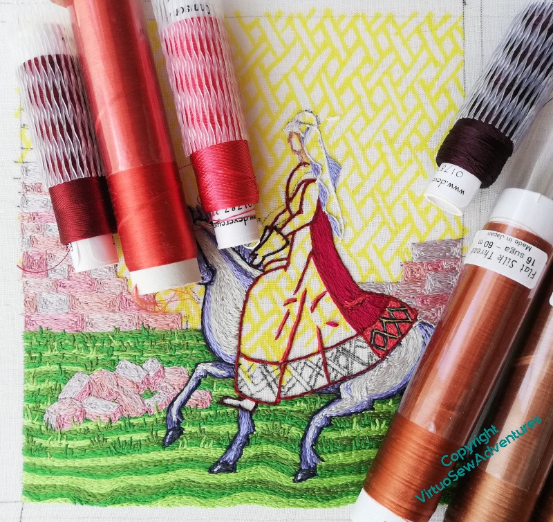
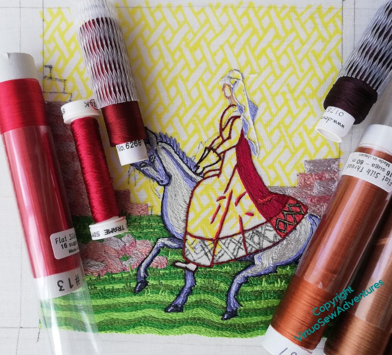
I’m not happy with the colours on her dress, there’s something a bit “off”, not the atmosphere I’m looking for. So yes, I’m going to have to undo the dress.
<fx: growls>