
Presentation for the Amarna Family Group
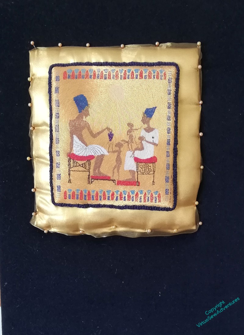
You may recall that when I had finished the or nué I started to apply it to the stela and was very upset because it did not look at all right.
Oddly, it seemed to need backup, as it were. So I thought – Ancient Egypt, gold, let’s give it a gold cushion, as it were.
Only to be less than thrilled with the result. I will grant you that merely pinned in place and without smoothing out the “cushion”, it wasn’t going to look its best, but still..
It has been leering at me across the living room for some months now, and every time I’ve caught sight of it, my head has dropped.
But then I had a thought – maybe what I need to do is pull out the colours in the border.
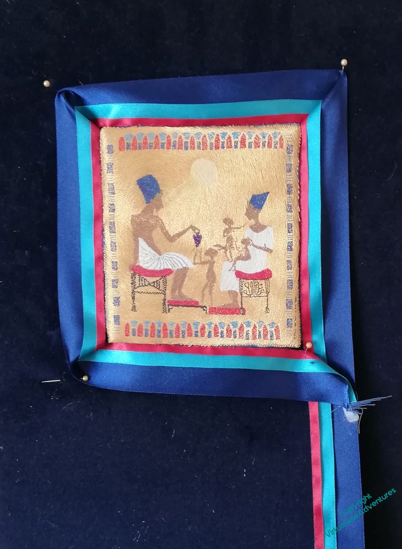
So I bought a couple of metres of satin ribbon in decreasing sizes, and spent quite some time attaching them to one another down one edge.
This is the result, attached in a very off-hand fashion, to be stared at for a while..
I think it’s better.
The question is, is it Best?
The colours make the gold sing beautifully and bring out the colours of the couching. It looks like a perfect solution. (The only thing that *might* work, if you’re not happy, would be a gold edge couched around between the red and the turquoise. But I think that might look Too Much.) It is a vast improvement on that deadly gold “cushion” which killed the embroidery.
It looks much better.
Definitely much better. Repeating some of the colours from the embroidery certainly complements the gold without overwhelming it.
The ribbon is better as it’s picking up on the colours already there. Only you can say for sure though as seeing it on a screen is t the same.
Certainly much better. Rehashing a portion of the varieties from the weaving unquestionably supplements the gold without overpowering it.
A great improvement, the colours help show off the gold work embroider. How are you going to display this piece? A wallhanging? A cushion?
I think this is very promising indeed, it really complements the embroidery making it shine and highlighting the borders. Definitely best in my view, well done you for perseverance 🙂
I love the lapis blues as a framing. Much better than drowning the group in gole.
This is a lot better but you will have to decide if it is “the best”.
Amazing how much difference the ribbon border makes – an inspired solution, I think.
Love the blues – they add such life to the whole of it.