
More work needed…
If you compare these two layouts, you may notice a bit of a difference.
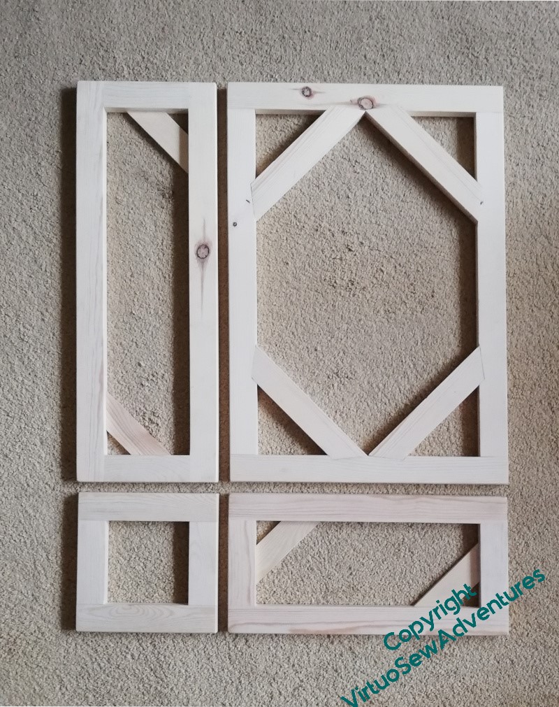
When I pulled out the panels to give the measurements to my friendly carpenter, I reduced all the dimensions slightly to concentrate the whole assembly. I’ve noticed recently that whereas watercolours are the better for being mounted with plenty of “air” around them, embroidery is often the better for being framed quite closely. This will help me to achieve that.
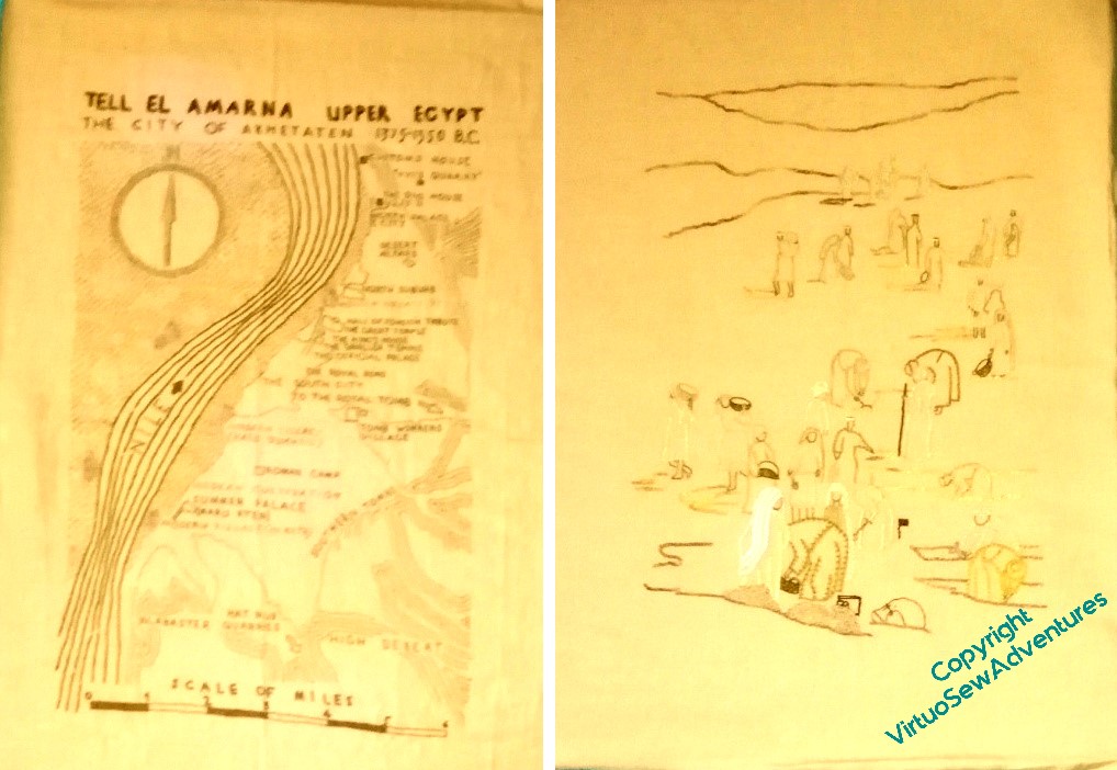
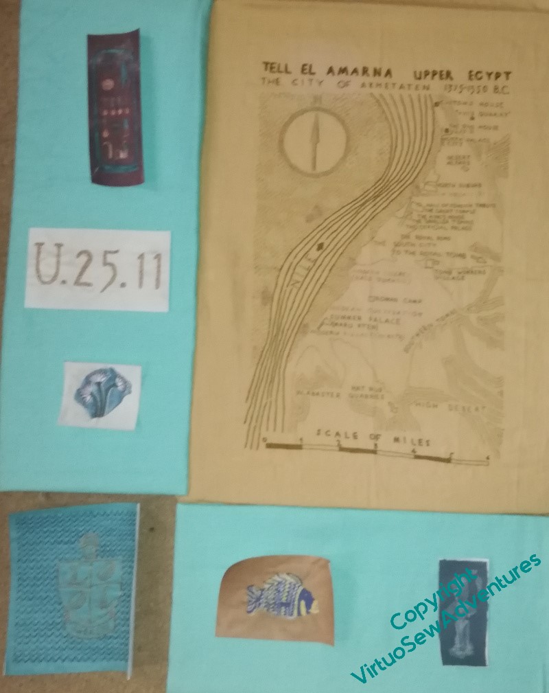
When I have the coloured fabric mounted, I will be able to continue planning the placement of the spot designs. And in the meantime . . . I’ve had to pull out the colour and contrast above here, to try to show what is worrying me here. These two panels are supposed to balance each other, and I don’t think they do, or at least, not yet. I think I need to do a bit more stitching on The Excavation so it can stand up to the Map of Amarna.
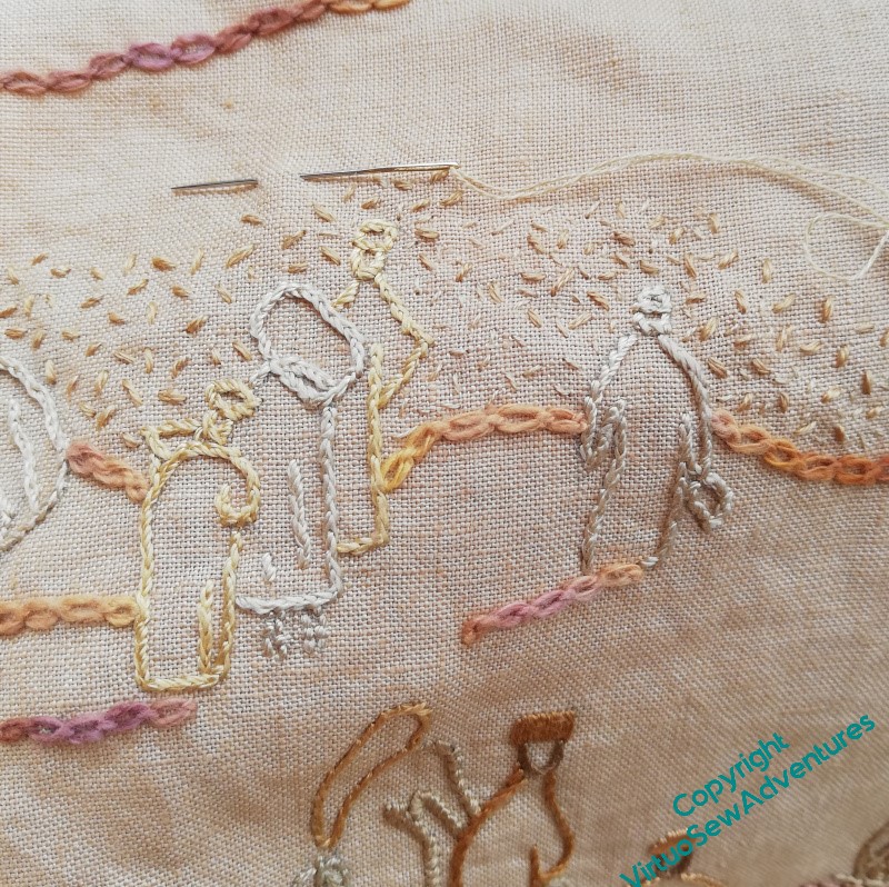
I’ve started in the far distance with some seed stitching. It’s going to take some time to get the right level of texture in the right places, but it’s always good to have made a start!
That’s a tricky challenge. Can you get some shading into the corner areas use? Just darkening the ground at the bottom corners, and echoing with darker shading on the further sand hills would giveth piece more shape – the map is a definite rectangle, the dig fades out irregularly. The other alternative would be a border line, but I think that would be too harsh.
I am sure you will find a solution that you’ll be happy with.
I suggest you give a title the Dig at the bottom of the embroidery which will give it weight here and then introduce more mid and dark tone texture there, fading out about half way up. I’m amazed we didn’t spot this before!!!
I think you are right it is unbalanced at the moment.
Starting is always the most difficult bit!