Working On The Lotus Flowers
Blended Thread 1
Last week I posted about my progress on the Lotus Tile Fragment, and commented that I was rather concerned about producing a suitable effect. Remember, the original fragment was described by Mary Chubb as “faintly lilac-tipped”, and my first effort looked distinctly clunky. That wasn’t going to be suitable, because the Amarna-period art of ancient Egypt has a particularly graceful style.
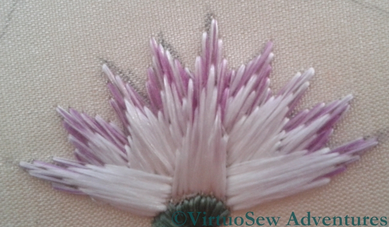
Solid Tip
There were a lot of useful suggestions in the comments, and more than one encouraging email conversation as well (thank you all very much!), and I’ve enjoyed experimenting in the week since then.
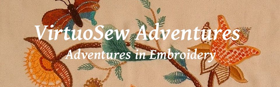
I’ve now got two lotus flowers using blended thread, and one using solid colour tips, and I can’t quite decide between them.

Blended Thread 2
If it comes to that, I’m not sure whether even I, who stitched them, can tell the difference between the two blended tip flowers! In one case, I simply split my original silk thread in two, and laid the two halves side by side, whereas in the other, I split each half in half again, and reassembled them alternately.
I suppose that if I can’t really tell the difference, that suggests that splitting and reassembling once will be enough. I just need to decide whether to go for blended silk or separate colours.
Decisions, decisions!
Definitely the blended tip – it looks like brush strokes.
Definitely Blended tips two – unless the difference is in the photography!
I love blended tips two — it really looks like painting and captures the delicacy of the flower. Whichever you choose its going to be lovely.
These lotus flowers are lovely!
I prefer the blended tips, but the solid tip is striking too (I always say I don’t believe in horoscopes ….. but then use the excuse that I am a Libra and therefore can’t make a choice!!)
I have a slight preference for blend 1, although blend 2 looks more subtle. Though if you can’t tell the difference on the real ones, it may be just the difference in photography! 🙂
There is a difference and my vote goes to the blended tips but that is because I can see the contrast to the solid variery. Maybe you need both to achieve your intended effect?
Carolyn suggested a mixture of both solid and blended, which I think is a lovely idea.
I think blended 2 is a little more subtle (given variations in photography) which actually counts against it when viewed from a distance? Depends how faintly tipped you want your faintly tipping to be.
my vote goes for blended….and that’s not to denigrate the single colour either as both are beautiful….you embroider perfectly.