
Mounting Choices Again
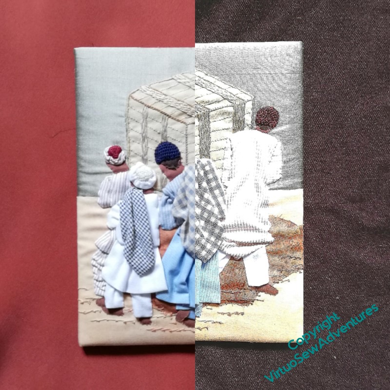
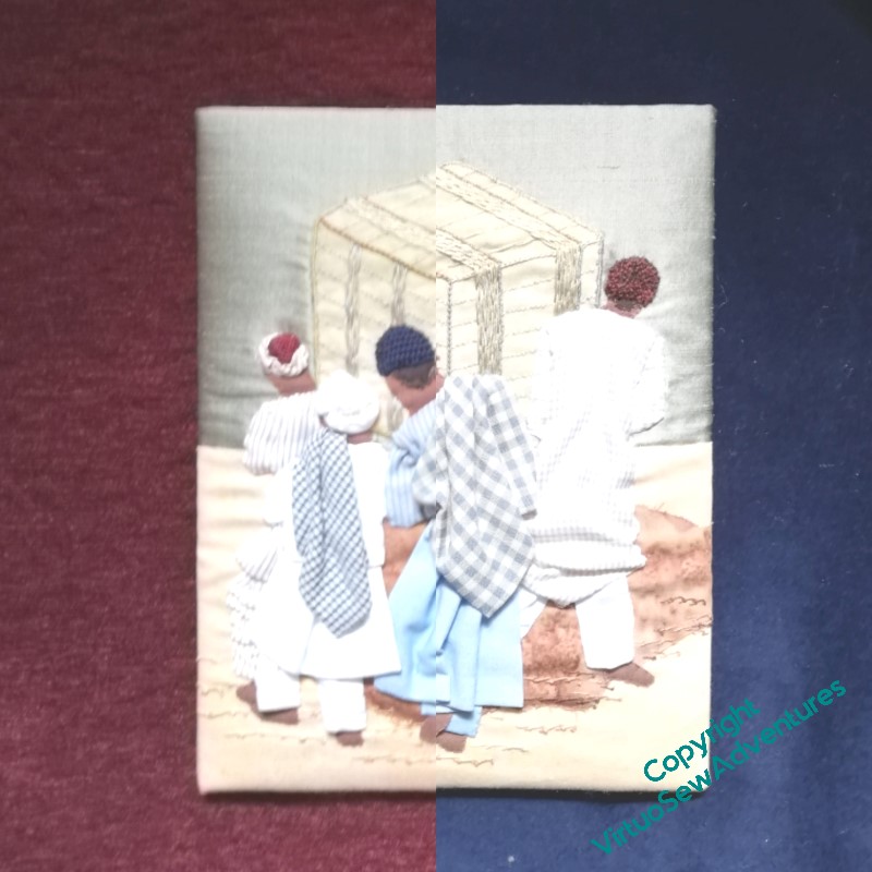
There were some quandaries about mounting “Loading The Felucca”. Burgundy? Navy? Copper? Brown? I posted these pictures on various social media sites – each of which picked a different preference, which wasn’t helpful at all, but at least left me free to apply my own judgement.
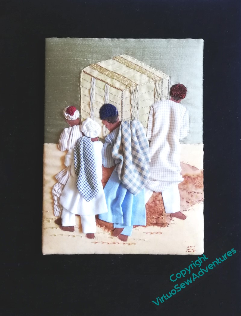
So I chose the same navy blue velvet I used for the Amarna Royal Family. All the other fabrics had something going for them, but the navy blue brought out the colours and shapes more emphatically and truly – although I fear you will have to take my word for it, as my photograph doesn’t really bring out the blueness of the velvet!
However, in the course of the final mounting process, I discovered that the embroidery was no longer visibly signed. Curses!
Then I checked, and neither was Ankhsenspaaten. Curses again!
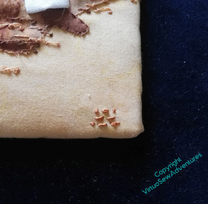
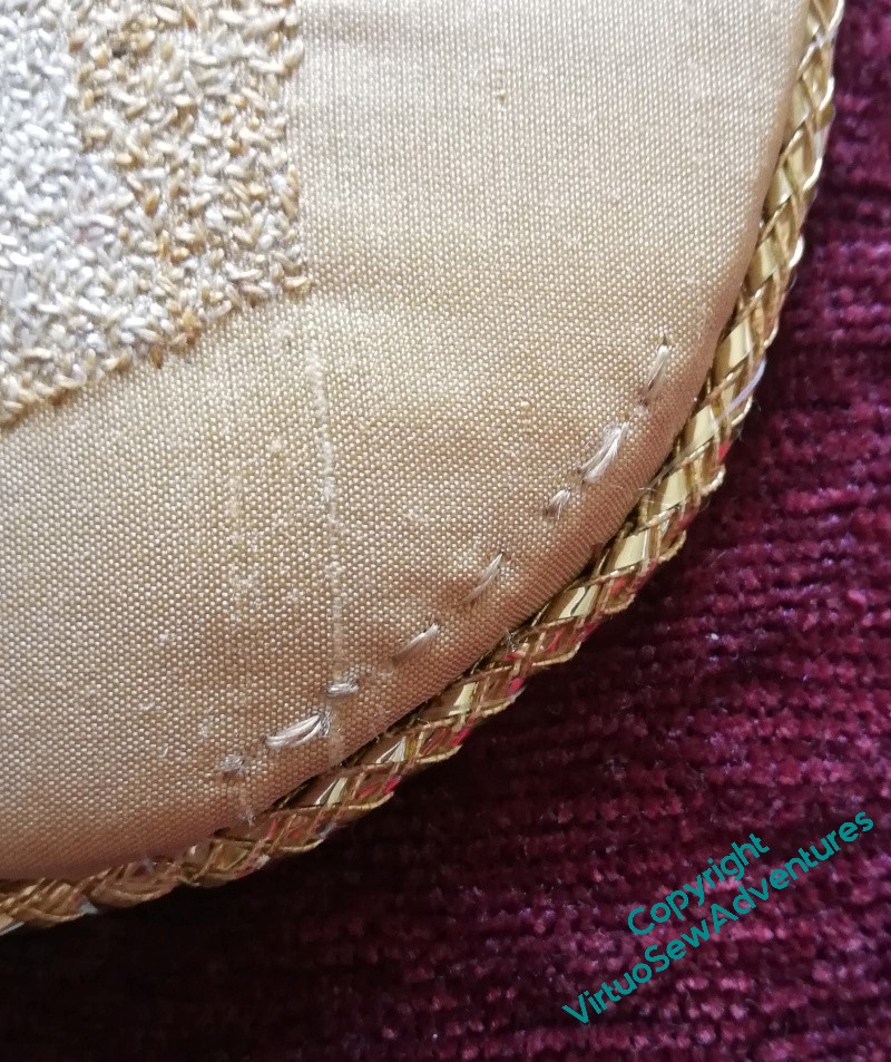
They are now…
It’s a strong picture that does work with all the colours, so matching another panel will help give some extra structure an coherence to the final exhibition.
I like your colour choice, it works well.
The navy shows up much better on your signature photograph and works well. x
The darker the mounting fabric, the more the eyes can focus on the embroidery, so you have made a good choice. Good that you discovered the missing signatures and that they are now in place.
I think you’ve made the right choice.
I liked the brown originally, I think, but the blue looks even better.
I’d have gone with the navy blue too. It looks really effective.