
Fishy Lessons
So now, having finished my two fishie experiments (there may have been a third in the pipeline, but I’ve forgotten what it was!), what can I say I’ve learnt?
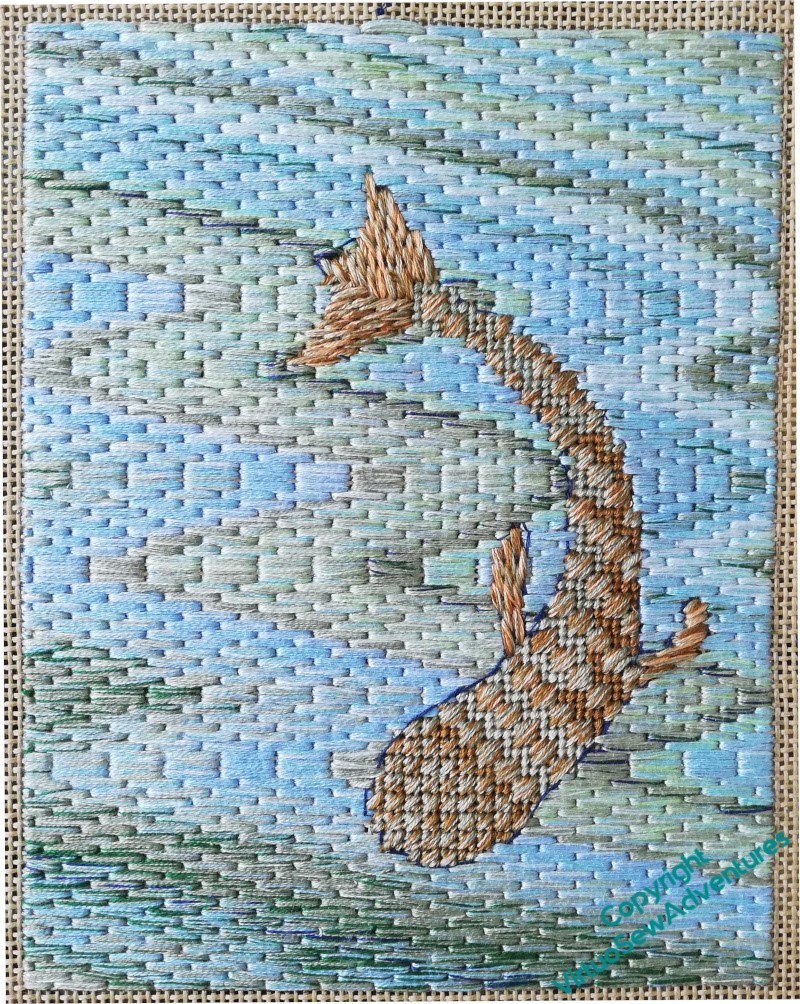
First, canvaswork stitches against the freeform bargello. There’s a sort of stillness, almost a static quality to this fish, in spite of the flowing bargello.
The bargello works well, although now I look at it, I’ve not managed to keep it flowing from top to bottom. And it was remarkably difficult to keep track of the pattern across the fish.
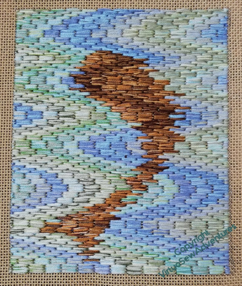
The second fish was an attempt to suggest the broken outline of an object seen through the interface between air and water. So this time, the pattern of the bargello ran through the fish, and I had to decide at each edge whether to stitch in the fish colour or the water colour. The pattern runs more successfully from top to bottom of the piece, but the whole thing looks a lot more active, maybe too active.
I think the colours are a bit too bright and swimming pool-like, but as these are experiments, using stash, I’m not too concerned about that. What does concern me is that even after these two, fairly substantial pieces, the appearance of a particular blend of threads as it was stitched was sometimes a surprise. It will be hard to pick the right colours to use if I can’t rely on my imagination of how the thread will stitch up.
So, I don’t know whether I will use this idea for the borders of Placidus, but I’ve got plenty to think about, haven’t I!
Episode 69 of Slow TV Stitchery is now live, on talking projects, the development of musical taste, and the challenges of suggesting wind over the water.
I like the shimmery quality of the underwater fish very much and think they are both very appealing. But I do understand how it is when you have a particular idea in your head and what is appearing under your hands just doesn’t quite match it.
I think you have managed very well to depict fish in water.
Static, well many kinds of fish do park themselves and wait for food. Look at carps in a pond, they tend to hang around the edge or near the bridge where they know people will come and – maybe – throw something for them to eat.
Looking at the fishes together, I think the softer colours of the top fish and the loss formal technique of the lower fish would produce something more effective.
Fish tend to be pretty hard to spot from on top, unless the water is sufficiently in shadow that you can see through it easily; and even then, they are often mud coloured from above, the glint of a silvery underside something seen only when they move. And if the water is transparent enough to see the fish, you are mostly seeing river bottom not blue sky reflections. Sorry, that’s reality for you. At least you can indulge in a little fantasy in your stitching!
Art isn’t required to be photographic, and textile art earns even more leeway because of restrictions. I think you’ve done a marvelous job, creating beauty and texture.
I like both fish but have to say I prefer the second, it is so ‘watery’. Just what I see from the jetty but if I was looking into a pond it might be more like No 1. I think it depends on just what look you are trying to achieve.