
Jacobean Coat – Sleeves – I was right!
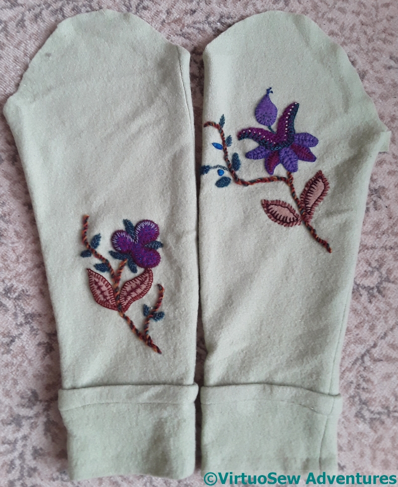
When I finished the first set of embroidery on the sleeves of the coat I said I thought it might need Something More.
After some thought, I decided that the Something More in question was a bit of light. This required a little negotiation, as my client (my mother) had wanted rich colours, and had originally enacted a veto on the lighter ones I had picked out. But then, she’d not seen what I had in my mind, and once she did, my tentative suggestion of a few lighter bits was met with a definite “Yes”.
She also said that what I’m doing is not quite what she had in mind, but it’s better. Phew!
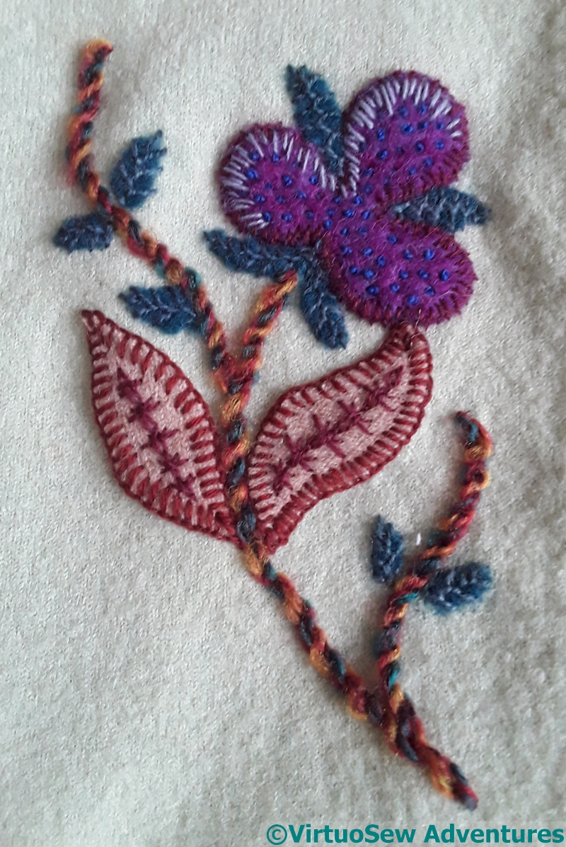
The first small, exploratory illumination was to add some pale blue stitches around two of the lobes of this bud (flower?). I didn’t want to add too much because, first, this isn’t meant to be actual illumination, and second, I felt that if I added these stitches all around, not only would I run into trouble in terms to angle and sense, but it would suddenly start looking a bit stiff and too “matchy-matchy”.
There’s a phrase I never used as a teen, even though I certainly had the concept…!
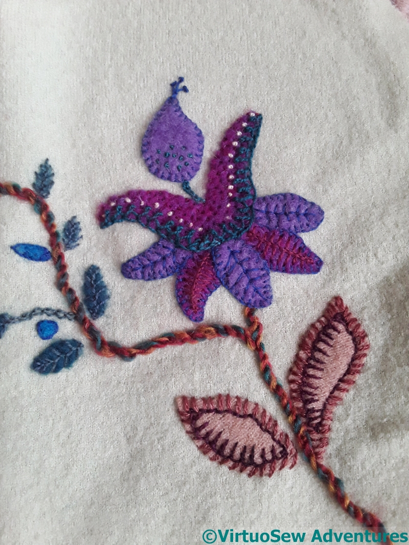
For the second sleeve, it was harder to settle on the best way to “lift” the motif. There was already the tiny tuft of pistil stitches stitched directly onto the fabric, which had done something a little similar.
For now, I’ve simply added a row of French knots highlighting the curves. The yarn is mohair, and has a lovely high shine which adds to the variation in the effect.
In case I needed to say so – I am really enjoying this project!
Well, I’ll repeat the title – “You are right!!” . One small addition has worked wonders!! How wonderful is that!!!
Going with the lighter bits was a good call!
Gorgeous. Very effective!
Lighter, but far from wishy-washy, let alone matchy-matchy. The flowers have more bounce and interest. This coat gets better and better – i can’t wait to see it modelled in all its glory!
Very delicate work., Must goes well with the coat.
lovely colours, you can’t go wrong with purple
Isn’t it amazing what a difference those small additions made. And yes… I can tell that you’re enjoying this project. I can’t wait to see the coat when it’s all together.
Just what it needed.
Yes, I think the added lighter stitches are effective