
Stella’s Birds – more thinking about the design
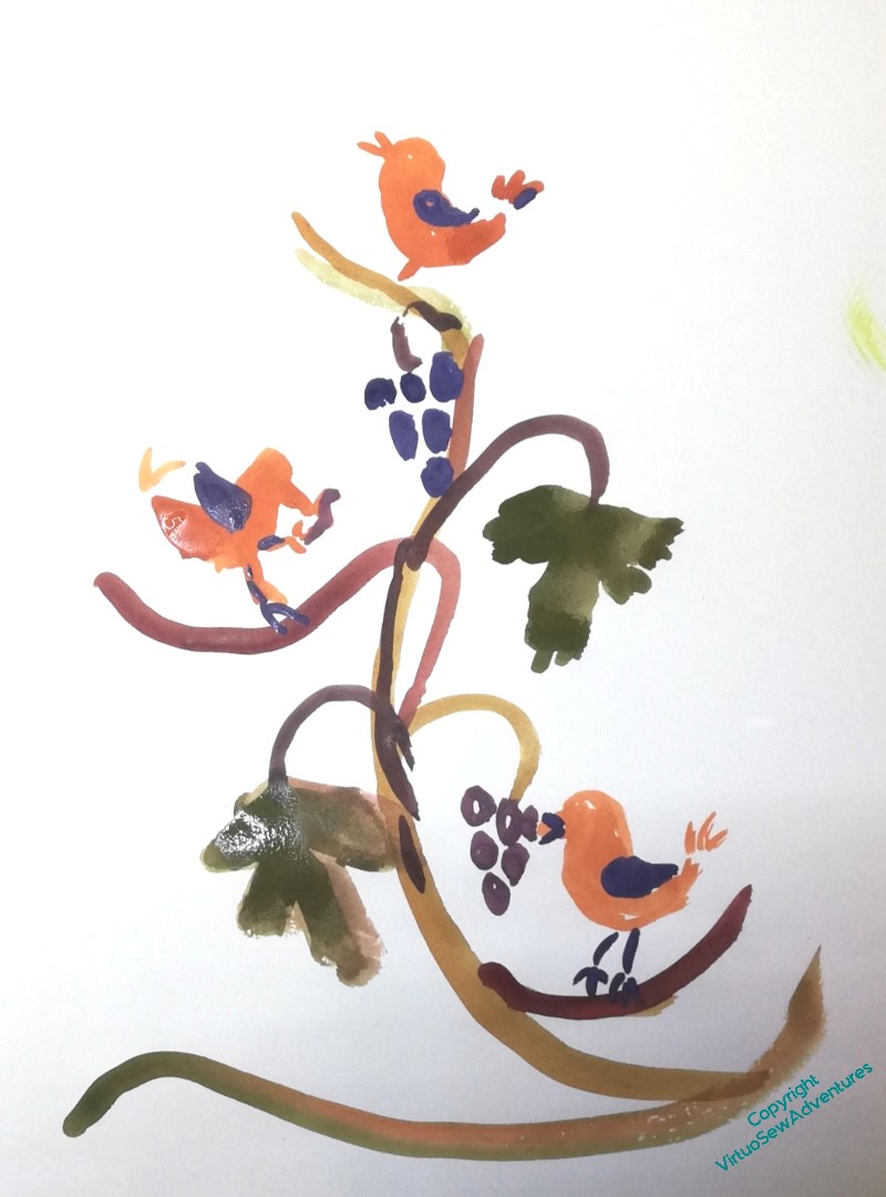
You may recall that I said last time I mentioned the design I am trying to work out here, that it was proving very difficult to balance three birds not looking the same way, and that making them look the same way didn’t work at all.
Then it occurred to me that – obviously! – the two earlier birds would be facing towards the one that’s singing. Partly because we always turn to look where the noise is coming from, and partly because that is their aspiration.
You will notice that all of the rough designs I’m playing with here are in colour, which is not at all in keeping with my idea of using Mountmellick work. That’s because at present I want to find it easy to distinguish parts of the design. When I’m a little clearer about the shapes and their flow, I’ll start moving towards a more tonal patterning that will help me to think about stitch choice.
In the meantime, I am playing with shapes and layout in very vague terms.
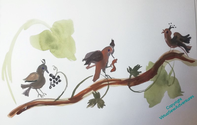
Eventually, I want the birds to be quite medieval and slightly mad in appearance, and I’m thinking of trying to find some suitable thread – a round, matte cotton in two or three thicknesses – in a variegated colour that will help me to create the look of carved wood. The challenge is in finding it. This is not something easily bought online with any confidence, and so many of the thread companies don’t go to the shows anymore.
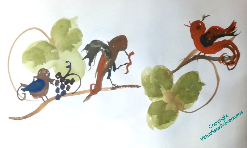
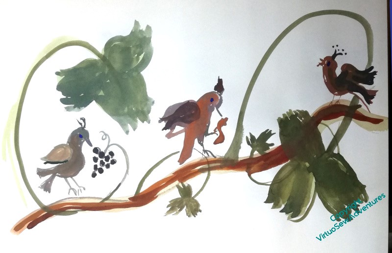
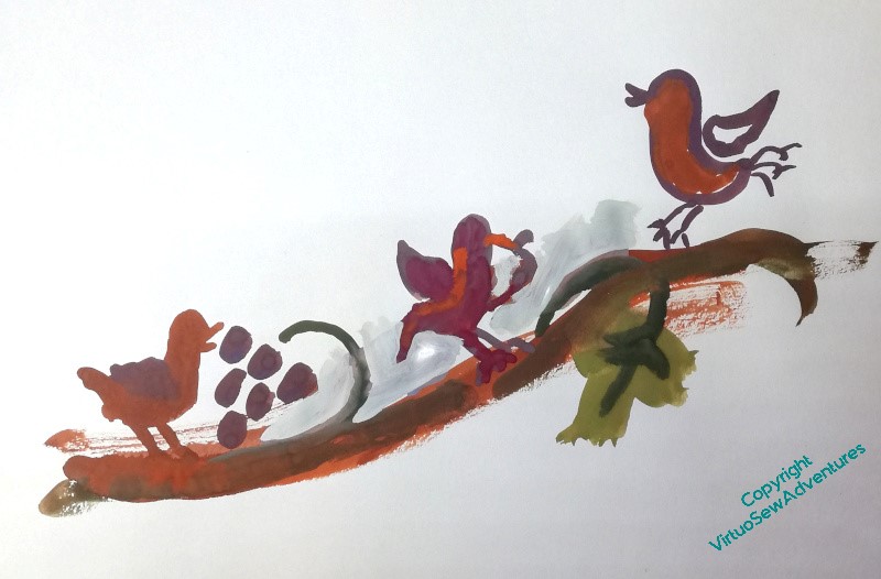
I definitely like the design at the right, which you’ve darkened down in the second image. The first one, with a little pyramid of birds contains that sense of progress upwards, but with the birds on the rising horizontal each seems to have a better defined space of its own while still being part of an upwards movement. I prefer the tendrils on the lighter toned version, though I think the singing bird might like to move forwards a bit, and be more puffed up with his celebratory enthusiasm. The space in front of him does seem to give more room for his song though.
Good thinking, doing the design first in colour for clarity, then toning it down to the subtlety you desire.
Quite medieval and slightly mad, eh? It makes me think of some quirky Crewel Work designs rather than Mountmellick…
Have fun!
I have to say I like the placement of the first design, and I agree with Queenie, it looks like Crewel work at the moment.
I too prefer the first one and love the idea of mad birds!
I am sure you’ll end up with a design that works. As for thread, have a nose around shops selling knitting and crochet cottons. There are a wide variety which are softer than the crochet threads of our youth. If you are intending to use colour, you can always variegate the thread yourself with ink or dye.
Just to add, that if you want the classic offwhite Mountmellick threads and fabrics, Empress Mills are your go-to place.
Mad medieval sounds pretty good to me. Good luck finding those threads – could you colour some plain white thread yourself…?
These are delightful designs – I love the way you’re trialling these to see what composition will suit your desired outcome. Such a wonderful part of your process that is always enjoyable to follow.
I do like the first design and to me it has the feel of a medieval page edging; those little narrative glimpses of an allegorical world.
I’m loving your mad birds.