
The Head of Nefertiti – working with Silk
Trial Weaving
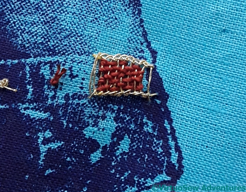
You will recall that I was rather underwhelmed by the effect of my first attempt at weaving the silk into the gold. Leaving the threads loosely packed to allow the gold to show through allows them to look untidy, and the colour is somehow a little flattened, not the rich, strong colour I wanted.
Different silk threads whipped in
So I decided to work the whipped style of filling stitch instead. It creates a strong colour, something like a grosgrain ribbon, in fact.
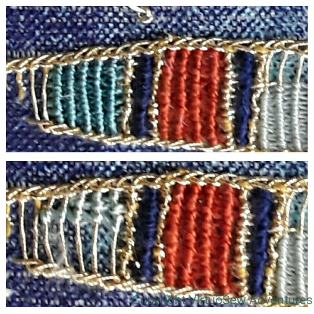
I’m using primarily colours from the Mulberry Silks “Nefertiti” colour range (appropriate, don’t you think!), and I’m happy with the rusty red. The navy is actually a heavy perle type and I’m not sure where it came from. That works too.
The lightest colour, however, on the far right, is too fine. It produces too retiring an effect, and weakens the whole effect. So I tried one of the stranded silks from Thistle Threads (lower example, left), and wasn’t convinced by that, either.
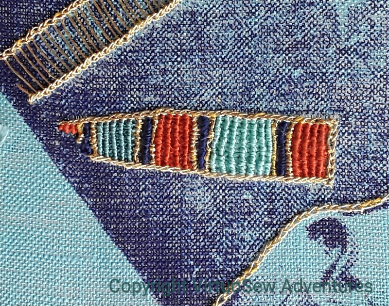
Third trial
This looks better. In fact the two light blue-greens are different, although that isn’t as clear in this photo as I might have liked. They aren’t as green as I would have liked, but I’m reasonably happy. If I decide to redo them, I may have to redo the whole thing, as the unpicking earlier on has left the Ladder Stitch a bit floppy.
Wonderful detail with those silk threads!
I really like the effect you have achieved – I wouldn’t unpick it 🙂
I think you’ve got a great result there. The blue-greens look right to me. Using the slightly less bright colour at the back gives an effect of the band going into shadow where the print is shaded. In fact, if you had a slighty greyed/darker shade of red, that might work well for the little triangle at the very back, making it also seem to fade further into the background.
That is very pretty. I love how it looks with the whipped stitch
It looks nice. I’m still campaigning for beads, of course, but this looks really good.
Oooh! I really like that third trial!
I really love that red silk, it really suits the design and background colour. I quite like your third attempt! It has a nice balance of colour. I love how you are weaving the stitches – it looks great!
You have a tremendous amount of patience, trying all the possibilities until you find the right one.
I see what you mean about the first one, but the second set looks like a quite eygptian pallete to me – their turquoise was often very blue
I liked the beads but I think the silk thread is better.
I like the final photo, just as it is. I don’t think I would ever have thought to use those lighter shades, but it really defines the darker ones.
Really enjoyed looking at your in progress experimentations with different threads and stitches. Amazing how much difference such a relatively small thing such as shade of colour or thickness of thread can make to the overall look. Mulberry threads are luscious and the colours perfect for this!
Oh, I love this!!
I love how you keep experimenting until you’re pleased with the way each part of it looks. This is going to be a stunning piece.
Thanks so much for linking up to last week’s Stitchery Link Party. Aloha hugs!