Adding details to the Frolicking Calf Fresco
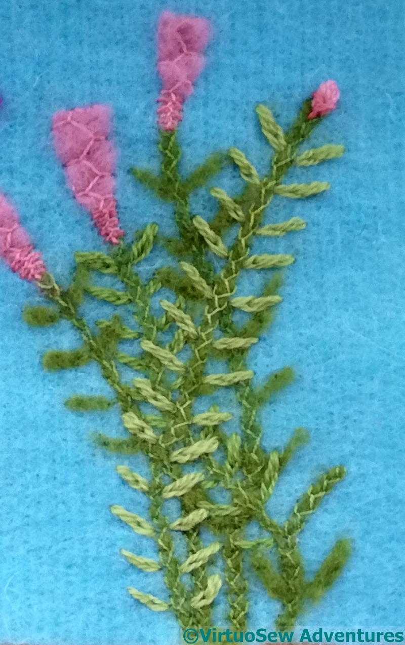
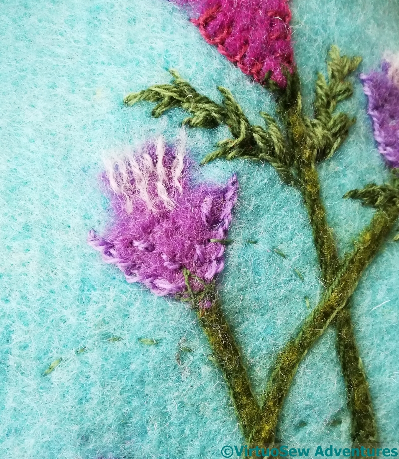
In the case of these plants, instead of stem stitch on either side of the stems, I narrowed and neatened them with a single felting needle, and then added feather stitch over the top, using another of those lovely Gumnut Yarns. The flowers have a flourish of Cretan Stitch, with two colours at the base.
Then I started to think about the leaves. At first, I was going to add fragments of felt for all of them – the original fresco looks as though they are in a single colour – but then I reminded myself that I’m an embroiderer, and after all, texture is one of the reasons why.
The back couple of stems have felt leaves, but then I used loose, large split stitches in Persian Yarn. This maybe looks a little more dense and “jungle-y” than the original fresco, but the Nile valley is famously fertile, after all…
The sharp, curved leaves on the other side were a little harder to deal with.
In the end I decided to make life easier for myself by putting in running stitch curves to help me place them. I’ve spaced them out a little more than in the fresco itself, because the variegated wool thread has created a lot more activity in the embroidered leaves than the frescoed ones.
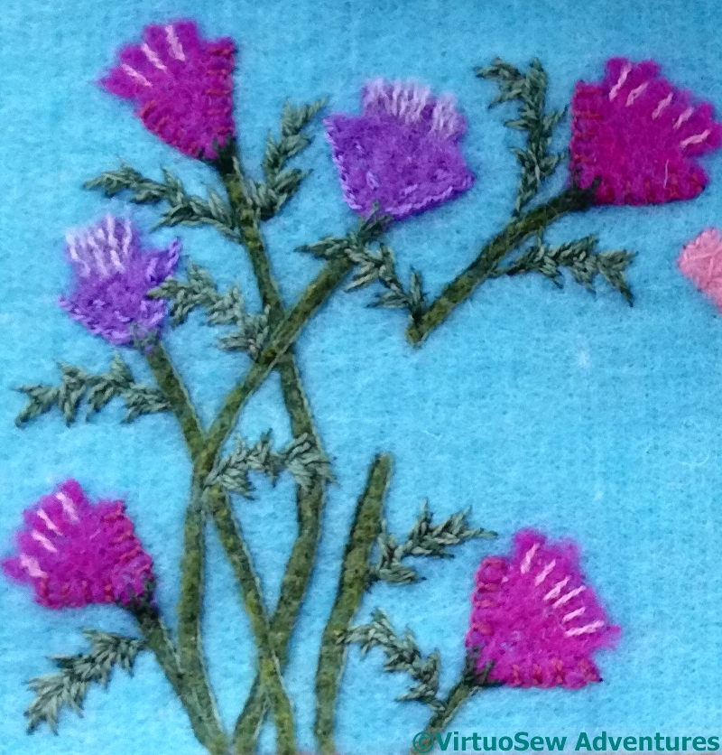
I think that’s clear in this photo of this section. The sharp, curving shapes, the variegated thread and the varying stitch direction all create a rather busy effect, and I’m even thinking of removing the lighter pink stitches in the flowers. That decision can wait until everything is in place.
So I have a little more thinking to do.
I love embroidery on top of appliqué, bias tape, ribbon, and of course felt.
Your woolly plants are looking very nice.
I love the feather stitch on the stems! Very clever. It adds so much texture and interest 🙂
The prickly leaves work beautifully. The simpler leaves are pleasing, too. I am sure you’ll know whether you need to keep the contrast pink on the flowers when you have the main subject in place. (You may find you need even more shading on them, who knows?) It’s good to leave a little room for manoeuvre and for adjusting the overall balance. There’s no reason not to use texture to bring the fresco to life a little. If you wanted to keep it exact to the original, you could have just used a print. How far it is “right” to go in that direction – that’s up to you!
I love this layered look that you have been able to achieve. I think it adds life to the fresco.
Love the prickly leaves and the colorful flowers for the calf to gambol in!
Fabulous details against that blue.
The embroidery adds a nice dimensionality to the plants. I love the colour combinations.
No, no, don’t remove a thing! Unless you need it to look exactly like the original. Gardens are leafy, flowery, sometimes overgrown places, and this all looks so inviting. The felting and the stitching combined is just a perfect representation of the flowers, stems and leaves.
Love your stitches with felting texture.
Those prickly leaves are so beautiful! I love the layered work on the stems and all the leaves. It looks like it would in my garden.