
Still More On The Packing Case
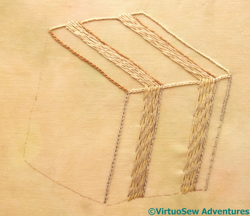
Bands In Place
When I came to work the bands on the “back” surface of the packing case, I felt that the slightly darker yellow silk thread was still too bright, so I worked the Bokhara Couching in two colours – the yellow as the long stitch, and the grey as the diagonal couching stitch. That shadows it nicely, I think.
I’ve only worked the trailing satin stitch edging at the back for about twice the distance I think will be visible. I believe there will be enough layers of fabric over the top, representing the clothes of the figures, that the trail won’t show through – but there is no point making life too difficult!
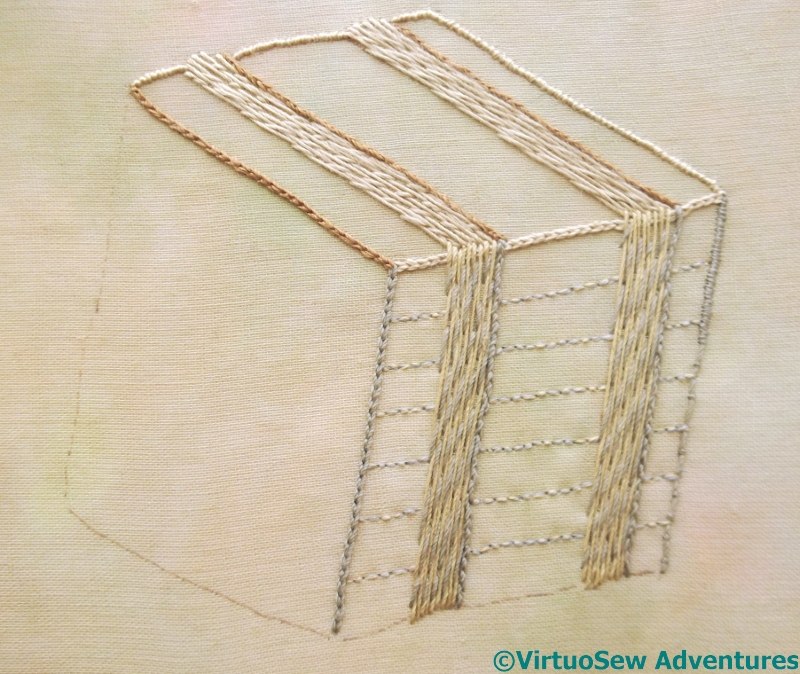
Planks On Side
I want to give some suggestion of the planks making up the packing case, but the silk thread is too heavy for that purpose. Fortunately I have some stranded threads that match the silk very closely, and using one of each colour breaks it up, as does using back stitches.
I used quilter’s disappearing pen to sketch approximate planks. It disappears so quickly that sometimes I’d lost my guideline by the time I was half way across!
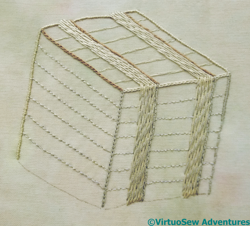
Packing Case
I used a slightly different technique on the top. I’ve laid two strands across on each plank-line, and then couched down each strand individually in a brick pattern, It creates a less spotty effect, and I am now wondering whether I should take out the backstitch and use this other technique instead.
I’ve done the trailing satin stitch on the back edge, because I am fairly sure about that, but the planking still leaves me in a quandary. Have I used the right technique? Do I need to do more, to differentiate shadow from sunlit? Dare I leave it as it is, put it in place, and add any other details later?
So I am now, once again, at the “Stare at it and think” stage.
It’s really taking shape and looks good.
The two-colour couching works very well. Just the right degree of woody texture. You might try running a few very-light coloured, very fine threads across the planks on the sunny top side, to lighten the surface. Irregular running stitch, to suggest roughness in the grain. I don’t think you want much grain on the left side, if any, and the near side is great as it is.
I like it, very realistic.
Have you tried holding it up and looking at it in a mirror – I know it sounds strange but I do it with quilts, as it somehow gives you a different view!
Yes, the darker colour gives a better definition to the shape.
It looks wonderful! Your stitching has definitely caught the feeling of the crate.
I think you have now “knocked the nail on the crate” – it looks very realistic.
it’s really wonderful – I love the effect the two threads give, it was a great decision.
this is amazing. I love how you have captured the 3D element of this with your very skilled use of threads….
Reading your blog I got to know more about the techniques of stitching.
The stare at it and think stage can last much longer than the actual stitching, in my experience! You have definitely created a three-dimensional and realistic packing crate.