Continuing The Crest for the Dig
Working On Crest
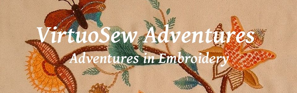
The sensible first stage for the Crest was to do the goldwork. First of all, I’m not at all sure how I am going to do the background, so I should concentrate on the bit I’ve decided on. Secondly, I was a little worried that I might not have enough gold thread of the type I wanted to use…
That being the case, I decided that rather than giving each line a stop and a start, I would try to keep the lines going. That has meant a lot of thinking had to go into getting all the double lines right, and a bit of a fiddle at the central crossing point!
In the interests of both contrast and economy, the charges – motifs, in non-heraldic language – and the motto will use only one line of gold, but the shield, the Gufti’s head, and the scroll will use double rows to help pull it out from the background.
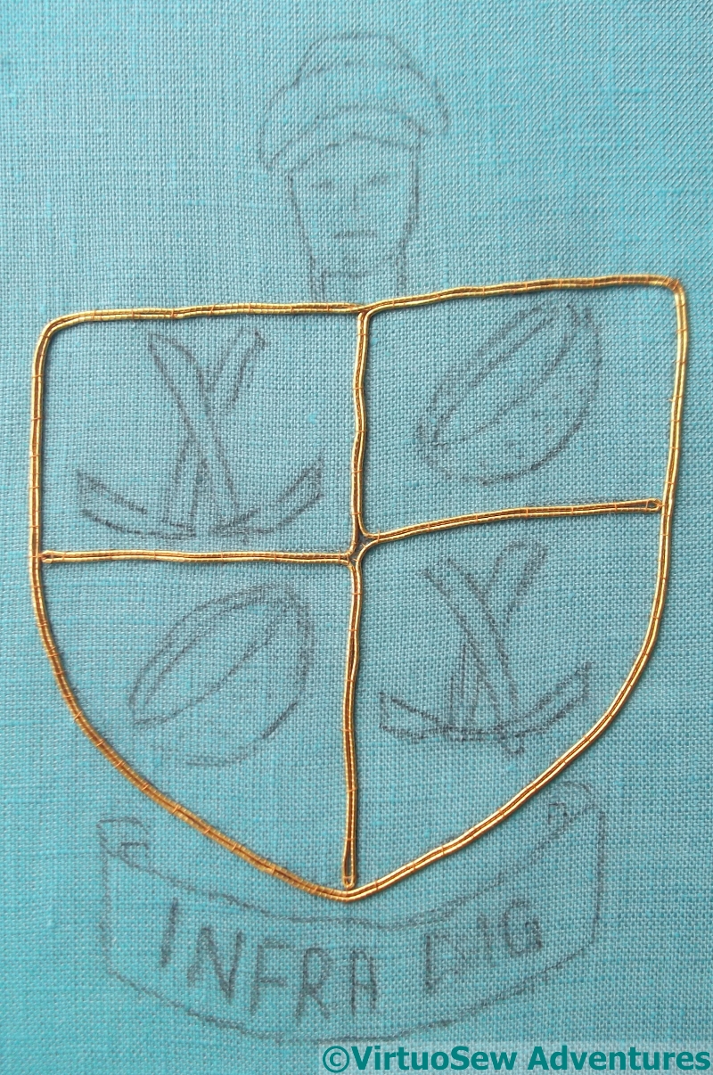
Goldwork Done
The goldwork of the Gufti’s head doesn’t have quite the same sense of life as my original sketch, but I am very pleased with how the folds of the turban turned out.
The charges – crossed touriehs (mattocks) and rush baskets (used to carry the spoil away) – have turned out well too. I was concerned that I might need to create a woven effect on the baskets, but now I look at the finished goldwork, I think it is enough to create the effect I am looking for.
The motto is a little uneven, but after all, it recalls Pendlebury just doodling something over dinner, and while drawing and sketching were vital skills for archaeologists – in fact they still are – I doubt he would have put the care into a doodle that he put into recording a trench!
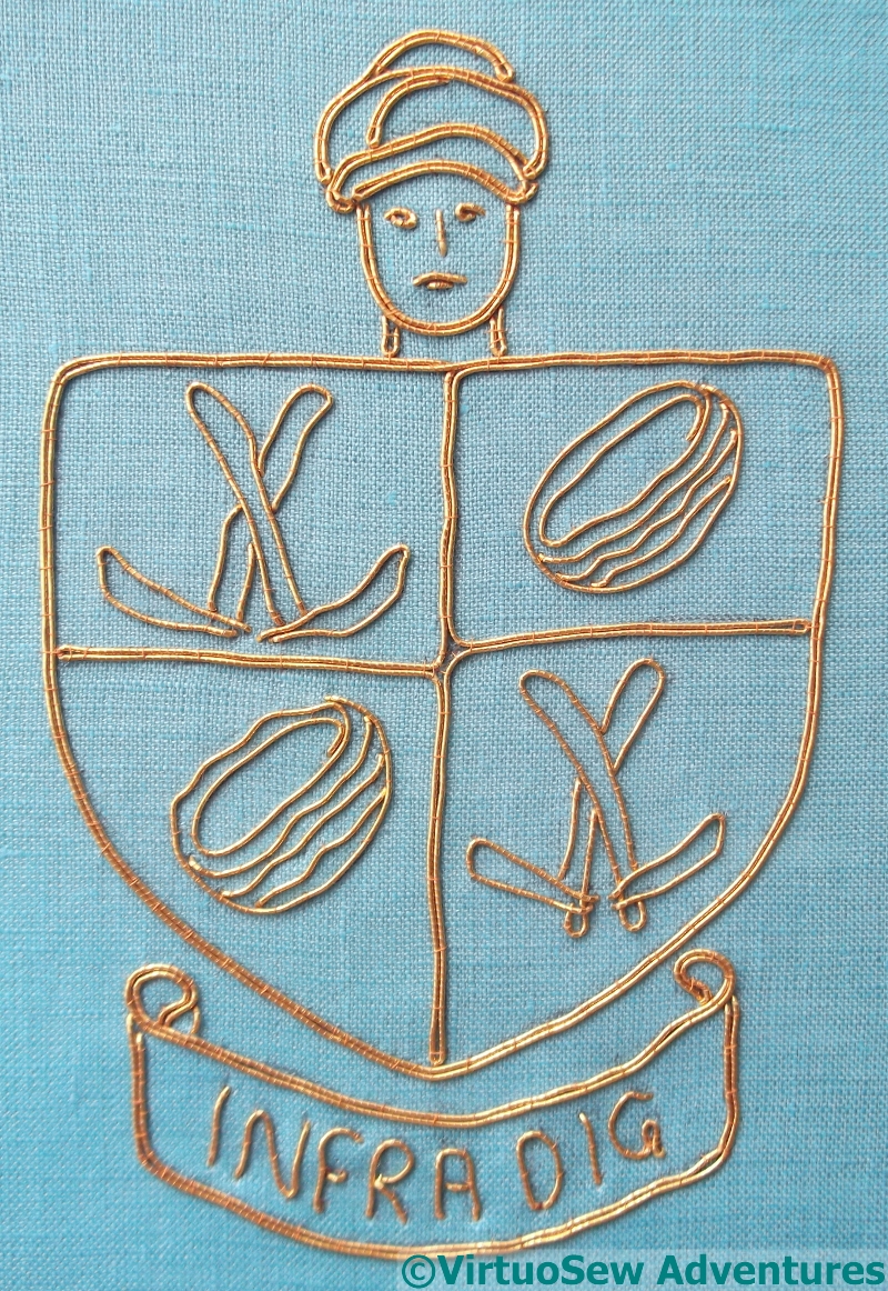
Trialling Backgrounds
That didn’t take very long, did it. Suddenly I realise that I should have thought it out a bit better before I started. There’s a rippling pattern sometimes seen on plaster which I would like to recall in the background. It’s a simple pattern, but I think it could be effective – if I can get it right. In order, the trials I have done here show:
1 – Variegated Pearl cotton following a ricrac “stencil”, couched as invisibly as possible using a single strand of stranded cotton.
2 – Variegated Pearl cotton in a variation of cloud filling stitch that creates a ripple effect instead of the usual diamond pattern.
3 – Variegated Stranded cotton in rows of open cretan stitch, using three strands.
4 – Variegated Stranded cotton in Arrowhead Stitch.
I’ve discounted the first and third possibilities, but I’m still staring thoughtfully at the other two.
The goldwork is fine – it certainly doesn’t look ‘skimpy’, however economical it actually is. The shapes are very clear and they read well. I think that your ‘rippled’ background needs to be fairly low-key to avoid swamping the shield, while still giving the background some interest. Perhaps horizontal rows of open cretan in a single strand of the stranded cotton might do the trick? Otherwise I like the shape of 2 better than 4, but would suggest a lighter weight thread or a lighter variegated blue, closer to the fabric colour, so it is less obtrusive. What do other readers think?
I agree that the color would be better if it were paler, or more muted – more a tone than a color. I’m not qualified to talk about the stitches but if they are intended to represent the ‘ripples’ in the plaster I would think they shouldn’t be too straight or even too defined.
The goldwork outline looks great and I agree with Sue, no.2 is my preference.
Add oil!
it’s looking good. I know nothing about heraldry so it’s good to learn something. Is there any way you can make your blog pictures bigger, I struggle to see the detail in the smale images.
I also favour 2. I think you have caught that sense and feeling of that original sketch well – I particularly like the baskets.
I am very much drawn to the second image, it has a simplicity yet I suspect it was anything but simple to execute.
I love that second one!
The goldwork looks really good. I had just decided that I preferred No3, when I read on down to find that you had already discounted it!
I love how your goldwork has turned out. I don’t think it has lost any of the original sketch, and the thread looks to have laid beautifully. Well done so far! Sounds like you have a lot of thinking to do before the next stage.