A further episode in the Difficulties of Assembly…
I spent hours – literally – making some kumihimo braid to trim the main Amarna panels, and finally finished the second three metre length during the MathsJam weekend in November. Rejoicing at this success, I pinned the braid in place over the interections in a panel, sat back, and was rather pleased. I thought it looked crisp and added a lovely finishing touch. WooHoo!
Then I put an overlay over the top and I was Most Disappointed. Rather than adding a neat little finishing touch, the braid seemed to shout over the embroidery, breaking up the panel into the constituent parts, rather than stitching it together.
That’s very odd. I’m not sure that the photograph really conveys the impression, but it was very striking in real life, and when I checked my perception by showing the piece to my mother, she agreed. She’s not been living with the project as I have, so I can trust her not to be jaded and seeing difficulties where none exist!
So that braid may need to find another home.
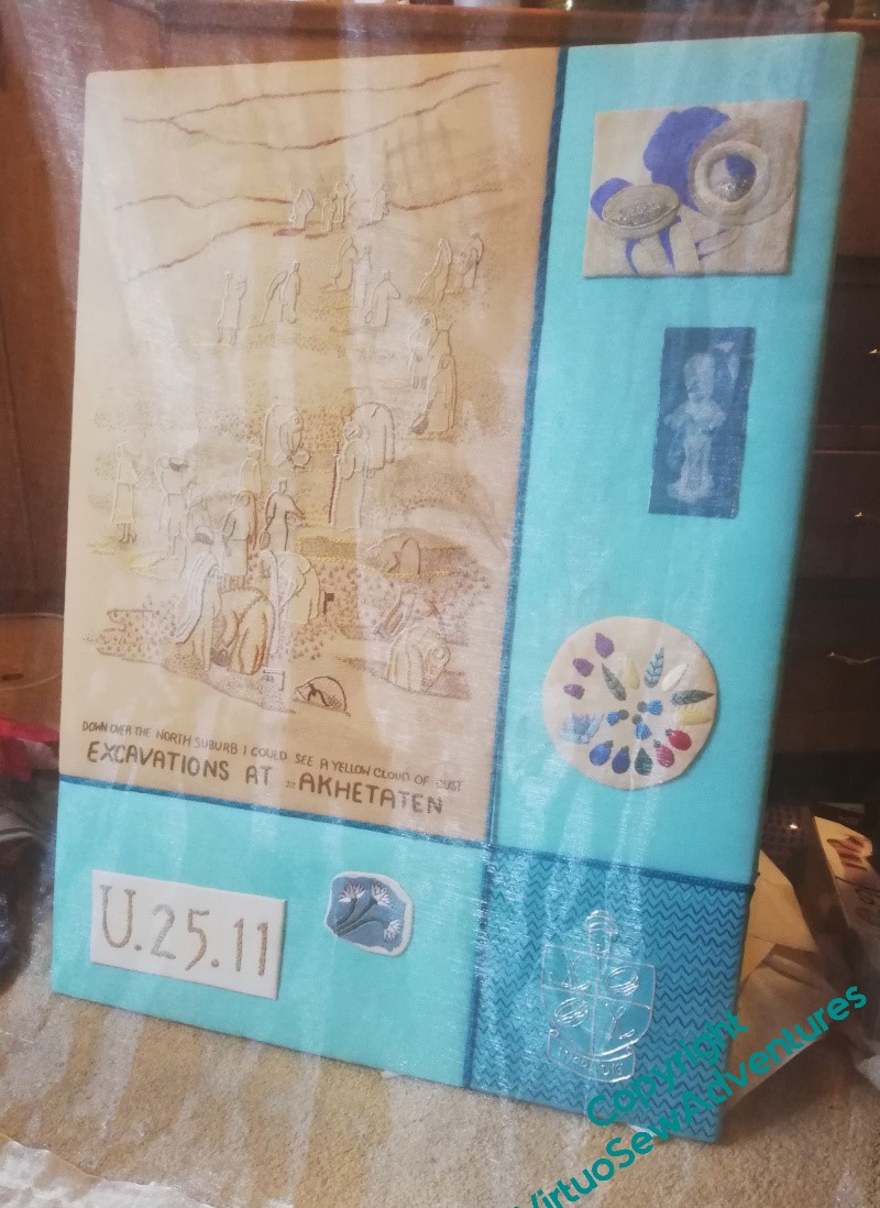
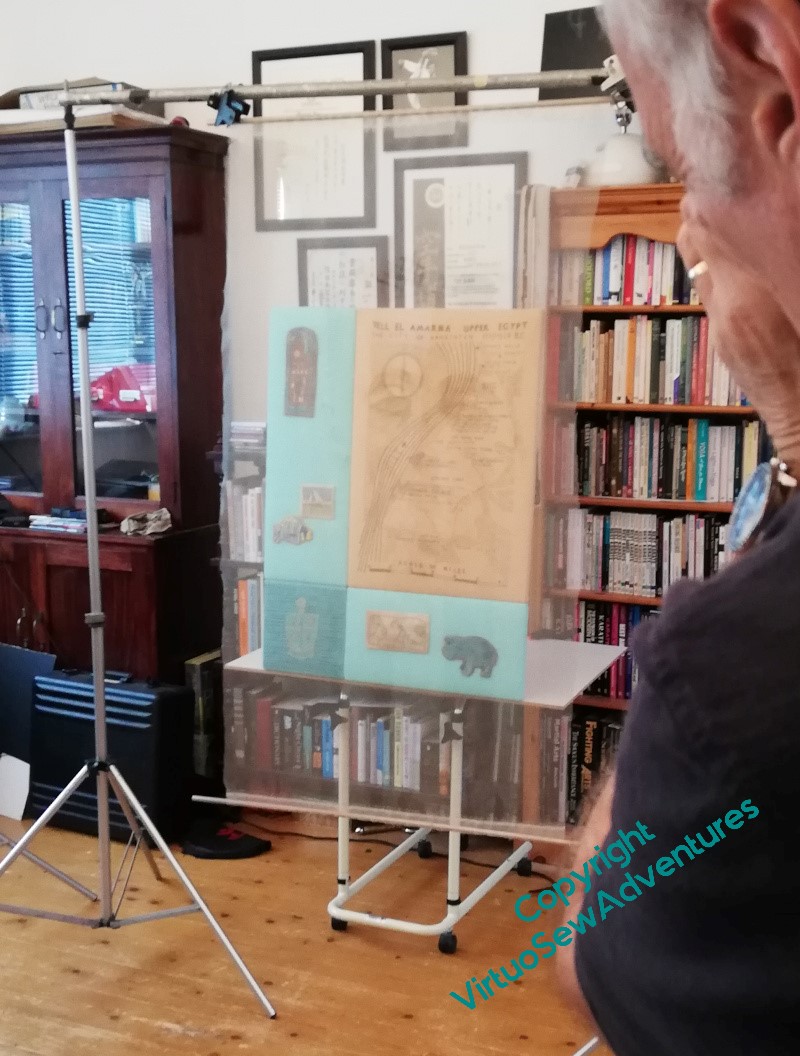
As you can see, the Trickiness of The Overlays continued into the photoshoot. It’s as well that the braid was not included in the end – there’s a length of fishing line in the horizontal gap, tieing the panel to a very solid weight to keep it upright. And the framework from which the gauze is hanging was macgyvered on the spot. See what I mean about the photoshoot turning into a creative collaboration?
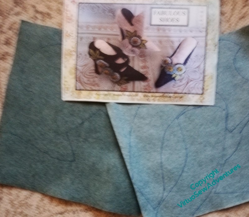
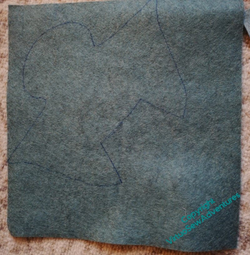
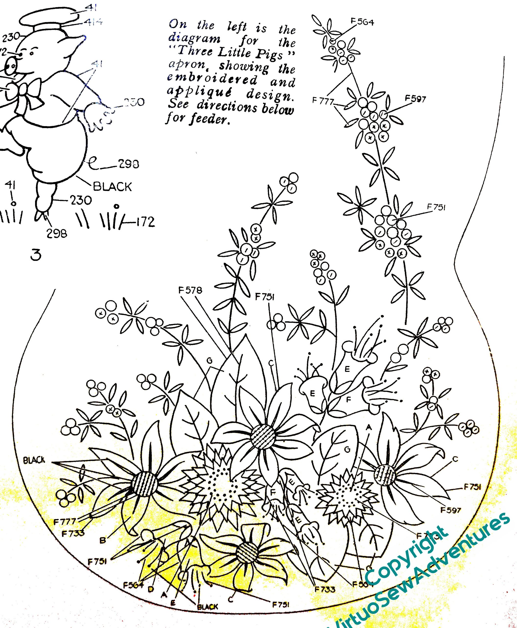
The instructions for a set of Fabulous Shoes in felt caught my eye when I was in at the Knitting and Stitching Show in Harrogate. I thought they’d make a perfect Reset Project for the beginning of the New Year, something a million miles from my usual adventures. When I bought the instructions – and the felt – I hadn’t found the Flox, so I wasn’t anticipating coming home with two projects for Twixmas, as people call it now.
Still, they will be a good change of pace from William, once I get onto his gold, even if that means neither the Flox nor the Felt is finished for the Feast of the Epiphany!
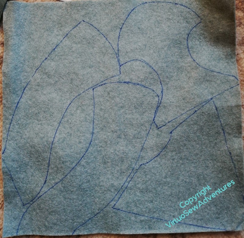
There are so many piecs to organise that rather than pinning my pattern pieces on, I’ve been drawing around them, only when I have got as far as having some confidence in my planning. It is going to involve quite an orgy of cutting out, and more than is usual for me of what might be called Plain Sewing, but I think it is going to be rather fun.
I shall probably hang them up in a corner of my studio (we’ve been calling it the Pre-Studio all this year, since it’s still in an intermediate state, but since I do use it as such, at least part of the time, I’m abandoning the prefix!) when they’re done..
Naturally, not being a lover of black and beige, I didn’t buy the ready-planned kit of felt, but instead a selection of pieces I liked the look of, teals and greens. And red for the Christian Louboutin-inspired soles, of course.
In fact the teals are smaller pieces than the pieces of black and beige, so I’m going to have to do a bit of playing around for the third shoe.
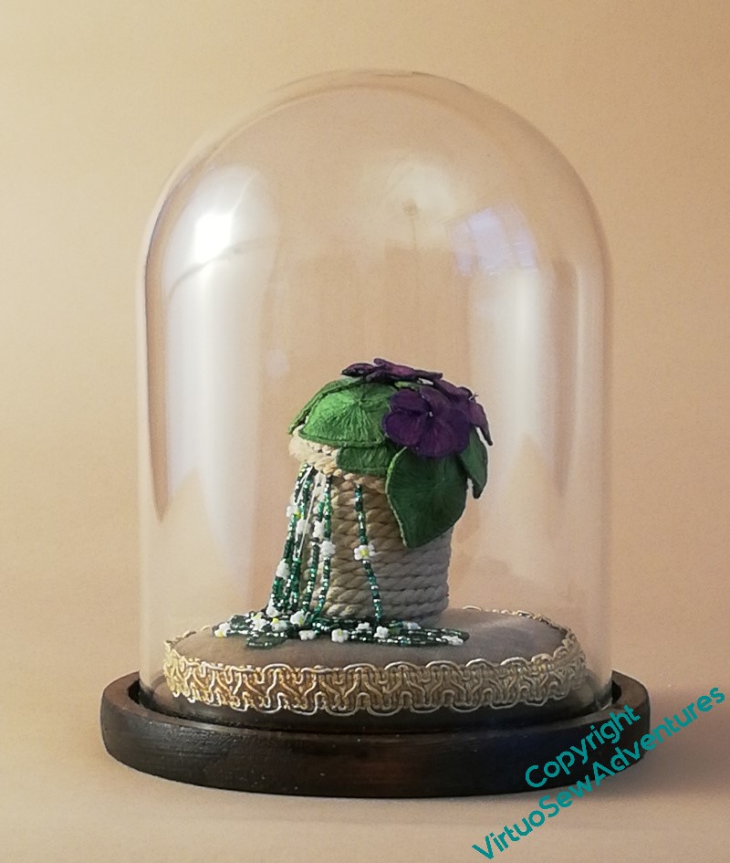
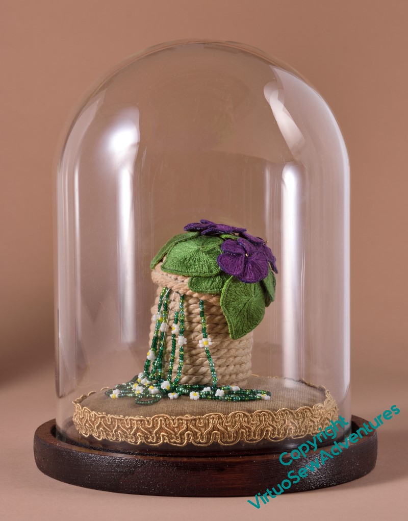
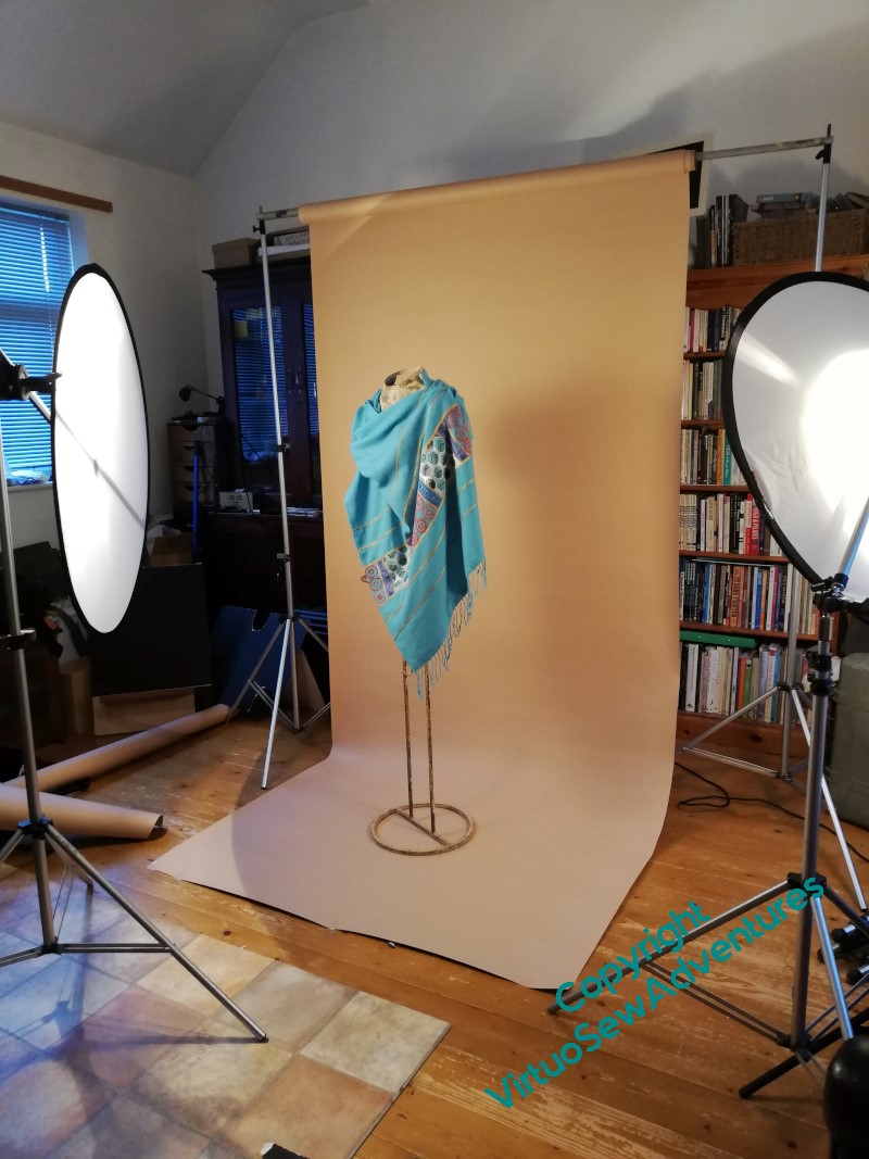
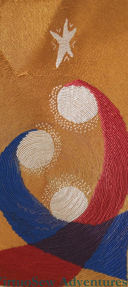
On the left, my photo. Granted, with my mobile phone, but it’s the best I have available to me. It’s in the same place, and against the same background, and with nearly the same lighting, as the one on the right, taken by Bernard.
In Bernard’s version, the colours are brighter, warmer, the crevices and shadows are reduced or enhanced in different places to bring out the details in the various elements, and the placement of the highlights on the glass was carefully tweaked and managed to ensure that the shape of the dome was brought out without any odd little bright spots in the wrong place. The highlights even bracket the embroidery, framing and presenting it.
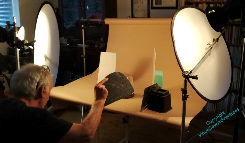
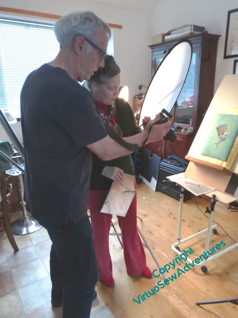
And now you see what it took. Lighting and diffusers, and then a whole slew of little improvised mirrors and reflectors, including one held in Bernard’s hand while he operates the camera with the other one.
We all say that embroidery is hard to photograph, but in truth, until you’ve seen the effort that an experienced professional photographer will put in to get a good shot, you have no idea just how hard!
And all this tells me something else – part of the trick is that, with a lifetime of doing this behind him, Bernard can look through a view finder and think, no, we can do better. I would be impressed from the start, and give up too early, not because I don’t want to achieve a good result, but because I’ve no idea just how good a Good Result can be, and still less of an idea of how to attain it.
But incidentally – I’m so glad I tinted the base of the dome. That dark, vaguely walnut shade works much better than the plain pine!
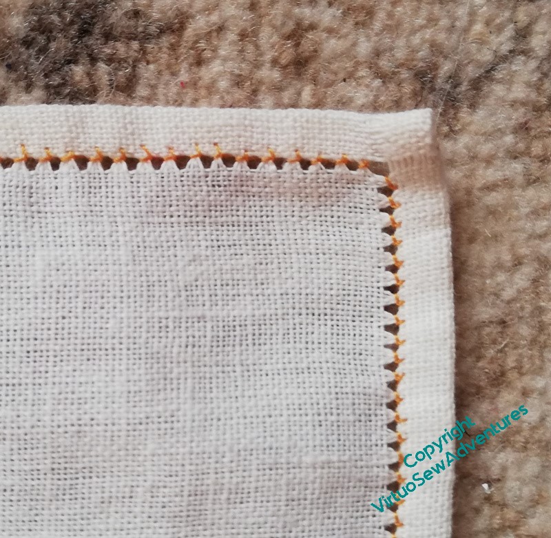
I found a suitable – fairly loosely woven – fabric, and evened up the edges (a lot of unravelling happened!), then hemstitched around the whole thing. In the past, I’ve done the hemstitching last, but as I had a few occasions coming up on which I had time to myself, in public, in which stitching might enable me to be usefully occupied and not loom at people, I thought this was a good use of my time. One reel of cotton, my knitter’s captive blade, and a needle – no other equipment needed, and no risk of losing any of the precious Flox!
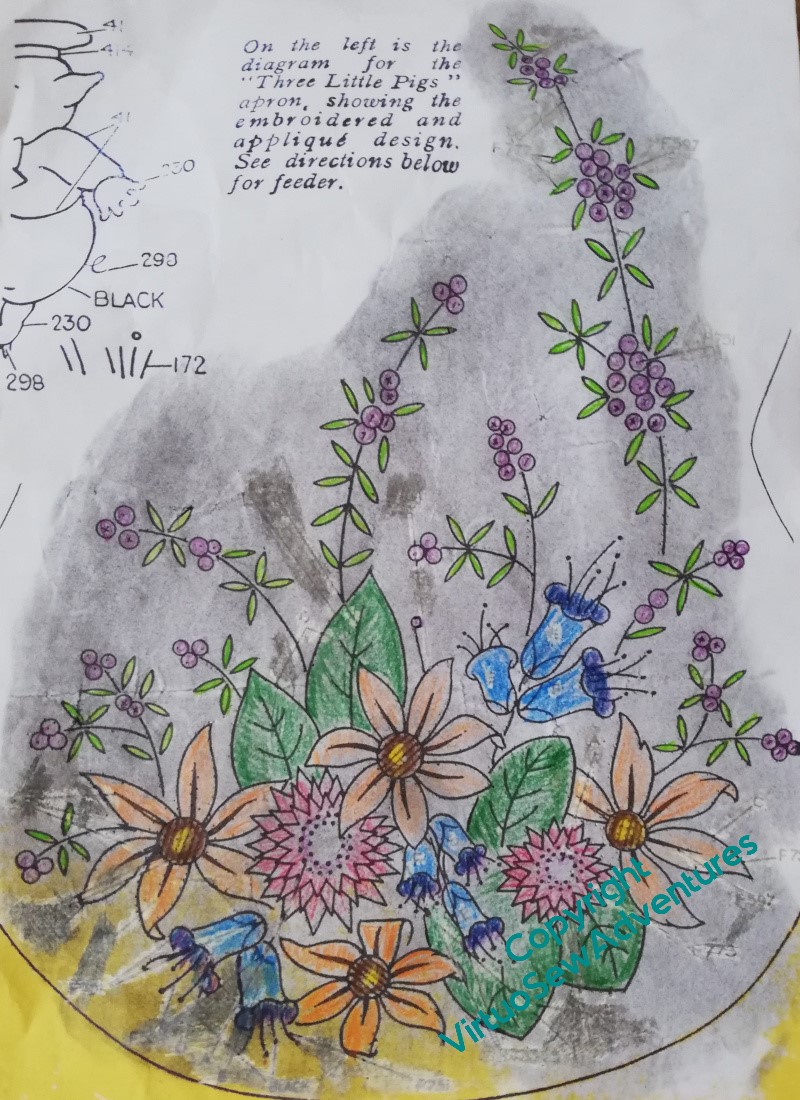
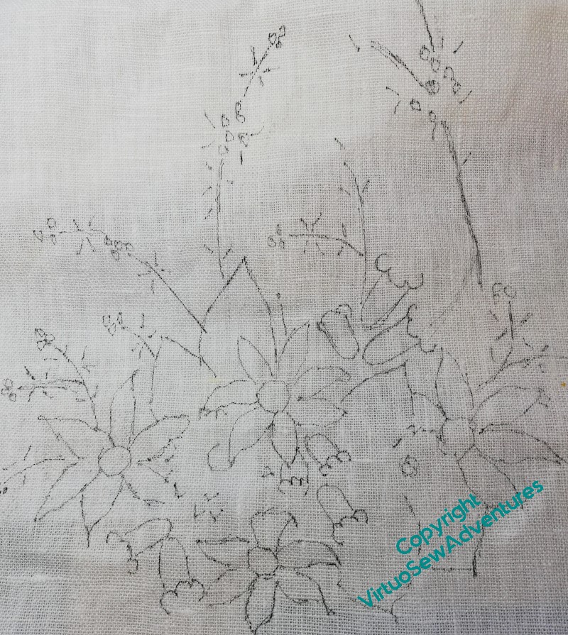
Then I did a colour plan for the chosen design. I don’t usually plan pieces like this so much in advance, but since I have limited thread to work with, I picked out a crayon for each colour I had, and had a go. The background is blackened because I first tried to used prick and pounce to transfer the design. It didn’t at all – possibly because the fabric is too loose and all my pounce ended up in gaps rather than on threads. The next attempt was a transfer pencil. That didn’t work either, not at all, no sign of transfer of anything. I wonder whether transfer pencils degrade with time?
So then, which much muttering, I moved on to my cheap and nasty LED lightbox substitute. If I ever find an old-fashioned one I shall leap upon it, LEAP, I tell you.
You can see that I didn’t transfer all lines in all detail. This is a legacy of the Stitch Off, and a result, also, of the efforts I’ve been putting into painting and sketching over the years. This sort of design doesn’t rely on precision, all of the charm of it comes from the sense of life and profusion, and the fabric and thread are both too chunky to allow for much delicacy. So I’m trying to minimise my reliance on guidelines, and indeed, gradually make the guidance still more minimal. A work in progress, again.
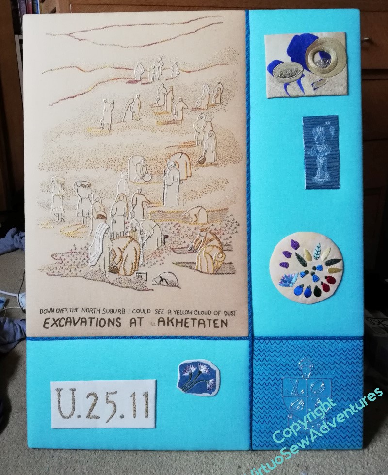
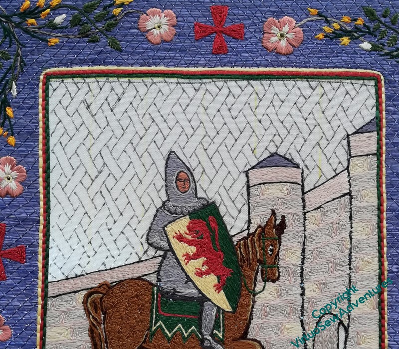
Before Christmas, but still, thanks to an arm injury earlier in the year, very much later than I had hoped (remember the original report, on the first photography session, was in April!), I took the remaining Amarna pieces to the wonderful Bernard Rose for their portraits to be taken.
In fact, we had a great time, because although it’s fair to say I was delegating everything about the photography to Bernard, he took a very collaborative attitude. He was interested in the stories I was trying to tell, and the impressions I was trying to convey, and that meant that, rather than just going “point and shoot” (albeit with better equipment and lighting!), he put great effort into bringing the best out of the various pieces.
Although, halfway through the morning, as he tried to develop a structure from which we could hang one of the overlays, he did comment on the level of puzzle-solving being demanded of him, which is apparently not entirely usual with other clients!
It’s a good thing that my arm injury is reduced to a mere occasional twinge, though – there was quite a lot of heaving things around, and the two main panels, now consisting in each case of four wooden frames screwed to a half centimetre or more of MDF, are really quite heavy and awkward.
The mannequin belonged to him, too. The battered paintwork helped to bring out the idea of something inspired by archaeological discoveries. And the fabric drapes beautifully, in spite of the heavy embroidery, and the additional layer of the lining.
So I think all the photography is now done – although I will be writing a bit more about what I observed and learned during the two sessions.
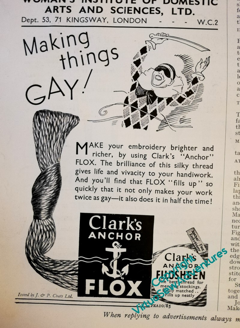
Well, if I had paid attention, forty years ago, to the adverts in those nineteen thirties The Needlewoman magazines, I would at least have known that Anchor “Flox” was a twisted, fairly heavy thread. I might also deduce that it was fairly new, because the tone of the adverts suggests that the reader needed to have the idea of it explained. So it is a fairly heavy thread, glossy and lustrous, and brightly coloured, creating bright, impactful pieces for interiors, rather than tiny delicate pieces for baby’s layettes.
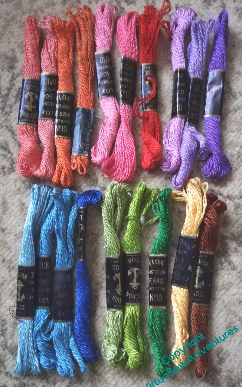
I laid out all my colours from the bunches I bought on the Embroiderers’ Guild stall at the Harrogate Knitting and Stitching Show in colour families to see what I had to work with. Bright, colourful, lustrous, yes – yes, all of that. The thread is a bit heavier than the heavy pearl cottons, but the twist is not so tight. I wonder how it will make up? (Apart from “in half the time”!)
Now I look at it in better light, the red is more of an orange, so it’s misplaced, but there’s a fair range of colour here, as long as I’m not going for subtlety..
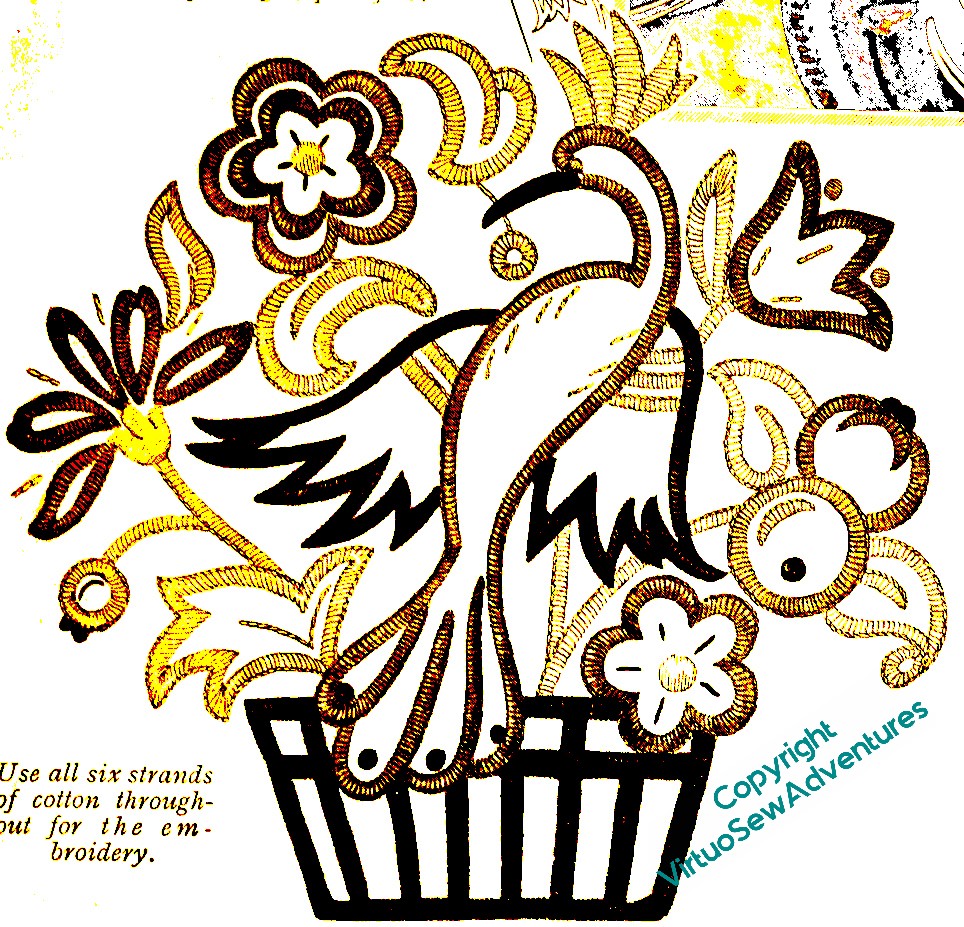
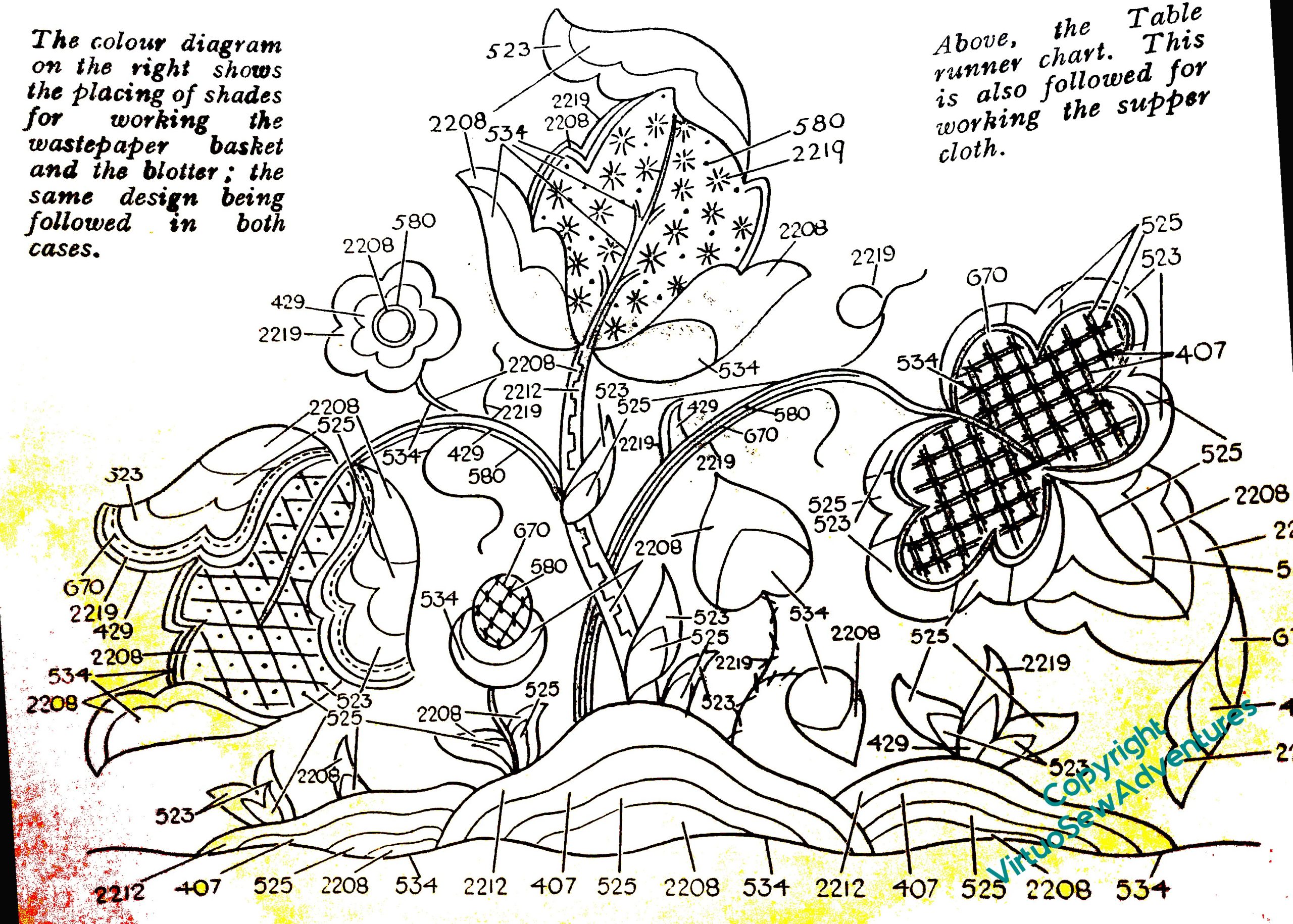
I went through my magazines, to find a selection of designs that were specifically intended for Anchor Flox, but not so huge (the Persian Fantasy Screen was intended for Anchor Flox, and that ends up as five feet by six!) as to demand more thread of each colour than I have.
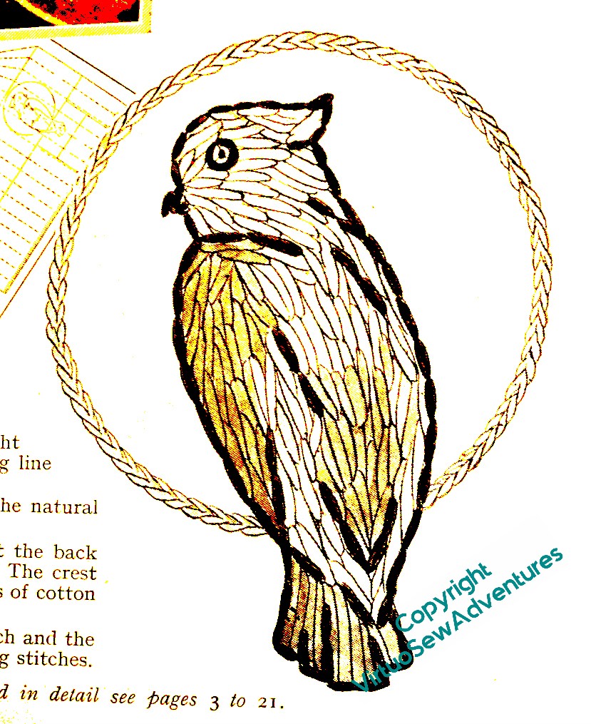
I’ve decided to do one of the floral table runner designs, the middle of the top row here, because I think it will talk nicely to the Queen Anne style teacloth which is presently gracing a side table in the the living room. After that, if I seem to have enough, I am very tempted by that parrot…
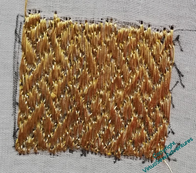
As my regulars know, all too well, I’m not much given to practicing beforehand. Therefore, the sight of me practicing should give everyone a slight sense of discomfort – the world is out of joint!
For this first practice, I used a gold metallic thread that is a bit finer than the recommended one, but it was at least the right structure and type. I did improve as I went through it, sufficiently to then move on to the real thread for the next practice panel.
This seems to be going better. The thread is slightly stiffer and thicker, and having taken the suggestion that Tanya made, I tried every combination of working away, working towards, working left to right, and working right to left, until I found the version that worked for me.
Horizontally, and away from me, since you ask!
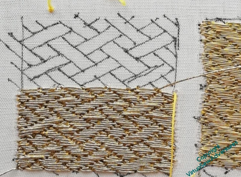
Anyway, I intend to finish the second practice panel before I start on the real thing, but in the meantime I have now sufficient belief in myself on this one to have put in the guidelines on William for the real thing.
Even that wasn’t entirely straightforward, as my lightbox substitute is a little too big to fit comfortably under the frame, and has a slightly fragile usb connector, but it is now done.
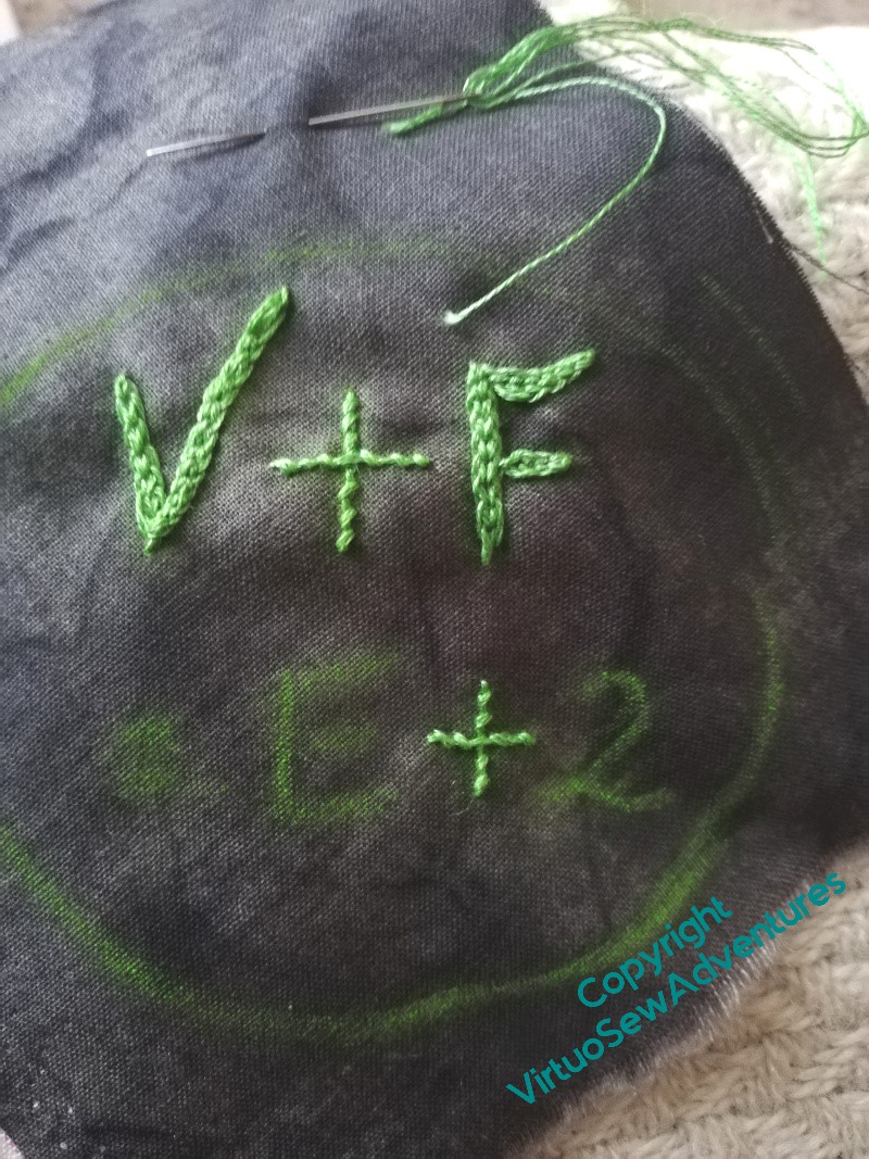
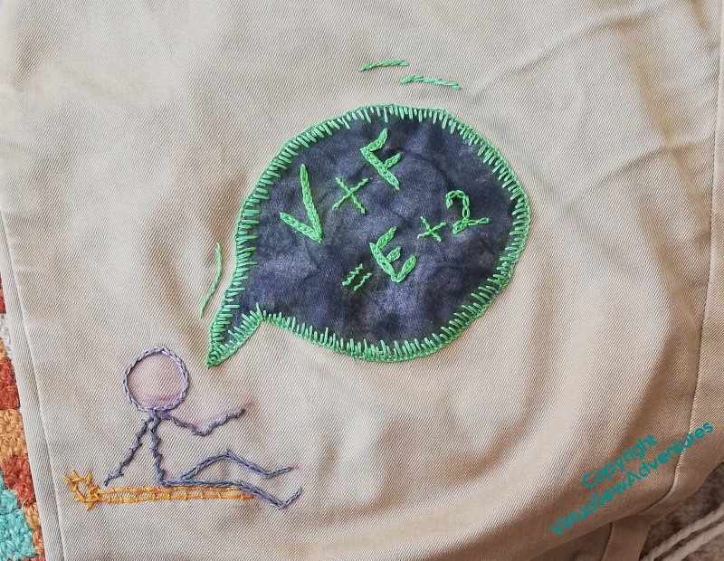
We discovered another thin patch on The Australian’s trousers..
This time I found a slightly darker grey marbled fabric, and got The Australian to write one of the equations I remember from maths lessons at school in chalk.
I’ve done the letters in Hungarian Braided Chain, the plus and equals signs in Coral Stitch, and the “2” in Cable Chain – so that’s several of my favourites all at once! – and then had a thought..
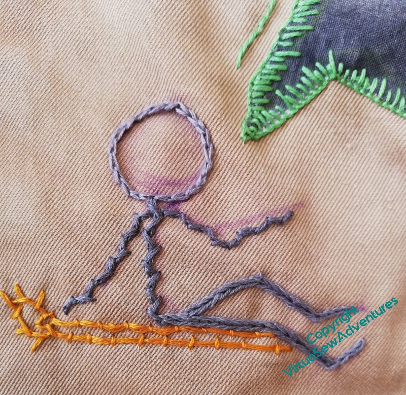
I’ve done the patch as a speech bubble, attached using varied length blanket stitches, and put a few little lines of stem stitch in the same green thread to suggest the speech bubble is moving.
Then I did a little stick figure, sitting on a yellow lounger, declaiming. I found three shades of grey, so make the figure a bit more broken up but still looking “drawn”, and did the head in ordinary chain stitches, the body and arms in Alternating Twisted Chain Stitch (so it looks like a woolly jumper) and the legs in Heavy Chain (a nice pair of jeans). The feet are ordinary chain again.
I hope The Australian’s trousers will survive without further patching for a while!
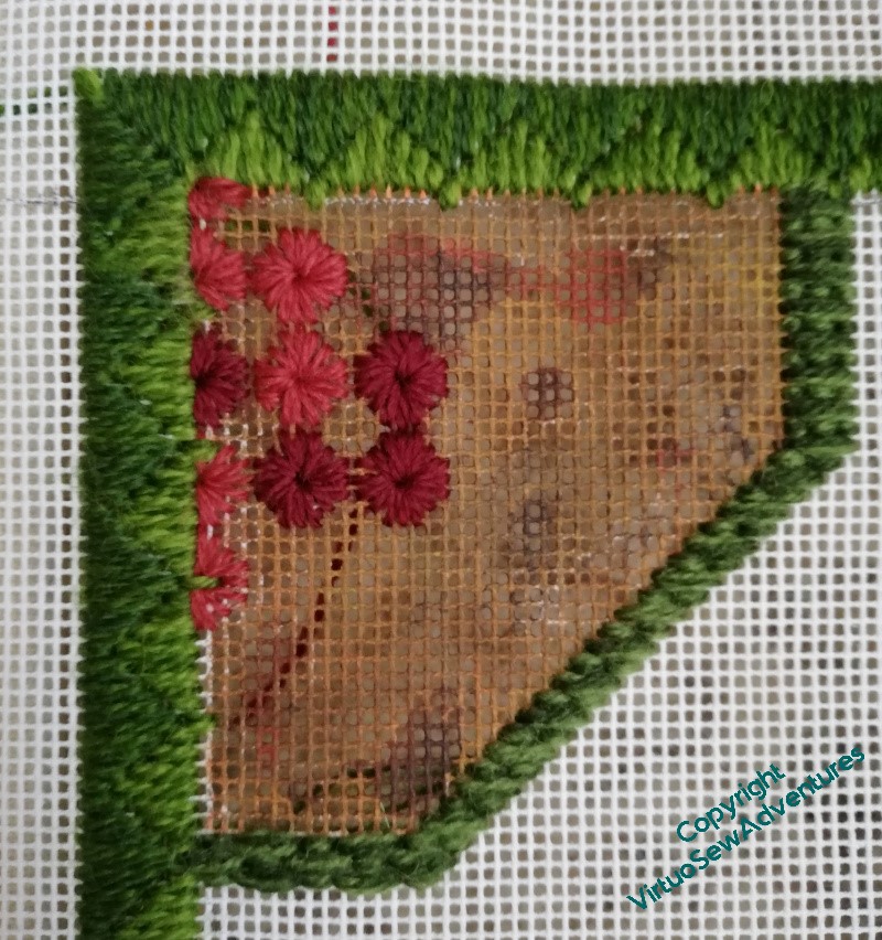
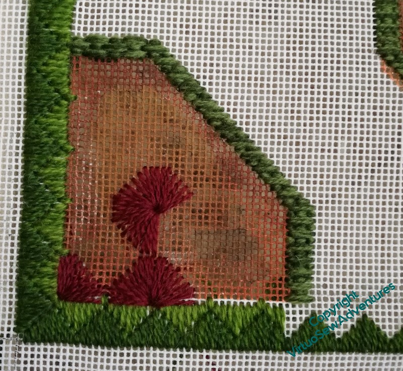
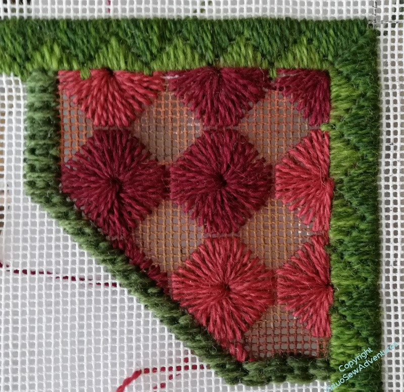
There’s still a great deal of to-ing and fro-ing on the Knot Garden/ Parterre. There’s a lot of border elements to do, and I’m quite certain that I’m going to have to find a way of making sense of a middle section on the short sides: the “Princess Stitch” border I’ve chosen for the outside border is symmetrical around a stitch, and the circular border in the centre is centred around a thread, so something may well look a bit too “off” to be fudged, if I’m not careful!
This pattern is called “Squared Daisies” in my copy of Jo Ippolito Christensen’s book on needlepoint. It looked like a very big pattern in the book, full of interest and personality, but while it has personality , it looks a bit small here, and I’m having Doubts about it.
So, in the spirit of exploration and investigation that I usually apply to needlecrafts, I found another corner and tried again, twice the size.
Yikes, that’s big. And Yikes, again, for the number of threads going through the central hole.
But I think I might rather like it.
In fact, I’ve carried on, and decided I do rather like it. I’m varying the colours to maintain the variation shown in the original inspiration, and now I’m thinking that – again in the spirit of variation – I will also finish the smaller stitch size version.
The other two corners can be the same stitches but in the other order, so that the similar corners are set diagonally to one another. And the only trouble with that is that these stitches are remarkably trying to do, and after a day wrestling with goldwork or Amarna, all I want to do is curl up with a good book!