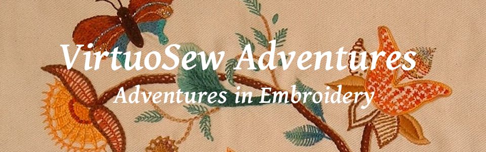
More on Silkie The Ostrich
I got started on the design by doing the split stitch, partly to cover the design lines, and partly because I find it easier to maintain interest if the design advances all over, rather than in spots. That’s why I did all the stems first when I did the Coat of Many Flowers!
The next element, with the white silk from outlining still in the needle, was to tackle the padded satin stitch around the beak and beneath the eyes.
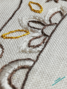
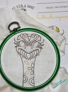
After that I moved on to the decorations on the neck. The patterns are picked out in padded satin stitch. Of course, I decided to complicate matters for myself, and I have decided to vary the levels of padding, and the placement of the padding. For example, I hope you can see here that the padding on the white petals of the flower is shifted to the outside of the petals, and has been done in a couple of layers.
When it came to the two golden leaf shapes, I combined two layers of chain stitch padding with a layer of satin stitch at right angles to the final layer.
The light grey elements are all unpadded.
I’m not sure that it shows at all well, but it does make more of a difference in person than in reproduction!
Meanwhile, Episode 45 is now live – in which I continue planning Placidus, while considering the challenges of image searches, and the occasional opacity of musical jokes.
I fully agree that working all the outlines first is a good way to keep motivated to go on. Your graded padding makes for a really beautiful and excellent finish.
Nice to see the start and would love to view the finished. Pretty starting.
I can see the difference in the padding but agree these things look better when viewed in person. He has a personality already. Or is it a she?
Silkie is looking rather fine, I love the way the padded satin stitch catches the light in different directions, and your angel background appears to be finished. How splendid. When you mentioned adding some couched gold around the cloak my immediate reaction was “ooh yes, I like that idea”. I think it would soften the edges of the boundary between foreground and background, and also bring the angel forward visually. Looking forward to seeing the whole off the frame 🙂
What a fun project!
My natural drawing style is ink then colour, so I tend to stitch in much the same way. Working one area before moving on always feels awkward to me. Lines, then filling – even if the first set of lines are really just marking stitches and going to need rework afterwards.
This is a delightful little project and you must be thoroughly enjoying yourself!
He’s looking grand! Love the textural effect and the gold contrast with the more subdued colors.
It´ll be fun stitching this design.